
Navigation
Install the app
How to install the app on iOS
Follow along with the video below to see how to install our site as a web app on your home screen.
Note: This feature may not be available in some browsers.
More options
You are using an out of date browser. It may not display this or other websites correctly.
You should upgrade or use an alternative browser.
You should upgrade or use an alternative browser.
Things you didn't notice before in Mario games
- Thread starter Princess Céline
- Start date
Larry Koopaling
Cruel, composed and bland
Another art work finding
View attachment 9182
Not only I did not notice Daisy in this but she has no nose and small eyes
Back when Daisy was basically a reskinned Peach. Good times.
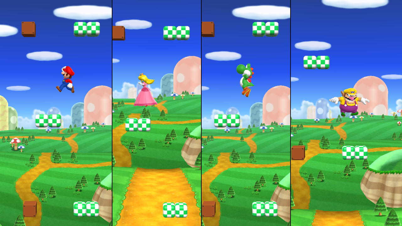
Yoshi! Yoshi!
Melon Inspector
- Pronouns
- He/him
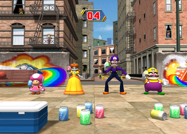
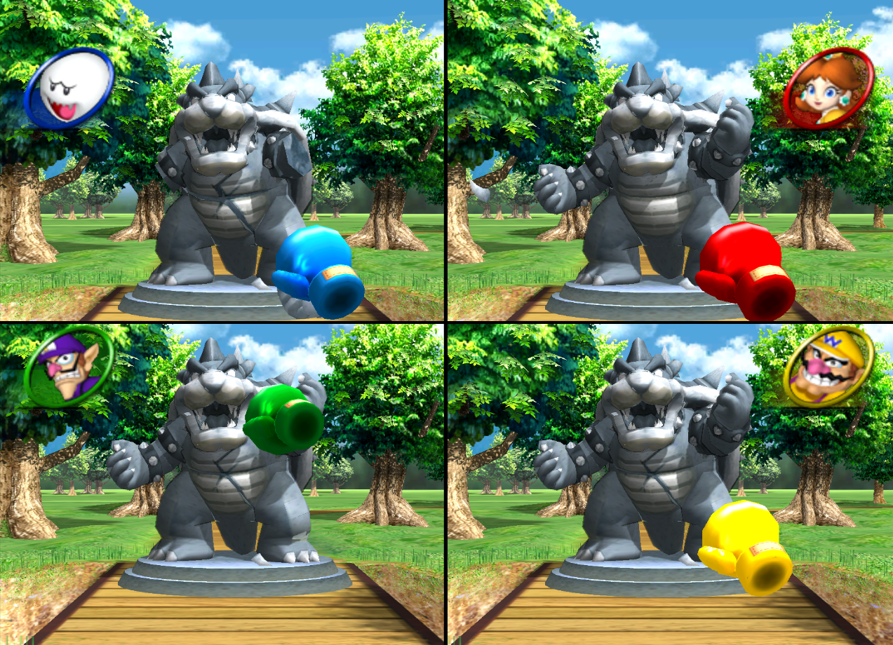
That in Shy Guy Bazaar the Taj Mahal is a mushroom.

Maruto Uzumaki
I will become-a Hokage. Believe it

in Mario Golf Toadstool Tour, when you land the ball into a flower garden, Pikmin will pop out of the flowers
I knew about this for quite some time now, but I really appreciate nintendo showing love to franchises other than mario in mario games.
Speaking of pikmin in mario, I completely forgot that theyre kinda hidden in the super nintendo world poster
Speaking of pikmin in mario, I completely forgot that theyre kinda hidden in the super nintendo world poster
- Pronouns
- she/her
- MarioWiki
- Mario
It's brought up before that Donkey Kong has a bit of a paint on his wrists to cover up probably more obvious seams from UVs and whatnot. It's been shared on Supper Mario Broth, but I couldn't find the post.
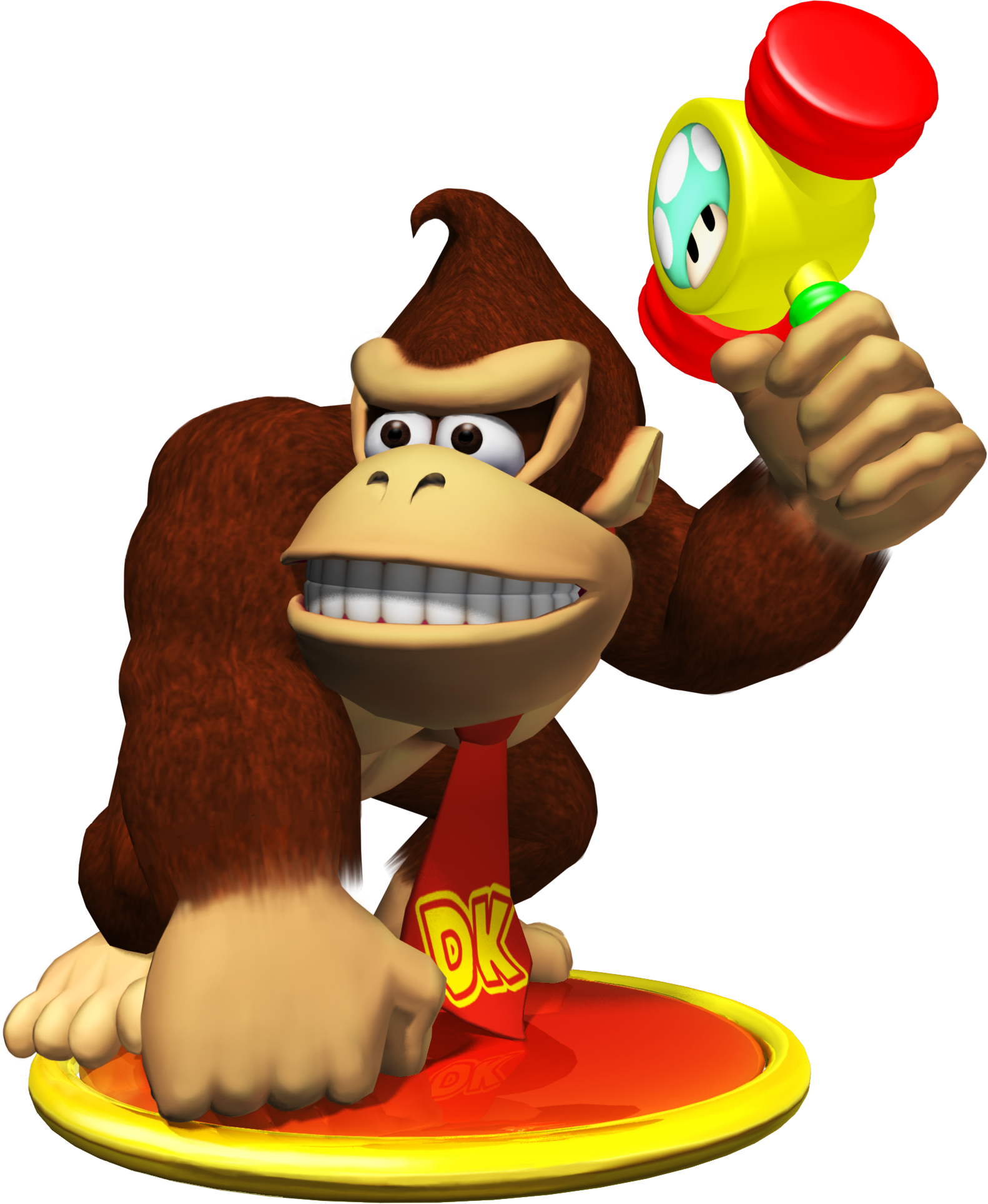
But Donkey Kong isn't the only one with quick paint-overs!
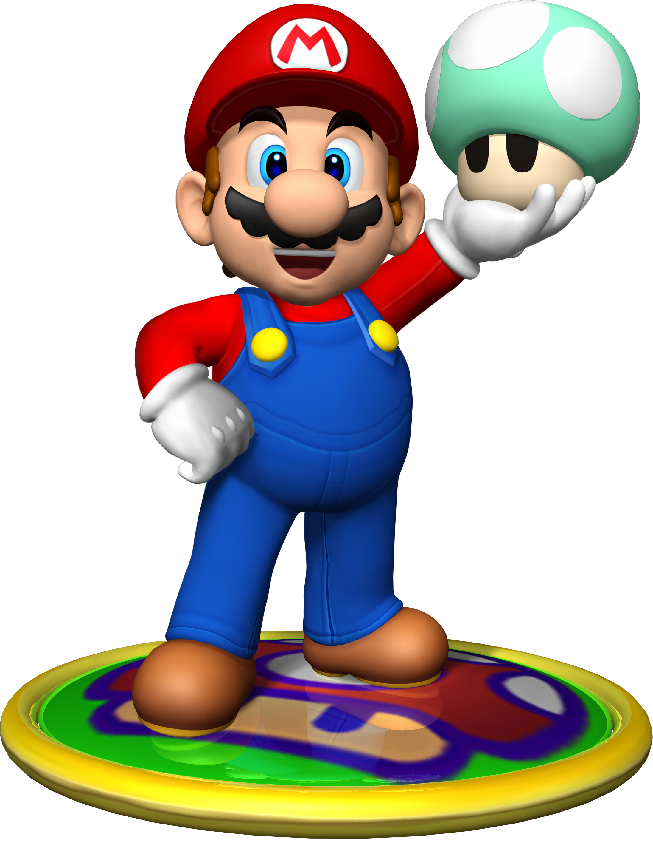
Mario is jealous that Luigi has a mouth that doesn't evidently look painted on AND there's no make-up smudge on the stache.
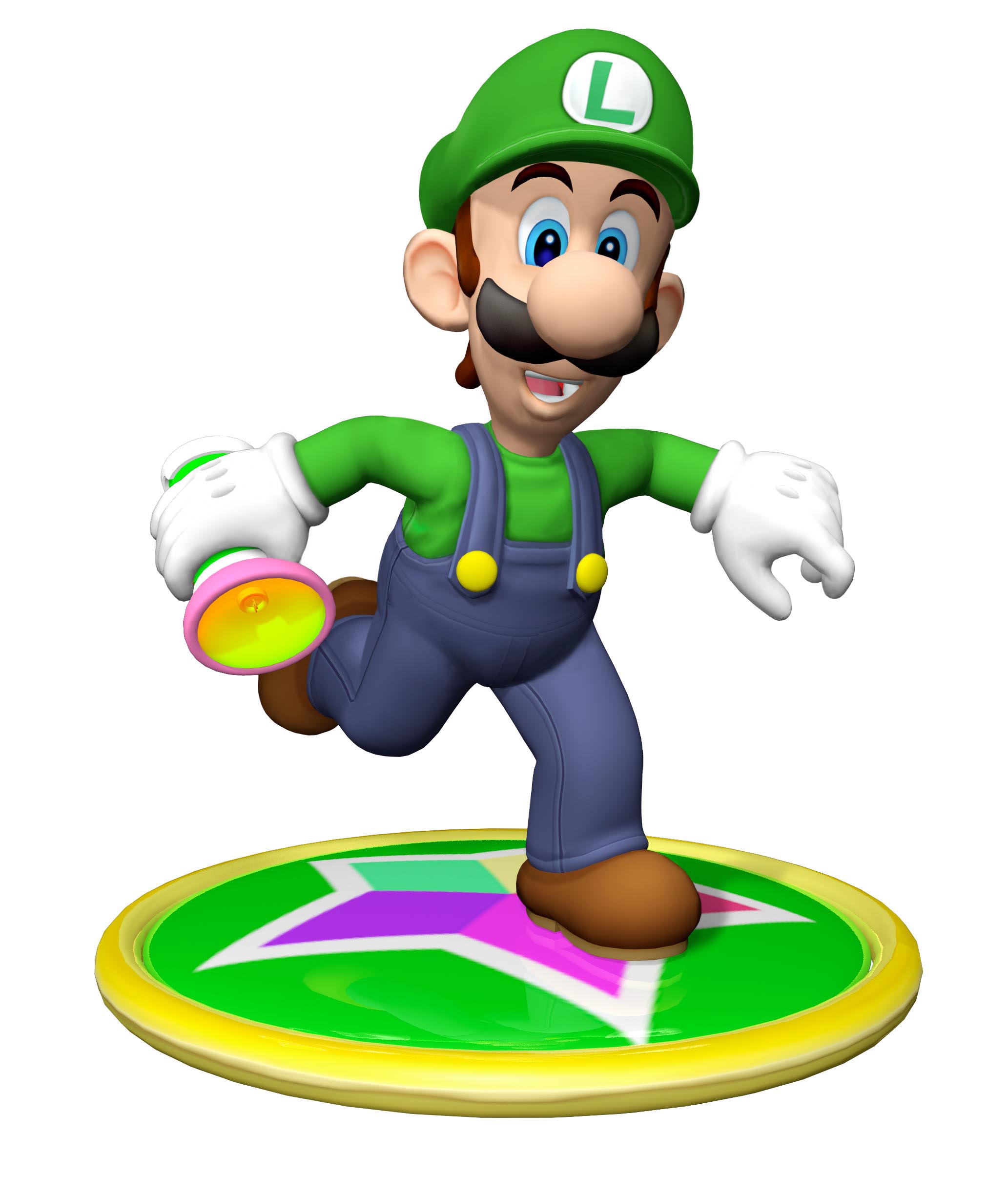
Zoom in for detail

And look at that, painted-on stuff near the knuckles to cover rendering flaws. What is going on at the rim of those gloves? And look at that cropping around the hands!

Art aged like butter under studio light. If you think that's just some MarioWiki sourcing fan-made jank and didn't catch it, look at the official wallpaper using this art. The poor cropping and paint-over's still there!

You're supposed to set an example, Mario! Why don't you have an actual mouth?
Anyway Mario Party 4 isn't wholly artistically bankrupt. I know we've ripped on its opening cutscene animation and its poorly aged renders, but it's capable of nice images

And to be fair, we wouldn't be able to spot most of those errors and paint-jobs because those renders were always meant to be viewed at lower resolutions, such as instruction booklets (beats me about full-sized wallpapers though). We wouldn't really spot a lot of these if we weren't given high-res versions of those images. Well, except for the cropping around the gloves; that's a mistake that could've been corrected.
But Donkey Kong isn't the only one with quick paint-overs!
Mario is jealous that Luigi has a mouth that doesn't evidently look painted on AND there's no make-up smudge on the stache.
Zoom in for detail
And look at that, painted-on stuff near the knuckles to cover rendering flaws. What is going on at the rim of those gloves? And look at that cropping around the hands!
Art aged like butter under studio light. If you think that's just some MarioWiki sourcing fan-made jank and didn't catch it, look at the official wallpaper using this art. The poor cropping and paint-over's still there!
You're supposed to set an example, Mario! Why don't you have an actual mouth?
Anyway Mario Party 4 isn't wholly artistically bankrupt. I know we've ripped on its opening cutscene animation and its poorly aged renders, but it's capable of nice images
And to be fair, we wouldn't be able to spot most of those errors and paint-jobs because those renders were always meant to be viewed at lower resolutions, such as instruction booklets (beats me about full-sized wallpapers though). We wouldn't really spot a lot of these if we weren't given high-res versions of those images. Well, except for the cropping around the gloves; that's a mistake that could've been corrected.
- Pronouns
- she/her
- MarioWiki
- Mario
Aesthetically, yeah, the Mario Party games had a big step up in quality since Mario Party 9. Since then, I'd consider the model quality to be better than at least their contemporary Mario Karts. The animations were also a big improvement in Mario Party 9; they could actually pass off as animation compared to whatever that jank that was in the GCN ones (Bowser stiffly stomping, Donkey Kong's beating his chest not looking natural). There's a lot of jaggy on the character models too; it's really evident when they open the genie bottle in Mario Party 4.
That being said, while I don't consider the parties to be blow away beautiful, the set pieces do look pretty pleasant. I like the way Faire Square looks for instance.
That being said, while I don't consider the parties to be blow away beautiful, the set pieces do look pretty pleasant. I like the way Faire Square looks for instance.
Koopa con Carne
Lidl K. Rool
- MarioWiki
- Koopa con Carne
Mario Party 8's visuals are particularly rancid and I blame MC Ballyhoo for setting that whole thing up. No offense meant towards Big Top.
- Pronouns
- She/her He/him
Mario Party 8 ran at 30 fps, which was such a major downgrade to pretty much the rest of the Mario Party titles.
Also, no widescreen support meant you have ugly borders for like 80% of the game.
Seriously what were they thinking back then?
Also, no widescreen support meant you have ugly borders for like 80% of the game.
Seriously what were they thinking back then?
Mcmadness
The idiot who puts things in the wrong board.
Seriously what were they thinking back then?
"We need a game out as quick as possible."
- Pronouns
- she/her
- MarioWiki
- Mario
This doesn't look bad tbh
and Noshi is there. Hi, Noshi.
zel
probably quit [see about for info]
- Pronouns
- she/her
i remember a convo on mp8 on a discord a few weeks (i think) ago and people were saying how it just looks post apocalyptic and how a lot of it seems to take place in some sort of wastelands. and i swear its true it really does look like that
whats up with the dull realistic enviroment textures everywhere this is just so unlike mario.. and whats also off about this in particular is how it looks like a bright and sunny enviroment but the shadows are just. black. whereas in the sun outside irl youd see the shadows are more blue
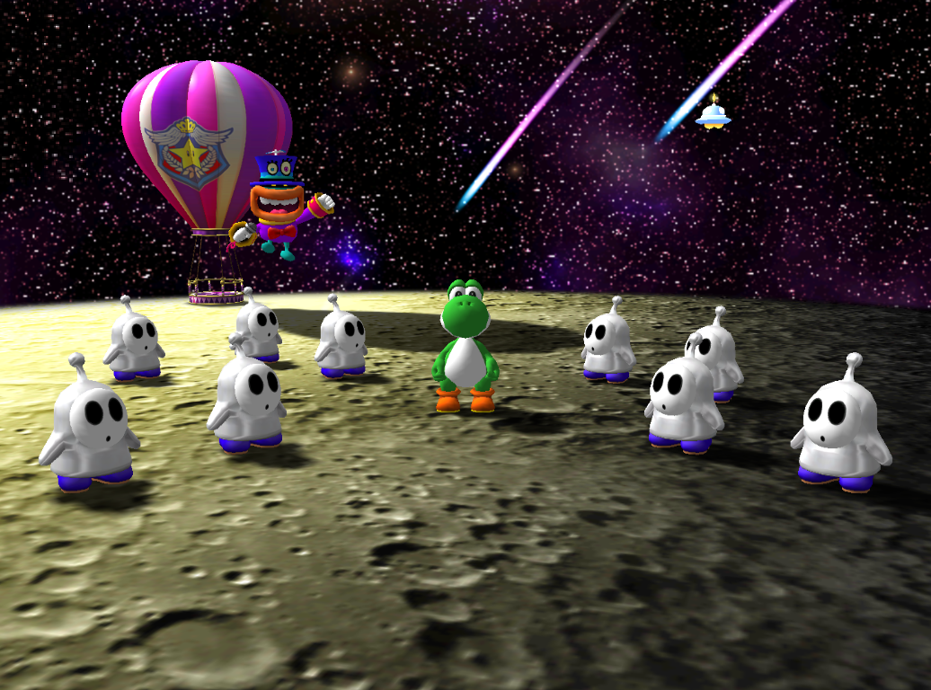
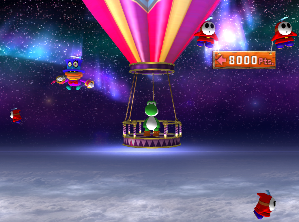
watch out for Yoshi on da Flat Disc Textured Like The Moon, Floating In The Middle Of Nowhere
but not all of it is bad? i do think the sky looks pretty here at least. and yeah that board in the previous reply also looks pretty nice
whats up with the dull realistic enviroment textures everywhere this is just so unlike mario.. and whats also off about this in particular is how it looks like a bright and sunny enviroment but the shadows are just. black. whereas in the sun outside irl youd see the shadows are more blue
watch out for Yoshi on da Flat Disc Textured Like The Moon, Floating In The Middle Of Nowhere
but not all of it is bad? i do think the sky looks pretty here at least. and yeah that board in the previous reply also looks pretty nice
- Pronouns
- she/her
- MarioWiki
- Mario
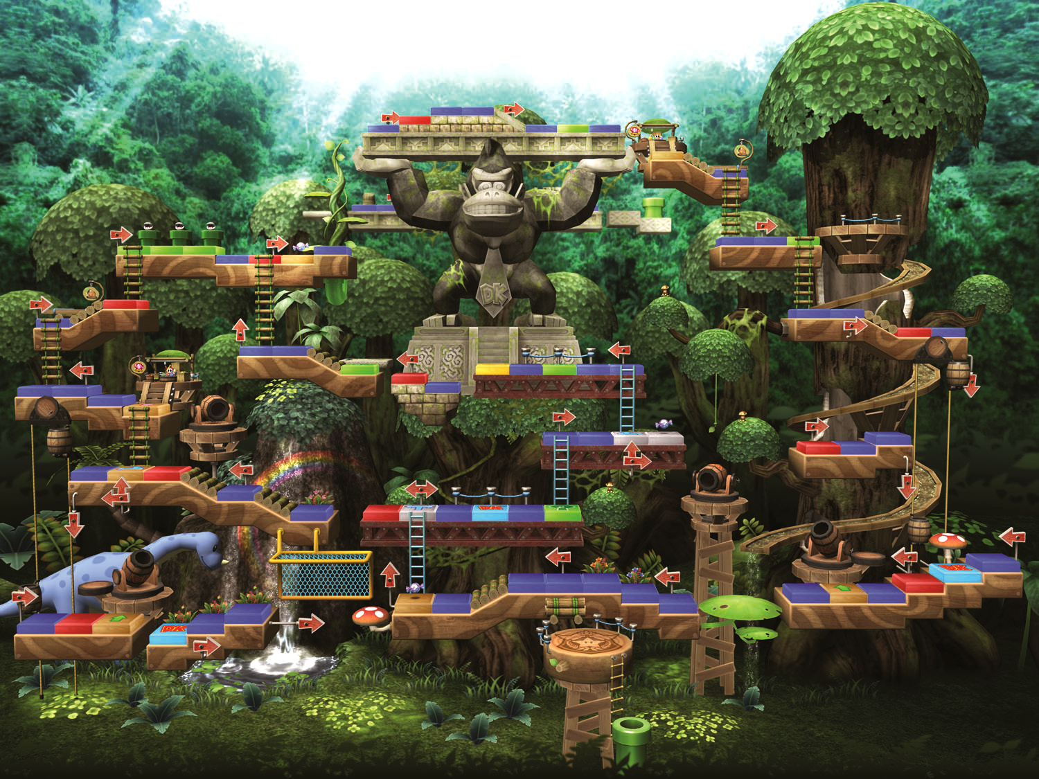
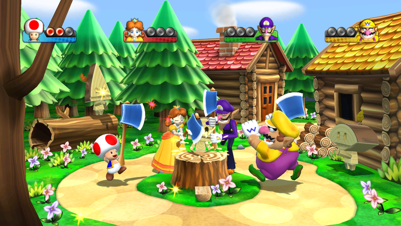
Yeah, one thing we all noticed was that Mario Party 9's set pieces are definitely less generic. People brought up the environment in Mario Party 9 to dock on its theming for... being Mario? Oh no, just New Super Mario Bros.. Just look at the background grass scenery of this
And then Mario Party 8
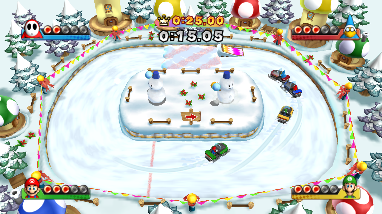
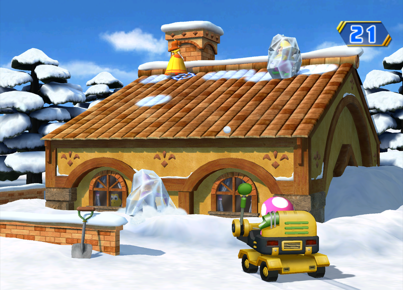
Or Mario Party 9 snow
Then Mario Party 8
And then Mario Party 8
Or Mario Party 9 snow
Then Mario Party 8
Rendering shadows realistically (i.e. soft) is VERY difficult if not graphics intensive, due to how light works. If not baked on a texture (ambient occlusion texture for instance), shadows are going generally be hard and uniform. You see this also in highly lit environments in later gameswhats up with the dull realistic enviroment textures everywhere this is just so unlike mario.. and whats also off about this in particular is how it looks like a bright and sunny enviroment but the shadows are just. black. whereas in the sun outside irl youd see the shadows are more blue