Paper Mario: The Thousand-Year Door (Nintendo Switch)

I like how they just took the old character models and applied a shiny coat of paint to them.

No I don't.
I love it. They aren't just the reused sprites, they pulled out the uncompressed versions for this, and I'm so happy everything wasn't redesigned to look like the (mostly inferior) modern designs. Even Peach has her old dress despite her having an updated one in SPM, so that suggests a deliberate choice to maintain how EVERY character looked in TTYD and I applaud that.

I could have done with the modern versions of Yoshi and Dry Bones though, and a middle ground design for Hammer Bro, but I doubt a game that combines the best of both classic and modern styles is ever on the table, they wouldn't bring back only SOME of the classic designs, so I'm satisfied with this.
 
On the topic of character designs, it seems like everyone is going crazy over a Toad NPC who wasn't in the original version. They take it as concrete evidence of the idea that Nintendo have fully eased their supposed Mario mandates. Even Yahoo Finances of all outlets reported on it.

aea1a69b38a770f5a4c6da1bbd4bc350


And my reaction to this is... what's the big deal again? Only the usual attire and color has changed from the Toad template; the character otherwise doesn't have hair nor a different body shape. The hat doesn't even cover the entire scalp, like you see in TTYD's Toad train workers. Toad designs in Color Splash and Origami King were afforded various articles of clothing, too, and that happened during the "stringent" era of Paper Mario, no? Here are some examples from across these two games:

Suit_Toad_PMCS_sprite.png
Toad_Researcher_PMTOK_sprite.png
Oarsman_PMTOK_sprite.png
The_Princess_Peach_captain_PMTOK_sprite.png
Toad_engineer_PMTOK_sprite.png
Shangri-Spa_Toad_PMTOK_sprite.png

Am I missing something?
 
On the topic of character designs, it seems like everyone is going crazy over a Toad NPC who wasn't in the original version. They take it as concrete evidence of the idea that Nintendo have fully eased their supposed Mario mandates. Even Yahoo Finances of all outlets reported on it.

aea1a69b38a770f5a4c6da1bbd4bc350


And my reaction to this is... what's the big deal again? Only the usual attire and color has changed from the Toad template; the character otherwise doesn't have hair nor a different body shape. Toad designs in Color Splash and Origami King were afforded various wear too, and that happened during the "stringent" era of Paper Mario, no? Here are some examples from across these two games:

Suit_Toad_PMCS_sprite.png
Toad_Researcher_PMTOK_sprite.png
Oarsman_PMTOK_sprite.png
The_Princess_Peach_captain_PMTOK_sprite.png
Toad_engineer_PMTOK_sprite.png
Shangri-Spa_Toad_PMTOK_sprite.png

Am I missing something?
I don't really understand this myself because Origami King in particular had a wide variety of designs and outfits for all sorts of different species across the game.

I think the real buzz around the new toad NPC I have heard though is mostly based around how the remake getting new NPCs means that some things might actually be different/there might be more content. While this toad guy is probably just a reskin of a generic toad that existed in the original or some kind of amiibo NPC, at least it's something to talk about.
 
New Paper Mario enemies are soulless, the old ones have more personality.

I'm sorry but what? They're both just standing there both making a blank emotionless facial expression. Characters don't express personality by just standing there with a dead eyed facial expression. It's how they're posed and animate is what gives them life, not if they're designed to look like how they look like in the other games.
 
I think the real buzz around the new toad NPC I have heard though is mostly based around how the remake getting new NPCs means that some things might actually be different/there might be more content. While this toad guy is probably just a reskin of a generic toad that existed in the original or some kind of amiibo NPC, at least it's something to talk about.
I'm down for the game getting new content at least, which is very good but I'm still not wholly convinced the game should be higher than 40 bucks. We'll see if new content and significant improvements can alleviate the concerns.
 
I'm down for the game getting new content at least, which is very good but I'm still not wholly convinced the game should be higher than 40 bucks. We'll see if new content and significant improvements can alleviate the concerns.
The original game is over a hundred dollars used now. $60 for a full remake is literally the cheapest way to play the game and doesn't also require you to buy old hardware as well.

Yes, you can emulate, but TTYD kind of emulates like shit at points (paper folding effects can cause bad slowdown or even freezing). If it was just a straight port I would agree but a full remake I think justifies the price tag when they alternative is paying twice as much.
 
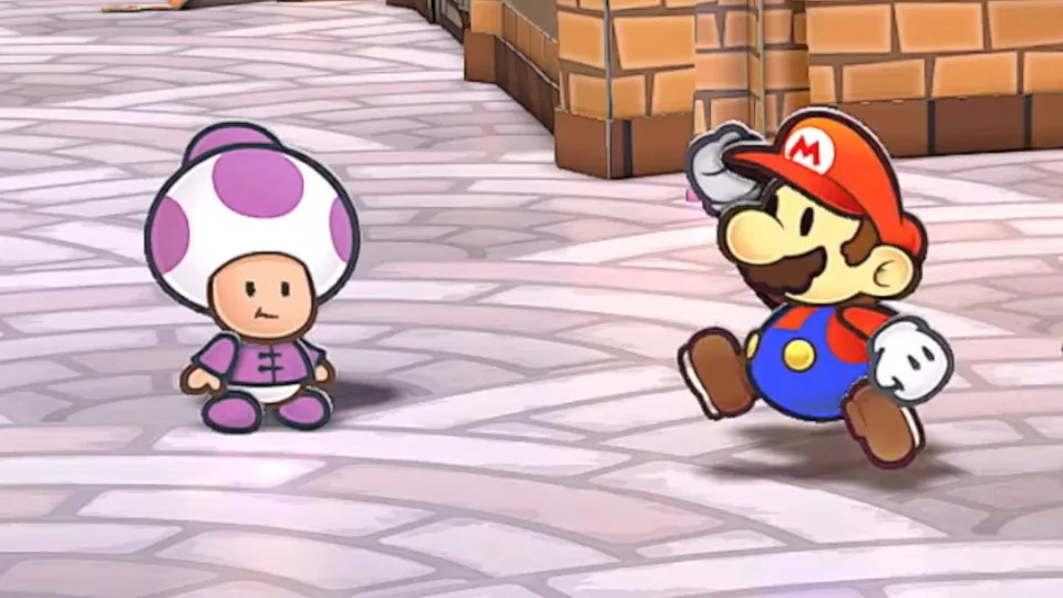
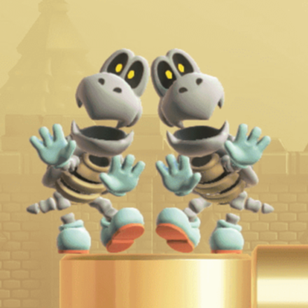
New Paper Mario enemies are soulless, the old ones have more personality. Plus, all the art here is actually new, it is much higher resolution than the original art and there are many new animations seen even in the trailer. It's not just a copypaste.

A character design doesn't have a personality unless it was meant to indicate something about that character specifically. Which these ones don't, regardless if it's new or old. Goombas are still goombas, red shoes or not.

The art is not new, it's uncompressed but most of it is recycled and touched up with a few new ones. It's not copypaste but this definitely the type of game I'd expect to see on a system on it's last legs.
 
Characters don't express personality by just standing there with a dead eyed facial expression.

Demeanour and personality should be communicated through design alone. That's kind of the point of character design.

Muriel_Bagge.png
Eddy_(Ed,_Edd_n_Eddy).png
eren_yeager_anime_design.png

These are pretty much what you'd expect to see on a typical character sheet--they're not too far removed from a T pose--and yet they already lend an impression on how they act even you had never seen them before. The body shape, the facial features, perhaps even the clothing, contribute towards their psychological profile: one is kind and sweet; another seems unpredictable and sleazy; and the last is austere and determined. Indeed, they're common stances these characters adopt in their respective stories. Characters aren't supposed to have a blank facial expression, unless it's part of their personality or is dictated by a current specific mood; if this is the most you can glean from your character when you strip them down to their most basic, then the design fails. In real life, people aren't motionless carcasses with a thousand yard stare who need a puppeteer to move them around; those people wouldn't be people anymore, they'd be morgue subjects.

I remember arguing in the past that the aesthetics of Paper Mario cooperate much better with the Yoshi's Island designs of enemies than with mindlessly flattened variants of their 3D counterparts. I still stand by that view. The designs that work and are expressive in 3D, don't lend as well to a 2D paper medium--unless the animators go out of their way to stretch the limits of their phyisical appearance like those 2D LINE stickers, a practice that barely exists in Paper Mario games.The elements therein are more static than in other Mario titles to emulate the feeling of a world governed by cardstock: it's all the more reason to give characters inherently expressive designs so they complement this limited aesthetic direction. Modern PM games wholly sacrifice that idea in favour of a clean, safe, but terribly misguided look for the cast.

Case in point with the most tragic character "uplifting" in the Paper Mario series:

PMTTYD_Boo_Sprite.png

mischievous, probably even dangerous

PMCS_Boo_1.png

"ball ghost clip art free download"
 
Last edited:
The original game is over a hundred dollars used now. $60 for a full remake is literally the cheapest way to play the game and doesn't also require you to buy old hardware as well.
IMO that's the reason they're releasing a 20 year old game for full price. It's only marginally better than their practice of slapping 60 buck price tags on 5+ year old games like the 3D World one.

I mean we got a remake for Baiten Kaitos I & II and that looks like a 50 dollar price for two games in one. Like two full-blown RPGs with 40 hours each. The Metroid Prime remake is 40 bucks. The Advance Wars remake also contains 2 games for 60 bucks.

The pricing for Mario vs DK is steep but I still think it's a more justified remake as it's a jump from gba prerendered graphics and includes a coop mode. This remake doesn't look that much different. Superstar saga remake DID benefit from reusing dream team assets but I would argue that one had more of a visual upgrade than this one.

Of course, if this remake is not 60 bucks, then it's more fair.
 
Last edited:

I mean I agree that designs are often used to reflect a personality.... but boos are supposed to look mostly harmless. Thats the whole point. They look harmless and shy so you think they are harmless and lower your guard, then you turn around or they suddenly go all creepy scary faced.

The latter design reflects this much better, the former you'd always be able to tell it's up to something, it has a literal evil frowny grinning face on it.
 
The redesigns look traced from 3D models from any other game. I think this fails to mesh with Paper Mario's sprite-based artstyle and quirky tone. Their proportions and style clash with the untouched main characters.

Taking Boo as an example, the mouth on the TTYD design is exaggerated to look cartoony, and it looks like the perspective is fudged and flattened out to read better. The redesign's whole face is squished to match the curvature of a 3D Boo's body, even though these games are far more insistent that the characters are flat. Look at how the eyes are scaled and unaligned, as if traced from a 3D model with perspective and a slight angle.

While i do like the ω-shaped Boo eyebrows, here they wrap around the body, creating a tangent-like effect that looks bad in 2D. If the brow stuck out past the body's outline, it would add interest to the silhouette and make the design read better. Cartoons use these floating eyebrows all the time; that's probably part of why TTYD carried them over.

You could make "generic" enemy designs that better fit the established Paper Mario style. The actual redesigns look like following the letter of a model sheet was top priority. All of the enemies being strictly on-model makes oddities in the main characters' designs that were grandfathered in, like Mario's leglessness and Bowser's orange scales, seem out of place. Why don't they get redesigns, too? If Goombas and Boos don't need to evoke Yoshi's Island, Mario doesn't need to evoke dated Small Mario sprites.

I love it. They aren't just the reused sprites, they pulled out the uncompressed versions for this, and I'm so happy everything wasn't redesigned to look like the (mostly inferior) modern designs. Even Peach has her old dress despite her having an updated one in SPM, so that suggests a deliberate choice to maintain how EVERY character looked in TTYD and I applaud that.

I could have done with the modern versions of Yoshi and Dry Bones though, and a middle ground design for Hammer Bro, but I doubt a game that combines the best of both classic and modern styles is ever on the table, they wouldn't bring back only SOME of the classic designs, so I'm satisfied with this.

I could have done with Mario's tweaked design from Super Paper Mario. It's mostly unchanged; his puffy cap just looks so much better. The cap shape is one thing from TTYD that i'm miffed that they immediately went back to :P

There are enemies that could be touched up—i think the Hammer Bros are garish—but i think it'd be bad optics to mess with their designs too heavily in this remake. Hopefully they can do it in the next game, but that might be too optimistic.
 
I'd like to clarify that I don't find fault with a 2D Boo that takes after its 3D design. I think this stock graphic is quite lively and shares positive elements with the TTYD Boo:

Boo_vector_art.svg


I'm moreso bothered by the way this concept was executed in Paper Mario, for reasons explained by Agent Muffin, which I believe tie into my argument of how the poor handling of a character's minutiae can translate into a less expressive, almost blank design.

Other Paper Mario enemies have suffered a similar transition, while a few were admittedly improved: as stated before, Dry Bones' modern makeover appears preferrable to its older PM design, in part because it simply makes the enemy more recogniseable. The roughly-human skull mounted on a shell, seen in its previous design, does a fairly mediocre job in representing an undead turtle.
 
I'm not particularly fond of the Dry Bones in the older Paper Mario games. I know they were probably just cribbing off Super Mario World but the current one has the anatomy that's more suitable to me. Both are cutsey but I like the newer one's rounder head shape and color scheme (the cyan gloves and shoes are always nice complement to the white-gray colors; it's like the best glove color choice for this character) more. I don't like the little hair marks on the head either.

PMDryBones.png
Dry_Bones_PMSS.png


Neither are "soulless" though.

I mean come on, they're possessed remains.

PDSMBE-DryBonesCheepCheep-TeamImage.png
SMBW_Dry_Bones.png


re: Boo. I would argue it's more a fault of translation than an inherent flaw in the character design (which concessions were already made by Koopa con Carne on this). I don't like how they handled the line weights here nor do I like how their arm (which I think is a tad too big) is overlapping their general outline. Partners in Time. Mario Party Advance, and Superstar Saga had less sprite space to work with and they made more appealing modern Boos. That being said, I don't like the Yoshi's Island Boos especially the smaller ones very much. The eyebrows on the modern one is more bashful looking rather than just slanted like they're mad. They're gonna be sticking out their tongue a bit, so probably better off just concentrating the teeth on four fangs on top. The modern one works fine. It's cute enough.
 
Last edited:
On the topic of character designs, it seems like everyone is going crazy over a Toad NPC who wasn't in the original version. They take it as concrete evidence of the idea that Nintendo have fully eased their supposed Mario mandates. Even Yahoo Finances of all outlets reported on it.

aea1a69b38a770f5a4c6da1bbd4bc350


And my reaction to this is... what's the big deal again? Only the usual attire and color has changed from the Toad template; the character otherwise doesn't have hair nor a different body shape. The hat doesn't even cover the entire scalp, like you see in TTYD's Toad train workers. Toad designs in Color Splash and Origami King were afforded various articles of clothing, too, and that happened during the "stringent" era of Paper Mario, no? Here are some examples from across these two games:

Suit_Toad_PMCS_sprite.png
Toad_Researcher_PMTOK_sprite.png
Oarsman_PMTOK_sprite.png
The_Princess_Peach_captain_PMTOK_sprite.png
Toad_engineer_PMTOK_sprite.png
Shangri-Spa_Toad_PMTOK_sprite.png

Am I missing something?

Because Toad characters can have diverse ages, bodies, hair, and genders in Paper Mario again!
365


That was not allowed for the longest time.

"From the production of Paper Mario: Sticker Star onwards, we were no longer able to graphically represent individual characteristics, such as age, gender etc., in the Toad NPCs (non-playable characters), and so it has become that much more important to convey their personalities simply through text. Our writer, Mr Taro Kudo, has been grappling with this difficult challenge since Paper Mario: Sticker Star." -Kensuke Tanabe
 
I find it interesting that they remixed the title theme from the N64 Paper Mario. (Maybe hinting of a Paper Mario N64 remaster?)

I also noticed that they now have back sprites for the characters. And in that one scene in the blimp, all the partners are seen with Mario, maybe showing that there will be more instances where all the partners will get to have more dialogue or all the partner will be seen more in certain cutscenes.
 
I find it interesting that they remixed the title theme from the N64 Paper Mario. (Maybe hinting of a Paper Mario N64 remaster?)

Yeah when they used that music it made me think at first they were remaking both games in one package at first. But unless this is a Bayonetta 2 situation where purchasing some versions of the Thousand Year Door remake also gets you a code for the first game. They probably would have titled this something like Paper Mario Classics or maybe a nod to the Japanese title for the first game by calling it Paper Mario Stories
 
I'm just angy they skipped Paper Mario 64. Guess because TTYD is more in demand.
Yeah yea, Switch has a n64 emulator, but only via online access..they're not letting us keep those games..
 
Yeah yea, Switch has a n64 emulator, but only via online access..they're not letting us keep those games
Exactly, it's such a shame that there isn't currently a way to own these games properly now that Wii U and 3ds eShop are gone
 
I'm looking forward to playing this game again as a remake. The new graphics look pretty snazzy and don't compromise the old designs, seems very faithful. I like that they're segmented models now instead of just sprites, it reminds me of the Paper Mario render on Paper Mario: Sticker Star's box art. I'm surprised they never went that route before, because I'd like to see a new Paper Mario game continue with this look and evolve it. Many people don't like the outlines from the previous 3 entries, and although I myself was never bothered by them, I did feel like it was about time to change it up. I commend Intelligent Systems for showing restraint and searching for a new visual avenue instead of using white outlines again, since that surely would have earned some ire from the fans and was a common doompost when discussing potential remakes for 64 and TTYD.

Speaking of Sticker Star, one thing I'm immensely curious about is if Kensuke Tanabe is involved. If he is, he is most likely a producer as per usual. I do recall a few years back he did field a question about a potential TTYD remake, asking back at the interviewer if "they'd buy it". I'd love to hear his thoughts on this remake, because it might herald a future of new Paper Mario games potentially going back to its roots. This is, of course, assuming the remake does good numbers. I think it will, but I'm not holding my breath for it to be the sole deciding factor on the series trajectory. I'm just glad more newcomers will be able to play it in an accessible and reasonable manner, since the original GameCube copy is fairly pricey nowadays.
 
Back