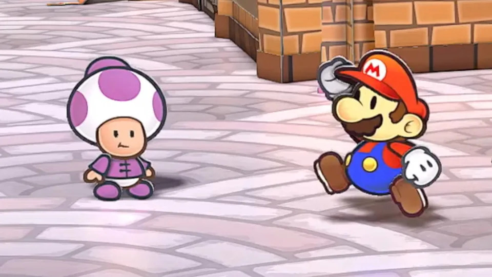
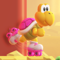
The redesigns look traced from 3D models from any other game. I think this fails to mesh with
Paper Mario's sprite-based artstyle and quirky tone. Their proportions and style clash with the untouched main characters.
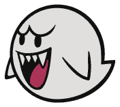
Taking Boo as an example, the mouth on the TTYD design is exaggerated to look cartoony, and it looks like the perspective is fudged and flattened out to read better. The redesign's whole face is squished to match the curvature of a 3D Boo's body, even though these games are far more insistent that the characters are flat. Look at how the eyes are scaled and unaligned, as if traced from a 3D model with perspective and a slight angle.
While i do like the ω-shaped Boo eyebrows, here they wrap around the body, creating a tangent-like effect that looks bad in 2D. If the brow stuck out past the body's outline, it would add interest to the silhouette and make the design read better. Cartoons use these floating eyebrows all the time; that's probably part of why TTYD carried them over.
You could make "generic" enemy designs that better fit the established
Paper Mario style. The actual redesigns look like following the letter of a model sheet was top priority. All of the enemies being strictly on-model makes oddities in the main characters' designs that were grandfathered in, like Mario's leglessness and Bowser's orange scales, seem out of place. Why don't they get redesigns, too? If Goombas and Boos don't need to evoke
Yoshi's Island, Mario doesn't need to evoke dated Small Mario sprites.
I love it. They aren't just the reused sprites, they pulled out the uncompressed versions for this, and I'm so happy everything wasn't redesigned to look like the (mostly inferior) modern designs. Even Peach has her old dress despite her having an updated one in SPM, so that suggests a deliberate choice to maintain how EVERY character looked in TTYD and I applaud that.
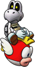
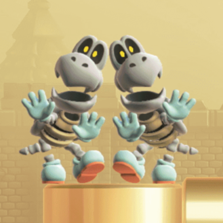
I could have done with the modern versions of Yoshi and Dry Bones though, and a middle ground design for Hammer Bro, but I doubt a game that combines the best of both classic and modern styles is ever on the table, they wouldn't bring back only SOME of the classic designs, so I'm satisfied with this.
I could have done with Mario's tweaked design from
Super Paper Mario. It's mostly unchanged; his puffy cap just looks so much better. The cap shape is one thing from TTYD that i'm miffed that they immediately went back to :P
There are enemies that could be touched up—i think the Hammer Bros are garish—but i think it'd be bad optics to mess with their designs too heavily in this remake. Hopefully they can do it in the next game, but that might be too optimistic.