That the likelihood that Plessie will be in is about the same that Wart will be in, perhaps not even that, since Wart is at least a 8-bit era character…i don't geddit

Navigation
Install the app
How to install the app on iOS
Follow along with the video below to see how to install our site as a web app on your home screen.
Note: This feature may not be available in some browsers.
More options
You are using an out of date browser. It may not display this or other websites correctly.
You should upgrade or use an alternative browser.
You should upgrade or use an alternative browser.
The Super Mario Bros. Movie (2023)
- Thread starter SuperShyGuy
- Start date
-
- Tags
- illumination mario movie movie

Gay Rights Luigi
watch fop a new wish or you're... straight ahaha
- Pronouns
- He/It
- MarioWiki
- Crazy Mr. L Fanguy
ok the poster is fucking gorgeous and the colors and details are just mmm perfection
but mario's model makes him look like a mascot costume. i know its most likely from the smaller hands but still it is bothering the fuck out of me. i also have a mild complaint with the shoes not having the rounded edge but hey i will take the design if it means we will have easier to cosplay pieces. love the new ridging on mario's gloves they look excellent and his hat omg the choice to round it out more makes it look a lot better and softer, it reminds me of a plush. i have hope they will add the overall button details like the one from the nintendo store statue, the gold star ridging on the buttons looks so good.
for the landscaping i think having peach's castle on a damn tall hill is dumb af but it would tie into odyssey for having peach's castle on a floating chunk of land. speaking of that i adore the levels being floating islands thats such a good move. i could do without the realistic mushrooms, or keep them and add more color variants like from the new mario bros series. seeing all the different pipes for transport is so cool too, they really nailed that child playground whimsical aesthetic mario's world has.
i dont have much more to say honestly, toads look fine and the town area looks cute, couldve done without the nostalgia baiting of the 8-bit antiques. i moreso enjoy deepdiving into character models and we didnt really get much lolol hopefully this movie wont be too mario (the character) focused. this looks like one of illumination's most detailed movie so far, ive never seen em go this hard with detail and local building.
- Pronouns
- She/They
- MarioWiki
- Fawfulthegreat64
I was really holding out hope that being a movie where worldbuilding is more important, they'd allow the Toads to have more diverse appearances like tall, short, male, female, old, young, hairstyles, etc. Pretty disappointed Nintendo still kept their foot down on not allowing that for the movie. Unless they purposely chose the blandest Toads in the film for this poster.
- Pronouns
- He/him
I wouldn't really blame Nintendo on this one, I can think of several reasons why they wouldn't go for that. They'd have to make a lot of extra models for one thing, and realistically these Toads are probably going to be used mostly as background characters, they don't need to stick out. It might actually be a bad thing if they did - having a bunch of different Toad designs might just be too distracting for background crowd shots. Plus, Toad diversity just isn't really something that's existed in the games at all for what, 15-20 years at this point? I wouldn't be so quick to assume that this is something Illumination actively wanted (or even suggested) and Nintendo shot down. I mean look at the Minions for example, it's a handful of designs that get copied over and over and the important characters get unique designs so they can stand out. They were probably content with recycling the same Toad model over and over and just swapping out the colors to get a sense of variety, they can get away with it and very few people would bat an eye at it.I was really holding out hope that being a movie where worldbuilding is more important, they'd allow the Toads to have more diverse appearances like tall, short, male, female, old, young, hairstyles, etc. Pretty disappointed Nintendo still kept their foot down on not allowing that for the movie. Unless they purposely chose the blandest Toads in the film for this poster.
- Pronouns
- She/They
- MarioWiki
- Fawfulthegreat64
I mean previous Illumination movies have had variety in background character models (just look at the people populating the towns in the Despicable Me films, The Lorax, etc) so I don't think that's an excuse. I just want to feel like the Toads are a cohesive and rich society and if they all look the same it's really hard to convince myself of that. As for the Minions, they aren't that varied but they are still more varied than the Toads. There's skinny and fat ones, some have one eye, etc.
Mcmadness
The idiot who puts things in the wrong board.
I was really holding out hope that being a movie where worldbuilding is more important, they'd allow the Toads to have more diverse appearances like tall, short, male, female, old, young, hairstyles, etc. Pretty disappointed Nintendo still kept their foot down on not allowing that for the movie. Unless they purposely chose the blandest Toads in the film for this poster.
It's based off the main Mario series, you know the one that's toads basically never had different types of appearances. (toadsworth being the ONLY exception) so I don't know why you would think otherwise.
Also while I'm at it, while I doubt there would be much world building regardless since this at most a 90 minute family film, having a group of characters that look all the same does not mean something can't have world building in it.
- Pronouns
- She/They
- MarioWiki
- Fawfulthegreat64
I never said that, I just said it's kind of a shame they went that route. After all the movie may be primarily focused on the main series, but the main series also had a focus primarily on gameplay, so there wasn't as great a need to make character designs like that. A movie doesn't have gameplay so I just kind of hoped they'd take the approach of the more story/character driven spinoffs for the background characters. The Super Show was also based on the main series and it had all kinds of crazy Toad designs. I know Nintendo is a lot more conservative now than they were then but man it would've been nice.
Anyways, on another note, Mario's clothes interest me. He looks kind of like a mascot costume at Super Nintendo world (honestly the poster in general reminds me of SNW, i wonder if the design of the park and the movie were aware of each other)
Anyways, on another note, Mario's clothes interest me. He looks kind of like a mascot costume at Super Nintendo world (honestly the poster in general reminds me of SNW, i wonder if the design of the park and the movie were aware of each other)
Mcmadness
The idiot who puts things in the wrong board.
I never said that, I just said it's kind of a shame they went that route. After all the movie may be primarily focused on the main series, but the main series also had a focus primarily on gameplay, so there wasn't as great a need to make character designs like that. A movie doesn't have gameplay so I just kind of hoped they'd take the approach of the more story/character driven spinoffs for the background characters. The Super Show was also based on the main series and it had all kinds of crazy Toad designs. I know Nintendo is a lot more conservative now than they were then but man it would've been nice.
Why on earth would they take inspiration from something that is but a small niche of the franchise as a whole? I don't want to sound mean but the entire point of a movie adaptation is to see iconic things on the big screen.
And the supershow did it's wacky junk because they had only 2 games to derive concepts from, everything else was mostly just stock parodies and pasta jokes.
- Pronouns
- She/her He/him
As much as I like Toads having various physiques and variations in their design, expecting official Mario media at this point to dabble in that is setting yourself up for disappointment and that's not something I prefer to revel in. I know this, you know this, and at this point you're just being contrary just for the sake of it. Also, one of the only animated movies I've seen like acknowledge random background characters is the Cars franchise but for one, it's not an adaptation but an original IP and two, car collections is a common hobby (see Matchbox and Hot Wheels) and Disney wants to jump on that too.
Anyway, the movie poster is very gorgeous. I pretty much love the environment and the set dressing. The Toad with the backpack is a nice homage to Captain Toad (and he has teeth), so I'm assuming he's the main Toad and that's how you distinguish him from other Toads (you can see other Toads with blue vests in the background). I've also noticed they're doing the thing with the white highlights in eyes where their eyes are rendered all black, but light settings give it that appearance, and I wonder if Mario's eyes will follow suit as well. It also seems like the environment was specifically designed for characters who can jump in mind, and you can see a lot of Toads jumping around in the distance. There's also a flying ? Block and the cannon from Super Mario 64 in this poster, plus it looks like those colored hills will be rendered with colored plantation (flowers?) rather than like a solid rock texture. Though that waterfall in one of the floating islands has a weird virga effect. Also those Toads pants look more like sweatpants than diapers.
Oh I'm also intrigued by the pipe system. It looks like a clusterfuck lol

There's also a Toad awkwardly hitting a ? Block with his hands when he usually does it with his head (ala Mario Party).

Anyway, the movie poster is very gorgeous. I pretty much love the environment and the set dressing. The Toad with the backpack is a nice homage to Captain Toad (and he has teeth), so I'm assuming he's the main Toad and that's how you distinguish him from other Toads (you can see other Toads with blue vests in the background). I've also noticed they're doing the thing with the white highlights in eyes where their eyes are rendered all black, but light settings give it that appearance, and I wonder if Mario's eyes will follow suit as well. It also seems like the environment was specifically designed for characters who can jump in mind, and you can see a lot of Toads jumping around in the distance. There's also a flying ? Block and the cannon from Super Mario 64 in this poster, plus it looks like those colored hills will be rendered with colored plantation (flowers?) rather than like a solid rock texture. Though that waterfall in one of the floating islands has a weird virga effect. Also those Toads pants look more like sweatpants than diapers.
Oh I'm also intrigued by the pipe system. It looks like a clusterfuck lol
There's also a Toad awkwardly hitting a ? Block with his hands when he usually does it with his head (ala Mario Party).
- Pronouns
- she/her
- MarioWiki
- Mario
Agree for the most part and I'm liking what I'm seeing from the poster. I always expected a nice array of colors and picture composition from the first look of the movie; people were kinda expecting wet cardboard from Illumination, but honestly, visuals have never been Illumination's weak points (though not like SPECTACULAR BLEEDING EDGE 3D REALISTIC WATER IN GOOD DINOSAUR), they're always pleasant at worst.ok the poster is fucking gorgeous and the colors and details are just mmm perfection
but mario's model makes him look like a mascot costume. i know its most likely from the smaller hands but still it is bothering the fuck out of me. i also have a mild complaint with the shoes not having the rounded edge but hey i will take the design if it means we will have easier to cosplay pieces. love the new ridging on mario's gloves they look excellent and his hat omg the choice to round it out more makes it look a lot better and softer, it reminds me of a plush. i have hope they will add the overall button details like the one from the nintendo store statue, the gold star ridging on the buttons looks so good.
for the landscaping i think having peach's castle on a damn tall hill is dumb af but it would tie into odyssey for having peach's castle on a floating chunk of land. speaking of that i adore the levels being floating islands thats such a good move. i could do without the realistic mushrooms, or keep them and add more color variants like from the new mario bros series. seeing all the different pipes for transport is so cool too, they really nailed that child playground whimsical aesthetic mario's world has.
i dont have much more to say honestly, toads look fine and the town area looks cute, couldve done without the nostalgia baiting of the 8-bit antiques. i moreso enjoy deepdiving into character models and we didnt really get much lolol hopefully this movie wont be too mario (the character) focused. this looks like one of illumination's most detailed movie so far, ive never seen em go this hard with detail and local building.
Mario's proportions do bother me a little but it'll take time getting used to. The face I'm having a good feeling about it but I do have worst case scenario faces in mind sometimes and that can bother me. Guess we'll find out in Thursday, but that's gonna occupy me for a few hours.
I like the landscaping myself and while it's dumb, it makes for a nice shot I feel.
Anyway this Nintendo Direct on Thursday is something I'm actually excited for. I can't stick around to watch it live, because of real life, but I'm hyped. I'm not part of the doomsday posters and idk if I'm in the minority or those doomsday posters are just a vocal minority themselves, but I don't see much doom and gloom myself. Hope we get something nice in Thursday as we did today.
Princess Viola
Dumbass Asexual
- Pronouns
- She/They
I don't like it.
It's not Ugly Sonic levels but it's just off enough from the Mario renders from the games to make me go 'That bothers me'.
It's not Ugly Sonic levels but it's just off enough from the Mario renders from the games to make me go 'That bothers me'.
Toadettefan
Avatar Credit to Yoshi the SSM
- Pronouns
- She/her
This face looks terrible! The mouth looks like it was attached to it with some kind of clay, and the eyes are so small! At least the Toads and Biddybuds look all right…but why on Earth would they massacre Mario's looks?
- Pronouns
- She/They
- MarioWiki
- Fawfulthegreat64
Eh I don't mind the face. I was expecting a redesign to some degree and honestly this is tamer than what I was scared of.
Last edited:
Gay Rights Luigi
watch fop a new wish or you're... straight ahaha
- Pronouns
- He/It
- MarioWiki
- Crazy Mr. L Fanguy
 Greybo
mario looks off probably from perspective, it is a shitty phone picture
but if it isnt perspective i find this mario very cute, he has this mild westernized look to him like the old cartoons and he's got nice full cheeks so i cant really complain much. i dig him having eyelashes now jaja yall acting like mario got butchered but tbh this is a excellent mario
OH YEAH AND I WAS RIGHT HE GOT THE GOLD BUTTONS WITH A STAR RIDGING LETS GOOO
Princess Viola
Dumbass Asexual
- Pronouns
- She/They
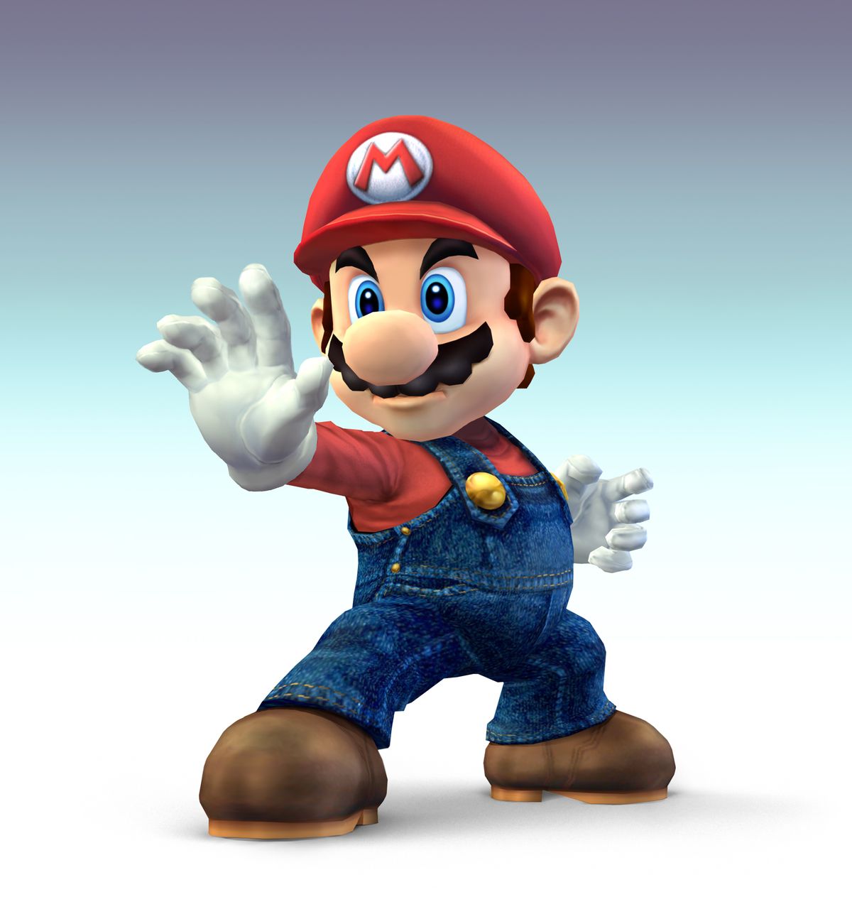
honestly what bothers me the most is how uncanny valley the design looks to me
it seriously feels like a toned down version of this

ok i'm kind of exaggerating BUT giving cartoony characters 'realistic' details like the details on mario's outfit, his more detailed looking hair. or his more realistic limb anatomy is just never something that vibes with me, it always just comes off as wrong
it seriously feels like a toned down version of this
ok i'm kind of exaggerating BUT giving cartoony characters 'realistic' details like the details on mario's outfit, his more detailed looking hair. or his more realistic limb anatomy is just never something that vibes with me, it always just comes off as wrong
Toadettefan
Avatar Credit to Yoshi the SSM
- Pronouns
- She/her
honestly what bothers me the most is how uncanny valley the design looks to me
it seriously feels like a toned down version of this
View attachment 30192
ok i'm kind of exaggerating BUT giving cartoony characters 'realistic' details like the details on mario's outfit, his more detailed looking hair. or his more realistic limb anatomy is just never something that vibes with me, it always just comes off as wrong
Honestly, I find it hard to believe that the same Nintendo that was picky about how a definitely on-model Bowser would drink coffee will allow a face that is so much off-model.
I guess tomorrow we'll see
I guess tomorrow we'll see
Coolio intensifies
Last edited:
I don't think Mario's face looks too bad, but I'll have to see it in motion to give a better judgement. I think the eyes look the most off, though - if they were a bit taller like in the games, then I think they'd look less uncanny.
On the whole, the movie looks like a blend between cartoons and realistic visuals. I was quite impressed with the amount of detail that was packed in the poster, I love the details like the pipe structures in the background and the various Toad shops.
On the whole, the movie looks like a blend between cartoons and realistic visuals. I was quite impressed with the amount of detail that was packed in the poster, I love the details like the pipe structures in the background and the various Toad shops.
- Pronouns
- she/her
- MarioWiki
- Mario
some of these impressions should be spoilered, as they do seem to indicate information that should be left quiet imo
Yeah the small hands and the more defined elbows are definitely derivative from the original Nintendo Mario. I don't think it's quite enough to distract me.
As for the coloration, it looks dull because it was a bad phone shoot. It'll look better if it's brighter I think.
I do suppose you're not fans of Sonic Movie or Detective Pikachu, and I found several Detective Pikachu stuff pretty uncanny so compared to Detective Pikachu, I think I can live with this one.
The cheeks look chubber probably due to the stache size being smaller mostly.
I just think overall the potential whiplash some people experience is that Mario hasn't been changed awfully much since the GCN days and so even slight changes to Mario, people magnify it a lot and seem to apply to places where it doesn't necessarily exist.
Weird how people talk about *LACK* of butt on the main poster but Mario's butt, when Mario is standing straight and neutrally, has never been THAT prominent in normal art. When Mario has that apparent curvature in the art, it's because his legs are raised, his back is arched, it's angled, etc I think people are just not used to the fact that Mario's wearing overalls with way more apparent wrinkles and baggage. Also I'm guessing the lighting is also playing tricks on people's eyes. I personally can't even tell with any confidence how the thing curves. Anyhow IMO I don't understand the discourse surrounding that. It was otherwise never personally worth that much comment until people forced me to pay attention, and I say, good job, you're better at fixating on Mario's particular body parts on this instance than the Mario fan herself who looks at Mario and draws Mario art every day. It's as weird as the nipples years ago, which ALSO didn't invite much passionate comment to me besides a "hey he has those dots", and it's as weird as the discourse surrounding Luigi's crotch on his pants from Mario Tennis Aces.
here's an edited version of the leaked picture that might look nicer to the fence-sitters
Sure, but keep in mind that you're basing your impressions off a photo with off-colors and taken at an angle, neither the colors and angle are flattering for this Mario. There are adjustments made in the tweet replies and they do seem to make enough difference for some people to reevaluate their impressions.I don't like it.
It's not Ugly Sonic levels but it's just off enough from the Mario renders from the games to make me go 'That bothers me'.
The eyes don't look too small. It's only vertically less big but horizontally generally matches. As for the mouth, it's okay, generally matches with the style.This face looks terrible! The mouth looks like it was attached to it with some kind of clay, and the eyes are so small! At least the Toads and Biddybuds look all right…but why on Earth would they massacre Mario's looks?
Definitely tamer than the worst case scenario. Granted, I also thought it was a little off-putting but I'm deciding it's a design that'll grow on me and I'm going to guess other people will also feel the same. The only thing that bothers me a little is the small hands but I'll get used to it. Kind of reminds me of Chris Pratt's casting, except not as extreme: something to get used to but I'll probably like it all the same, given time.Eh I don't mind the face. I was expecting a redesign to some degree and honestly this is tamer than what I was scared of.
I'm not sure what's the big deal behind the details. Nintendo already gave Mario a detailed look in Super Mario Odyssey, and we've also seen more developed hair on Mario through Mario Tennis Aces promotional video of Mario versus Rafael Nadal. I was actually looking forward to see how they'll render the hair on this one, and to be honest, it's what I expected. It was a bit of a shock first seeing Odyssey Mario fully render Mario's hair too, by the way, since we're so accustomed to the smooth plasticky look of Mario's hair, but I embraced it.honestly what bothers me the most is how uncanny valley the design looks to me
it seriously feels like a toned down version of this
*pic*
ok i'm kind of exaggerating BUT giving cartoony characters 'realistic' details like the details on mario's outfit, his more detailed looking hair. or his more realistic limb anatomy is just never something that vibes with me, it always just comes off as wrong
Yeah the small hands and the more defined elbows are definitely derivative from the original Nintendo Mario. I don't think it's quite enough to distract me.
As for the coloration, it looks dull because it was a bad phone shoot. It'll look better if it's brighter I think.
I do suppose you're not fans of Sonic Movie or Detective Pikachu, and I found several Detective Pikachu stuff pretty uncanny so compared to Detective Pikachu, I think I can live with this one.
Honestly, I find it hard to believe that the same Nintendo that was picky about how a definitely on-model Bowser would drink coffee will allow a face that is so much off-model.
I guess tomorrow we'll see
Well when Nintendo has much more control with how the overall world looks, then maybe some restrictions are relaxed... I find it funny that Mario mandates have been brought up in reference to the inability to tweak current character's physical characteristics but we do see Toads and Mario having obvious slight changes from their original designs. But maybe something ought to be revised from our understanding concerning da mandates I guess...Coolio intensifies
His face looks fine to me, he just has slightly chubber cheeks.
What's sticking out to me most though, is that his arms, shoulders and chest proportions plus his apparent lack of buttocks on the poster make him look way less fat and a lot more buff.
The cheeks look chubber probably due to the stache size being smaller mostly.
I just think overall the potential whiplash some people experience is that Mario hasn't been changed awfully much since the GCN days and so even slight changes to Mario, people magnify it a lot and seem to apply to places where it doesn't necessarily exist.
Weird how people talk about *LACK* of butt on the main poster but Mario's butt, when Mario is standing straight and neutrally, has never been THAT prominent in normal art. When Mario has that apparent curvature in the art, it's because his legs are raised, his back is arched, it's angled, etc I think people are just not used to the fact that Mario's wearing overalls with way more apparent wrinkles and baggage. Also I'm guessing the lighting is also playing tricks on people's eyes. I personally can't even tell with any confidence how the thing curves. Anyhow IMO I don't understand the discourse surrounding that. It was otherwise never personally worth that much comment until people forced me to pay attention, and I say, good job, you're better at fixating on Mario's particular body parts on this instance than the Mario fan herself who looks at Mario and draws Mario art every day. It's as weird as the nipples years ago, which ALSO didn't invite much passionate comment to me besides a "hey he has those dots", and it's as weird as the discourse surrounding Luigi's crotch on his pants from Mario Tennis Aces.
I like it all personally. Mario looks great to me. I like the upper eyelids getting prominence, basically cartoon lashes; Mario always had those but like only when he's half-blinking or blinking. The leak has gotten me more optimistic about the direct tomorrow too. I stayed up all night anticipating Thursday, and I have to admit that this Thursday is going to be my most anticipated Direct in a loooong time. I've never been this excited for an official announcement in a while... maybe except the time Strikers Battle League was announced LMAO but I mean not in such a short time. I'm more excited for this than I was for Smash Ultimate I believe, and I LOVE Smash Ultimate, don't get me wrong.I don't think Mario's face looks too bad, but I'll have to see it in motion to give a better judgement. I think the eyes look the most off, though - if they were a bit taller like in the games, then I think they'd look less uncanny.
On the whole, the movie looks like a blend between cartoons and realistic visuals. I was quite impressed with the amount of detail that was packed in the poster, I love the details like the pipe structures in the background and the various Toad shops.
here's an edited version of the leaked picture that might look nicer to the fence-sitters
side by side comparison. see how perspective is a hell of a drug

Last edited:
Connor McKoopa
Who da fook is dis guy?
- Pronouns
- He/him
side by side comparison. see how perspective is a hell of a drug
Honestly, it's still visibly off-model. I still remember when in Wreck-It-Ralph they were picky on how Bowser was drinking coffee, and said Bowser was fully on-model.
Here I simply can't call that picture on-model, way too off, in particular on that face. Especially because the overall look so far is very similar to that of Super Nintendo World, whose Mario was fully on-model.
Here I simply can't call that picture on-model, way too off, in particular on that face. Especially because the overall look so far is very similar to that of Super Nintendo World, whose Mario was fully on-model.
- Pronouns
- She/They
- MarioWiki
- Fawfulthegreat64
Princess Viola
Dumbass Asexual
- Pronouns
- She/They
There's nothing there.
IDK if it's a problem on my end but yeah, there's nothing in the spoiler (that's why this post isn't being spoiler tagged).
IDK if it's a problem on my end but yeah, there's nothing in the spoiler (that's why this post isn't being spoiler tagged).