That the likelihood that Plessie will be in is about the same that Wart will be in, perhaps not even that, since Wart is at least a 8-bit era character…i don't geddit

Navigation
Install the app
How to install the app on iOS
Follow along with the video below to see how to install our site as a web app on your home screen.
Note: This feature may not be available in some browsers.
More options
Style variation
You are using an out of date browser. It may not display this or other websites correctly.
You should upgrade or use an alternative browser.
You should upgrade or use an alternative browser.
The Super Mario Bros. Movie (2023)
- Thread starter SuperShyGuy
- Start date
-
- Tags
- illumination mario movie movie

Gay Rights Luigi
watch fop a new wish or you're... straight ahaha
- Pronouns
- He/It
- MarioWiki
- Crazy Mr. L Fanguy
ok the poster is fucking gorgeous and the colors and details are just mmm perfection
but mario's model makes him look like a mascot costume. i know its most likely from the smaller hands but still it is bothering the fuck out of me. i also have a mild complaint with the shoes not having the rounded edge but hey i will take the design if it means we will have easier to cosplay pieces. love the new ridging on mario's gloves they look excellent and his hat omg the choice to round it out more makes it look a lot better and softer, it reminds me of a plush. i have hope they will add the overall button details like the one from the nintendo store statue, the gold star ridging on the buttons looks so good.
for the landscaping i think having peach's castle on a damn tall hill is dumb af but it would tie into odyssey for having peach's castle on a floating chunk of land. speaking of that i adore the levels being floating islands thats such a good move. i could do without the realistic mushrooms, or keep them and add more color variants like from the new mario bros series. seeing all the different pipes for transport is so cool too, they really nailed that child playground whimsical aesthetic mario's world has.
i dont have much more to say honestly, toads look fine and the town area looks cute, couldve done without the nostalgia baiting of the 8-bit antiques. i moreso enjoy deepdiving into character models and we didnt really get much lolol hopefully this movie wont be too mario (the character) focused. this looks like one of illumination's most detailed movie so far, ive never seen em go this hard with detail and local building.
but mario's model makes him look like a mascot costume. i know its most likely from the smaller hands but still it is bothering the fuck out of me. i also have a mild complaint with the shoes not having the rounded edge but hey i will take the design if it means we will have easier to cosplay pieces. love the new ridging on mario's gloves they look excellent and his hat omg the choice to round it out more makes it look a lot better and softer, it reminds me of a plush. i have hope they will add the overall button details like the one from the nintendo store statue, the gold star ridging on the buttons looks so good.
for the landscaping i think having peach's castle on a damn tall hill is dumb af but it would tie into odyssey for having peach's castle on a floating chunk of land. speaking of that i adore the levels being floating islands thats such a good move. i could do without the realistic mushrooms, or keep them and add more color variants like from the new mario bros series. seeing all the different pipes for transport is so cool too, they really nailed that child playground whimsical aesthetic mario's world has.
i dont have much more to say honestly, toads look fine and the town area looks cute, couldve done without the nostalgia baiting of the 8-bit antiques. i moreso enjoy deepdiving into character models and we didnt really get much lolol hopefully this movie wont be too mario (the character) focused. this looks like one of illumination's most detailed movie so far, ive never seen em go this hard with detail and local building.
- Pronouns
- She/They
- MarioWiki
- Fawfulthegreat64
I was really holding out hope that being a movie where worldbuilding is more important, they'd allow the Toads to have more diverse appearances like tall, short, male, female, old, young, hairstyles, etc. Pretty disappointed Nintendo still kept their foot down on not allowing that for the movie. Unless they purposely chose the blandest Toads in the film for this poster.

- Pronouns
- He/him
I wouldn't really blame Nintendo on this one, I can think of several reasons why they wouldn't go for that. They'd have to make a lot of extra models for one thing, and realistically these Toads are probably going to be used mostly as background characters, they don't need to stick out. It might actually be a bad thing if they did - having a bunch of different Toad designs might just be too distracting for background crowd shots. Plus, Toad diversity just isn't really something that's existed in the games at all for what, 15-20 years at this point? I wouldn't be so quick to assume that this is something Illumination actively wanted (or even suggested) and Nintendo shot down. I mean look at the Minions for example, it's a handful of designs that get copied over and over and the important characters get unique designs so they can stand out. They were probably content with recycling the same Toad model over and over and just swapping out the colors to get a sense of variety, they can get away with it and very few people would bat an eye at it.I was really holding out hope that being a movie where worldbuilding is more important, they'd allow the Toads to have more diverse appearances like tall, short, male, female, old, young, hairstyles, etc. Pretty disappointed Nintendo still kept their foot down on not allowing that for the movie. Unless they purposely chose the blandest Toads in the film for this poster.
- Pronouns
- She/They
- MarioWiki
- Fawfulthegreat64
I mean previous Illumination movies have had variety in background character models (just look at the people populating the towns in the Despicable Me films, The Lorax, etc) so I don't think that's an excuse. I just want to feel like the Toads are a cohesive and rich society and if they all look the same it's really hard to convince myself of that. As for the Minions, they aren't that varied but they are still more varied than the Toads. There's skinny and fat ones, some have one eye, etc.

Mcmadness
The idiot who puts things in the wrong board.
I was really holding out hope that being a movie where worldbuilding is more important, they'd allow the Toads to have more diverse appearances like tall, short, male, female, old, young, hairstyles, etc. Pretty disappointed Nintendo still kept their foot down on not allowing that for the movie. Unless they purposely chose the blandest Toads in the film for this poster.
It's based off the main Mario series, you know the one that's toads basically never had different types of appearances. (toadsworth being the ONLY exception) so I don't know why you would think otherwise.
Also while I'm at it, while I doubt there would be much world building regardless since this at most a 90 minute family film, having a group of characters that look all the same does not mean something can't have world building in it.
- Pronouns
- She/They
- MarioWiki
- Fawfulthegreat64
I never said that, I just said it's kind of a shame they went that route. After all the movie may be primarily focused on the main series, but the main series also had a focus primarily on gameplay, so there wasn't as great a need to make character designs like that. A movie doesn't have gameplay so I just kind of hoped they'd take the approach of the more story/character driven spinoffs for the background characters. The Super Show was also based on the main series and it had all kinds of crazy Toad designs. I know Nintendo is a lot more conservative now than they were then but man it would've been nice.
Anyways, on another note, Mario's clothes interest me. He looks kind of like a mascot costume at Super Nintendo world (honestly the poster in general reminds me of SNW, i wonder if the design of the park and the movie were aware of each other)
Anyways, on another note, Mario's clothes interest me. He looks kind of like a mascot costume at Super Nintendo world (honestly the poster in general reminds me of SNW, i wonder if the design of the park and the movie were aware of each other)
Mcmadness
The idiot who puts things in the wrong board.
I never said that, I just said it's kind of a shame they went that route. After all the movie may be primarily focused on the main series, but the main series also had a focus primarily on gameplay, so there wasn't as great a need to make character designs like that. A movie doesn't have gameplay so I just kind of hoped they'd take the approach of the more story/character driven spinoffs for the background characters. The Super Show was also based on the main series and it had all kinds of crazy Toad designs. I know Nintendo is a lot more conservative now than they were then but man it would've been nice.
Why on earth would they take inspiration from something that is but a small niche of the franchise as a whole? I don't want to sound mean but the entire point of a movie adaptation is to see iconic things on the big screen.
And the supershow did it's wacky junk because they had only 2 games to derive concepts from, everything else was mostly just stock parodies and pasta jokes.

- Pronouns
- She/her He/him
As much as I like Toads having various physiques and variations in their design, expecting official Mario media at this point to dabble in that is setting yourself up for disappointment and that's not something I prefer to revel in. I know this, you know this, and at this point you're just being contrary just for the sake of it. Also, one of the only animated movies I've seen like acknowledge random background characters is the Cars franchise but for one, it's not an adaptation but an original IP and two, car collections is a common hobby (see Matchbox and Hot Wheels) and Disney wants to jump on that too.
Anyway, the movie poster is very gorgeous. I pretty much love the environment and the set dressing. The Toad with the backpack is a nice homage to Captain Toad (and he has teeth), so I'm assuming he's the main Toad and that's how you distinguish him from other Toads (you can see other Toads with blue vests in the background). I've also noticed they're doing the thing with the white highlights in eyes where their eyes are rendered all black, but light settings give it that appearance, and I wonder if Mario's eyes will follow suit as well. It also seems like the environment was specifically designed for characters who can jump in mind, and you can see a lot of Toads jumping around in the distance. There's also a flying ? Block and the cannon from Super Mario 64 in this poster, plus it looks like those colored hills will be rendered with colored plantation (flowers?) rather than like a solid rock texture. Though that waterfall in one of the floating islands has a weird virga effect. Also those Toads pants look more like sweatpants than diapers.
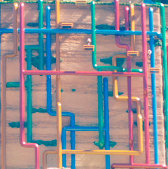
Oh I'm also intrigued by the pipe system. It looks like a clusterfuck lol
There's also a Toad awkwardly hitting a ? Block with his hands when he usually does it with his head (ala Mario Party).
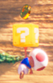
Anyway, the movie poster is very gorgeous. I pretty much love the environment and the set dressing. The Toad with the backpack is a nice homage to Captain Toad (and he has teeth), so I'm assuming he's the main Toad and that's how you distinguish him from other Toads (you can see other Toads with blue vests in the background). I've also noticed they're doing the thing with the white highlights in eyes where their eyes are rendered all black, but light settings give it that appearance, and I wonder if Mario's eyes will follow suit as well. It also seems like the environment was specifically designed for characters who can jump in mind, and you can see a lot of Toads jumping around in the distance. There's also a flying ? Block and the cannon from Super Mario 64 in this poster, plus it looks like those colored hills will be rendered with colored plantation (flowers?) rather than like a solid rock texture. Though that waterfall in one of the floating islands has a weird virga effect. Also those Toads pants look more like sweatpants than diapers.
Oh I'm also intrigued by the pipe system. It looks like a clusterfuck lol
There's also a Toad awkwardly hitting a ? Block with his hands when he usually does it with his head (ala Mario Party).