
Navigation
Install the app
How to install the app on iOS
Follow along with the video below to see how to install our site as a web app on your home screen.
Note: This feature may not be available in some browsers.
More options
You are using an out of date browser. It may not display this or other websites correctly.
You should upgrade or use an alternative browser.
You should upgrade or use an alternative browser.
I have a new/avatar/sig/whatever.
- Thread starter Smiddle
- Start date
zel
probably quit [see about for info]
- Pronouns
- she/her
i cant actually! opening one of the pics in a new tab just tells me "Your client does not have permission to get URL [link] from this server." perhaps try reuploading it to imgur or somethin?Can anyone even see my sig?
edit: and oh i just changed my pfp because as good as it is i think ive had enough of the toadette one for a while
Last edited:
- Pronouns
- she/her
- MarioWiki
- Mario
What did Cappy see to have such a shocked face?
I wanted a theme change so I just looked through Mario's gallery on MarioWiki trying to explore options, but Brawl Mario came to me because he's super serious and seeing him strokes nostalgia for him even though I hated that depiction of him. I wanted a bit of irony to that Mario because Brawl Mario is probably one of the most disliked depictions of Mario, if people got picky about character depictions.
I've considered several pfps. I explored some potential candidates.
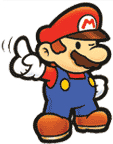
The regular art came off as too generic as it's ubiquitous. I'm still a fan of it because of the nostalgia of seeing such shiny new, stylized art, even though it aged considerably in today's lenses
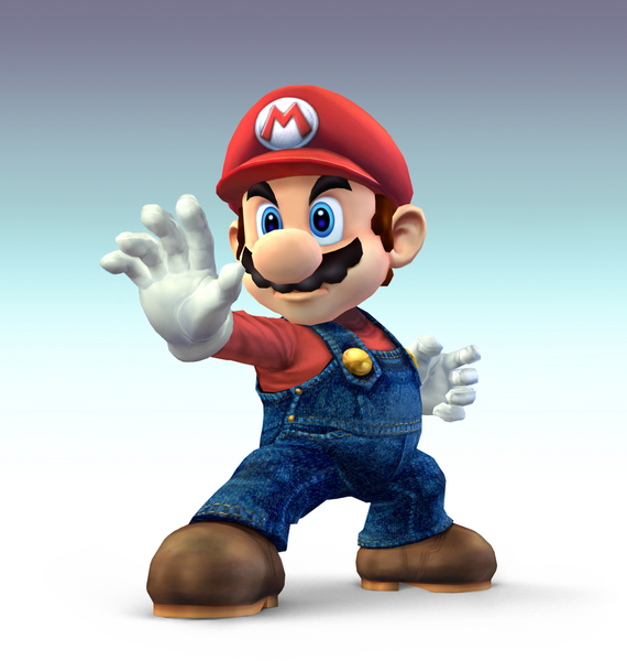
I liked the next one too because Mario looks super serious but shocked. And considering how hated Brawl Mario is, it made me realize that maybe my new theme should revolve more around how much a beating Brawl Mario takes for not just being disliked but also in many cutscenes.
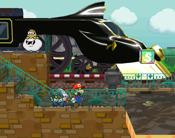
However his face took up too much space after getting cropped for a pfp, and it looked kind of messy to leave in bits of the characters with him. It was not really a clear picture, though I guess knowing the context, that these characters were going to get farted in the face, was hilarious, but not enough for a funny pfp.

And I also considered this screenshot due to similar context of "about to be farted in the face", but I had two problems. Mario actually looked normal, like himself, in this one, since it was a pretty rare shocked expression from him. It just didn't fit the "serious" face I associate with this Mario. Second, the quality just wasn't quite there for pfp material; it was just too bluish and muddy, which I guessed I could toy with through image editing programs, but eh.

I also considered this one (video is from ProfasiaGaming, sorry about the crudeness, the pfp wouldn't have a playback bar) because it was ridiculously "serious" and was close to using it,maybe with some extra "srs" filters.

But I think while saving it, I saw a gif of Mario being cooked by Kirby in my folder, and it brought back funny memories of how much Mario and his agonizing, but still SERIOUS, face cracked me up, and I think I found the perfect pfp for Brawl Mario. Serious face that's been dialed up due to agony, but kinda pathetic.
My signature wasn't as hard but I chose that moment because Star KOs were always funny. Also in some still frames, there was a split second, one frame, showing a "normal" face which my sister liked to make fun of. Also Mario got killed really easily within the first few cutscenes, which was pretty pathetic for him, though let's be fair, Mario was more of a victim of plot contrivance. I mean, the spacing between Mario and the cloud where the cannonball emerged was really whack between the shot where Mario was running and the shot where he got hit.
I did crop out the brief camera change showing those guys just standing there, but that's for brevity's sake and to keep focus on Mario.
I don't have other elements in my sig because too many gifs I find to be distracting to others
I wanted a theme change so I just looked through Mario's gallery on MarioWiki trying to explore options, but Brawl Mario came to me because he's super serious and seeing him strokes nostalgia for him even though I hated that depiction of him. I wanted a bit of irony to that Mario because Brawl Mario is probably one of the most disliked depictions of Mario, if people got picky about character depictions.
I've considered several pfps. I explored some potential candidates.
The regular art came off as too generic as it's ubiquitous. I'm still a fan of it because of the nostalgia of seeing such shiny new, stylized art, even though it aged considerably in today's lenses
I liked the next one too because Mario looks super serious but shocked. And considering how hated Brawl Mario is, it made me realize that maybe my new theme should revolve more around how much a beating Brawl Mario takes for not just being disliked but also in many cutscenes.
However his face took up too much space after getting cropped for a pfp, and it looked kind of messy to leave in bits of the characters with him. It was not really a clear picture, though I guess knowing the context, that these characters were going to get farted in the face, was hilarious, but not enough for a funny pfp.
And I also considered this screenshot due to similar context of "about to be farted in the face", but I had two problems. Mario actually looked normal, like himself, in this one, since it was a pretty rare shocked expression from him. It just didn't fit the "serious" face I associate with this Mario. Second, the quality just wasn't quite there for pfp material; it was just too bluish and muddy, which I guessed I could toy with through image editing programs, but eh.
I also considered this one (video is from ProfasiaGaming, sorry about the crudeness, the pfp wouldn't have a playback bar) because it was ridiculously "serious" and was close to using it,maybe with some extra "srs" filters.
But I think while saving it, I saw a gif of Mario being cooked by Kirby in my folder, and it brought back funny memories of how much Mario and his agonizing, but still SERIOUS, face cracked me up, and I think I found the perfect pfp for Brawl Mario. Serious face that's been dialed up due to agony, but kinda pathetic.
My signature wasn't as hard but I chose that moment because Star KOs were always funny. Also in some still frames, there was a split second, one frame, showing a "normal" face which my sister liked to make fun of. Also Mario got killed really easily within the first few cutscenes, which was pretty pathetic for him, though let's be fair, Mario was more of a victim of plot contrivance. I mean, the spacing between Mario and the cloud where the cannonball emerged was really whack between the shot where Mario was running and the shot where he got hit.
I did crop out the brief camera change showing those guys just standing there, but that's for brevity's sake and to keep focus on Mario.
I don't have other elements in my sig because too many gifs I find to be distracting to others
The Green Knight
ooga booga spooky
- Pronouns
- He/him
My computer doesn't do well with imgur, so I used google.
Figured I'd get myself an obligatory Love Live theme sooner or later. If I was getting "Nico's #something something fan" or whatever as the result of a theme suggestion thread at some inevitable point, then at least I thought I'd rather first adopt a Love Live theme that I am actually willingly putting up. Revali was fun, but suggested themes usually only last a month and I keep it a tradition.
Sometimes tho, ya just gotta be You.
(You guys get it? This theme is PERFECT for bad puns!)
(Also I saw someone suggest this theme to someone else at some point so I thought I'd just snatch it before anyone else got the chance.)
Sometimes tho, ya just gotta be You.
(You guys get it? This theme is PERFECT for bad puns!)
(Also I saw someone suggest this theme to someone else at some point so I thought I'd just snatch it before anyone else got the chance.)
- MarioWiki
- White Lightning
I love Skyrim, so I changed my avatar to my favourite character in the game, Ulfric Stormcloak.
Power Flotzo
pings chat ops too much
- Pronouns
- He/him
- MarioWiki
- Power Flotzo
Felt like theming after a BanG Dream! character since I've been getting into the mobile app as of recently.
Princess Viola
Dumbass Asexual
- Pronouns
- She/They
Decided to go back to my regular name since I don't really wanna come up with a new name every month. New avvy is Blackarachnia from Beast Wars, specifically art of her taken from the comic packed in with her Transformers Legends toy a few years ago.
- Pronouns
- She/her He/him
i'm a robotic bear that plays videogames
bonus points if you can name what game and a line that he says
Fifteen Days at Chuckie Cheese's
I'm a small, pink bear, but don't be fun, I'm a scare-loving girl!
- Pronouns
- she/her
- MarioWiki
- Mario
Well I have an entirely new Paper Mario theme because to peer pressure to changing to something Paper Mario related, especially after the random announcement of Paper Mario: The Origami King.
This would've been my pfp IF MarioWiki had a resolution higher than the max, what you're seeing here. I couldn't find higher res ones outside of crop jobs. Anyway, it's a good potential pfp, has attitude and sass I like.
So I picked on another one, and I decided to give it a bit of a design. What came to mind was the countless GameFAQs bickering about Paper Mario's story and characters and whatever. It's super tiresome. So I hope you enjoy the OG Paper Mario plugging his ears to it. I also added an inverted logo with
 on it because the inverted logo is a hilarious puke yellow color and I also have a history of inverting the colors of things to make them look stupid as well as slapping that on it, especially when it's sticking out of .
The signature is from a YouTube poop from December 2007 (yeah it's super ancient) Masahiro Sakurai's Alcohol-Induced Subspace Cutscene which is a weird montage of all the video game commercials, usually repeated or having a filter applied to it. The Paper Mario part is around 3:21 but it's making fun of the Paper Mario 64 commercial overall. I actually think I sped it up a bit because it lasts long. I like that part because the announcer's all "PAAAAAAAAPPPEEEEERR MMMMMAAAARRRRIIOOOOOOO" in that demented way, as opposed to the original commercial's more "epic" "heroic" feel. I'm having the other Paper Marios respond to it. If you think the signature looks like crap, well, it's supposed to.
I want to make a comment on how much leg work this Paper Mario has but, well, ran out of space to incorporate witty catchphrases.
This would've been my pfp IF MarioWiki had a resolution higher than the max, what you're seeing here. I couldn't find higher res ones outside of crop jobs. Anyway, it's a good potential pfp, has attitude and sass I like.
So I picked on another one, and I decided to give it a bit of a design. What came to mind was the countless GameFAQs bickering about Paper Mario's story and characters and whatever. It's super tiresome. So I hope you enjoy the OG Paper Mario plugging his ears to it. I also added an inverted logo with
on it because the inverted logo is a hilarious puke yellow color and I also have a history of inverting the colors of things to make them look stupid as well as slapping that on it, especially when it's sticking out of .The signature is from a YouTube poop from December 2007 (yeah it's super ancient) Masahiro Sakurai's Alcohol-Induced Subspace Cutscene which is a weird montage of all the video game commercials, usually repeated or having a filter applied to it. The Paper Mario part is around 3:21 but it's making fun of the Paper Mario 64 commercial overall. I actually think I sped it up a bit because it lasts long. I like that part because the announcer's all "PAAAAAAAAPPPEEEEERR MMMMMAAAARRRRIIOOOOOOO" in that demented way, as opposed to the original commercial's more "epic" "heroic" feel. I'm having the other Paper Marios respond to it. If you think the signature looks like crap, well, it's supposed to.
I want to make a comment on how much leg work this Paper Mario has but, well, ran out of space to incorporate witty catchphrases.
zel
probably quit [see about for info]
- Pronouns
- she/her
as much as i do love that mario pfp. if i never shut up about rayman i might as well go all in on it! so heres globox from the origins artbook (which was also used for the relics in the vita version)
i may find a better globox later (and one thats actually blue) i dunno but this works for now i just LOVE how hes drawn in these lil illustrations
i may find a better globox later (and one thats actually blue) i dunno but this works for now i just LOVE how hes drawn in these lil illustrations
YoshiFlutterJump
Power Star
- MarioWiki
- YoshiFlutterJump
For me my theme choice was between Kersti (Paper Mario: Sticker Star) and Queen Sectonia (Kirby: Triple Deluxe), the two games I plan to get alongside my new 3DS by the end of the month, and I almost went with Sectonia until I saw a Paper Mario fad starting, when I immediately knew I had to join with a Sticker Star theme. Sectonia can wait another month.
Princess Céline
It's teatime!
New theme based on my favorite character from Awakening
Hot Chocolate
fuck it, we ball
- Pronouns
- She/They
- MarioWiki
- Cosmic Cowboy
I wanted to keep my old avatar but screw it, this is an opportunity.
is that a tape dispenser