
- Pronouns
- She/her He/him
Throughout its lifespan, Paper Mario has undergone some art-style changes, from its N64 inception, to the Wii U entry, Paper Mario: Color Splash.
Paper Mario first started on the Nintendo 64, where its graphics are sprite-based and they're simply animated frame-by-frame, as traditionally speaking (characters don't have elaborate animations for the most part, running has only like, three sprites while idle animations take three sprites and that includes a blink animation). It was originally called "Mario Story" in Japan before opting its English name, probably because it appeared to look like a pop-up book similar to how Yoshi's Story was coined. The character sprites are simple, low res, and they're graphics you can easily draw with a simple image program like MS paint, spouting few colors. Characters tend to have a darker palette in the game compared to the brighter colors used in the next titles: the whites appear as grayer and muter if you look at Mario's gloves.


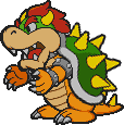
Most characters are drawn in one sprite, while others require assembly, such as Bowser.
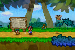
Its environment, as it's from an N64 game, was simple. You had flat colors and simplistic polygons representing much of the environments, and a lot of the aspects of the environment is represented by 2D sprites, such as bushes, leaves, rocks, signposts, and a multitude of other things. The only shadows are simple circles generated by the character, while there are only a few cases of metallic shading in the game that I recall. Aside from the flatness, Paper Mario didn't really use much paper elements other than some cute aesthetic effects such as Paper Mario falling down, going to bed, or getting stuck in the ground.
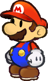
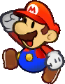
Onto the next two entries, Thousand Year Door and Super Paper Mario (they're lumped together because they practically use the same graphics as each other), and the character sprites become more refined and higher res, meaning that their sprites cannot be easily be drawn with a simple art program like MS Paint. And in addition, most characters require assembly to be used, and animating the characters properly requires a program that can keyframe the rotations, making the character animations look very smooth, very reminiscent of cartoons that use Adobe Flash. This is probably why you're not going to find animated characters on MarioWiki unless someone can accurately portray the animations as they are in the game, and it requires meticulously piecing the characters together to be as accurate as possible as well as making accurate keyframes.
Also, unlike Paper Mario, more characters are drawn with 3D in mind, such as Hooktail and the Shadow Queen, whereas in the original, almost all characters (barring like that whale that takes you to Lavalava Isle) are sprites.
The environment in both TTYD and SPM have received an upgrade in terms of resolution as well, but the overall shaders and other lighting effects remain simplistic, with still, the only shadows cast being that from the characters themselves. However, the greater resolution and hardware power from the GCN enables environments to be much more vivid and support a greater palette of colors, making environments stand out more. In addition, both TTYD and SPM use the paper part of the game much more liberally than what happened in the N64 incarnation of the game, though not to the extent of the next entries.

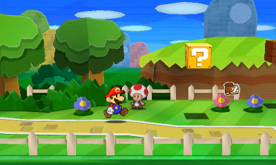
Paper Mario: Sticker Star is the first handheld Paper Mario, so the game has to be adapted for a tiny screen. However, there were quite a bit of changes that incurred from Super Paper Mario to Sticker Star. First, Mario has reverted to the frame-by-frame animation rather than the smooth keyframes, making him closer to the N64 counterpart, though the sprite design retains TTYD and SPM's style, just at a lower resolution to suit the Nintendo 3DS's power.

In addition, the world has a greater emphasis on crafts than the other games, giving the environment a more crafted feel to it by introducing visible seams and craft textures to the world. The shading engine is a bit more improved than the previous games, but it's not a huge upgrade all things considered, as the Nintendo 3DS isn't a particularly powerful system.
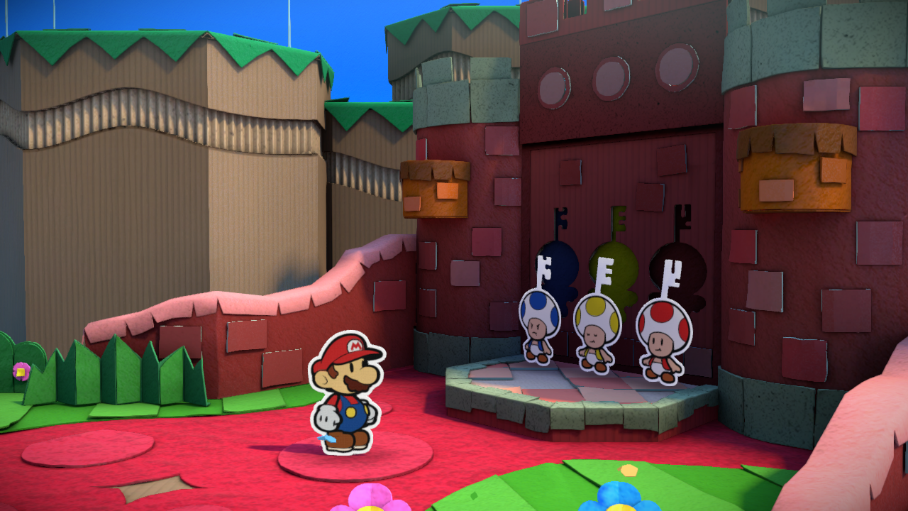
Paper Mario: Color Splash is the latest Paper Mario game at this time of writing, and it's the first game to take advantage of HD hardware. The character sprites are in greater resolution, and they have reverted to a more muted palette compared to TTYD and SPM. In addition, characters receive a white outline, likely added to increase contrast between the characters and the environment. The outlines and color of the sprites are also more refined than they were in TTYD and SPM, having less artifacts around the sprite due to compression. Characters still move in frame-by-frame animation than keyframes for the most part, but because they all have white outlines, they don't require assembly to be displayed properly.
However, the environment has received a dramatic upgrade. Paper Mario: Color Splash is the first Paper Mario title to have a dynamic lighting system, where objects cast shadows as they should and characters sprites actually change color if they are underneath a shadow for the first time. Subtle bloom is used for areas with high lighting, especially when there's lava. The environment itself is more clearly constructed from crafts, taking advantage of higher resolution textures, bumpmaps, and specmaps to portray a more realistic environment: you can see cardboard bumps, cloth fabric, rock detail, and much more of the tiny stuff that the Wii U is capable of.
So anyway, after this run-through of the Paper Mario games, which art-style do you like the most? Me, I like Color Splash the most, because I enjoy the realistic environment that better hardware is capable of, but the other games also have their own perks that I enjoy. As for the animations, both have their strengths and weaknesses to me: the frame-by-frame is like a flipbook style while the computerized smooth animation is pleasant to look at.
Paper Mario first started on the Nintendo 64, where its graphics are sprite-based and they're simply animated frame-by-frame, as traditionally speaking (characters don't have elaborate animations for the most part, running has only like, three sprites while idle animations take three sprites and that includes a blink animation). It was originally called "Mario Story" in Japan before opting its English name, probably because it appeared to look like a pop-up book similar to how Yoshi's Story was coined. The character sprites are simple, low res, and they're graphics you can easily draw with a simple image program like MS paint, spouting few colors. Characters tend to have a darker palette in the game compared to the brighter colors used in the next titles: the whites appear as grayer and muter if you look at Mario's gloves.
Most characters are drawn in one sprite, while others require assembly, such as Bowser.
Its environment, as it's from an N64 game, was simple. You had flat colors and simplistic polygons representing much of the environments, and a lot of the aspects of the environment is represented by 2D sprites, such as bushes, leaves, rocks, signposts, and a multitude of other things. The only shadows are simple circles generated by the character, while there are only a few cases of metallic shading in the game that I recall. Aside from the flatness, Paper Mario didn't really use much paper elements other than some cute aesthetic effects such as Paper Mario falling down, going to bed, or getting stuck in the ground.
Onto the next two entries, Thousand Year Door and Super Paper Mario (they're lumped together because they practically use the same graphics as each other), and the character sprites become more refined and higher res, meaning that their sprites cannot be easily be drawn with a simple art program like MS Paint. And in addition, most characters require assembly to be used, and animating the characters properly requires a program that can keyframe the rotations, making the character animations look very smooth, very reminiscent of cartoons that use Adobe Flash. This is probably why you're not going to find animated characters on MarioWiki unless someone can accurately portray the animations as they are in the game, and it requires meticulously piecing the characters together to be as accurate as possible as well as making accurate keyframes.
Also, unlike Paper Mario, more characters are drawn with 3D in mind, such as Hooktail and the Shadow Queen, whereas in the original, almost all characters (barring like that whale that takes you to Lavalava Isle) are sprites.
The environment in both TTYD and SPM have received an upgrade in terms of resolution as well, but the overall shaders and other lighting effects remain simplistic, with still, the only shadows cast being that from the characters themselves. However, the greater resolution and hardware power from the GCN enables environments to be much more vivid and support a greater palette of colors, making environments stand out more. In addition, both TTYD and SPM use the paper part of the game much more liberally than what happened in the N64 incarnation of the game, though not to the extent of the next entries.
Paper Mario: Sticker Star is the first handheld Paper Mario, so the game has to be adapted for a tiny screen. However, there were quite a bit of changes that incurred from Super Paper Mario to Sticker Star. First, Mario has reverted to the frame-by-frame animation rather than the smooth keyframes, making him closer to the N64 counterpart, though the sprite design retains TTYD and SPM's style, just at a lower resolution to suit the Nintendo 3DS's power.
In addition, the world has a greater emphasis on crafts than the other games, giving the environment a more crafted feel to it by introducing visible seams and craft textures to the world. The shading engine is a bit more improved than the previous games, but it's not a huge upgrade all things considered, as the Nintendo 3DS isn't a particularly powerful system.
Paper Mario: Color Splash is the latest Paper Mario game at this time of writing, and it's the first game to take advantage of HD hardware. The character sprites are in greater resolution, and they have reverted to a more muted palette compared to TTYD and SPM. In addition, characters receive a white outline, likely added to increase contrast between the characters and the environment. The outlines and color of the sprites are also more refined than they were in TTYD and SPM, having less artifacts around the sprite due to compression. Characters still move in frame-by-frame animation than keyframes for the most part, but because they all have white outlines, they don't require assembly to be displayed properly.
However, the environment has received a dramatic upgrade. Paper Mario: Color Splash is the first Paper Mario title to have a dynamic lighting system, where objects cast shadows as they should and characters sprites actually change color if they are underneath a shadow for the first time. Subtle bloom is used for areas with high lighting, especially when there's lava. The environment itself is more clearly constructed from crafts, taking advantage of higher resolution textures, bumpmaps, and specmaps to portray a more realistic environment: you can see cardboard bumps, cloth fabric, rock detail, and much more of the tiny stuff that the Wii U is capable of.
So anyway, after this run-through of the Paper Mario games, which art-style do you like the most? Me, I like Color Splash the most, because I enjoy the realistic environment that better hardware is capable of, but the other games also have their own perks that I enjoy. As for the animations, both have their strengths and weaknesses to me: the frame-by-frame is like a flipbook style while the computerized smooth animation is pleasant to look at.
