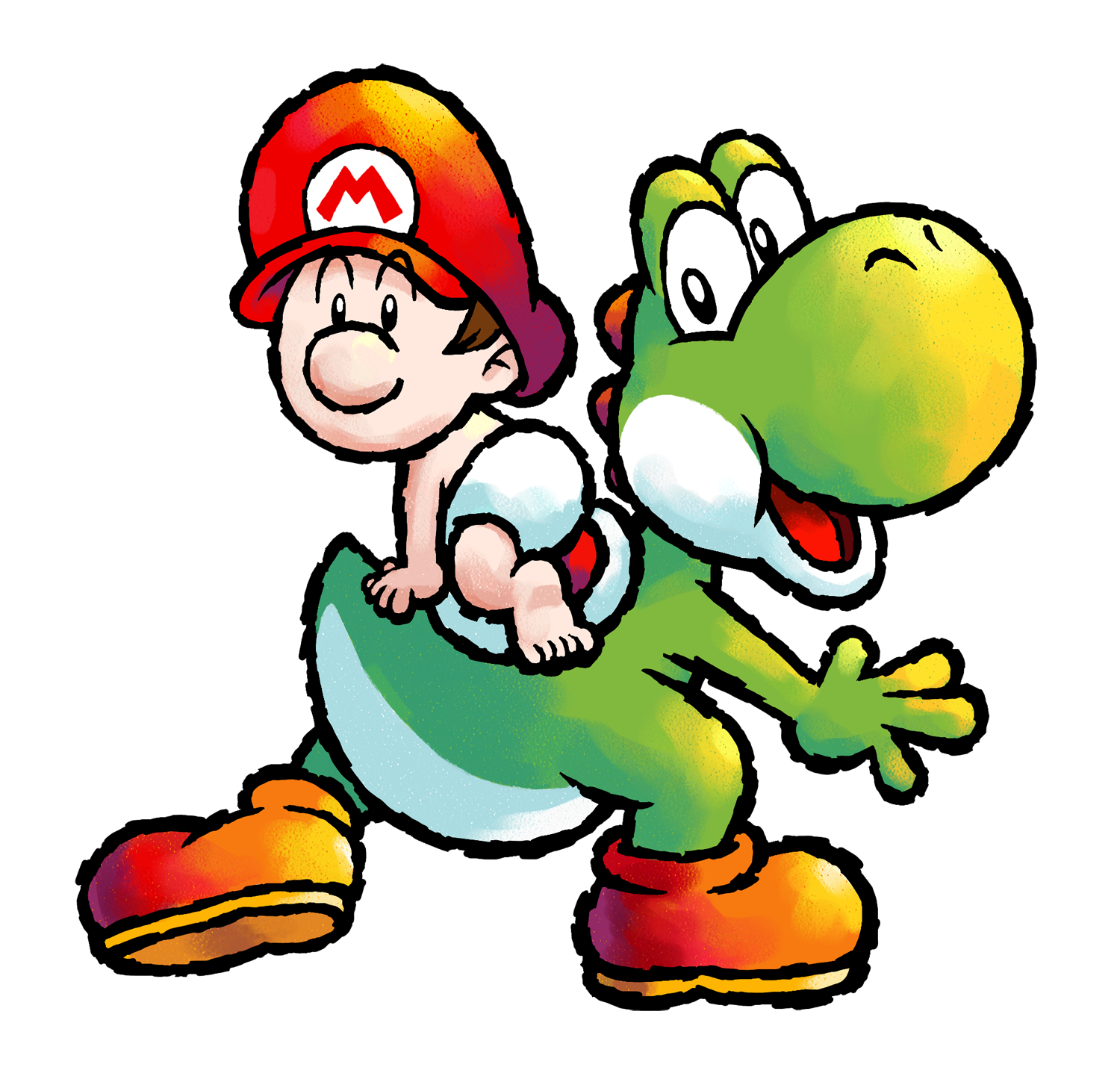
Mario pictures

Think they swapped the colors of his nose and the M.
 
Meanwhile, Donkey Kong aims for the yellow balloon because it looks like a banana and idk Wario is doing.
 
!!!!
I WANT THE MARIO OVERALLS
NO
I WANT YOSHI HOLDING AN APPLE
AAAHH I CANT DECIDE.
799px-ToadsQuickDraw_4.png


:waluigi: 
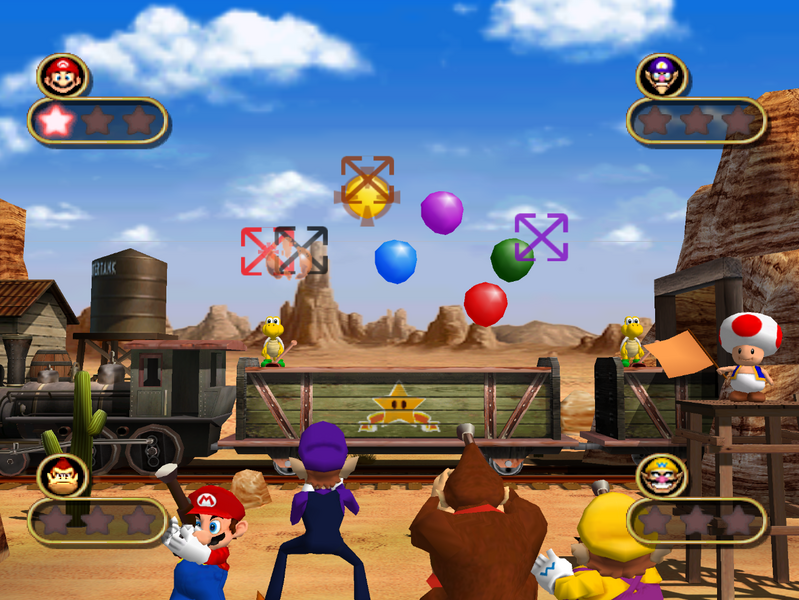
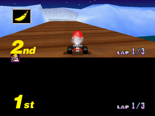
WALUIGI CALLS RICOCHET SHENANIGANS, CHEATER
799px-ToadsQuickDraw_4.png
i love this omg. HOVER HANDS. "OW MY EYE!"
 
Yoshi's Island DS literally just siphons like half of its sprites out of Touch & Go

YTGO_-_YoshiGreen.png
->
Green_Yoshi_YIDS.png

BabyMarioYT%26G.png
->
Baby_Mario_Yoshi%27s_Island_DS.png

YT%26G_StorkandBabyLuigi.png
->
Stork_YIDS_Sprite.png
BabyLuigi_-_YIDS.png
(gotta thank Touch & Go for that beautiful Baby Luigi sprite btw)
YT%26G_Kamek.png
->
Kamek_YIDS.png

YT%26G_Cloud_Drop.png
->
CloudDrop_YIDS.png


If it's not siphoning sprites off Touch & Go, it's taking them straight from Yoshi's Island. Or, in the case of Bowser, Topsy Turvy.

Explains a bunch of the stylistic clashes that occur in the game.
 
sometimes within one sprite........
PetalGuy_YIDS.png

now watch this. this is literally just the yi sprite but slightly paler and they added, like, one more barely noticeable shade on the back and also under the mouth. what a differnce
LungeFish_YIDS.png
 
What really bothers me about it is how Goonie is so much larger than Skeleton Goonie. Or how Scorchit is badly stretched and still has SMW2 feet.

Also, they sprites aren't technically taken from SMW2, pay close attention to the shading.
They're taken from SMA3.

It extends to artwork too, since Glide Guy's is clearly edited from Fly Guy's.
 
  • Like
Reactions: zel
BabyMario_YIDS.png

This artwork is taken from Yoshi Touch & Go. You know, that main image in front of the Yoshi's Island DS box?

Pretty good metaphor for the overall graphics of the game I say.
 
Toxic_Tower_DKC2_slime.png


I just saw this image on MarioWiki. Without any context, you're like, wtf is going on?
 
Back