
Navigation
Install the app
How to install the app on iOS
Follow along with the video below to see how to install our site as a web app on your home screen.
Note: This feature may not be available in some browsers.
More options
You are using an out of date browser. It may not display this or other websites correctly.
You should upgrade or use an alternative browser.
You should upgrade or use an alternative browser.
Look at it! Look at it! LOOK AT IT!
- Thread starter Lario
- Start date
Czario
Rightful ruler of the kingdom of Russia!
- MarioWiki
- Luigi 64DD
Oh, I get it! Mario's mad because Luigi gets a game at the Gamecube's launch and not him, but Luigi's happy about it.
Sgt Nate V said:full version of the magazine cover

Looks like I was right in the money on two things: 1) It's a 2001 issue and 2) the image pertains to Luigi getting a Gamecube game at launch and not Mario.
Thank you for reading.
Mario Kart DS Fan
MVE856
I didn't want to sleep tonight anyway....
The Nate
Wow, what a party!

@MariobrothblogAnimation cel used in the production of Episode 9 of the Super Mario World animated series, "Gopher Bash".
- Pronouns
- she/her
- MarioWiki
- Mario
when I think N64 and "cake" I think of this for some reasonLED42 said:Although this is cake when compared to other things in this thread.
elarmadillosucks
You know that El guy? *BLEEP* him.
I'm being completely serious when i say that i want this to be a Power-Up.LED42 said:
*takes an awkward look to this thing*
Although this is cake when compared to other things in this thread.
Marioro
DM me if interested in art commissions.
- Pronouns
- He/him
SMRPG may have pretty sprites, but many of the models themselves are just blegh... I mean, what's even going on with his mouth? Also his arms also look like sausages. His eyebrows are also melting for some reason too.
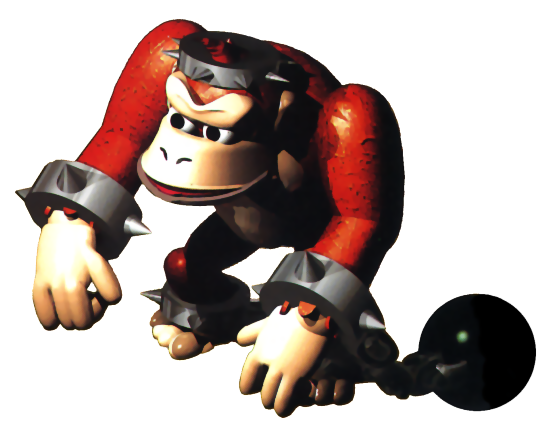
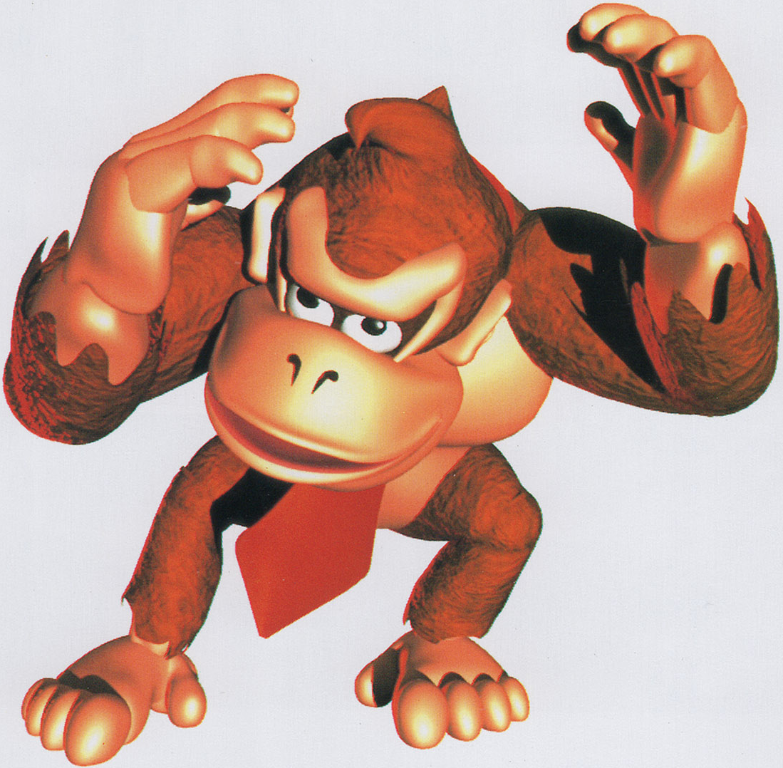
I mean, even DK's model in DKC was just better and less ugly:
ThatGuy62
Boo
That's debatable.Mr. Saltman said:I mean, even DK's model in DKC was just better and less ugly
Both models have some pretty whack proportions (especially DKC DK's legs, ayiyiyi) and the DKC render has some stuff like the fur thing ending at DK's wrist/hands.
Bowser's model though, that is a sight.
- Pronouns
- she/her
- MarioWiki
- Mario
I'm not sure what's going on in the fingers of either of them. Chained Kong has conjoined index fingers, Donkey's pinkies have no form and don't look like fingers on an ape.
TinTinfinite
scrunkly
- Pronouns
- He/Him
- MarioWiki
- Infinite8
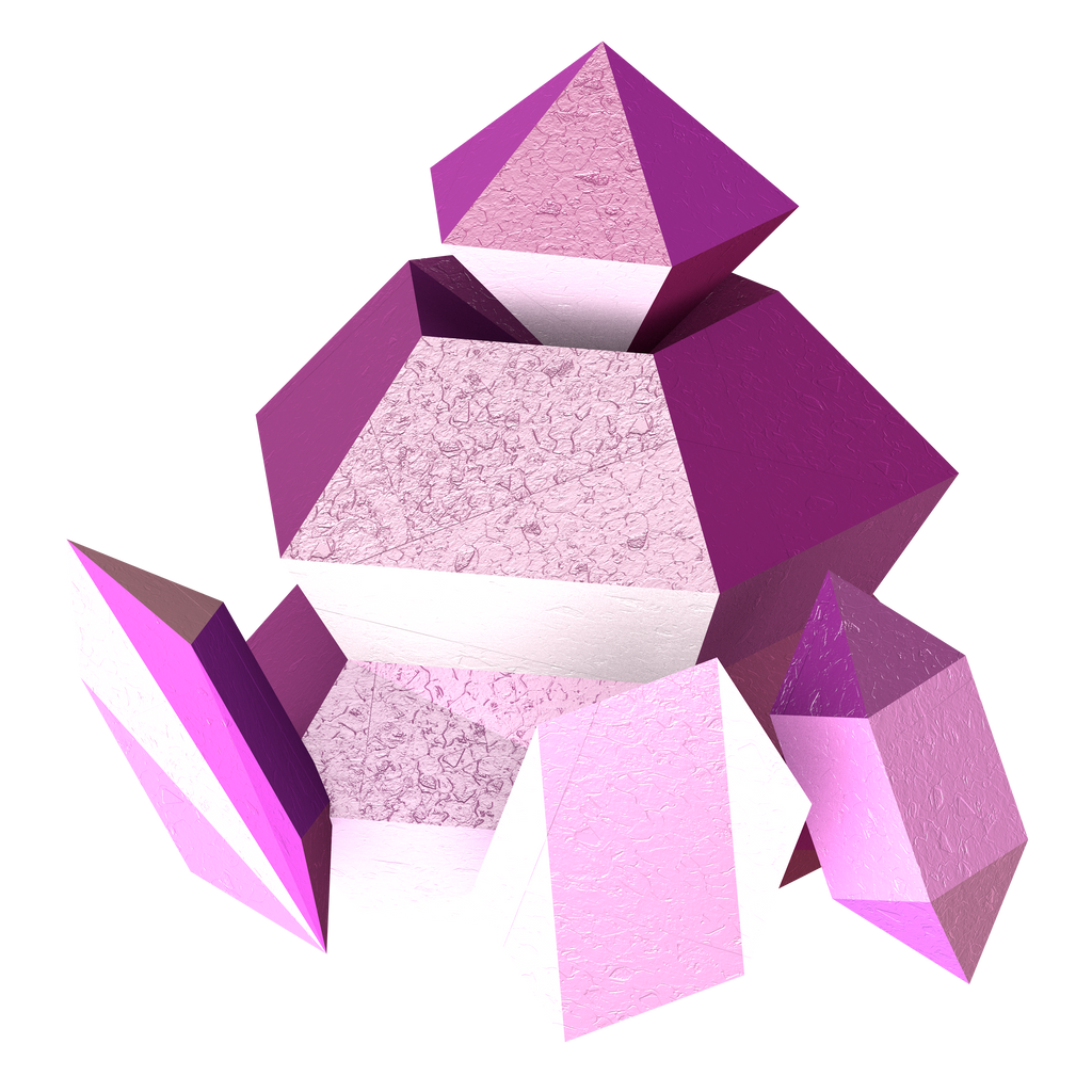
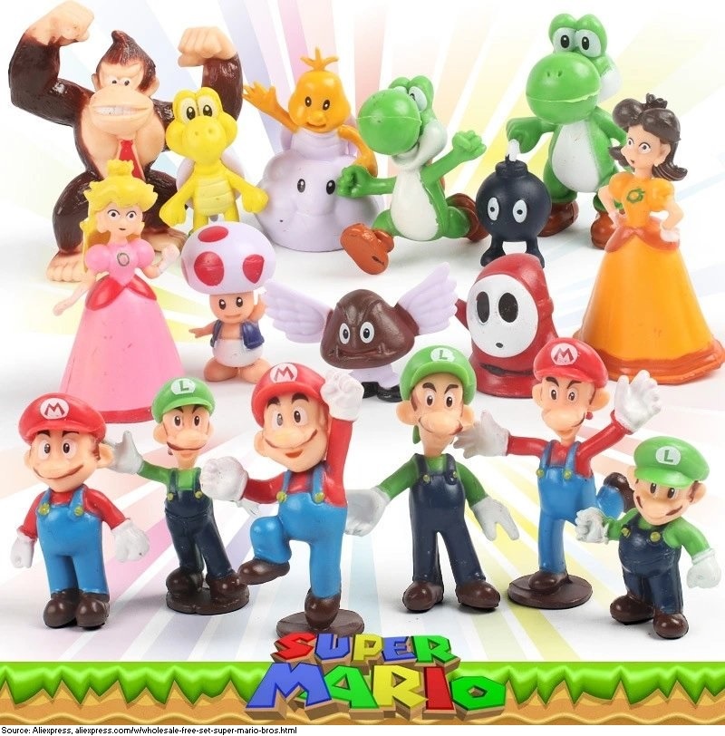
http://www.suppermariobroth.com/post/171347809870/a-variety-of-unlicensed-mario-character-figurines
Czario
Rightful ruler of the kingdom of Russia!
- MarioWiki
- Luigi 64DD
Luigi and Muigi Death StareMr. Saltman said:Why are the Luigis and Muigis so angry?
