Doc von Schmeltwick
Multi-hat Koopa cutie
- MarioWiki
- Doc von Schmeltwick

Follow along with the video below to see how to install our site as a web app on your home screen.
Note: This feature may not be available in some browsers.

Personally I love it. The Wario Bros are much more fascinating than their Mario counterparts, and Daisy is infinitely more interesting than Peach, but Nintendo has done her dirty. She deserves better. Same for Waluigi.Mr. Edo's theory has made ripples in the comic strip community, I see.
To be fully fair though, I still think those two Mario Karts are the best looking, considering when they came out. It's the artstyle that wins in them: Double Dash has that "everything has eyes" style and a very consistent style also thanks to its courses being connected, in that you can see other courses in some of them, while Mario Kart 8 has a lot of care for the small details and the settings, like the marvelous panorama below N64 Rainbow Road. And both have very good choices in colors, all things considered.See I was impressed by Double Dash's visuals but that opinion changed. I also believed in engine rendering can't match game art even but here we are with Luigi's Mansion 3 Mario and Luigi looking better than Double Dash Mario and Luigu renders. I remember being impressed with Mario Kart 8's visuals, which still look nice but it definitely has aged a lot and looks like a decade old despite not being a decade old.
I mean rumor has it that Guppy beaches himself to snatch Chilly Bullies, AND he eats Porcupuffers as part of tea time.Imagine being a Lakitu floating in a cloud and a shark of all things becomes a potential airborne threat.
Thing is, in that artwork Eddi is Orange Yoshi, not Brown Yoshi, but there's more to it, another official artwork showed Orange Yoshi in Yoshi's Island:View attachment 19653
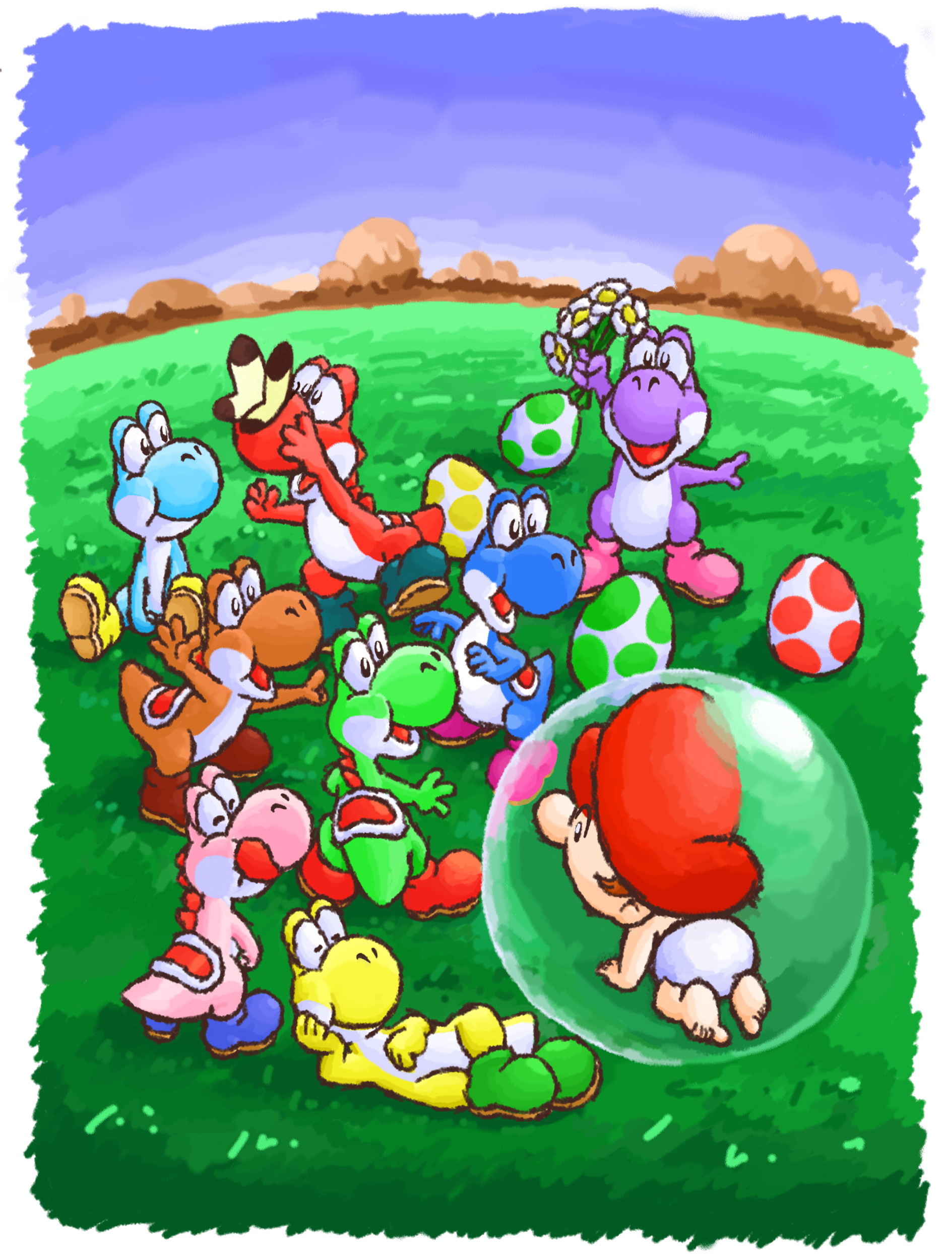
Did you know? Official Nintendo of Europe materials give each of the Yoshis in Yoshi's Island a name: Yoshi, Jonny, Sunny, Claudi, Eddi, Netty, Tommy and Marci. These are used both in the official guide for the game and Club Nintendo comics. I kind of wish Black, White, and Orange Yoshi were given names as well, now that this has been discovered.