Unpopular opinions about the Mario series

I can tell I'm going to learn a lot about Mario being on these forums, things I didn't even consider to exist.
Is everything you listed have english adaptations? -hopeful-
I guess the German stuff has English translations. I remember there's a plot involving Mario crossdressing and everyone (including Star Fox) speaks in rhymes, which drives Mario crazy. But some other plots are that language. There's another plot that involves dolphins living inside Yoshi's stomach and they believe cows don't exist. And there's one where Bowser uses hair dryers to try to melt Antarctica.

They're not going to use the older, contemporary designs from the 1990's for practically any character. In the original Paper Mario, cribbed off designs for Koopa Troopas, Goombas, Boos, etc. from their contemporary games such as Super Mario World and Yoshi's Island. Dunno where they got the Buzzy Beetle design from though.
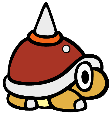
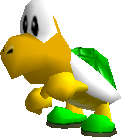
Perhaps. Many designs from Paper Mario are hardly unique to Paper Mario as it is just designs from contemporary games, particularly Yoshi's Island. After all, we have a few enemies that were from Yoshi's Island: Bandits, Mousers, Crayzee Dayzees, BUMPTIES, Spear Guy, Goonie (cameo) Lantern Ghost (Nep-Enut was planned), which wouldn't be surprising that they took Goomba, Paratroopa (long slender wings though only in the first game), and Boo designs from Yoshi's Island.

I give you that the Koopas in shades and Clubbas are their own, though.

But this doesn't have to mean they can't go back to those designs. I just don't see it very likely.
 
Well the Clubbas aren't entirely their own, they are clearly based off the spike enemies, just instead of throwing spiked balls they put them on sticks.
 
But the designs are noticeably different, as how Goombas, Boos, Buzzy Beetles (to an extent) and Paratroopas are derived from an existing design. Clubbas have black eyes, white bellies, and have more defined, dinosaur-like bodies. Yoshi's Island, however, has adopted the black eyes and white bellies though but can't say for the body since the sprite is so scrunched, and I don't know what the artwork of Spike looks like.

The old Paper Mario Buzzy Beetles look kinda like the Para Buzzy Beetles, though the weird toenail things are all their own.
Actually just found out, even that's not Paper Mario's idea originally, was in Super Mario World first.

SMWSpikeTop.png
 
Welp, there you go.
 
It's like... the thing's eye isn't just on its face but part of it is fixated on the shell.
 
Those are the eyes that know true suffering.
 
3D Land is a really solid game but there's quite a few issues I had with block placement that tricks your depth perception and kills you for misjumps, especially in the latter half of the game.

3D World is also good too though there's also a lot I don't like about the multiplayer mode.
 
I reviewed both these games in detail in "I just beat_"

3D World is also good too though there's also a lot I don't like about the multiplayer mode.
I've never done it in multiplayer for lack of IRL friends who would want to play Mario together (I do have IRL friends tho)
 
I was introduced to Clubbas through Grubba, before I had seen the Spike enemy. Heck, I think Sticker Star was the first time I took notice of Spike, by way of "hey that looks like a Clubba" and I figured they were the same enemy, just named differently and with different ways of attacking. Heck I didn't know it was a species when I first played TTYD, so when I saw Clubbas in SPM I was like "hey those guys look like Grubba!" One of the first things I noticed is that I vastly preferred the way the lips are drawn on the Clubbas. I feel like every model & shape in most SS designs, except the main characters like Mario, Peach and Bowser, was arbitrarily changed to look like a 2D adaptation of a 3D design rather than designed for 2D like the previous designs.

A lot of the designs in Sticker Star look just... "Off" to me, and I'm less referring to the updates from contemporary designs but more to smaller changes like Goombas and Koopas, they don't look as fitting in the PM style now. PM was known for its own distinct chibi-like style that's often derived from Yoshi's Island designs, but those were 2D as well so they work. Now they try too hard to keep every single proportion from the 3D designs as possible and it looks incredibly off in the Paper Mario style. Basically, i miss when they took liberties to make the characters fit the style better. Thicker eyebrows on Goombas, Koopas that don't look like they were just punched in the face, etc. Admittedly it's hard to explain but i don't have time to put together an image right now since i've got other things i'm working on

Edit: I just remembered that the Koopas in Color Splash, at least their artwork, seem to have halfway brought back the old design. So if you want to try to get an idea visually of what I'm talking about, look at what's similar between the CS Koopas and the TTYD Koopas (artwork-wise), that is different from the Sticker Star ones. The shape of the beak is most of it.
 
To me, complaining about the enemy designs in Sticker Star is like complaining about Sonic's green eyes and blue arms, or Modern, sleek Sonic vs Classic, potbelly Sonic. It's not like, an overhauled design like they would sometimes engage in that would end up as a terrible result. It's simply an evolution that almost all video game characters with a long history engage in. It's not just Paper Mario that "introduced" those designs anyway, you see Koopa Troopas like this in other games of its time:

KoopaT_%2798.gif
MKSC-KoopaTroopa.png
KoopaTroopaSM64.png


I think complaining about them is like exposed flesh. Because that there's a lack of, say, like, interesting NPC designs that wallpaper the character up, you harp on character designs instead. Like, even PM64 to TTYD has a subtle art-style change as the transition to 64 to TTYD in character designs and no one really bats an eye.

KoopaTroopaPM.png
PMTTYD_Green_Koopa_Troopa_NPC_Sprite.png


I guarantee you, if characters like Goombario or Koops reappeared in Sticker Star as cameos just with their updated NPC designs, and there were other NPCs than Toads that filled the void, and that Sticker Star had partners, and that Sticker Star had a good battle system, that Sticker Star had a story worth a crap, that Sticker Star had Luigi and Bowser dialogue, you wouldn't complain about the character design.
 
I guarantee you, if characters like Goombario or Koops reappeared in Sticker Star as cameos just with their updated NPC designs, and there were other NPCs than Toads that filled the void, and that Sticker Star had partners, and that Sticker Star had a good battle system, that Sticker Star had a story worth a crap, that Sticker Star had Luigi and Bowser dialogue, you wouldn't complain about the character design.
With Paper Mario: Sticker Star and to a lesser extent its sequel, it's a whole lot of small problems that add up and snowball into what many call one of the worst games in the franchise, so if people actually liked other elements of the game I wouldn't be surprised if there were way fewer complaints about the redesigns.

As for the designs themselves, I mean they're good (I like the old Buzzy Beetles), but I'm just saying I wouldn't really care if they went with the current ones.

They should bring back Koopatrols though. Those guys were rad.
 
I'd still take either game over the third one but they all got their problems.
 
I mean you're right that if everything else was satisfactory I wouldn't really care about the character designs. It's just that when so much is taken away, there wasn't much to distract me from the little things like that lol

and honestly in regard to 64 to TTYD, i think that change was an improvement. I do like the pixel art but the vector style became iconic for the series and the details they fleshed out to work with the new design overall perfected the style imo, so changing it again wasn't really necessary.
 
I know it's been almost 17 years since it came out but I'll still never stop saying that Bowletta was a bad idea for a plot twist.
 
"Hey we got this new badguy for you to fight that works differently from Bowser, let's turn her literally into Bowser thus making her whole point of being introduced utterly pointless"
 
"Hey we got this new badguy for you to fight that works differently from Bowser, let's turn her literally into Bowser thus making her whole point of being introduced utterly pointless"
I mean she kept her personality and everything.

It was already great to have two original villains who were both awesome but then to legit defeat the main one halfway through the game (it wasn't even like she was partially weakened or anything, or wasn't trying her hardest) who then possesses Bowser is just completely crazy and unexpected. If you haven't figured by now that's what I want to see from MaRPGs.

Plus the
Cackletta Soul Battle
was a neat ending to the game
 
"Hey we got this new badguy for you to fight that works differently from Bowser, let's turn her literally into Bowser thus making her whole point of being introduced utterly pointless"
So it's a twist villain from Mega Man except slightly better.
 
Made little difference when all they did was just kidnap Peach and then bombard the kingdom with Bowser's castle.

It's distinction without any real difference. When they were just themselves the plot was a lot more fun, like it could have been the ACTUAL Bowser that took over the plot and very little of the game would need to be changed other than some dialogue and boss fight here and there.

So it's a twist villain from Mega Man except slightly better.
Worse more like.
 
It's distinction without any real difference. When they were just themselves the plot was a lot more fun, like it could have been the ACTUAL Bowser that took over the plot and very little of the game would need to be changed other than some dialogue and boss fight here and there.
Wouldn't feel as positively crazy imo
 
Back