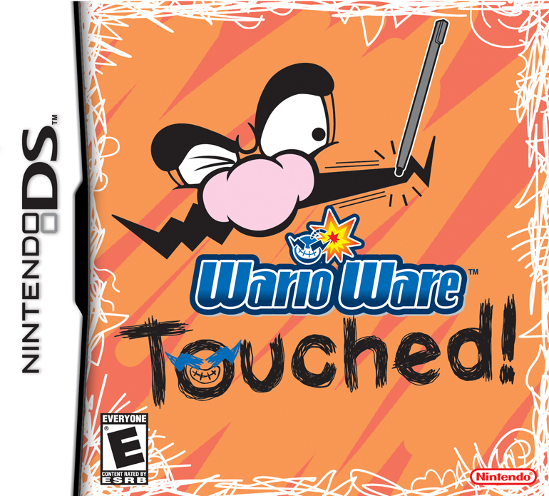
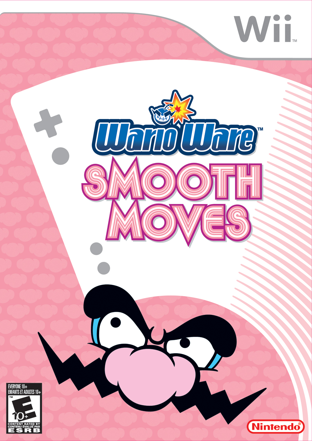
I don't have a problem with any of the WarioWare boxarts. Sure, they're minimalist, but their color palette is very pleasant and invoke the mood for each of the themes of the game. For instance, Touched has some aggressive colors and stripe patterning to complement the scribbly nature of the game. The logo of the game is invokes crude hand drawing. The borders are scratched off. There's a simple action that conveys a lot, you use your stylus to manipulate things, and it's just Wario's eyes to show you it's a weird, wacky WarioWare game.
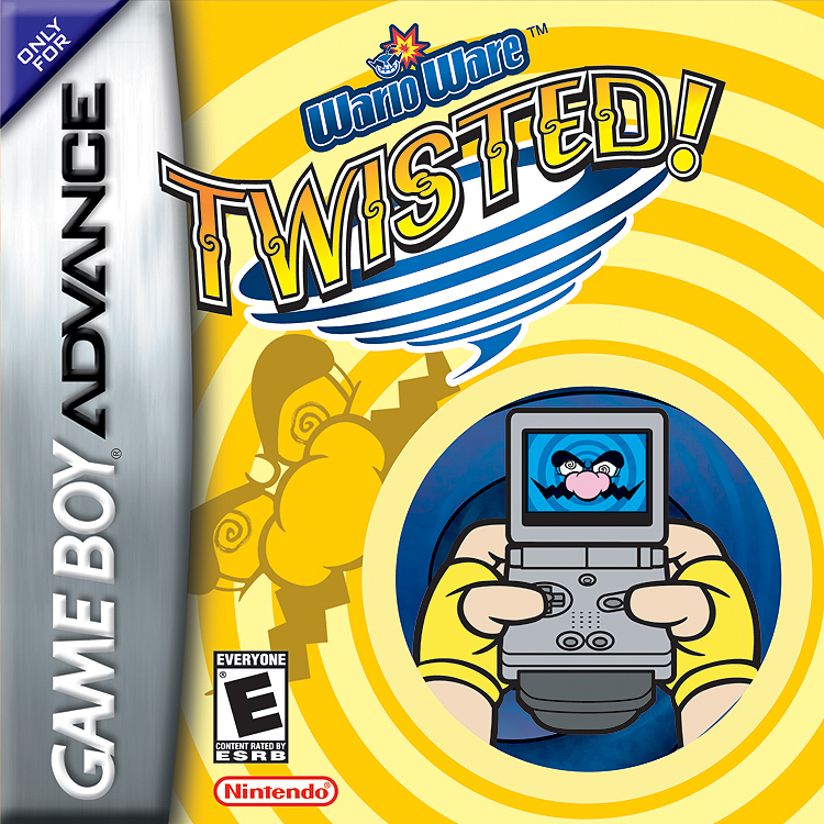
WarioWare Twisted has a rather gentle color scheme for a discordant box, though I think yellow is a good fit for dizzyness, and it goes well with the blues (also yellow is an invert of blue), which helps contrast the blue and draws your eye to the GBA and also draws out the tornado. I think there's quite a bit going on, but, again, it's pretty clear to know what the game is selling you on: using your GBA and its peripheral to spin it around. The dizziness isn't there to tell players they'll be dizzy, it's just a cartoonish appeal saying "look how crazy, but fun we are!"
Smooth Moves has a weird patterning of Wario's nose going on (maybe it invokes orderly marquee effect or the effect of a scrolling background, think the background for the menu of Mario Kart Double Dash) but the color palette is ideal to fill the entire box, nonobstrusive. Similar to the name, "Smooth Moves", a calming name (also think about the zen theme of the game when you are introduced to new ways to beat a microgame with the Form Baton). But the logo's great. I think the uneven lines running along the logo, while artificial, mimic the illusion movement, trying to invoke a blur, especially with S. The Wii Controller is simple and easily read, and it has a trailing line that mimics movement and resembles the lines in the logo. Wario's face is placed fine, with his eyes directing to the Wii Remote, but it's a trademark indicator of a WarioWare game. I like the color scheme for this one a lot, a gentle pink, a wash of white and gray that complements the Wii labeling that's on every Wii box. Wario also is great contrast. His mustache and eyebrows are bold and black which help stand out against the pastels here.
So yeah, they aren't busy and super colorful, but the color schemes work and I think the minimalist design works pretty well here. I don't have much complaints for that and I can't suggest any improvement. I say I like Smooth Moves the most of the boxes, and Twisted's a bit busy, like maybe the area with the GBA SP shouldn't have a small spiral pattern going on as opposed to a solid color