Bad box arts

You know, I totally get why people continue to make fun of the North American box arts for Mega Man (and to a lesser extent Mega Man 2), but I think some of the later original series North American box arts are still pretty bad.

Take Mega Man 3 here for example:
na.original.jpg


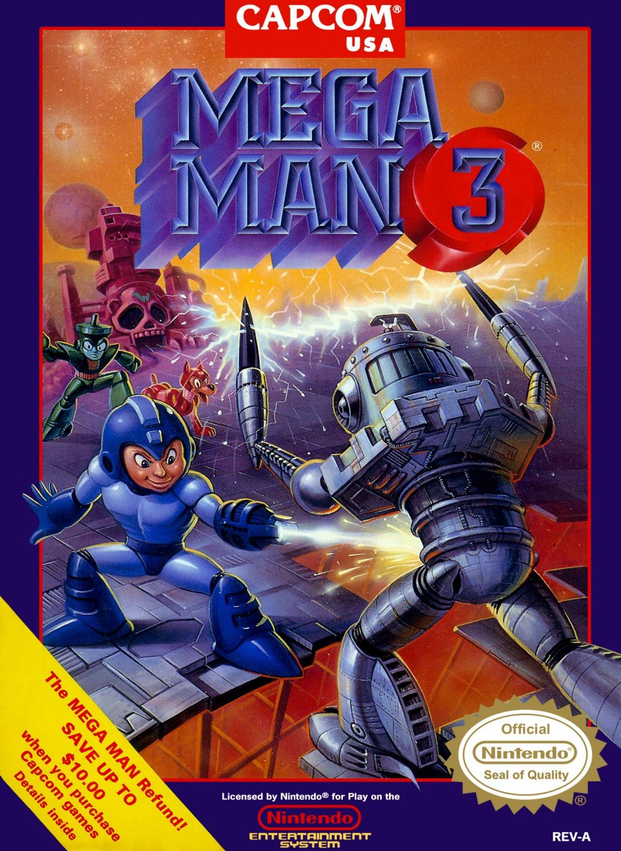
Like yeah you're no longer trying to make him look like some adult, but I really don't care for that whole early 90s thing with games with anime-style box art where they'd redraw it for the North American (and sometimes European) releases and give it a similar style but made more 'realistic' in terms of details and shading. Just looks weird and wrong to me.
oh no, megaman's shooting in the no-no zone!
(sorry if I was a bit late)
 
Hammerin' Harry on NES had a particularly ugly box art. I've also noticed a trend here. Most boxarts here seem to also appear in the AVGN Bad Box Art Marathon.
 
View attachment 7080
Pauline just looks...stiff in this one.

Also, like with WarioWare GC, this is taking place in the piss void.
669px-MvsDKMLM.jpg

The box is decently appealing as the colors are not offensive (WarioWare GC is just a void of highlighter yellow while this one, the colors are a bit more muted and I think they fit well with the dominant red and brown foreground elements). As far as Pauline goes, well, it's not like you can really pose much if one of that ape's hands matches your entire abdomen and hips.

Worst I can say about the box is that it looks cluttered. On the other hand, it's not like Mario plays a big role in this one, but it just doesn't seem clear to me that Mario's a passive character; he kinda competes with the Mini Marios here.

But you compared this to March of the Minis and it's obvious March of the Minis had the better of the boxes. Despite having as many elements, at least the background has some atmospheric perspective applied (colors mute and look blusish as they "recede" from the foreground) to help bring out the main element: Mini Mario. And unlike Mini-Land Mayhem, it's far clearer that Mini Marios are the main star (or "1337 mvp?") and Mario's just garnish. It's just more organized and has more thought put into it rather than look like a bunch of stock artwork slapped together.
668px-Mvsdk2motmcoverart.jpg
 
i dont find any mario vs donkey kong boxes bad...........except for tipping stars....
1604308418861.png

i dont know how unpopular my opinion is, this box is not appealing to look at. the reason? the text. instead of making it look good, they just made it look generic and bland, which ruins this box for me. maaaaybe if it was in only one spot instead of there being text in multiple parts of the box, it wouldn't look as bad.

and i know that because the japanese box art doesn't have it and it looks waaaaay better.
1604308914273.png

the text makes it look like something you'd see in a manual, while the japanese box actually LOOKS like a box!
 
Mega Man 9 was downloadable and didn't need box art, but they decided to make one anyway.
1604592607381.png
 
im guessing maybe hes jumping into the b dasher, but seeing as the b dasher is facing the CAMERA, it looks so weird
 
The Japanese version of Super Paper Mario
1614897414130.png

The subdued yellow color REALLY doesn't fit in here, and the main villain is literally just a footnote (I know spoilers and such but still. It's no secret that Bleck is the villain, it's literally revealed in the opening cutscene)
 

AVGN did a whole slew of bad boxes back in 2015. Warning: The video contains swearing and toilet humour. Don't watch if you can't tolerate any of that.
 
View attachment 10221

The word Xbox appears seventeen times on this.

Holy shit this is so laughably terrible: it's literally two boxes in a box in a box. I'd also count the occurences of the bloody Xbox logo as "Xbox" mentions.


AVGN did a whole slew of bad boxes back in 2015. Warning: The video contains swearing and toilet humour. Don't watch if you can't tolerate any of that.

I remember watching this video, but it's nice to link it to this thread! If you want to post individual entries for us to oogle at, then be my guest!
 
And here's another video showcasing bad boxes. This one focuses on US Playstation boxes compared to PAL ones in a Top 10 list, starring Caddicarus!

 
Don't you just love how they put two box arts inside a split boxart

View attachment 10221

The word Xbox appears seventeen times on this.
lmao I counted like 23 times (and don't forget 11 of these freaking logos) including the reflection of the Fallout 3 box.
 
Last edited:
Back