
Navigation
Install the app
How to install the app on iOS
Follow along with the video below to see how to install our site as a web app on your home screen.
Note: This feature may not be available in some browsers.
More options
You are using an out of date browser. It may not display this or other websites correctly.
You should upgrade or use an alternative browser.
You should upgrade or use an alternative browser.
Why do people hate Paper Mario: Sticker Star?
- Thread starter A Paragoomba and the Koopa Bros.
- Start date
The Golden Yoshi
Yes.
Although the combat is somewhat tedious, I found a lot of enjoyment out of this game. It's a great game and I defend it when possible.
A Paragoomba and the Koopa Bros.
Actually Braixen.
- Thread starter
- #53
I take back my bump post.
I'll rate it a 6.5/10.
I'll rate it a 6.5/10.
StickerStarFan101
Goomba
Personally I really felt like sticker star had a lot of fun gameplay. Only two levels that stop me from playing the game is the desert level with the pokey boss and the boo mansion in world 4. It's also a very memorable game for me. I know i haven't played any other paper mario game but i honestly don't need to when I know sticker star is a good enough paper mario game for me.
- Pronouns
- He/him
As someone who really dislikes Sticker Star, it's not actually a bad game when viewed in a vacuum, aside from some poor design choices like the boss battles. The problem is when you compare it to the first three Paper Mario games, it falls short in just about every aspect. If you like Sticker Star, I highly recommend trying the original Paper Mario or The Thousand Year Door if you can, I think you'd enjoy them. Just know that if you don't want to play the other games because Sticker Star is "good enough" then you're settling for one of the poorest games the franchise has to offer.
Koopa con Carne
Lidl K. Rool
- MarioWiki
- Koopa con Carne
Oh, god. That last post I made makes me cringe.
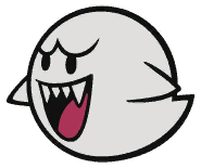
Why did I ever think Dry Bones and Boo's PM design were better?
Because PM Boo
Even the mainline Boo
- Pronouns
- He/him
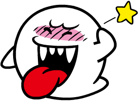
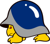
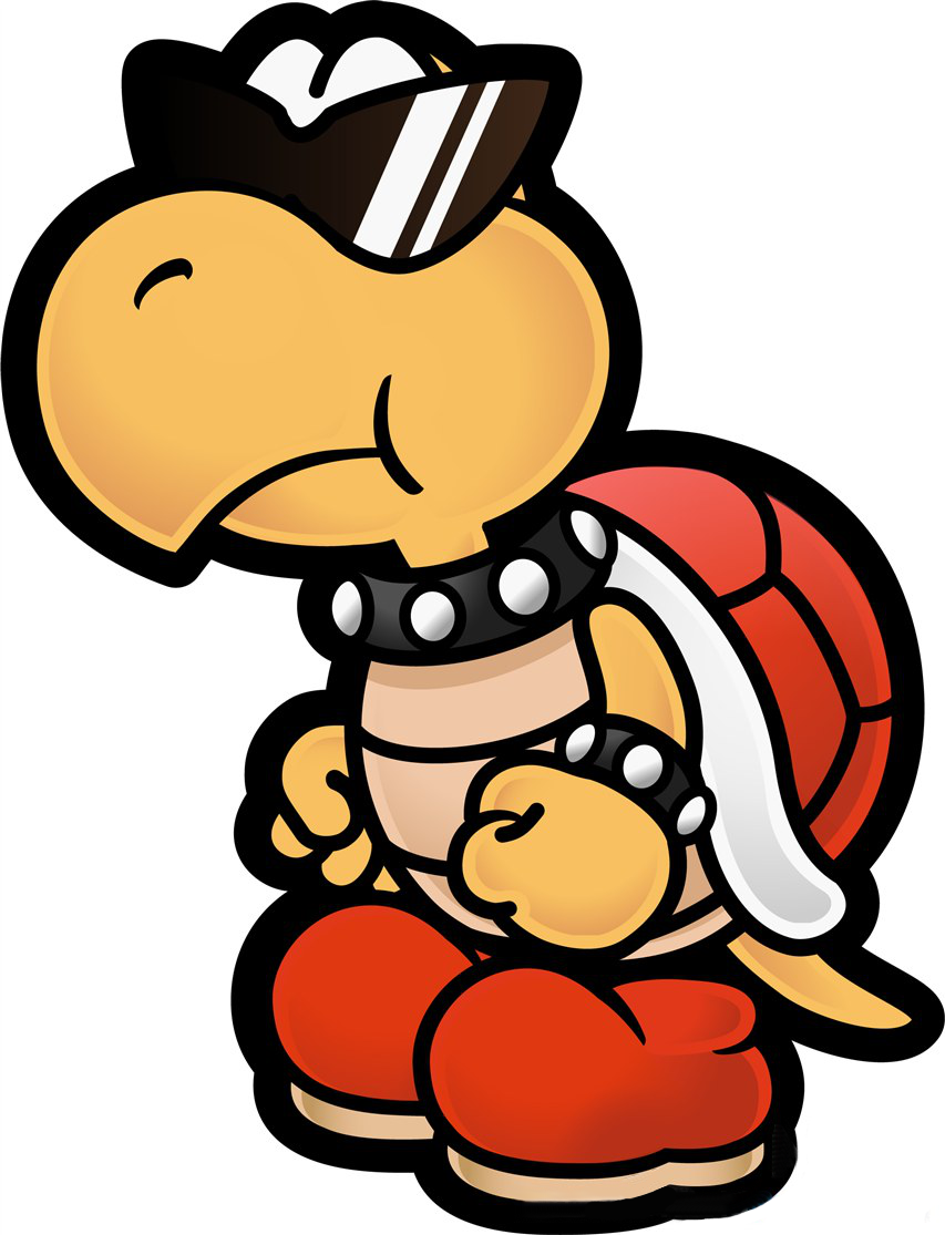
The old Paper Mario art style was so much more expressive in general. They're leaning way too hard into the paper aesthetic and now all the characters and enemies have no shading and barely any frames of animation. Personally I just find it really boring to look at. This is actually one thing Sticker Star got right.Because PM Booshows some emotion while the present version barely even emotes and comes across as nothing more than a balloon with an amateurishly marker pen-drawn face. It also has a butt for eyebrows lmao.
Even the mainline Boois more expressive than that.
Koopa con Carne
Lidl K. Rool
- MarioWiki
- Koopa con Carne
I know. My point stands.
- Pronouns
- He/him
Technically PM Boos are closer to the YI Big Boos, but yeah. It's pretty interesting how much influence Yoshi's Island had on Paper Mario, especially the original game.
- Pronouns
- she/her
- MarioWiki
- Mario
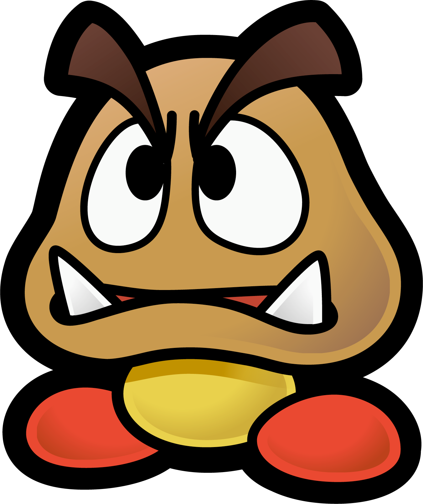
I don't like the designs for Dry Bones, Hammer Bro., or Goombas for Paper Mario. IMO, different =/= appealing. Maybe I just have a preference for high-fidelity to the 3D stuff between Yoshi's Island and the modern 3D Mario games, I don't know.
That-1-Green-Pokey
A Pokey, That's it
- Pronouns
- He/him
- MarioWiki
- That-1-Green-Pokey
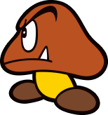
I honestly really loved the game! It being my only true Paper Mario game (the other being paper jam which i don't count) I like the battle system and the creative bosses sometimes taking advantage of them being made of paper such as the Megasparkle Goomba's cone form and rolling attack.
- Pronouns
- He/him
Personally, I like the Paper Mario designs in general because I feel like they give the series more unique charm and character, and if there's any series that makes sense to be stylized it's probably Paper Mario. I totally understand why some people would prefer it to be more in line with the standards for the rest of the series though.
Mcmadness
The idiot who puts things in the wrong board.
Personally, I like the Paper Mario designs in general because I feel like they give the series more unique charm and character, and if there's any series that makes sense to be stylized it's probably Paper Mario. I totally understand why some people would prefer it to be more in line with the standards for the rest of the series though.
Well see, for the most part barring certain things, PM's style isn't even unique to it, even back in the day.
Koopa con Carne
Lidl K. Rool
- MarioWiki
- Koopa con Carne
Personally, I like the Paper Mario designs in general because I feel like they give the series more unique charm and character, and if there's any series that makes sense to be stylized it's probably Paper Mario. I totally understand why some people would prefer it to be more in line with the standards for the rest of the series though.
The newer style is just so sterile and contrived, like it would look right at home in a generic mobile game. It lacks personality; as I stated for Boos, it has even less personality than the "Super Mario" series counterparts. I could concede, however, that Dry Bones looked hella generic in previous PM installments and that I prefer the newer design for them myself, but look at the Hammer Bros:
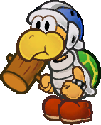
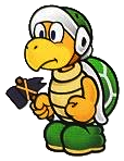
He used to be so giddy. He had that big wacky hammer and he was eager to bonk Mario with it. Now he looks like he hates his job and has to keep on appearances, wielding a small cold hammer from a factory that he is paid to use. I'm surprised the arms and shoes' designs even remained the same.
This is just conjecture, but I think the Yoshi's Island-inspired shapes and forms work so much better for Paper Mario because they were created with arts and crafts aesthetics in mind, since the universes of YI and Paper Mario have both materialised as artsy and colourful. Nowadays, the characters look like they were made by a graphic designer, printed onto a cutout and thrown into a game.
- Pronouns
- she/her
- MarioWiki
- Mario
I don't agree. You're really judging the character based on the weapon they're using, but I'd argue the old Hammer Bro. is just a Koopa with a helmet and a hammer. The standard Hammer Bro. is more unique from other koopas but you deride the standard Hammer Bro just for being standard...
Koopa con Carne
Lidl K. Rool
- MarioWiki
- Koopa con Carne
i'm not judging it based on just the weapon, i also distinctly brought up the feelings i read from their expressions. the newer design is ok, it does its job: it sure is a hammer bro, though a flat one at that. the older one is cute and distinctive, and with a different color scheme it would have looked even better. what would paper mario look like if his appearance was closer to his standard counterpart? charmless.
Last edited:
Koopa con Carne
Lidl K. Rool
- MarioWiki
- Koopa con Carne
Mario isn't inherently charmless. If I thought that, I wouldn't be here. But if his standard design were to be paperized as is, I'd wager it would lose something. Like, it would just look... flat? It's not like M&L, where his appearance is stylized despite being a 2D sprite, or the various 2D artwork we see of the Mario cast where they do not have paper-y limitations.
Speaking of, the paper aesthetics seen in the Paper Mario series heavily restrict the animation complexity and the range of expressions, so the character design needs to carry a certain amount of expression and personality on its own. Post Sticker Star enemy designs resemble their standard counterparts to a tee, with traits seen in previous iterations only carried over if they are in line with the intended design. And this is where the newer design choices fall short: you now have a character in an almost permanently default state who, while more easily recognizeable for sure, ends up being rather soulless. I would hate the character of Paper Mario to lose its charm like that.
Speaking of, the paper aesthetics seen in the Paper Mario series heavily restrict the animation complexity and the range of expressions, so the character design needs to carry a certain amount of expression and personality on its own. Post Sticker Star enemy designs resemble their standard counterparts to a tee, with traits seen in previous iterations only carried over if they are in line with the intended design. And this is where the newer design choices fall short: you now have a character in an almost permanently default state who, while more easily recognizeable for sure, ends up being rather soulless. I would hate the character of Paper Mario to lose its charm like that.
Last edited:
Mcmadness
The idiot who puts things in the wrong board.
Ignoring the fact that it doesn't have a soul either way, 90% of pre-sticker star designs are just taken from what was at the time the current designs so to accuse the modern designs of being "soulless" is frankly ridiculous.
The hammer bro is like, one of the few exceptions and even then you can trace aspects of that design to the hammer bros from SMRPG and the hammer bros from super mario bros all stars.
The hammer bro is like, one of the few exceptions and even then you can trace aspects of that design to the hammer bros from SMRPG and the hammer bros from super mario bros all stars.
Koopa con Carne
Lidl K. Rool
- MarioWiki
- Koopa con Carne
Ignoring the fact that it doesn't have a soul either way, 90% of pre-sticker star designs are just taken from what was at the time the current designs so to accuse the modern designs of being "soulless" is frankly ridiculous.
The hammer bro is like, one of the few exceptions and even then you can trace aspects of that design to the hammer bros from SMRPG and the hammer bros from super mario bros all stars.
yes, because the TTYD Buzzy Beetle looked identical to its Super Mario Bros. precursor.
and the mainline Goomba definitely had red shoes and overgrown eyebrows that the YI/PM counterpart borrowed.
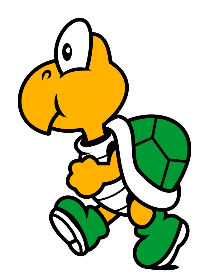
And Koopa Troopas were very much wearing punk attire before Paper Mario.
What Paper Mario did was stylize, or otherwise borrow from the stylized designs of Yoshi's Island, in order to complement the limited paper animation and thus concentrate much of their personality into one area--as I said above. The newer designs approach the mainline style too much without regard to the fact that mainline games (say, those with 3D renders) offer characters a bigger range of movement and expressions to communicate their emotions and don't necessarily oblige them to a strong design characterization--all of them are cute, bubbly, and friendly, which when translated to a more static, choppy world comes across as stilted and uninspired without having something of a distinct and defining addition.
In the end, this discussion can be found to be merely rooted in taste, allowing for an "agree to disagree" situation. All I'm trying to do is find a reason for my preference towards the older style, and why I think that, for the most part, it works better for Paper Mario's papery universe. Therefore, excuse me for thinking that post-SS Boos look like a balloon with a drawn face compared to their "uglier", exaggerated yet more lively predecessors who actually look like mischievous ghosts.
Last edited: