winstein's art that are drawn by him, take a look if you want

winstein

Justice is not limited, it is a universal quality
Awards Committee
MarioWiki
winstein
Categories

Shroom-related art


Others

========

Hello, and welcome to my Fan Creations thread! After a little encouragement, I decided to be more open in sharing my art with all of you! Because of how I really like my art, I also felt like I could say quite a number of things about them! I don't know if this sort of thing is appreciated, but if there's enough resistance about that, I will have to figuratively bite my tongue for every new entry I made.

I also felt like everybody else have superior artistic skills compared to me, even though I didn't look at everyone's. In fact, I might even say that mine is hardly a looker! You know what, let's call it that unless it's agreed that they are not as bad as I think of them.


mario_characters___part_2_by_edwinart_d3heb87-fullview.jpg


Completed: 27th May 2011

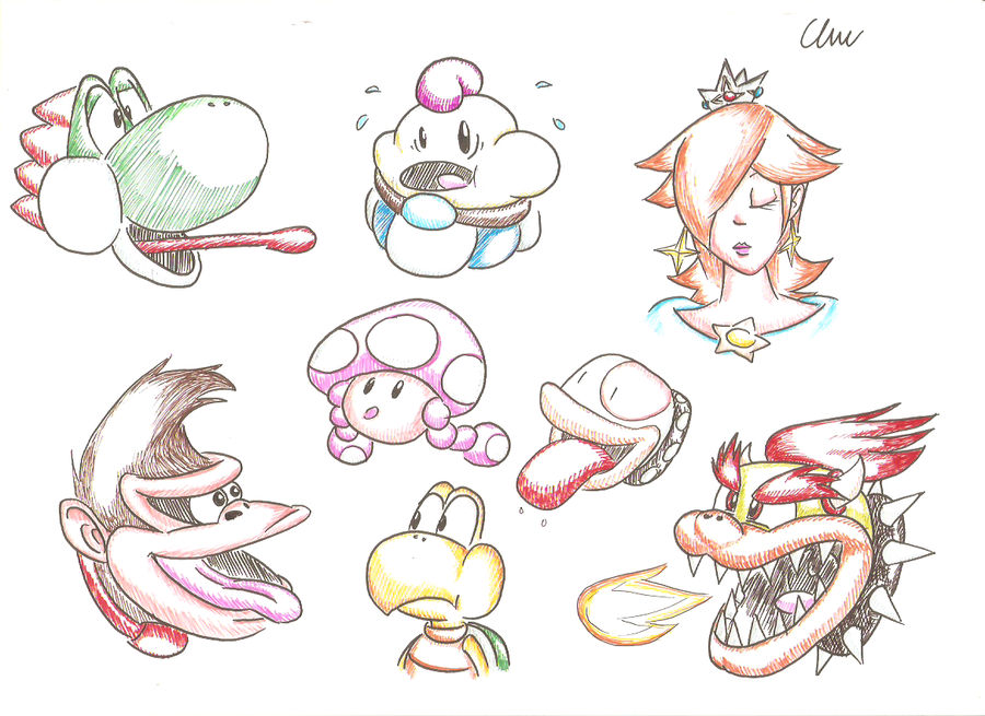
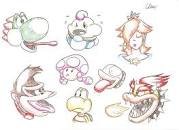
The colouring is inspired by this fan art, which used colours to depict shading, making the colouring look minimal yet still present. Because it looked like something I could do, I decided to draw Mario characters with them. Perhaps I should revisit that colouring approach again one day.

There are actually four images (this is one of them) depicting various Mario characters' heads, and certain characters were added to represent the different spin-offs that they first appeared in. For example, Poochy is meant to represent Yoshi's Island, Kammy is to represent Paper Mario and Plum represents Camelot Sports games. You can say my holistic appreciation for Mario as a whole was felt back before I joined Mario Boards, and I am still open to celebrating spin-offs rather than deriding them. Each character shown actually have my brief opinions on them that may be different from today, so for example I expressed more fondness for Geno but right now I am not that fond of him.

I don't know how well y'all will think of something I finished so many years ago, because it is not representative of how I would draw Mario characters now. In fact, I decided to withhold the other three images. This one is probably the one that I am most comfortable showing.

Marioware Mario.png


Completed: 14th July 2018

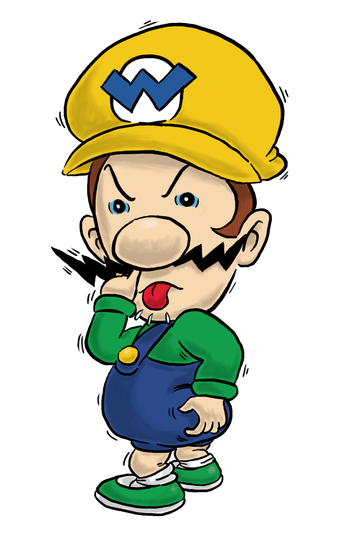
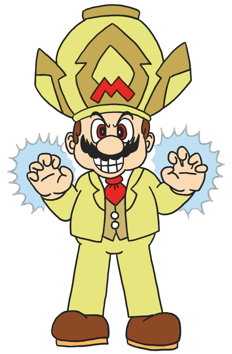
I have a fondness of the fan idea in Mario hosting a video game company instead of Wario. As there was an Art Contest last year, I took the opportunity and drew Mario donning Wario's biker outfit with his own colours. Initially Mario is supposed to be smiling, but I felt that it is too much for me to handle, which is why Mario is scowling instead. My favourite part about depicting Mario this way is the moustache. I wanted it to be sharp like Wario's but also wanted it to keep it Mario in some way, so the compromise is to make the top portion sharp and the bottom portion Mario-like.

There were going to be four smaller pictures where Mario is replaced with Wario in certain microgames, and three of them are going to be inspired by these:
WWIMM_HotDogHog.png
WWIMM_CrazyCars.png
Wario_Wear.png

Why weren't they included? Time constraints basically. This picture was drawn for a contest, remember?

I wanted to give Mario's biker outfit colours that mirror Wario's colours, with Mario's colours shining in some spots. For example, Wario's helmet is yellow, so I made Mario's red. Because the whole image is drawn using a mouse, I had to resort to primitive black shading similar to how comic strips depict shading properly despite the lack of shading. Unfortunately, I can't help but be disappointed by the results, because in retrospect it looked garish.

Appropriately, my drawing garnered the second-to-least votes, but right now I kind of wish Koops' submission had more votes than my image because I felt that at least he's proud of his Smash Bros art. It's also from that contest that I found out that votes are more towards seeing whose idea is the most well-liked since that Pirate Goomba in the Beginner bracket managed to win. It also showed me that drawn and scanned images aren't inherently at a disadvantage since the winning entry of the Amateur bracket is of that description. To wit, the reason I preferred to do this digitally is mainly that, barring some exceptions, I didn't really like how pictures are usually shown when it's drawn and then scanned/taken a photo of, which is why I wanted to also be able to draw digitally.

IfsFNiLP_o.png


Completed: 7th April 2019

This image was finished way before I got my Wacom Intuos because it's my belief that I would do better at digital drawing if I could do it in a more familiar way. In fact, most of the drawings I did before were with the usage of the mouse, which I found to be very difficult to do. The first picture I did wasn't too bad if I say so myself.

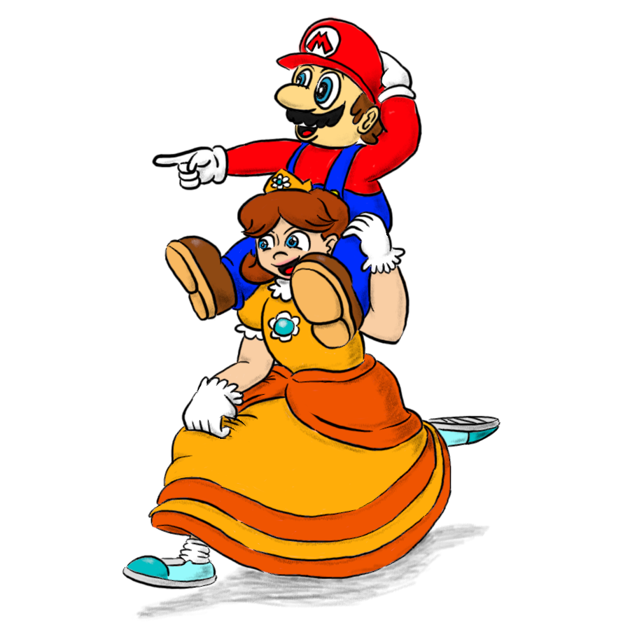
The reason I drew up this image is mainly that I rarely found what I wanted to find: Mario and Daisy interacting in a friendly and not romantically-motivated way (aka [relation]-shipping). I lamented about this until one day I decided: why don't I draw what I wanted to see myself?

My sources of colour pickers were different for Mario and Daisy, which is why Mario looked kind of different from his regular portrayal, and I think it makes him look very similar to his colouring in Super Mario 64. Daisy is based on some of the Kotabe art which is more accurate to the character. Because of the inspiration of the Kotabe art style, I attempted to imitate the shading that he usually used. It probably came off as too tame from my inspiration though.

The original sketch and the final product are also different. For one, Daisy was originally holding Mario with two hands, but when I realise that Peach runs with her hands carrying the dress, I thought it would be better if I changed it a bit. Daisy also lacked the frills at the bottom of her dress but a glance at the source allowed me to correct that mistake. Mario lacked the upper teeth earlier, but that one was also corrected. Something that didn't get corrected was that Mario's soles are wider than his shoes, whereas it's actually smaller.

I suppose it's something to be proud of, but at the same time I have a feeling that there are people that are far better in this craft than I am, which makes me feel a bit disappointed with it.


lEbSQxe2_o.png


Completed: 20th October 2019

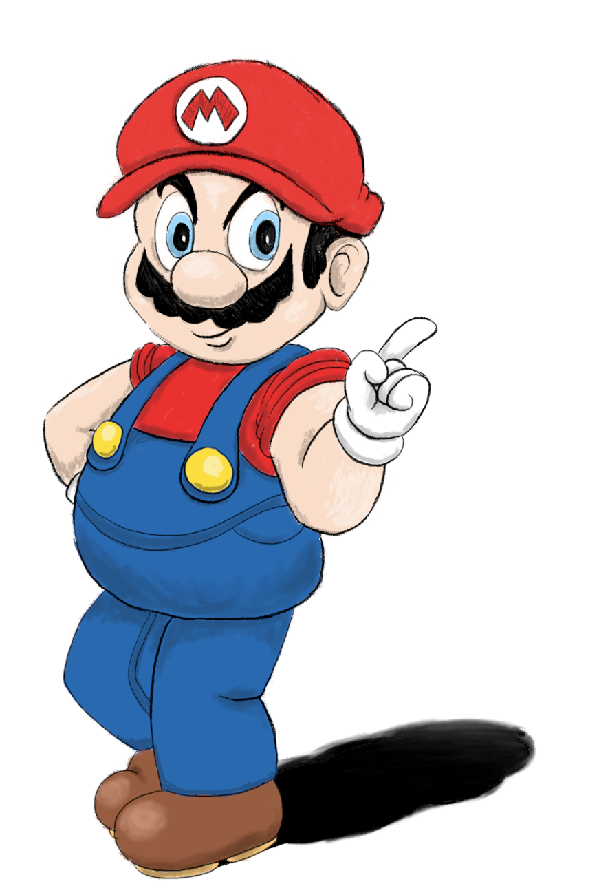
The inspiration is basically Sonic the Hedgehog's most famous official art, which depicted him in a confident and somewhat rebellious manner. I sketched Mario doing the same thing, and because I liked how he turned out, it naturally became a subject of my next piece. Usually, I use a translucent layer with black to depict more accurate lighting, but for this image, I decided to use approximate coloured lighting to simulate a painted picture because I wanted to experiment with the look. It doesn't look perfect, sad to say, but I suppose it's a pretty good effort.

The sketch also contained things that are different from the original. For one, I didn't draw Mario's shoes because it's meant to evoke Sonic's look from his first video game since his sprite lacked feet. With the wonders of infinite canvas on a computer, I might as well add the shoes, followed by the shadow. Because of the change in direction midway, I didn't get to experiment with the colouring used by one of Sonic's first official art, but the closest that I got was the shadow. Another thing is that Mario's buckles are lower because all this while I thought it's similar to how Mickey Mouse's shorts are. Similarly, the denim lines weren't present either. Goes to show that I don't always know everything about Mario until I studied the original picture better.

I picked the colours based on the Mario Moschino art, except that Mario's overalls are slightly darker than usual because I felt that the one depicted in the Mario artwork is a bit light, and also because I think it's probably not a standard thing for Mario to do.

Thank you for reading.
 

Attachments

  • 1571665175984.jpeg
    1571665175984.jpeg
    5.2 KB · Views: 404
Last edited:
woag i didnt know you made art... i think it looks lovely!!
i like how daisy looks kinda swole in the second one
 
Oh boy... I have drawn this...

RwxS7sdd_o.png


The inspiration for this lovely picture is due to NanoPhoenix posing the question "What if Wario had a bonneter?" to the twins. Even though the responses don't allude to the image above, the thought of Baby Luigi being captured by Wario is too funny to not put it in, even though I fear it might offend somebody.

So the idea is to translate the qualities on Mario-captured enemies or characters: the things that are retained are the moustache and the eye type. Since Mario has blue eyes and a bushy moustache, a Wario-captured character would have his beady eyes, the blue lines near the eyes, and of course his moustache. To really highlight how Wario is on the agency of his captured victims, I put three things that Wario would normally do: scratch his butt, pick his nose and doing a raspberry. The raspberry part was originally showing a full set of teeth, but perhaps that might appear too uncanny for a baby, so that's the next best thing.

Thank you for reading.
 
Last edited:
..................................................................................................................................................................
 
1604854026875.png


I have always enjoyed drawing Mario doing Wario's expressions, and that was what I intended to do when I did the MarioWare fan art I did a couple years ago. This fan art is drawn with thicker lines due to WarioWare's usage of thick lines, but the unpolished nature of the artwork means that it doesn't come close to looking like that. Instead, it ended up resembling Bourgyman's Mario fan art due to the thick lines and the portrayal of Mario with individual teeth. The artwork received a bit of cleaning, which is still not perfect but I suppose it gets the job done. Even then, I am still not satisfied with my digital art skills.

This fan art is based on the Microgame called "Mug Shot", where the player has to catch a sliding mug.

Thank you for reading.
 
unknown.png


As we can see here, it's Mario drawing Wario in the style Wario drew the other characters after scanning their amiibo in WarioWare Gold. Wario is the only character to have a distinctly better-drawn art compared to the other characters makes me wonder if anybody attempted to draw Wario in the crude style he did for the other characters. Not wanting to leave it as it is, I decided to put Mario on the job because of his past experience as a painter. Previously Mario looked more like the Wario painter in that game, but as the art slowly developed, it became more Mario-like, with practically the only thing retained being the cap that Mario wears.

Sometimes I felt that I drew that crude Wario too well, though...

Bonus image:
unknown.png


Months ago, I brought up on how nobody quite attempted to draw Wario in the same style of crudely-drawn art he did for the other characters for the WarioWare amiibo functionality. And then @Koops did that lovely drawing of Wario. After I completed the image above, I decided to just slap that image on it.

He also off-handedly mentioned Krita, which sounded like an interesting art program (I used GIMP), so I suppose I will see how well that program does it for me.

Thank you for reading.
 
ZtbEXS2U_o.png


Since I am satisfied with my experience with Krita, I decide to finish up some of the images that I currently have on GIMP before I continue on with Krita as my primary drawing program. I have about three unfinished images, and this is one of them. It's also the oldest of the three, since I started months ago but only finishing it up in two nights.

The inspiration for this image is Lost in Austen, which is about a character named Amanda, who is into Pride and Prejudice, but one day she encountered one of the characters in the book (Elizabeth Bennet) in her home marvelling at modern technology given how the setting in the novel took place in 19th century England. What follows is Amanda going into the world of Pride and Prejudice while Elizabeth acclimating to modern life, but it's mainly about Amanda. The thrust of the image is how Daisy has two rather different designs: one from before the Gamecube games and one from the Gamecube games onward (starting from Mario Party 4). That's why we have an unnamed character on the left doing an equivalent to what Amanda did (reading Pride and Prejudice), in this case playing the Game Boy with Super Mario Land slotted in. I imagine that when they switch places nobody would be the wiser that they looked different, at least not in a way that raises suspicion.

Even though this image took after several elements from the moment I mentioned, I am not entirely satisfied with everything. For example, what possible reason would Daisy from the world of Mario be marvelling at? I decided on TV where there are a lot of channels, even if I thought that there should've been a better way. I suppose you could say that as imperfect the ideas have been, finishing the drawing is my priority and here we are.

Thank you for reading.
 
DOPU98TV_o.png


This is another picture where I depict Mario doing something Wario does. In this case, it's "Mario Deluxe"! I still haven't gotten around doing Mario with Wario expressions, but I have fun doing them because it gives me a chance to draw Mario being un-Mario-like, given how Mario has to uphold a certain standard.

One thing I noticed about WarioWare's writing is that there is a tendency to uphold a status quo through justifications despite the characters doing unusual things. For example, 5-Volt (9-Volt's mother) is depicted as being sneaky and terrifying in the Gamer mode, which the game attempts to justify it as being 9-Volt's active imagination. Similarly, Wario Deluxe seems evil on the surface, but it's justified as Wario being sleep-deprived (the red eyes) and him just getting the suit he wears because he just got it. Because of this, you can make justification on Mario doing un-Mario-like things as being in some sort of role play, and him having red eyes might just be him wearing red contacts.

It's a quick drawing I made since I decided not to do any shading, given the lack of it in WarioWare's art style.

EyrOD2fy_o.png


There has been a lot of fan art depicting various characters in the "Calvin & Hobbes walking on a log" mould, but I don't think I have seen Garfield being applied to that sort of template. Similarly, I don't think I have seen Calvin & Hobbes being drawn in a Garfield style (as themselves). As I wanted to have a hand in drawing in Garfield's art style, there's one perfect candidate for this job before I try my hand on doing actual Garfield characters. Somehow I got a feeling that some people consider it heresy and perhaps cursed, to which I say is preposterous since this is part of what makes creativity something to seek: the possibilities.

In my opinion, the resulting image has some things I am satisfied with, and some that I am not. For example, I think Calvin came up nicely, as with Hobbes' head. It's Hobbes' body that is not satisfactory, and it's probably because that part wasn't sketched very well meaning the foundation for the line art is weak.

Thank you for reading.


Inspired by a recent comment on Bowletta, here's my interpretation on what would happen if Luigi got possessed by Cackletta instead of Bowser, based on the characteristics that Cackletta keeps when she possessed Bowser (e.g.: face change, breasts) and what are kept (e.g.: body type, facial hair). Personally I thought that Bowletta is a pretty inspired plot twist in Mario & Luigi: Superstar Saga because of how Cackletta was faced earlier, and there's the fact that it happened in only one game so it didn't overstay its welcome.

Some people call it by different names like Cackluigi, but personally, I dub this fusion as Luigiletta. In terms of what-ifs for Cackletta's possession, the only one I have really seen is Peachletta. Prior to what you see here, Luigiletta was never put into image form, but it did get a mention in one of the fan offshoot wikis.

This is my attempt to imitate the Mario & Luigi artstyle, and while the line art is satisfactory, the colouring leaves something to be desired, given how many artists already imitated it quite well, including kenny.png.


I wanted to draw a bird, and decided on a parrot after some deliberation. When I searched for images, I ended up with this one as reference. The result that I ended up wasn't perfect, like for example the tail which is supposed to be longer. The shape may also be imperfect and that is despite correcting the much less perfect first iteration. I may do another bird in the future similar to this, with the great horned owl being on the list. Perhaps it would be easier to do since owls are rounder than a parrot.


Finally, here's a series of poses that Mario does, based on Wario's memorable 4th place animation in Mario Party 9. Although that game has some funny animations, this is the funniest of them all for how Wario jerks his movement in three phases. I also do this because the thought of Mario doing Wario actions is funny, and if we take the spirit of how WarioWare and Rhythm Heaven writes the characters (wherein the absurdities have playful explanations), then we can say that Mario imitated Wario doing this to tease him after Wario did it so many times. It's pretty shoddy because it's done quickly to get this idea out of the way.

Thank you for reading.
 
Companion Parrot.png


The first piece here is known as Companion Parrot, which is as the title suggests. This art is an experiment in using non-black lines for the outlines, using the approximate colours of the things. For example, the blue parrot has blue-ish outlines. It is meant to rely less on black lines to form the art, giving it a fresher look than what I am used to. This image was finished last year, but today I quickly added a pink background so that it doesn't look so plain.
Flight of the Wahs.png

The second piece is titled Flight of the Wahs, which is a double meaning, and I'll let you guess why it's titled as such. Unlike the other image, this image is basically coloured with a water colour look, to evoke a certain pureness in its imagery. Unfortunately I did not do as well, as I have kind of cheated with black outlines to make some images clear, like on Wario's side. There is a version that's just the original line art, which is removed for this image.

The flying letters is a reference to a Doraemon story where Nobita (Noby) discovered that the specific Japanese character makes for a convenient seat in a flight, although my time with the image meant that I can't reference it directly. The fact that it's a reference to Doraemon is why Doraemon is in the image.

Thank you for reading.
 
Last edited:
Hats-off-to-a-good-Toad.png

Starting off is what I would call Hats off to a Good Toad, alluding to the original greeting card of Mario, Luigi, and Toad tossing their caps that said "Hats off to a good friend". Instead of just Toad tossing his cap, his pals join in the fun, including Toadette! Do note that besides the main Toad, the hairstyles are imagined by me, so they are in no way official. The Toads should be easy to identify by their traits even if you may not see the colours, hopefully.

Moonlight-Blues.png

Next up is an image that is called Moonlight Blues, even though there's nothing about feeling blue here (the colour, on the other hand, is clearly present here). Ironically, the original image did not originally contain blue, nor was there a moon at first. Those were added to give it a bit more flavour. In fact, the whole image is borne of serendipity.

The idea was to originally draw this original character in a sequence on the same bench, which is actually more difficult to do because of a need to ensure that the details are the same between them. The first bout of serendipity was when I wanted to add the white into the character to differentiate her from the bench (this is a layered image), and I randomly chose this shade of blue because Krita's transparency makes it difficult to see the white. The effect on the image ended up looking wonderful. The second bout of serendipity was when I noticed how the white contrasted well with the blue background, as the character very easily stands out this way. The blue was given shading to the character to make the effect better (in my opinion). These two colour elements and my decision to pose the character this way got me to thinking the best way to contextualise it, and that's why there's a shooting star added, also in white because of how well the colours blend together.

Speaking of that, it does have something in common with the Scribbles in that it has a colour limit of white, black, and a specific colour. Though in this case, I am not confined to a specific colour, but this colour ended up working in the image's favour.

Thank you for reading.
 
Cycle-of-Calumny.png


The main attraction of the day is titled Cycle of Calumny, mainly because Mario is one of the characters who is very easily accused of things he has never done, and his intentions are also taken out of proportion. Things like accusing him of being mental or being secretly evil to Luigi, it just seem to never end for poor ol' Mario, and he feels the same. This piece is inspired by another fan art that expressed that the tax fraud jokes in relation to Yoshi never seemed to end, but I get the gist that unlike Mario, it seemed to die down that it just is not so prevalent any more.

Yoshi-s-Touching-Surprise.png

Speaking of Yoshi, next up is Yoshi's Touching Surprise. Not only is the title self-explanatory, it also gels well with how Yoshi's games are usually named. This is based on the old print advertisements for Nintendo DS's "Touching is Good" initiative, which yes, do sound very suggestive. Among those ads is a person whose finger grew Yoshi hands, and one of those hands is holding a Yoshi egg. So this idea was born from it, where instead of a person, it's Yoshi who got this treatment. Yoshi's shocked expression is based on one of the Mario Strikers Charged's character sheets, though unfortunately not all characters got their sheets (Yoshi's is thankfully there). Some say it's cursed, but after all, so is the original ad.

Thank you for reading.
 
Mario-s-Impromptu-Roleplay-on-Wario.png


Mario's Impromptu Roleplay on Wario says it all. It's Mario doing a bunch of Wario expressions, some with easy-to-get references, but some not so. I have long thought that it's hilarious to see Mario behave like Wario because Wario has a bunch of funny expressions, and Mario could benefit from being more expressive. So, as a compromise, Mario acts them out because I imagine he's a great actor, so he isn't actually possessed by Wario. As such, it's presented in sequential art form, to give it some flow.

List of references, from left to right, top to bottom:
  • Super Mario Land 2: The 6 Golden Coins (US) commercial
  • Super Mario Land 2: The 6 Golden Coins (JP) commercial (for the quote), the pose is based on Wario's pose in official art from that game.
  • Mario vs. Wario comic (Nintendo Power)
  • Mario Kart 64; quotes are taken from both Japanese and US versions
  • Wario Land 4's Flat Wario
  • Wario Land: Shake It!!
  • Wario World
  • Mario Golf: World Tour (Bogey animation)
  • Super Smash Bros. series Star KO
  • Wario Land 4's ending
  • WarioWare (the first game); the various Mario icons are based on the final Wario minigames in the first game, Touched, Twisted, and Smooth Moves.; the quote is based on the Wario Press Conference
  • WarioWare Gold
  • Mario Party 10 and later's Wario's losing animation; Mario Party 4's Wario losing frame
  • Wario Land 3's shocked Wario, but the quotes are from the Strikers series; Wario Land 3's 100% ending
  • Wario's standard pose in official art, even on the Super Mario series amiibo; quote is one of Martinet's common deliveries for Wario (Raspberry is original because there's no official art of Wario doing a raspberry)
  • Mario's quote is from Mario Teaches Typing where he made an impression on "American Advertising".
  • Mario's expression from the Super Mario Bros. 3 cartoon (True Colors), in regards to Wario's expression

I have to thank @Striker Mario Boogaloo for some of the ideas, since I clearly don't know much about Mario as much as she does.

Here's a bonus Mario doing a Wario, titled Mario's Biting Remark, which is based on Wario's losing expression in Mario Kart 64.
Mario-s-Biting-Remark.png


Thank you for reading.
 
Last edited:
Winter-Pastime-at-the-Toad-Residence.png

Taking a while to finish, here is Winter Pastime at the Toad Residence, where Waluigi decided to sneakily throw a snowball to Mario, but he somehow sees this coming. Although Waluigi has often been billed as Luigi's rival, I think that is way too limiting of a character, and so in my opinion, he is equally a dirty player to everyone else (Game & Watch Gallery 4's Rain Shower and Mario Party-e have shades of this). This is also an art where I do not resort to black lines to for the line art, instead opting to have everything in colour to give it a more unique look. The shading is admittedly all over the place, and I felt that the best ones would be the ones on the front where I felt I got the hang of what I want to do, since I start from the back to the front for this one. I know it's clearly not even close to winter, but I still want to draw the cast in the snowy environment.

Here's the art that compares the original line art to the final product:
unknown.png

The-Roll-Goom-guy.png

For the extra artwork, here's The Roll Guy. Given how the Goomba Tower operates, where they have some sort of ability to think alike when they are stacked, but what if the one at the second-bottom decided to do things their own way? Here's the image, which depicts the one at the bottom being the fall guy, or in this case, the "roll guy". While I felt that the line art for the image is not very satisfactory due to how off the Goombas look, I think the colouring made up for this image, so I am kind of satisfied with it.

Thank you for reading.
 
Welcome to Mario World!

Mario-s-Rich-Bath.png


For this piece, it's my hitherto final piece in making Mario doing Wario things, this time imitating Wario bathing in his treasures in the Wario World box art, which is once again an idea suggested by @Striker Mario Boogaloo. The earlier idea was for Mario to be bathed into Princess Peaches, but I didn't quite like that because I thought it may be obscene, and later on food was suggested, since it's acknowledged that Mario loves some Italian food. In fact, that was what kickstarted the idea! However, he is also known to find power-ups to be essential for his adventures, so it ended up being both power-ups and Italian food.

Personally speaking, despite the fact that Mario and mushrooms are strongly linked due to Super Mario Bros., I prefer the idea that Mario loves Italian food more than mushrooms (they can be supplementary toppings), because well, he's Italian, so it makes more sense for him to enjoy Italian food first and foremost! Which is one of the things that the Mario cartoons got right, and it also gives a good explanation on why he has a bit of a pudge.

As a bonus, this is what it looks like without the line art, leaving only the shading. It gives off an illuminating effect, like as if the stuff dropped from heaven.
Mario-s-Bright-Bath.png


Thank you for reading.
 
The Donk at the Girder

The-Donk-at-the-Girder.png


The title is basically a double meaning: Not only is Donkey Kong features in this image, but the event precedes the "donk" that will happen to poor Donkey Kong. This scene is inspired by Mario vs. Donkey Kong, where there is a cutscene where the Toads sadistically stomp on Donkey Kong's hand when he's hanging onto his life, likely as their revenge from being abducted (and maybe traumatised). Their faces reflect on their glee in Donkey Kong's suffering, even though Mario's more concerned about the ape's safety, which is even reflected in the cutscene following Donkey Kong's descending. The idea that Toads can be evil is funny by itself, which is the reason I drew this up (You can make up your own Toad sounds where they said sadistic things to poor Donkey Kong).

The New MarioWare

The-New-Mario-for-Mario-Mart.png


In the process of making a new Mario cast, I needed to go beyond Mario merely wearing a derivative of the famous biker Wario outfit from WarioWare, because that felt like blind imitation, missing out on why Wario started wearing a new outfit in the first place. I have asked a bit on why Wario wore this particular outfit, but the answer seems to be lost in time, so I was not properly able to gauge how Mario would dress.

The speculative reasoning for Wario being hip and cool would be my basis for the first Mario design, who is meant to be smart, so I did some research on what smartly-dressed business people wear. This design did not appear to be well-received, which meant that I needed a refresh and a new direction. The bright side (pun not intended) is that the lightbulb logo is the best part of the design, which is why it was carried over.

The next design would be the "humble employee", where Mario wears an outfit that while looks like a worker on the outside, he still has a bit of a white collar side, which is indicated by the necktie. This is to tie back to Mario's hardworking origins, where he was a carpenter and is professionally a plumber, because the idea is that Mario was once an ordinary worker, so it's his way of telling others that he's got the same level of responsibility as his employees. He's dressed as an example to the rich and an encouragement to the poor, if you will.

The design cues are partly based on Builder Mario, due to the hard hat, but make no mistake: Mario's supposed to be wearing a bump cap, which is like a hard hat but is lighter and more fashionable. I felt that the final sketch in colour conveyed the idea best. Anyway, There are clearly some design cues for this version of Mario that have parallels to Wario's biker outfit, and I have to admit that some are coincidences, like the fact that Mario eventually wore a PPE (personal protection equipment) hat, but some are intentional parallels like Mario's lightbulb logo, towards the Wario bomb found on Wario's jacket.

As to who will be the employees? That's for another time. When I showcased what my idea for the employees are, it seems like a receptive idea and I can't wait to show it when it's ready. Despite the fact that this image is titled MarioWare, it will not be called MarioWare.

Thank you for reading.
 
The Exceptional Egghead
The-Exceptional-Egghead.png
The-Exceptional-Egghead-s-Confrontation.png


The-Exceptional-Egghead-s-Other-Characters-1.png
The-Exceptional-Egghead-s-Other-Characters-2.png


First off, the title is a play on Sonic's title "The Blue Blur", applied to Robotnik due to its alliterativeness.

One of the things I have realised is how the Robotnik designed by Milton Knight is the only version with conjoined eyes, like Sonic himself. Between Robotnik's over-the-top expressions and how I would like to imagine Sonic doing them, the idea is born where not only is Sonic shaped like Robotnik, but Robotnik is shaped like Sonic. The basis for the designs are from Adventures of Sonic the Hedgehog, because of its wacky designs and how the classic cast can easily substitute for some of the show's regulars. Early on, this is basically how I designed Sonic:

SPOILER_unknown.png


However, I have decided to keep the head shapes for the characters intact, lest I risk the characters becoming reskins instead of the character's transformation. By which I mean like if the old Sonic design is used, it would basically be "Robotnik the Hedgehog" instead of the intended "Sonic transformed to have Robotnik's body type". In case it's not clear, the characters are the following:
  • Robotnik - Sonic
  • Coconuts - Tails
  • Sonic - Robotnik
  • Tails - Coconuts
  • Ray - Scratch
  • Mighty - Grounder
  • Amy - Mama Robotnik
  • Knuckles - Warpnik
  • Fang the Sniper - Wes Weasley
Fang the Sniper was the one added based on suggestion, and Knuckles was a bid to add Knuckles into the group somehow. Originally Scratch and Grounder would be Tails and Knuckles but both Tails and Knuckles don't have much known chemistry, while Mighty and Ray are clearly born at the same time that they fit better for them. Some might be upset that Tails replaced the beleaguered Coconuts, but Tails fit very well in the role because of how the relationship between Sonic and Tails contrasted strongly with Robotnik and Coconuts, where the former have a huge respect between one another, while the latter is akin to an abusive relationship. So I guess now that the heroes and villains are switched, so do their dynamics.

Note that even though that horror version of Sonic is known to have black sclera and red eyes, that's now why Sonic and Amy have them. They have those because of basic colour inversion: Sonic and Amy have green eyes, and the opposite of green is red (if they were blue, they would've been orange).

Some might say that these are cursed, but I thought they are funny, which is why they are drawn in the first place. If you wanted to know how Sonic and co. would be like in a different universe, this could possibly be it!

Thank you for reading.
 
Last edited:
Ahead of time I have decided to post my Scribbles from last year, 'cause it's better late than never. The gist of it is that it's a fun event for exercising my artistic skills, and in the process might have surprised some people on how well I drew.

The gist is that every submitter only has three colours to work with: black, white, and a colour of their choice. My colour is Windsor ( #3C0878 ) because it starts with a "win" like my username, which turned out to be a dark shade of purple, which is perfect for me.

Here are the relevant submissions made for the event:

Image
Description
LIGHTNING


14520.png
The first of the scribbles, this was basically me getting a feel on what to do. This is the only piece that was drawn in Krita, and it looks different because none of the brushes I have seen gives out the flat-colour look.

The idea is that Lightning in Mario Kart is best used to rain down a leaping character into the abyss, because it costs them more time than when they are on the ground, especially in last place. Here, Waluigi takes advantage of Luigi's leap of faith. The pose Waluigi did is reminiscent to Mario's in the Japanese Mario Kart Advance commercial.

This is the only piece that took less than an hour to finish, because I was in a rush, and I wanted to add more to the image (like the fact that it takes place in Waluigi Pinball). Given who I was up against, saving the effort was probably the right choice at that time.
BULLET BILLS

14729.png
For the next piece, I knew that I need to do better because after seeing what everyone came up with, I know that I can do better than my previous attempt.

The original idea is Bullet Bills holding hands as they fire themselves forward, but I ultimately settled for something Mario Party, specifically Billistics, where the crew are dodging the Bullet Bill onslaught. Of course, Luigi is once again taking the pain, though Wario too took some pain this time.

By using flat colour brushes, the look is more stylised and less generic compared to the first one, giving it a more artistic look. It also took longer than before because of the extra detail that went into this image.
FAKE NEWS

15118.png
When this prompt came up, I knew that I have to make one about Mario being dead because that's the definition of misinformation that spread too fast, and for the extra details I have decided on adding more "news" from the 'Shroom.

The Mario mug from my MarioWare avatar made an appearance here. Also, this is probably the only appearance of Luigi where he's not in harm's way, so this is breathing room for him.
NEW DONK CITY

15446.png
New Donk City is probably when I have decided to be more ambitious with what I drew, because it's the first time I decided to take advantage of my dark colour palette in contrast to many users' lighter palettes. The brush that I used is also smaller for the background, to make the farther scenery a more detailed look.

Of course, I just had to include Donkey Kong in a place themed around Donkey Kong, though Pauline would be too small to be seen. Diddy Kong was a last minute addition, to cover up for empty space. The top-right unfortunately did not have the same treatment, so it's still empty space there.

The use of darkness is possibly my favourite thing about this image. The drawback? From here on it took longer to finish the images.
METAL MARIO & PINK GOLD PEACH

15738.png
Continuing my trend for taking advantage of my dark palette, I have used a background for it.

Metal Mario may not have been introduced in Mario Kart, but it's arguably Mario Kart that this version of Mario gained a highlighted prominence. Together with Pink Gold Peach, who did debut in a Mario Kart game, it's natural that the duo appear as drivers, knocking their original counterparts out of their way.

Most of my detailing went to the karts, and not enough for the race track. That's why the track and the background are relatively rudimentary, yet the karts look great given how much I referred to the original images.
A VERY STICKY SITUATION

15975.png
The theme for this is very challenging, but I felt that I can't ask for a better one given what the others were. The drawback is that the space background was not the best when I looked back at it. Because the article is about a Super Mario Galaxy level, it's natural for it to take place in the galaxy, once again making use of a dark background.

The approach here is to incorporate multiple gags in this image to pack it with humour. Luigi's predicament is based on Mama Luigi where Luigi is surrounded by Wigglers, Toad is there because screaming Toad is funny. Finally, Waluigi is there because I wanted to add Waluigi, and what better way than to introduce the signature cereal love from @Shmaluigi.

This piece is titled "In space, everyone can hear you scream".
(CHARACTER) AND (CHARACTER), ROLE REVERSAL

16286.png
In terms of conceptualisation, it did not take long for me that I knew I want to make it about Mario's Mansion, with Mario using the Poltergust to rescue Luigi from King Boo, because of a lack of role reversal art for this. Obviously, Mario enlisted the help of Slimario (Gooigi counterpart) and Polterpup for help.

This piece, however, took the longest to draw, and it best encapsulates my use of light (first 3) and dark settings (next 3) by making it half-and-half, giving it a decent contract look. The overalls colours are not correct, but it can't be helped when it already took long to finish this.

The piece is "Yes, I've made THAT reference", which is of course talking about how Mario approached King Boo with a fiery spirit while King Boo menacing glows. The perspective did not match, but it can't be helped when Luigi must be featured.
winstein.png
Finally, this is the @Rohan Kishibe (aka GBAToad) artwork, which is titled "IPs that debut on GBA" to be of befitting nature of the name of the person who made it, and it is represented by five IPs that debut on GBA:
- Golden Sun (Isaac's scarf)
- Kuru Kuru Kururin (the Helirin)
- WarioWare (the helmet)
- Rhythm Heaven (the GBA display)
- Drill Dozer (the drill)

A repost of my comment in the contest back then:

One thing that really helped is that because others submitted their artworks, I am able to see what were impressive about others in a way that I could incorporate it into my future rounds. For example, one of the things that Edo did is to add a while outline for characters and objects to make it easier to look at, which I did starting from round 5 (the Metal Mario and Pink Gold Peach one). I didn't really incorporate everything though, such as multi-coloured lines like was shown in Ninelevendo's Round 7 art or Zelen's Round 7 art. In general, many of the works posted so far have their merits, whether it's a technique in the art or the humour presented in the scribble, which I must say isn't necessarily the easiest for the latter.

It really helped that the colour limitation is in play, because it allowed for other areas to shine, like how to incorporate shading and to make things stand out. I'm sure if there are less limitations, the matches would turn out differently. A lot of people here picked a brighter colour which I think has its merits, but I picked a darker colour because the name starts the same with my username, so I can't really use that colour in the same advantage as the others. I think it worked out in my favour because I felt that I did use the darkness as a strength.

Thank you for reading.
 
Golfing with the Underdog
Golfing-with-the-Underdog.png


The original sketch was done many years ago, when Mario Tennis Aces was released but not Mario Golf: Super Rush, which meant that the outfits for Daisy, Wario, and Waluigi were what I imagined they would dress like if they went golfing. The process was delayed until I decided to finish this, and by the time I decided to start drawing it, it was revealed the the characters dressed more fancily, especially the Wah bros., and so it presented the opportunity to make them dressed best for the occasion. Daisy also had a bit of skintone change to reflect how her skin looked a tad darker in pre-release footage despite not quite being the case in-game. Daisy, Lakitu, and Waluigi had the same pose, but Wario used to do the same thing as in the GameCube Mario Party games where he covers his eyes, while Plum had a blanker expression.

The title alludes to how Plum is the underdog among the more famous and skilled golfers, who are in this case the characters who LeftyGreenMario and her sister like to force them to lose in spinoff games, and in-game, Plum's stats are designed as a beginner where she can hit the golf ball straight, but her drive is the lowest and the ball trajectory has a low height. So in this way, the characters can't believe when she's beaten them all in their own game.

The background is a bit quick and dirty, where the less relevant parts are lineless, where it's just to facilitate the characters in the golf course, though sometimes I felt that I made out the course to be smaller than it should look. The rightmost tree received a revamp when I did not like how it look, and in general, colouring trees to make them look convincing is a bit difficult for me. The end result seems good enough. The second tree in the background, on the other hand, still looked strange but I don't feel like recolouring it.

Anton's Sparkly Gushers
475px-HalfBaked_183_1.png


As a request by @Anton, I've drawn an image of his persona for his current Half-Baked Reviews article which is about sparkling water thanks to it being Super Mario Sunshine-themed. Because of this, he wanted his persona to don the F.L.U.D.D. similar to how Mario used the Hover Nozzle, which has sparkling water instead of the normal water. The result turned out pretty decently, so the process of taking a request turned out to be satisfactory, and I think the colouring is also quite good.

Thank you for reading.
 
The Two Big M's in Entertainment
The-Two-Big-Ms-Of-Entertainment.png


The Mario and Mickey partnership is one of the more notable crossovers, given how both of them are one of the famous characters in their respective mediums even with how cartoony they are. There was one fan art on DeviantArt (it's gone unless a web archive miraculously got a picture of it) which depicted both Mario and Mickey with an "M" in the background, and one thing I noticed was how Mario's eyes are of stereotypical Japanese animation style, which did not look right to me. The author of the fan art justified it as being to represent the Japanese style, though I don't think it's the standard Japanese style. I decided to sketch a copy to one day draw it digitally on the computer.

It wasn't many years after I sketched it that I finally did it, only because I found this image, therefore I felt that I need to complete what I started. The original picture has a background depicting the characters' houses, but I have decided not to proceed for one simple reason: the anatomy of the characters was not satisfactory. What went wrong in my eyes? Basically it's the hands behind the backs: the arms were too long. There were other inconsistencies as well, like how Mario's nose used to be smaller, but those were easier to fix compared to the hands, and because I felt it's too far ahead in completion, I decided to cut my losses and put a simple background to compensate.

It's not the most complete, but I think it's good enough.


Dear Redundancy
Dear-Redundancy.png


A tweet by LonelyGoomba had made me realise something that I have never realised: Sonic's letter in Sonic Heroes has a redundant line at the beginning, so this is my way in pointing out the unusual use of language by reversing the roles. Role reversal is one way in highlighting certain flaws, I felt, so that's why it's Sonic sending his "regards" to Eggman by boasting his assurance in stopping him. Sonic's pose is based on this image, which is one of my favourite poses because of how cool Sonic looked when he's facing the front like that. I cannot find an image on how Sonic signs his name, so I made up one in the spot. I wanted to do a follow up where Eggman said "Because we're... Eggman Empire!" but I did not feel like making another image to expand the idea, unfortunately.

Thank you for reading.
 
The Closest Enemy of Them All

The-Closest-of-them-All.png


This is a short comic I made that is partially inspired by one of Mario's quotes in the Mario Press Conference which is about Mario Sports Mix. In particular, Mario said this after he was asked about the allegations that he and Bowser teamed up from time to time. The context of the quote is how Mario wanted to really keep an eye on Bowser because of how much of an archenemy Bowser is. Indeed, in the Mario RPG games, Bowser would either be an ally or one of the final boss phases, with the notable exception of Paper Mario: The Thousand Year Door. However, what is my primary inspiration for this is to see Mario being buddy-buddy with both Wario and Waluigi, without Luigi in the picture since it's far more common in fan art to have four of them together as opposed to the three characters I mentioned.

After deciding on the context to place Mario in, there were some changes here and there that happened on a whim. For one, Donkey Kong was not originally there, but he fits great for the quote on keeping enemies close, so he was added behind the Wah bros. Among the group of friends eating doughnuts, one of them was originally going to be Peach but I decided Pauline would be better here, and finally, Bowser Jr. was not originally there. Also, Bowser Jr. originally had a different pose that would slightly overlap Bowser, which would be a bit troublesome for me until I made a separate layer for Mario that would fit Bowser Jr. in, but by that time Jr. was already drawn so I just left what is currently in the final product.

The colouring and shading would combine a few different styles within it. The background would be completely in black and white so as to not draw any importance in them, while colouring the characters that are relevant to the subject. The shading would be to add short lines here and there to give it a bit of shade or texture, which I realise worked best when there's no colour. Every coloured character also have coloured lines to make them stand out more, and the nearer ground is given colour to make them stand out as the things being nearer to the reader. This mishmash might have made things a bit scattered, but it was overall a good attempt, I felt.

I have posted the comic on the Mario Reddit and it accrued a pretty sizable 100+ upvotes, which is a very encouraging result and certainly more than any Mario art I submitted there (the one about golfing barely get any upvotes).

Caught Red-Mouthed

Caught-Red-Mouthed.png


Now for something slightly different: a Kirby comic. This was an idea I had before the days of acquiring a tablet to draw, because I thought it would be funny if Kirby's mouth was shut in the manner in the third part of the sequence. This is the best I can think of in how the context would be played, where Meta Knight would shut Kirby's yap if his mask is meddled with. Portraying Meta Knight is one of my concerns because Meta Knight is portrayed as a cool character, and I am afraid that portraying him in a silly manner would make the art unappealing in an "out-of-character" way. I guess the result was fine when I showed it, and now I am sharing it here now.

Thank you for reading.
 
Pointy-Eared Humans
Humans-Mario-Characters-with-Pointy-Ears.png

Wario and Waluigi, despite having pointy ears, are still classified as humans, when I presume that they weren't because of that (I thought they were elves), but given how they are called humans even on the Mario Wiki, I can accept this oddity. In fact, I decided to do the reverse for the existing Mario characters who don't have pointy ears, and change that.

Given the size of the image, I only have enough room for six, and I have already decided that I wanted to evenly distribute the sexes, so three men and three women. That meant that I needed to pick one of the more obscure male characters, and since Foreman Spike is reportedly going to be in the Mario film, he's chosen. For the women, the pickings are admittedly a bit crowded, but I ended up choosing the three (meaning Rosalina is left out).

Admittedly, I should have made the ear positions different for both Mario and Daisy, as the former is in a more relaxed state while the latter is in a more tense state.

Cave's Upside-Down Tree
Cave-s-Upside-Down-Tree.png


This piece is inspired by the upside-down fig tree in Batoli, Italy, where it was found in an ancient ruins, which is still surviving to this day. I have seen this image on the Mildly Interesting sub-Reddit, and I thought it's fascinating that nature can still find its way, even when it found itself inverted. And thus, it's the inspiration for this piece, even though it might be a bit difficult to make sense of the logic here. The piece is also kind of expensive in its memory consumption, thanks to the use of a texture to simulate paper and the use of a gradient to simulate a radial gradient. Therefore, I had to shrink it, which I don't normally do but for this I will make an exception to keep its size a bit more manageable.

Thank you for reading.
 
Back