- Pronouns
- she/her
- MarioWiki
- Mario
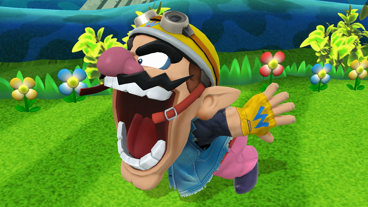
lol if those super basic mid-res textures and materials are the ones that ate the budget, they seriously need better programs

Follow along with the video below to see how to install our site as a web app on your home screen.
Note: This feature may not be available in some browsers.
The shell texture looks good though....lol if those super basic mid-res textures and materials are the ones that ate the budget, they seriously need better programs
through the entire process of making this bowser render no one objected to the fact that his jaw looks Like This. someone could stop this from happening and make him look like he has a normal open mouth but no one did