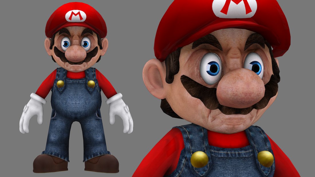
Look at it! Look at it! LOOK AT IT!

Short answer? Textures are annoying to work with on that shape, and modeled lids on said shape are even worse.
 
To be fair, the SNES sprite doesn't look all that much different.
 
Thanks to FanOfYoshi, I know of this.
tumblr_mgvta141q91rrftcdo1_1280.jpg

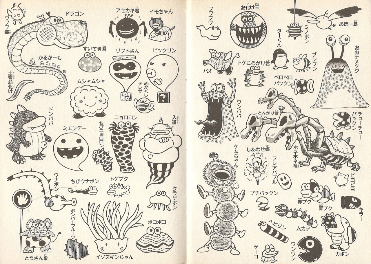
Kodansha depictions of Yoshi's Story enemies and misc critters. Presumably the Shy Guys and other missing things are on another page.

So apparently, when you eat a Power Bee/Happiness Butterfly, you're actually eating a fully-humanoid fairy. And I have no idea what's up with that Fuzzy Wiggler.

Blessed image. Blessed.
 
Doc von Schmeltwick said:
Short answer? Textures are annoying to work with on that shape, and modeled lids on said shape are even worse.

Not necessarily, depends on how the shape is unwrapped. I think it's mostly a stylistic choice, not a technical one.
 
Yoshi's story always was a whack looking game.
 
What's ironic about its style is that when SMW2 was being developed, Miyamoto complained when Nintendo attempted to pressure him into making it pre-rendered in style, like DKC. And then Story does exactly that (albeit with SMW2-like sprite rotation and distortion).
 
These generally look better in 2D because at the time, 3D modeling was far more constrained. I don't know what the thought process was behind that Wiggler because in 3D, it's very adorable.
 
You know...

This is ironic...

We have someone here who loves Mario but hates Yoshi...
 
Science has gone too far.
 
Mario Party X said:

I must not fear. Fear is the mind-killer. Fear is the little-death that brings total obliteration.
 
He tried hard scrawling them out after seeing the recent images.
 
Back