
Navigation
Install the app
How to install the app on iOS
Follow along with the video below to see how to install our site as a web app on your home screen.
Note: This feature may not be available in some browsers.
More options
You are using an out of date browser. It may not display this or other websites correctly.
You should upgrade or use an alternative browser.
You should upgrade or use an alternative browser.
Bad box arts
- Thread starter Xiahou Ba
- Start date
Flame Princess
Power Star
- Pronouns
- She/her
- MarioWiki
- MiracleDinner
hmm i wouldn't say i can think of any outright terrible box arts, but i guess bowser's inside story's is kinda bland especially when compared to how great the game is
Toadettefan
Avatar Credit to Yoshi the SSM
- Pronouns
- She/her
Usually, Pokémon boxart is great. They always have good boxes when it comes to Nintendo Consoles. But put them on the Sega Pico Beena, and you get this boxart.

If you never heard of the Beena, basically it's a successor to the Pico that was only released in Japan, and had several officially licensed Pokémon games on it during generations 3, 4, and 5. However, Pokémon Diamond & Pearl: Search for Pokémon! Adventure in the Maze's boxart is just way too cluttered with them. A few of them is nice, but this box has 30-40 Pokémon taking over all of the space, leaving very little room for anything else. Talk about laziness.
If you never heard of the Beena, basically it's a successor to the Pico that was only released in Japan, and had several officially licensed Pokémon games on it during generations 3, 4, and 5. However, Pokémon Diamond & Pearl: Search for Pokémon! Adventure in the Maze's boxart is just way too cluttered with them. A few of them is nice, but this box has 30-40 Pokémon taking over all of the space, leaving very little room for anything else. Talk about laziness.
- Pronouns
- She/her He/him
- Thread starter
- #31

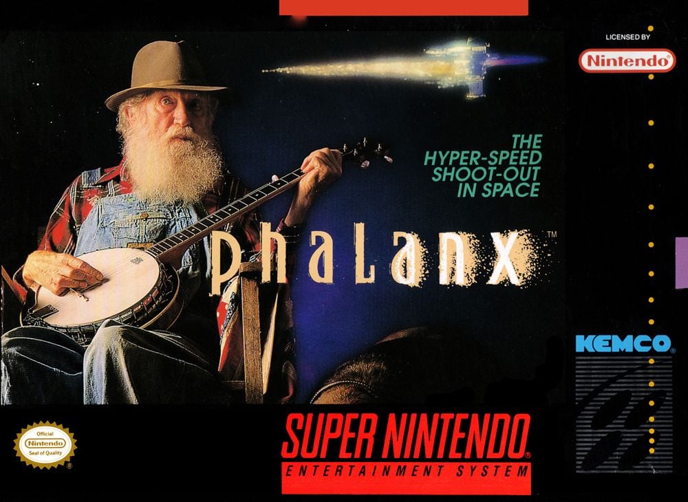
I know I'm cheating since this was bad on purpose but I never pass up an excuse to show the Phalanx box art.
It's...an interesting way to try to differentiate themselves from all the other space shooters in the market that's for sure.
Princess Viola
Dumbass Asexual
- Pronouns
- She/They

The worst part is like all the characters you can choose from in this game look very bizarre, but the guy on the cover is not one of them.


Basically most of the NES and virtually all of the SMS library. Aside from that I came to post Bust-A-Move, but of course that was posted, so:
It's just too random and unappealing to the target demographic. I know they were trying to be random but still, could've done better even with that angle.
It's just too random and unappealing to the target demographic. I know they were trying to be random but still, could've done better even with that angle.
- Pronouns
- He/him
I'm sorry but ever since they first showed this, I always found it stupid. Why is Claude upside-down
Kinda late, and maybe you already know this, but did you know that Claude actually do an upside-down animation in-game?
Bob Craples
went out for milk
- Pronouns
- He/Him
Princess Viola
Dumbass Asexual
- Pronouns
- She/They
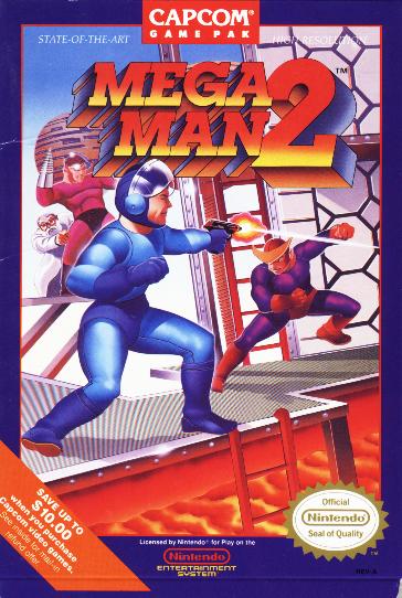
You know, I totally get why people continue to make fun of the North American box arts for Mega Man (and to a lesser extent Mega Man 2), but I think some of the later original series North American box arts are still pretty bad.
Take Mega Man 3 here for example:
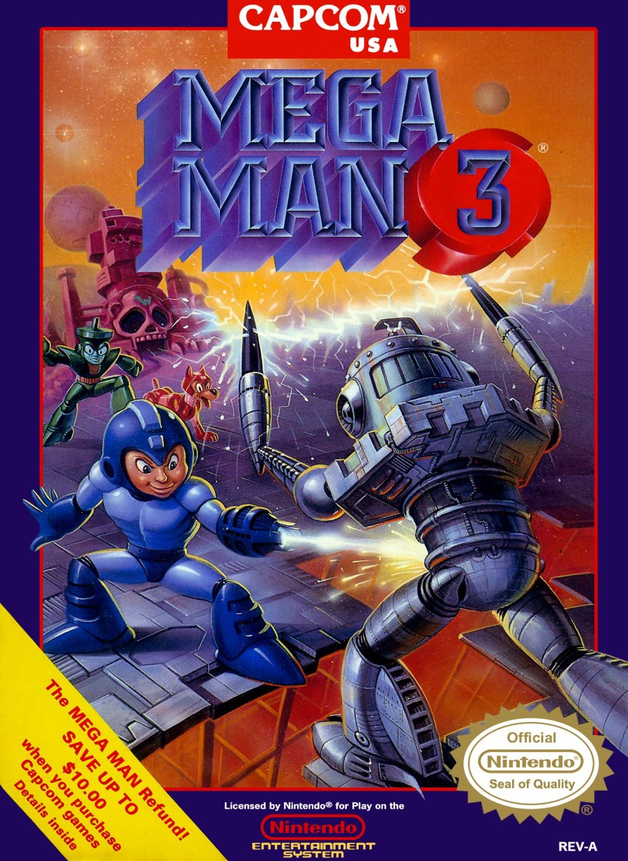
Like yeah you're no longer trying to make him look like some adult, but I really don't care for that whole early 90s thing with games with anime-style box art where they'd redraw it for the North American (and sometimes European) releases and give it a similar style but made more 'realistic' in terms of details and shading. Just looks weird and wrong to me.
Take Mega Man 3 here for example:
Like yeah you're no longer trying to make him look like some adult, but I really don't care for that whole early 90s thing with games with anime-style box art where they'd redraw it for the North American (and sometimes European) releases and give it a similar style but made more 'realistic' in terms of details and shading. Just looks weird and wrong to me.
Bob Craples
went out for milk
- Pronouns
- He/Him
"Seal of Quality" huh?
Toadettefan
Avatar Credit to Yoshi the SSM
- Pronouns
- She/her
Want some bad boxes from our favourite marsupial?
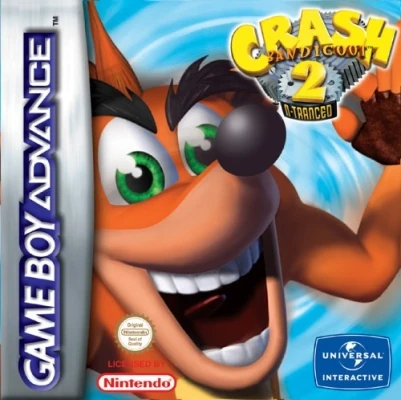
Here's N-Tranced's pal box. It's just Crash on a cyan background with his mouth open. It seems that once again, the Europeans simply don't care. Just look at what the Americans got.
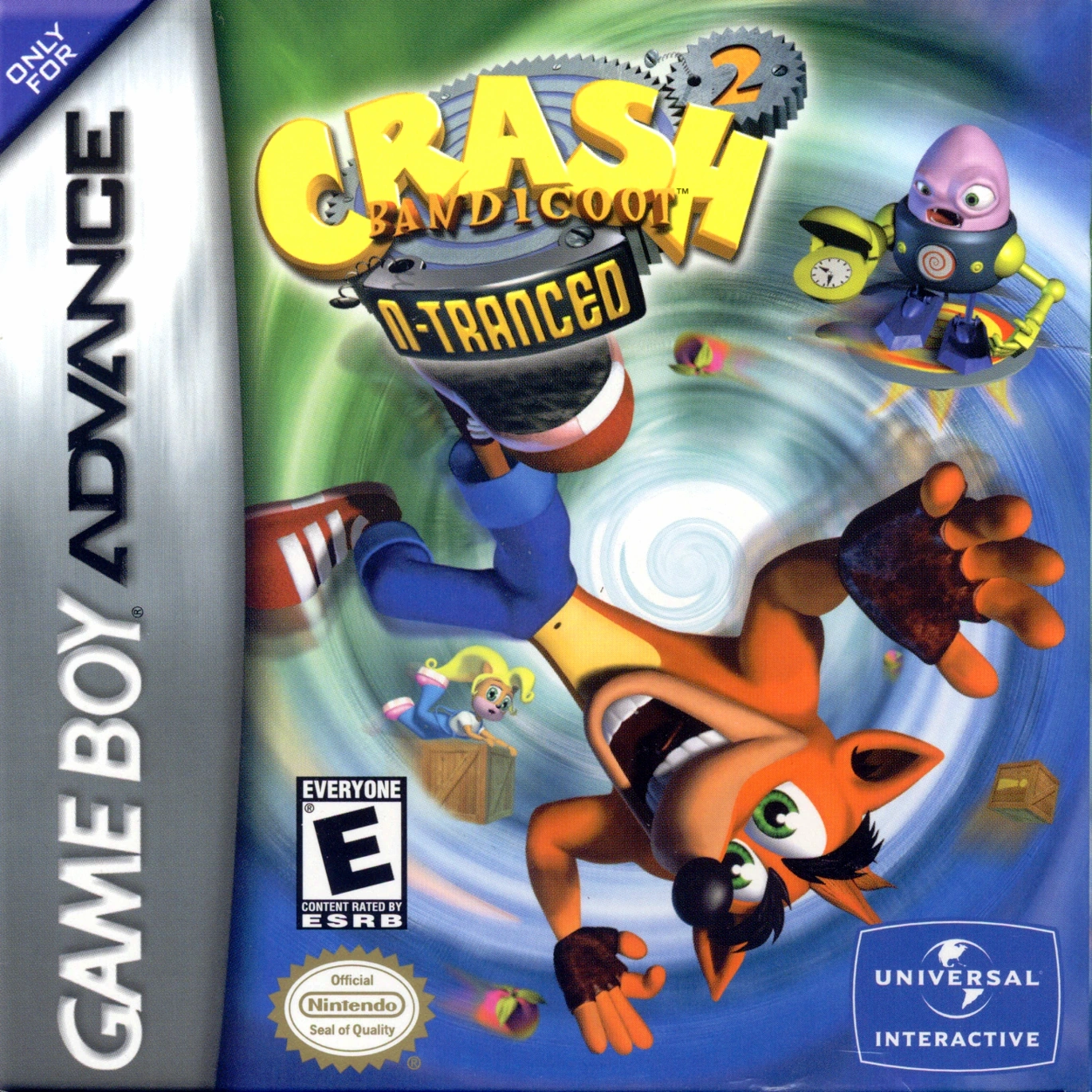
It doesn't even compare to this. How did the one above this one even pass? I swear, the euros have no sense of quality control at all.
Here's N-Tranced's pal box. It's just Crash on a cyan background with his mouth open. It seems that once again, the Europeans simply don't care. Just look at what the Americans got.
It doesn't even compare to this. How did the one above this one even pass? I swear, the euros have no sense of quality control at all.
Bob Craples
went out for milk
- Pronouns
- He/Him
They just put a render in front of a vortex, blurred it a tiny bit, and threw some logos in the corners. I could do better than that!Want some bad boxes from our favourite marsupial?
Here's N-Tranced's pal box. It's just Crash on a cyan background with his mouth open. It seems that once again, the Europeans simply don't care. Just look at what the Americans got.
It doesn't even compare to this. How did the one above this one even pass? I swear, the euros have no sense of quality control at all.
Last edited:
- Pronouns
- She/her He/him
- Thread starter
- #44
That Crash 2 European boxart is far too uncomfortably close to the camera, he looks like he's going to breathe on the lenses.
It's ugly and it has the most pointless use of the mirror effect ever.
View attachment 6554 What the hell?
It's ugly and it has the most pointless use of the mirror effect ever.
Euro Zero almost looks like he's on some theme park ride.
Left: North America.
Right: Europe.
I feel like Europe got the short end of the stick when it came to the Zero series' boxart.
Chair
yo that's a sick chair tho
- Pronouns
- He/him
Making a box art like this would not make people want to buy the game.View attachment 6554 What the hell?
Hot Chocolate
fuck it, we ball
- Pronouns
- She/They
- MarioWiki
- Cosmic Cowboy
This game was half my childhood, but...

They literally just put stock images of Lightning and Mater over a scene from the movie.
They literally just put stock images of Lightning and Mater over a scene from the movie.
Moldomré
Dry Bowser
Surprised no one has put the Ico boxarts in here. Here's the good one that was in the EU and Japan:

Seems mystifying and adventurous right?
Let's look at the North American boxart:

...oh. It's...a PS2 game all right. You can tell by the offputting graphics that are put front-and-center instead of a cool piece of art.
Seems mystifying and adventurous right?
Let's look at the North American boxart:
...oh. It's...a PS2 game all right. You can tell by the offputting graphics that are put front-and-center instead of a cool piece of art.
- Pronouns
- she/her
- MarioWiki
- Mario
I was gonna go defend the first box of Ico...
Moldomré
Dry Bowser
I was gonna go defend the first box of Ico...
"YOU JUST TRIGGERED MY TRAP CARD"