Should Mario get a redesign in one of the platformers? (as a one-shot thing)

Before you say "Nintendo will never redesign Mario because he's like the Mickey Mouse of video games and changing his appearance would be a huge risk to take and so they wouldn't even consider doing such a thing for a standard Mario platform.", I know, but I still think that having maybe just one single platform game using a different art style and character style (that might allow for a slight redesign for the main cast, there including Mario) might be really cool and a novel and exciting new take on the series' artistic style. Super Paper Mario doesn't count by the way, as it's a 2D platforming RPG but it's neither part of the Main 2D series nor of the 3D one, just of a pretty "platformy" spinoff...

And before anyone makes the "realistic looking Mario"-joke, I know that putting togheter "Mario" and "redesigned" or "reimagined" usually makes many people think of something like this:
mario_redesign_by_thebzrkr-d4notsf.jpg


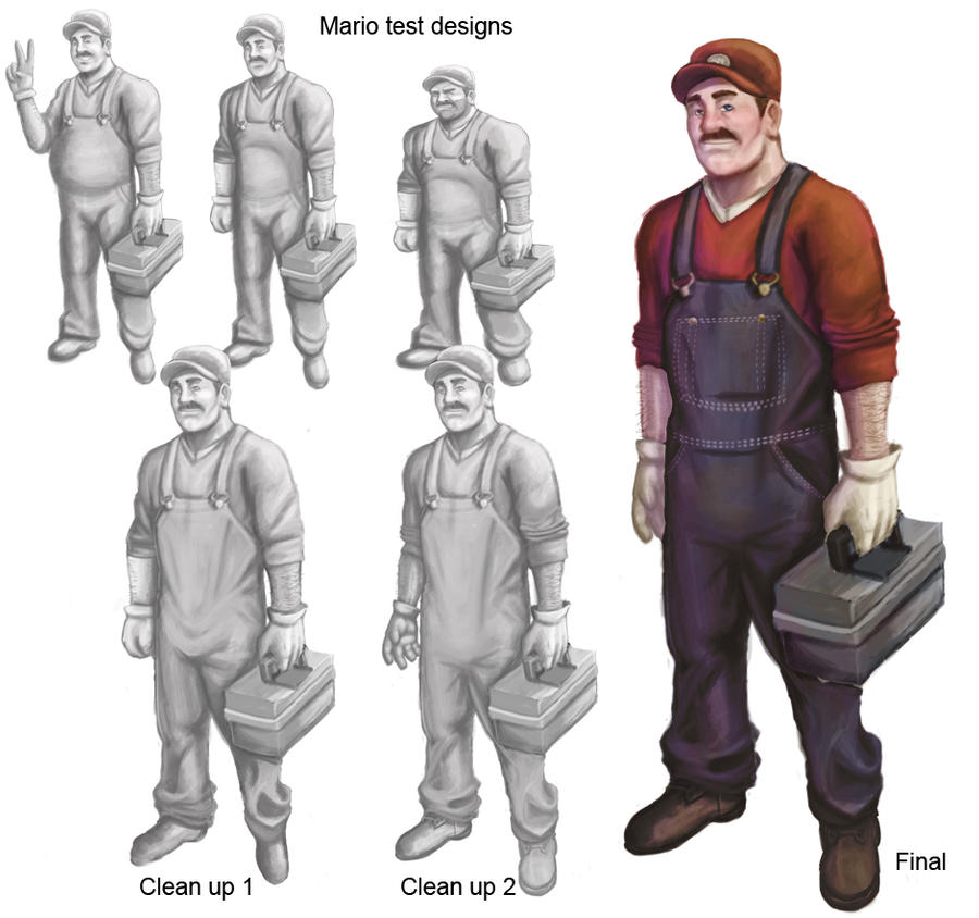
But that's not the kind of redesign we want, Mario should always feel like the jolly, cartoony moustached man-baby he is, and this overly-realistic reimagination is just your average plumber, he doesn't convey any of the characteristiques of classic Mario outside of the clothing and he'd be WAAAAY too photorealistic for a series that's famous for its cartoony looks. So this redesign is a big NO-NO!

To make a GOOD Mario redesign we still need to have the new Mario feel like the older Mario while looking new, as that's what a well-made redesigned should always accomplish. So here's a rendering of Mario's most recent appearance in 3D in Super Mario Odyssey:
ajq6yUI0CwPsclt4NQeSlVSlsq7HEScS.png


By looking at this image you see a colourful, happy and slightly-cutesy cartoon character that's really pretty and easy to look at and recognise, he has more or less the same exact look he had in the past years with the only change being more detailed textures (especially for the hair and overalls); yet even with those extra details he still looks simplistic and appealing just like his previous iterations. However that's just adding extra DETAIL to Mario's older look, so the changes Odyssey did aren't a redesign but just an "update" of the already existing look without actually changing it.

What we want, instead, is a Mario that looks different but feels the same, and stumbling on some Mario fan arts on the Internet I found one that I think features one of the greatest Mario redesigns I've ever seen so far:
536433_mizu-wolf_super-mario-odyssey.png

This one here is a PHENOMENAL redesign for Mario! He still conveys the same feel of your standard Mario, he still feels very cartoony and colourful like the original and it doesn't stray away from the original design that much, it's a look that's still really close to the original so anyone can say "That's Mario!" because the character is still 100% recognisable; the only extra change I'd make would be to replace his overrals' "round" buttons with a flat, slightly more realistic one (like this one: https://shop.buttons.com/v/vspfiles/photos/770012836100331-2T.jpg ) and it'd be absolutely perfect in my opinion!
It just made Mario a bit slimmer, gave him longer limbs, a wider moustache, more elongated irises and slightly altered his haircut (also replace the round buttons with the flat ones in your mind if you can, as I think they'd fit well), yet he still looks and feels like Mario while looking new, fresh and original at the same time.
Having a 2D Mario platformer, maybe using a 2D hands-drawn cartoony style where Mario looks like this would be a phenomenal-looking game! Just the fact that Mario and everything looks different would alone make it stand out from the NSMB series and, if they make another quality game like NSMBU, then it might be the gem that will stop people who say that 2D Mario never changes (or at least it would temporarily as it'd be a on-shot thing before more NSMB games arrive...)

And here's even another one that quite successfully manages to convey the same cartoony look and overall feel of Mario while not being as close to the original look:
d547fbdea23d1f8882e2dc8e5d942d9e.jpg

Make the overalls of actual blue and remove the texture from the hat (and maybe from the shirt aswell) and It'd be a Mario redesign that keeps the same cartoony feel of the original and conveys the same idea of the character while completely revamping and reimagining him, yet he'd still be Mario to anyone as you can't go wrong with those overalls, hat and moustache. This would be another spectacular redesign, only that it being so much more different from the current look (the previous one was just minor alterations to it) might cause it to never be used in a Mario platform game as it simply looks so diverse (and, again, Mario is a big icon so Nintendo would be scared of doing such a drastic change to him that's not forced a completely different art direction like in the Paper Mario games).

I personally think that the Mario shown in the Odyssey fan art might be the best candidate for a theoretical 2D platform where the graphic style is different, and I'd LOVE too see such a game be a real thing.
Sadly, even if we get lucky and NSMB won't appear on the Switch but another 2D Mario will, Mario will still keep the same look he always did in the past years. Not that's a bad thing, but a little graphical update/change might freshen him up a bit and he'd feel more interesting as a character.

What are your thoughts about a possible Mario redesign for a platform game? Would you like it? And how would you redesign Mario for a seres' main platformer if you could?
 
No.
 
While I think you make a good argument, I don't see the point personally; e.g. don't fix what isn't broken. The fact that Mario has remained the same for like 30 years is a key point for the series' popularity and success. That is if you're talking about platformers which are the most played and most well known (iirc) Mario games. I think the redesign in Paper Mario and other spin-off games is good enough because it signifies the different genre (e.g. Paper Mario is an RPG and not a platformer, so redesigning the characters makes sense so people won't readily assume it's a platformer)
 
I like to see more interesting experimental takes on Mario; after all, we've seen how Mario + Rabbids made people interested in how... different it was. That was from a gameplay standpoint. But you're right, Mario has to maintain his simplicity, appeal, and overall cuteness. I don't know what kind of DEGREE of redesign we're asking for as Mario has seen subtle redesigns like in Mario / Luigi where even his body proportions are different from the standard. Heck, the picture you cited isn't much of a redesign and is arguably as much of a "redesign" as Mario & Luigi Mario. In fact, it gives me Mario & Luigi vibes to begin with, with what the lankier arms and legs, which is pretty much what Dream Team Mario's sprite looks like.

Mario_Running.gif
Mario_Idle_-_MLPJ.gif


Overall, I like the interesting takes on Mario in fanart, and while I do like to see them in only spinoff games, I'm not exactly begging for a redesign.

I love Mario the way he is right now though. He's mostly perfect though I like to see a little punkiness from him (like Strikers Charged) and he needs to talk.
 
I think, if Miyamoto were to be believed, the fact that developers are interested in experimenting with different styles would be in line with what you want, but I do not think that they are strictly referring to platformers. Perhaps their experimentation won't satisfy them, but it's good that they are interested in giving Mario an art style that differs from his standard look. I feel this is why Paper Mario is intriguing: this style is a result of experimentation that went on to leave an impression to not only everyone who sees it, but Miyamoto himself.

Something I like about Kingdom Hearts is how Sora and his friends have an updated look based on which Kingdom they are in, such as Little Mermaid, Lion King and Nightmare Before Christmas. That's not to say they look different every place, since they kept their standard look in certain Kingdoms. Likewise, if Mario is going to different types of places, I would like to see Mario take on the look of that different place. For example, in a kingdom where everything is mosaic Mario would adapt a pixelated look. An oil painting area similar to historical paintings would provide Mario with an oil painting appearance.

Thank you for reading.
 
GIVE ME RED OVERALLS OR GIVE ME A GAME OVER
 
LeftyGreenMario said:
I like to see more interesting experimental takes on Mario; after all, we've seen how Mario + Rabbids made people interested in how... different it was. That was from a gameplay standpoint. But you're right, Mario has to maintain his simplicity, appeal, and overall cuteness. I don't know what kind of DEGREE of redesign we're asking for as Mario has seen subtle redesigns like in Mario / Luigi where even his body proportions are different from the standard. Heck, the picture you cited isn't much of a redesign and is arguably as much of a "redesign" as Mario & Luigi Mario. In fact, it gives me Mario & Luigi vibes to begin with, with what the lankier arms and legs, which is pretty much what Dream Team Mario's sprite looks like.

Mario_Running.gif
Mario_Idle_-_MLPJ.gif


Overall, I like the interesting takes on Mario in fanart, and while I do like to see them in only spinoff games, I'm not exactly begging for a redesign.

I love Mario the way he is right now though. He's mostly perfect though I like to see a little punkiness from him (like Strikers Charged) and he needs to talk.
The fact is that Mario is an incredibly popular and recognized character, therefore a "redesign" for a character of such impact shouldn't be that large, just subtle changes; again, he should look same-y but FEEL different. Look at how Rayman's appareance has changed in the mainstream platfromer games of his series:
Rayman_Brand_Anniversary_Evolution_151117_3PM_CET1.jpg

The only major redesign he had was during the jump from 2D (used in the original Rayman) to 3D (used in Rayman 2: The Great Escape), where they ditched the cutesy look with huge puppy eyes, round nose and large hands and they tried to make him a bit more "grown-up looking", likely to match the game's more serious tone compared to the first one. But after that, all the other appereances of Rayman are technicall still all redesigns of him, only that they are minor: yes, they did change him because of the style, but there are also some other alterations that aren't necessairly bound by a change in art direction and ALL the redesigns have at least a change.
Rayman 3 Rayman now has much more "messy hair", his eyeballs are now one piece instead of 2 (like Sonic's eyes) and the bandana he had around his "neck" is now a hood, he also has different shoes.
Rayman Origins made his nose bigger, changed his shoes again, made his hair even messier than before and slightly changed his hood.
The changes from Origins to Legends are much less noticeable and minor: his hands and shoes are a bit smaller and the "O" symbol on his shirt is larger, but he pretty much looks almost exactly like he did in Origins (without counting the different graphic style).

Those would be the kind of changes I'd like to see for Mario aswell, not a complete re-imaination of the character but just slight changes to his appereance to make him feel a bit more fresh and different, yet making him feel the same. By looking at the various Raymans you can tell without a doubt who the character is even with the alterations, as they're all small and he pretty much follows the same "base" but with a slightly different take on it every time (Rayman 1 excluded).
With the exception of Rayman 1's cutesy Rayman and Rayman 2's "heroic and serious" Rayman, all the other redesigns still give you the same feel of the character even if they are different from one another.

Now I know some of you might say that redesigning Rayman is easier than redesigning Mario because Rayman, even if less famous than Mario, is much easier to recognize than him just because of his really odd look (as he's a dude with no limbs, a body that looks like an eggplant and a weird haircut, can't go wrong with such an odd design...) so doing a similar thing for Mario while still letting people know "Hey! This isn't a spinoff! This is a main game in the series!" would be kinda hard, and that might be another reason for why they are so scared of updating Mario's look outside of simple texture changes/updates.
But I still think it'd be cool and refreshing regardless, it'd be such a breath of fresh air in a game series that, while changing his gameplay in great ways, is way too conservative in the stylistic department (again, I'm talking only about the main 2D and 3D series, no spinoffs); while it might not be NEEDED, it would make a great game even better.

Imagine f NSMBU had a different art style or if they simply decided to slightly alter Mario and Luigi's appereance in that game, even just a bit (maybe a longer moustache or a small decoration on his overral? Like a seam in the shape of a star?), that agme might have felt a tad bit more "new" other than "new stages and powerups".
Sure, the best option would be to change both Mario and the art style at the same time, so that's a thing to consider (as all the changes they did to Rayman also came with a different art style aswell and they were likely made for making him fit better with the new visuals), however since all 3D games (except those on N64) using different art styles still use the same look for Mario then it's unlikely that we might see a look change for Mario in any future mainstream game unless they also change the style of them significantly too.

winstein said:
I think, if Miyamoto were to be believed, the fact that developers are interested in experimenting with different styles would be in line with what you want, but I do not think that they are strictly referring to platformers. Perhaps their experimentation won't satisfy them, but it's good that they are interested in giving Mario an art style that differs from his standard look. I feel this is why Paper Mario is intriguing: this style is a result of experimentation that went on to leave an impression to not only everyone who sees it, but Miyamoto himself.

Something I like about Kingdom Hearts is how Sora and his friends have an updated look based on which Kingdom they are in, such as Little Mermaid, Lion King and Nightmare Before Christmas. That's not to say they look different every place, since they kept their standard look in certain Kingdoms. Likewise, if Mario is going to different types of places, I would like to see Mario take on the look of that different place. For example, in a kingdom where everything is mosaic Mario would adapt a pixelated look. An oil painting area similar to historical paintings would provide Mario with an oil painting appearance.

Thank you for reading.
The thing is that Miyamoto is a huge troll, so him saying that there will be a "new style of Mario" or "they might be experimenting with a new art style" means they are making a new style for a Mario spinoff, not a mainstream title, as those naturally have a different art, music and gameplay style. Or he actually meant "new style of (gameplay for) Mario", meaning that there would be minor changes of gameplay (like removing lives like they did with Odyssey or making GAMEPLAY changes, not visual ones) and not in the style of the game.

While a game changing its art style for each world might be a nice idea, usually it generates confusion and most people treat it as bad game design, and seehing how many people disliked the numerous style changes of the kingdoms in Odyssey then they'd react to a multi-styled Mario game in a similar, if not worse way...
We should just have one new style (and possibly a new-looking Mario because of it), not a bunch of them for each world as many people dislike inconsistent games. Seeing from how people hated the continous changes of art styles for the cutscenes in Crash: Mind Over Mutants, then doing the same for the actual game might get a similar, if not even worse response.

TheSuperStarSaga said:
Best Style


I'm bias clearly.
I'd love a 2D Mario platformer with a visual style like that, I always thought that the Mario & Luigi artwork would be a PHENOMENAL style to use in a non-RPGMario and Mario and Luigi's look in those games are fun and refreshing, I find them much more inviting than Mario's standard look in his 3D games. He looks more cartoony and goofy, which IMO suits the serie much more than his current "generic" look. Which is still cartoony, cute-sy and at rare times even a bit goofy/silly, don't get me wrong, but why stop halfway there when you can go all the way in making him seem like he's from a cartoony world? IMO the games would benefit so much more from a goofier tone, making them more silly might be a great thing IMO, after all we're talking about games where an ex-plumber has to save a princess that rules a kingdom of mushroom-people from getting kidnapped by an evil bull-dragon-turtle-thing who is obsessed with building castles and leads an army of evil mushrooms and turtles... While I think that anything can be taken seriously, a serie such as Mario is one of those things that would be better if they were made more explicitely dumb and goofy, too bad doing so would reduce Mario's "global, fits anyone"-appeal so we might never see it, as it would technically benefit the serie but it would make it less "generic and for anyone" and ths it would make it less accessible to the general auduence.
That's likely another reason for why Mario's 2D games always feel so "generic and monotonous", they change only the gameplay and stage designs and both in small increments each game, as making the serie more unique might remove it's global appeal and it would end up selling worse overral because of that...

Sgt Nate V said:
GIVE ME RED OVERALLS OR GIVE ME A GAME OVER
That's actually a thing I always thought they should let the players do: be able to choose between Mario and Luigi's current color pallette (blue overrals and unique-color shirt) or their original one (unique-color overrals and blue shirt), maybe in the character select screen or by choosing between the classic or modern look for Mario and Luigi from the Option Menu.
 
Jumping Spider said:
winstein said:
I think, if Miyamoto were to be believed, the fact that developers are interested in experimenting with different styles would be in line with what you want, but I do not think that they are strictly referring to platformers. Perhaps their experimentation won't satisfy them, but it's good that they are interested in giving Mario an art style that differs from his standard look. I feel this is why Paper Mario is intriguing: this style is a result of experimentation that went on to leave an impression to not only everyone who sees it, but Miyamoto himself.

Something I like about Kingdom Hearts is how Sora and his friends have an updated look based on which Kingdom they are in, such as Little Mermaid, Lion King and Nightmare Before Christmas. That's not to say they look different every place, since they kept their standard look in certain Kingdoms. Likewise, if Mario is going to different types of places, I would like to see Mario take on the look of that different place. For example, in a kingdom where everything is mosaic Mario would adapt a pixelated look. An oil painting area similar to historical paintings would provide Mario with an oil painting appearance.

Thank you for reading.
The thing is that Miyamoto is a huge troll, so him saying that there will be a "new style of Mario" or "they might be experimenting with a new art style" means they are making a new style for a Mario spinoff, not a mainstream title, as those naturally have a different art, music and gameplay style. Or he actually meant "new style of (gameplay for) Mario", meaning that there would be minor changes of gameplay (like removing lives like they did with Odyssey or making GAMEPLAY changes, not visual ones) and not in the style of the game.

While a game changing its art style for each world might be a nice idea, usually it generates confusion and most people treat it as bad game design, and seehing how many people disliked the numerous style changes of the kingdoms in Odyssey then they'd react to a multi-styled Mario game in a similar, if not worse way...
We should just have one new style (and possibly a new-looking Mario because of it), not a bunch of them for each world as many people dislike inconsistent games. Seeing from how people hated the continous changes of art styles for the cutscenes in Crash: Mind Over Mutants, then doing the same for the actual game might get a similar, if not even worse response.

I have never thought that Miyamoto is a "huge troll", especially when he's interviewed for an article (as opposed to a casual interview in a video like the one where Miyamoto questions for Super Mario Maker). Could you present some cases where Miyamoto presents the attitude that you are talking about?

I am not sure people disliked the numerous style changes for kingdoms in Super Mario Odyssey. At the very least, I liked that the style is different since it signifies how different going to different countries felt. Perhaps that could be in a Super Mario Wiki poll if there is a chance.

Perhaps you have a point when a visual identity for Mario is inconsistent, but I imagine the Mario development team could make it work if they feel it's a good idea (I do not know, but I trust the Mario development team's efforts).

Thank you for reading.
 
I say, yes, I want a stylistic change for the next Mario platformer. Hell, I even want a Mario x Rayman game done in the art style of the Ubi Frame work games, I think that would easily be a must-buy for me.

Paper Mario and Mario & Luigi has shown us what you could do if you had Mario designed in a slightly different style and they both pulled it off very nicely. Not to mention, it's also a breath of fresh air compared to how vanilla Mario has gotten over the years.
 
Seeing from how people hated the continous changes of art styles for the cutscenes in Crash: Mind Over Mutants,

I thought that was the only thing people actually liked about that game and what was actually disliked was the drastic and rather bad redesigns carried over from the previous game
 
plus just not being very fun to play.
 
Back