Guy Rocketram
Lower City Empathy
- Pronouns
- He/him
It looks like Link is really pissed at Mario, for telling him stupid jokes all day and is a second away from jabbing him with his Master Sword.

Follow along with the video below to see how to install our site as a web app on your home screen.
Note: This feature may not be available in some browsers.
Don't laugh, Mario's a sophomore in college strapped for cash, he had to make some budget cuts on his appearance for his Astrophysics textbooks
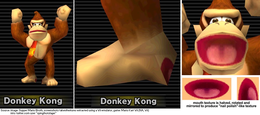
Wow.You can even see the eye sockets in the head.
Hat-Tip: Supper Mario Broth
Someone needs to hire a better modeler. TWO UV errors from Mario Kart Double Dash (remember Baby Mario)? And NO ONE noticed?
I've seen uglier Mario tattoos, though, like one where posted earlier in this thread of Mario and Yoshi were swapped. Yeesh.At first I thought these were tattoos. Imagine getting these permanently marked onto your skin.