Look at it! Look at it! LOOK AT IT!

I've seen enough of The Mask, Son of the Mask, and The Haunted Mask to know where that truly terrifying 2d render of a cardboarded Gooigi will do. And I humbly accept the fusion.
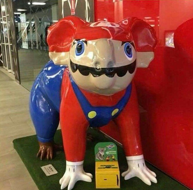
I just want to see how awful it looks with someone wearing it.
 
the most jarring thing about the image is the hard shadows from the singular light source

How about the superimposing the shitty turquoise texture with the comparatively-better pink one? Though it likely is just that the skinnier object to map to stretches a texture of about the same quality less...particularly since it stretches crappily over the eyes a bit.

But of course, having the sole purpose of being used as a template for sprites on a system that still builds things out of 8x8 tiles and a limited palette and as artwork itself doesn't lend itself to needing good lighting or texture. Especially if it's meant to be underwater.
 
Last edited:
unwrapping that center, fleshy pink portion of the model looks like a major pain in the ass. i think they could have cut a seam in the center of the eyes, though, since the eyes would cover it anyway.

i really don't know what they're trying to accomplish with that blurry turquoise texture though. it's like it wants to be metallic, but not quite.
 
That's an awesome picture. It doesn't belong here. Unless you want to LOOK AT IT because it's underappreciated!
 
The light logic seems okay? It's just the background that seems weird as hell.
 
MKT_Gold_Mario_render.png


i cant help but notice how utterly bad this pose is, especially compared to the other tour renders (though the hakama mario is still pretty bad)

compare it to this render of mario from fortune street, which has a better sihoulette, a better angle, better left shoulder, better spine rotation, and better left wrist pose. the left arm in general is posed really stiffly and poorly

450px-FortuneStMario.png
 
  • Like
Reactions: zel
i cant help but notice how utterly bad this pose is, especially compared to the other tour renders (though the hakama mario is still pretty bad)

compare it to this render of mario from fortune street, which has a better sihoulette, a better angle, better left shoulder, better spine rotation, and better left wrist pose. the left arm in general is posed really stiffly and poorly

iworkfornintendonow
 
Same. Couldn't find a "funny" caption for that reason.
 
Probably the best-looking balloon animal thing I've seen on here
And given how they generally look, that's not saying much. It just doesn't look tumorous.
6y2bg28.jpg


Well, I like this one too because it goes for a stylized look and it ends up looking cute (the highlight also helps bring life to the eyes; it wouldn't look as good in poor lighting)
 
Back