Starlight24
King Bowser
- Pronouns
- He/him
There was something about Rare's render style ... so dark , so wacky , yet so unique.

Follow along with the video below to see how to install our site as a web app on your home screen.
Note: This feature may not be available in some browsers.
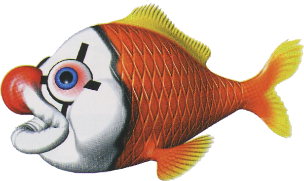
LeftyGreenMario said:Yeah, I don't think the previous two Donkey Kong Country games have any equivalent to this horrible monstrosity.

Yeah, that's probably one of the worst DKC renders. It is ugly because it has its upper lip swollen to resemble a clown nose; real . I always thought DKC3 had a somewhat odd direction in enemy appearances. Most fish do not have much of any nose beyond nostrils that are between their eyes and their lips.LeftyGreenMario said:(Koco)

")