
Navigation
Install the app
How to install the app on iOS
Follow along with the video below to see how to install our site as a web app on your home screen.
Note: This feature may not be available in some browsers.
More options
You are using an out of date browser. It may not display this or other websites correctly.
You should upgrade or use an alternative browser.
You should upgrade or use an alternative browser.
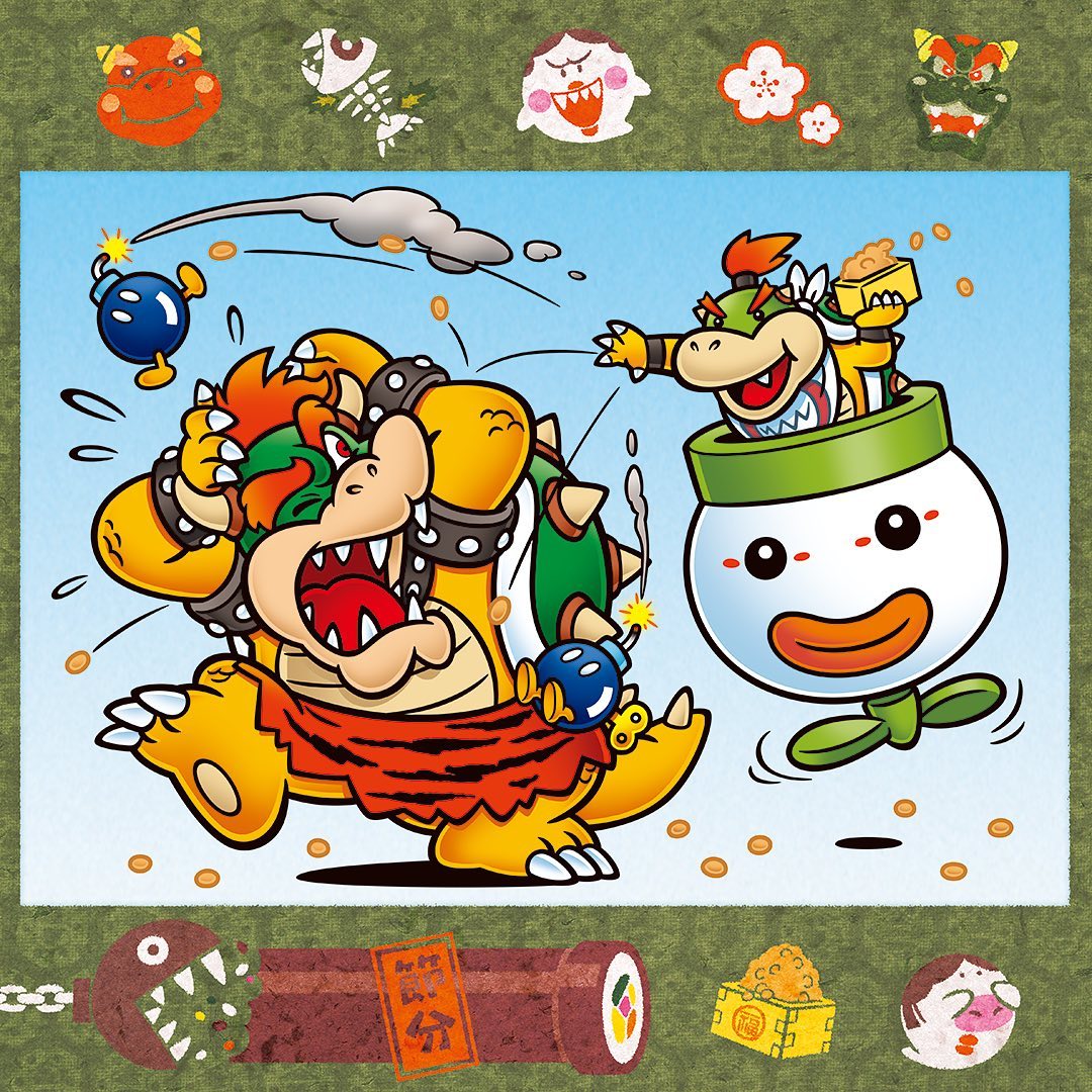
Mario pictures
- Thread starter Mcmadness
- Start date
And now for an oddity I talked about on Discord:
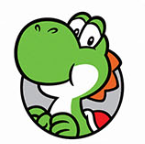
around in 2015, Nintendo for some reason decided to silently update Yoshi's design, changing some features. This updated design didn't even end up in 3D models, so far. And after all, you can see by looking at the changes appllied why they didn't bother implementing it yet:
PREVIOUS
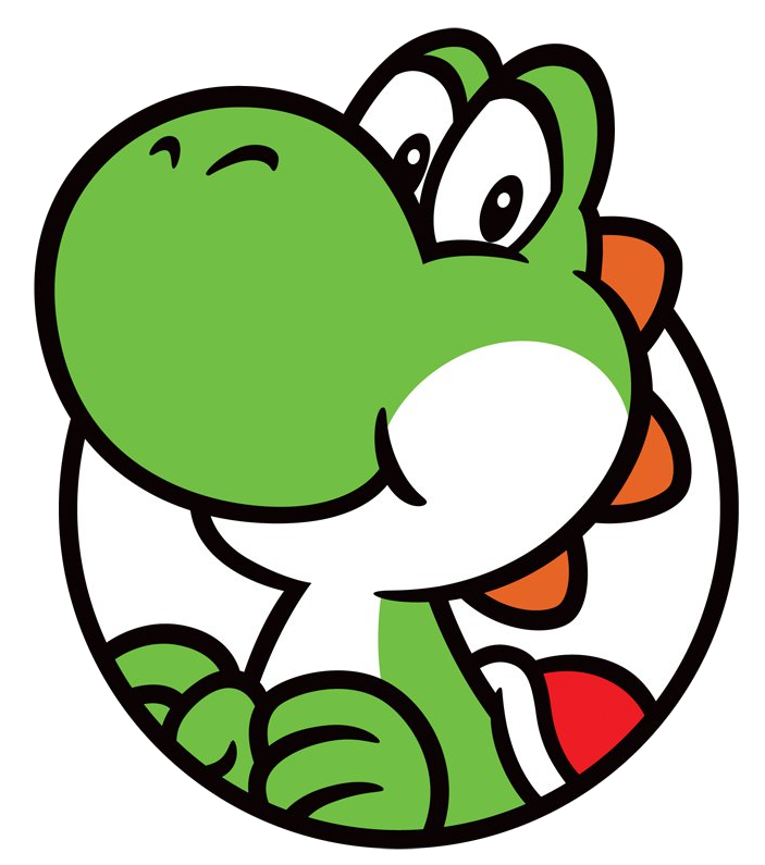
NEW
PREVIOUS
NEW

What are the features of this new design? Here are the ones I found in all their marginality:
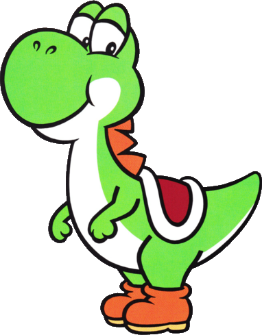
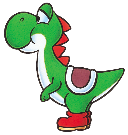
Yup, the "new" features come from the original design!
As if that wasn't enough, the brand new artwork featuring this updated design was often involved in a SNES posture renaissance:

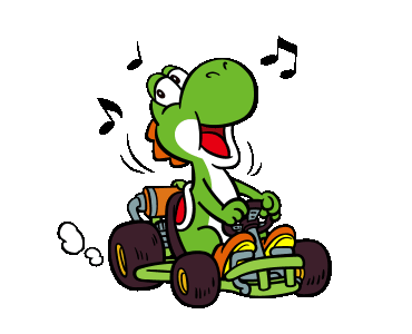
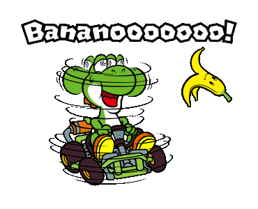
But it was the Mario Kart LINE stickers that definitely clarified what this design is aimed at, when compared to Super Mario Kart art:
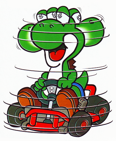
SUPER MARIO KART

MARIO KART LINE STICKERS
SUPER MARIO KART
MARIO KART LINE STICKERS
basically, the new design is so far used exclusively in artwork to go back a little to the SNES design feeling while still keeping the modern crest, shell (since it's now confirmed to be a shelled turtle) and, most importantly, hands.
around in 2015, Nintendo for some reason decided to silently update Yoshi's design, changing some features. This updated design didn't even end up in 3D models, so far. And after all, you can see by looking at the changes appllied why they didn't bother implementing it yet:
PREVIOUS
NEW
PREVIOUS
NEW
What are the features of this new design? Here are the ones I found in all their marginality:
- more defined nostrils
- actual eyelids instead of that brow thing
- more prominent protrusion behind the eyes
- smaller white part on the cheeks
- the crest spikes are nearer one another and all point downward
Yup, the "new" features come from the original design!
As if that wasn't enough, the brand new artwork featuring this updated design was often involved in a SNES posture renaissance:
But it was the Mario Kart LINE stickers that definitely clarified what this design is aimed at, when compared to Super Mario Kart art:
SUPER MARIO KART
MARIO KART LINE STICKERS
SUPER MARIO KART
MARIO KART LINE STICKERS
basically, the new design is so far used exclusively in artwork to go back a little to the SNES design feeling while still keeping the modern crest, shell (since it's now confirmed to be a shelled turtle) and, most importantly, hands.
Or not?
2020
SNES-era
Man, if they reintroduce dino-hands-and-posture Yoshi I'll almost end up flutter jumping out of contentness, I soooo liked that!
2020
SNES-era
Man, if they reintroduce dino-hands-and-posture Yoshi I'll almost end up flutter jumping out of contentness, I soooo liked that!
Gay Rights Luigi
watch fop a new wish or you're... straight ahaha
- Pronouns
- He/It
- MarioWiki
- Crazy Mr. L Fanguy
I like the older modern design. More cute imo.
Doc von Schmeltwick
Multi-hat Koopa cutie
- MarioWiki
- Doc von Schmeltwick
I like the movie design 
As a fan of dinosaurs, I can't argue against that...I like the movie design
#mostdinoYoshievah
Last edited:
Gay Rights Luigi
watch fop a new wish or you're... straight ahaha
- Pronouns
- He/It
- MarioWiki
- Crazy Mr. L Fanguy
That's kinda cute tbh. If someone were to redraw it as actual Mario that would be awesome~
- Pronouns
- she/her
- MarioWiki
- Mario
Calls to mind this


zel
probably quit [see about for info]
- Pronouns
- she/her
i was on models resource and found this gobblegut statue model from mk8dx, appearing in dragon palace i think
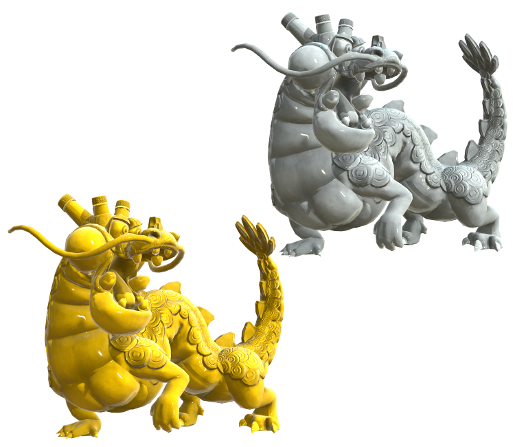
its pretty interesting cause it has a slightly more realistically proportioned chunkier body and limbs instead of just being spaghetti. i like that!
its pretty interesting cause it has a slightly more realistically proportioned chunkier body and limbs instead of just being spaghetti. i like that!
Doc von Schmeltwick
Multi-hat Koopa cutie
- MarioWiki
- Doc von Schmeltwick
Bowser was orange in-game in the very early days for the simple reason that the NES cannot make a "true" yellow and uses tan or orange, and that kinda stuck around until Sunshine. I prefer the orange myself.
I actually like that a lot too, even more than the original! It's a "short & chunky" Chinese dragon version of Gobblegut and it turned out very well in my opinion!i was on models resource and found this gobblegut statue model from mk8dx, appearing in dragon palace i think
its pretty interesting cause it has a slightly more realistically proportioned chunkier body and limbs instead of just being spaghetti. i like that!
Gay Rights Luigi
watch fop a new wish or you're... straight ahaha
- Pronouns
- He/It
- MarioWiki
- Crazy Mr. L Fanguy
Front facing DiC Luigi is rare so I love this.
Hot Chocolate
fuck it, we ball
- Pronouns
- She/They
- MarioWiki
- Cosmic Cowboy
this is so invaluable for making a 3D model out of them really thanks for sharing!
I got a good feeling about this
- Pronouns
- she/her
- MarioWiki
- Mario
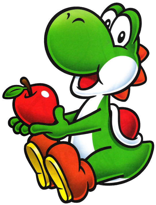
I still think the most jarring thing about Super Mario Bros. 3 is the Tanooki Mario that's flying. He looks so different from the "normal" Mario, like they just copy-pasted the original art and didn't really adapt it?
Gay Rights Luigi
watch fop a new wish or you're... straight ahaha
- Pronouns
- He/It
- MarioWiki
- Crazy Mr. L Fanguy
Only thing really changed was the head, and even that's a stretch.