- Thread starter
- #51
SiFi said:On a more serious note, Super Mario RPG. Most of the elements exclusive to that game just look so out of place
iconic mario character

Follow along with the video below to see how to install our site as a web app on your home screen.
Note: This feature may not be available in some browsers.
SiFi said:On a more serious note, Super Mario RPG. Most of the elements exclusive to that game just look so out of place
My bad, The GBA may have been more advanced than the SNES (32 bit vs 16 bit), but the games were nowhere close to the 64 which is why I called it "SNES level". Even though maybe the more proper term would be in between SNES and N64 but that wasn't my point. Also comparing handheld sales to console sales is again, like comparing apples to oranges as more people (in the gamer market as a whole) will buy handhelds because they are cheaper and more convienent than home consoles. The DS for example, sold over 50 million more units than the Wii (even though it came out two years before the Wii it is safe to say it would still overtake sales of the Wii even if it came out at the same time), even though the Wii was considered revolutionary when it came out and was in high demand.Glowsquid said:calling the GBA "SNES-level" is ridiculously wrong
Don't know why nintendo would choose to make a SNES-level console (even if it was a handheld and had more technical limitations as opposed to home consoles) when they already had the Gamecube which was much more powerful, and essentially went back 10 years in terms of technical evolution.
one device sold 81 millions and the other sold 22 millions. Hint: it's not the Gamecube.

Boshi said:more people (in the gamer market as a whole) will buy handhelds because they are cheaper and more convienent than home consoles
Boshi said:Additionally, i hate the graphics on most Game Boy Advance titles. Don't know why nintendo would choose to make a SNES-level console (even if it was a handheld and had more technical limitations as opposed to home consoles) when they already had the Gamecube which was much more powerful, and essentially went back 10 years in terms of technical evolution.
Boshi said:Also comparing handheld sales to console sales is again, like comparing apples to oranges as more people (in the gamer market as a whole) will buy handhelds because they are cheaper and more convienent than home consoles.


Trunks Mario said:I know Yoshi's Island DS has been mentioned for its bad sprite work, but I remember trying to manually recolor the Yoshi sprite in paint years ago. Shading inconsistencies and color banding HAS been pointed out, but I like to bring more examples.
https://www.spriters-resource.com/resources/sheets/5/4875.gif
It turns out that the contrast in the shadows is really bad. The Yoshi sprite in general has very little shadow contrast, at least in the skin. The white part of the Yoshi has more of a contrast going on, but it's jarring that the skin's shadows are so faint, it looks like one color. It doesn't help that other sprites in Yoshi's Island DS have more shading contrast so the shading in general is very inconsistent. Take Nep-Enut, and also, its shading is extremely lazy. There is no illusion that the form is 3D. Kind of defeats the point of shading, doesn't it?
But then, a similar enemy, but smaller, gets a different ruleset for shading. Here, the shadow actually seems to wrap the form and even the mouth has shading going on. Also, the red contrasts more sharply here and clashes with the Red Yoshi sprite.
I also don't understand why some enemies have banded shading like the Nep-Enut, but then, you also get things like Gobblin, where the shading style is... more elaborate. The shading is better here, but there is a weird illusion of smoother shading going on here, and that completely conflicts with the harsh bands of the Nep-Enut and both still are inconsistent with Yoshi
The shading is so inconsistent, it looks like Yoshi's Island DS was made by several different artists who were unaware they were working on the same game.
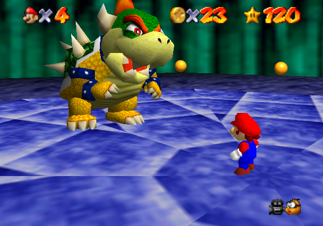
Trunks Mario said:I think the environments in Super Mario 64 are fine. It's just that Bowser looks horrible.
Swiftie_Luma said:i mean yeah ... but im also the same person that thinks Baby Bowser barking in Yoshi story was cute lol
i need a doctor.
Magikrazy said:dont worry, there are people here who need one more than you
*glares at literally everyone who posts in Marioverse*
