Mario, being a video game character that is currently 34 years old (remember he starts from Donkey Kong the arcade game!), had been exposed to various types of art styles that are ever-changing with the times. This means that he had gathered quite a lot of art styles that, while distinct from each other, defines Mario very well. Here, I will do my best to categorise all art styles to cover as many categories as possible.

1) Retro art style - This one is kind of a stretch, since there are lots of different interpretations on how Mario and Donkey Kong looked like. The most dominant Mario art style gives it a retro cartoon look reminiscent to something you see in Popeye or Betty Boop, though there are some extreme examples as well, with Atari intepreting Mario as a macho person and Donkey Kong as a ferocious gorilla in the CBS Electronics box art. It should be noted that Mario had a bald top back then. The Japanese style is different for Donkey Kong, though Mario Bros. appear to be the same between the East and the West. Mario is drawn in a very simplistic look, showing his basic features and short stature (shorter than all the art styles below). Lines are thick and colouring is lacking shading, which is why is looked simple compared to later games. This retro Mario art style is appealing in a retro way, showing Mario when he started.

2) Hand-Drawn Art style - This art style is notably used ever since Super Mario Bros. in Japan, and extending its way to SNES, GB, GBC and GBA. Mario now has natural shading, and his features are set as a foundation for later series (save for the colour of his overalls and shirt, which will change in a few games). Not all characters in the earlier games are modelled as they are now, such as Mario being stubby and having shorter legs, but that is changed later on. Sometimes, the shading is not there, instead just showing the characters with a bit of thick line and flat colours, meaning only the art style remains.

3) DIC Mario Cartoon Art style - As its name suggests, this art style is used in Mario cartoons, specifically Super Mario Bros. Super Show, Super Mario Bros. 3 and Super Mario World. This style seemed like it is very Western in nature, being that is styled by them. For example, Mario and Luigi's eyes look like pies with a slice cut off, and Princess (as they called her here) is red-haired. King Koopa looks drastically different in this version, even! This art style qualifies here because there are official art with these characters on some video box arts, so in essence, Hotel Mario's cutscenes don't count as an official art style because there are no official depictions of characters as shown there (besides, the box art uses the "Hand-Drawn Art style".

4) Valiant Mario Art Style - The Mario comics released by Valiant have a style that gives it a western comic book flavour, in a different way from the DIC cartoons. Characters and scenery are given a more realistic depiction while retaining the cartoony style Mario is known for.

5) Manga Mario Art Style (Mainly Super Mario-Kun) - This art style is mainly used in the Mario manga. There are different Mario manga throughout, but Super Mario-Kun takes priority when talking about this style, mainly due to its long-running history. The character's models are very different from the official counterpart, where everyone is deformed and have a more expressive mouth. In Super Mario-Kun's case, the eyes of most characters are close to each other.


6) Club Nintendo/Nintendo Power Mario Comics Art Style - Used during Nintendo Power's Super Mario Adventures comics, this style is sort of a fusion between the expressiveness of the manga style and the colourful cartoony western style. The art style in Club Nintendo's comics are more western-flavoured, but I put it together here because its zaniness is comparable to the expressiveness of Super Mario Adventures. Both are also comics for Nintendo's official magazines, anothing thing common between them.

7) Silicon Art Style - Most notably used in the Donkey Kong Country games of old and the N64 games. This style is mainly used to signify the character's jump to 3D, or in Donkey Kong's case, pre-rendered graphics. It has primitive shading that make the characters look shiny in places that shouldn't be (like the moustaches), probably because of the silicon graphics used during that era. If looking at these now, perhaps one might feel that they look uncanny compared to present portrayals.

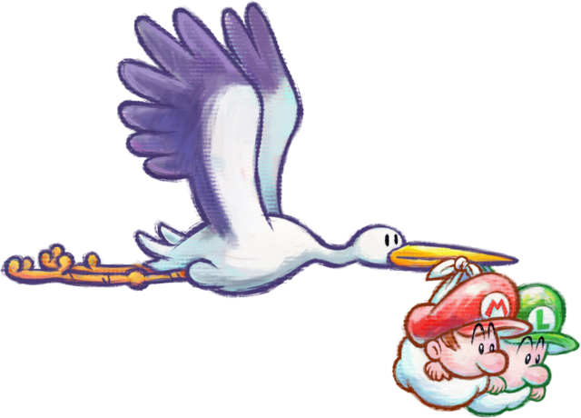
8) Yoshi Art Style - Used in the Yoshi series ever since Yoshi's Island (or Super Mario World 2 if you are so inclined to call it that), save for Yoshi's Story (which used the Silicon Art style). With its more crudely drawn lines and crayons and pastels as a basis for colouring, it has a very child-friendly look in its atmosphere.

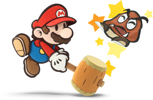
9) Paper Mario Art Style - Used in the Paper Mario games, Mario has a lot of features simplified. For one, Mario's eyes are black dots. Unlike most art styles here, Paper Mario's aesthetics evolve overtime. From the mixture of hand-drawn and paper to a more paper-like look with fragmented parts (sometimes with a paper model look) to a more realistic paper look, this style has charm that (Paper) Mario fans adore.

10) CG Mario Art Style - This is the most prevalent art style. It is first used during the Gamecube era starting with Luigi's Mansion and extending its way to the Wii, DS and certain 3DS games. Even the New Super Mario Bros. series used this style. This style could sometimes have rim lighting added as well, as seen in the Super Mario Galaxy series and Mario Party 9. Because it portrays the character models well as well as being easily recyclable as models (I guess), it's used a lot.

11) Mario and Luigi Art Style - Used in, you guessed it, the Mario and Luigi games. It has a hand-drawn look that is distinct within this series, with what looks like it's been coloured with water colours. It sets the tone of the series, which is the humorous side with a sense of epicness in the adventure.

12) Clean Digital Art Style - Notably used in the Mario vs. Donkey Kong series, WarioWare series, as well as modern depictions of Mario drawn in 2D. The style is similar to the "Hand-Drawn Art style" in that the characters are organic, but they are digitally drawn instead of hand-drawn, creating a cleaner look with flat colours and clearer shading.

13) High-Definition Art Style - This is the most recent Mario art style, to showcase Mario in High-Definition (HD). It is most notably used in the Wii U Mario games starting from Super Mario 3D World. Here, Mario is more detailed than ever, showing more subtleties in lighting and detail, having textures on the surfaces as well as a more detailed M-emblem (you can see the stitches now), among others. It may not be realistic to some, but the clean art style makes it distinct from other games, and is quite pleasing to look at. Some 3DS games might have the subtle shading as well, though not some of the details, as seen in Mario Golf: World Tour and Mario Party: Island Tour. This extends to Donkey Kong too, whose fur is as impressively detailed in the official art of Tropical Freeze.

14) Mario Strikers Art Style - Obviously, this art style is used in the Mario Strikers series. This series is generally known to be rougher than the usual Mario fare, hence the rougher outlines for its official artwork. Not only is it portrayed as a rougher alternative, it also shows vibrant energy in its characters, through its lines and colours. Combining the hand-drawn and vibrant look, it gives Mario Strikers a vibe of excitement. (This category is added on 8th April 2015)
These are the 10+ categories of art styles I know of. Maybe there are more that I didn't know of, but it should be all of them for now. So, which of these are your favourite?
Thanks for reading.

1) Retro art style - This one is kind of a stretch, since there are lots of different interpretations on how Mario and Donkey Kong looked like. The most dominant Mario art style gives it a retro cartoon look reminiscent to something you see in Popeye or Betty Boop, though there are some extreme examples as well, with Atari intepreting Mario as a macho person and Donkey Kong as a ferocious gorilla in the CBS Electronics box art. It should be noted that Mario had a bald top back then. The Japanese style is different for Donkey Kong, though Mario Bros. appear to be the same between the East and the West. Mario is drawn in a very simplistic look, showing his basic features and short stature (shorter than all the art styles below). Lines are thick and colouring is lacking shading, which is why is looked simple compared to later games. This retro Mario art style is appealing in a retro way, showing Mario when he started.

2) Hand-Drawn Art style - This art style is notably used ever since Super Mario Bros. in Japan, and extending its way to SNES, GB, GBC and GBA. Mario now has natural shading, and his features are set as a foundation for later series (save for the colour of his overalls and shirt, which will change in a few games). Not all characters in the earlier games are modelled as they are now, such as Mario being stubby and having shorter legs, but that is changed later on. Sometimes, the shading is not there, instead just showing the characters with a bit of thick line and flat colours, meaning only the art style remains.

3) DIC Mario Cartoon Art style - As its name suggests, this art style is used in Mario cartoons, specifically Super Mario Bros. Super Show, Super Mario Bros. 3 and Super Mario World. This style seemed like it is very Western in nature, being that is styled by them. For example, Mario and Luigi's eyes look like pies with a slice cut off, and Princess (as they called her here) is red-haired. King Koopa looks drastically different in this version, even! This art style qualifies here because there are official art with these characters on some video box arts, so in essence, Hotel Mario's cutscenes don't count as an official art style because there are no official depictions of characters as shown there (besides, the box art uses the "Hand-Drawn Art style".

4) Valiant Mario Art Style - The Mario comics released by Valiant have a style that gives it a western comic book flavour, in a different way from the DIC cartoons. Characters and scenery are given a more realistic depiction while retaining the cartoony style Mario is known for.

5) Manga Mario Art Style (Mainly Super Mario-Kun) - This art style is mainly used in the Mario manga. There are different Mario manga throughout, but Super Mario-Kun takes priority when talking about this style, mainly due to its long-running history. The character's models are very different from the official counterpart, where everyone is deformed and have a more expressive mouth. In Super Mario-Kun's case, the eyes of most characters are close to each other.


6) Club Nintendo/Nintendo Power Mario Comics Art Style - Used during Nintendo Power's Super Mario Adventures comics, this style is sort of a fusion between the expressiveness of the manga style and the colourful cartoony western style. The art style in Club Nintendo's comics are more western-flavoured, but I put it together here because its zaniness is comparable to the expressiveness of Super Mario Adventures. Both are also comics for Nintendo's official magazines, anothing thing common between them.

7) Silicon Art Style - Most notably used in the Donkey Kong Country games of old and the N64 games. This style is mainly used to signify the character's jump to 3D, or in Donkey Kong's case, pre-rendered graphics. It has primitive shading that make the characters look shiny in places that shouldn't be (like the moustaches), probably because of the silicon graphics used during that era. If looking at these now, perhaps one might feel that they look uncanny compared to present portrayals.

8) Yoshi Art Style - Used in the Yoshi series ever since Yoshi's Island (or Super Mario World 2 if you are so inclined to call it that), save for Yoshi's Story (which used the Silicon Art style). With its more crudely drawn lines and crayons and pastels as a basis for colouring, it has a very child-friendly look in its atmosphere.

9) Paper Mario Art Style - Used in the Paper Mario games, Mario has a lot of features simplified. For one, Mario's eyes are black dots. Unlike most art styles here, Paper Mario's aesthetics evolve overtime. From the mixture of hand-drawn and paper to a more paper-like look with fragmented parts (sometimes with a paper model look) to a more realistic paper look, this style has charm that (Paper) Mario fans adore.

10) CG Mario Art Style - This is the most prevalent art style. It is first used during the Gamecube era starting with Luigi's Mansion and extending its way to the Wii, DS and certain 3DS games. Even the New Super Mario Bros. series used this style. This style could sometimes have rim lighting added as well, as seen in the Super Mario Galaxy series and Mario Party 9. Because it portrays the character models well as well as being easily recyclable as models (I guess), it's used a lot.

11) Mario and Luigi Art Style - Used in, you guessed it, the Mario and Luigi games. It has a hand-drawn look that is distinct within this series, with what looks like it's been coloured with water colours. It sets the tone of the series, which is the humorous side with a sense of epicness in the adventure.

12) Clean Digital Art Style - Notably used in the Mario vs. Donkey Kong series, WarioWare series, as well as modern depictions of Mario drawn in 2D. The style is similar to the "Hand-Drawn Art style" in that the characters are organic, but they are digitally drawn instead of hand-drawn, creating a cleaner look with flat colours and clearer shading.

13) High-Definition Art Style - This is the most recent Mario art style, to showcase Mario in High-Definition (HD). It is most notably used in the Wii U Mario games starting from Super Mario 3D World. Here, Mario is more detailed than ever, showing more subtleties in lighting and detail, having textures on the surfaces as well as a more detailed M-emblem (you can see the stitches now), among others. It may not be realistic to some, but the clean art style makes it distinct from other games, and is quite pleasing to look at. Some 3DS games might have the subtle shading as well, though not some of the details, as seen in Mario Golf: World Tour and Mario Party: Island Tour. This extends to Donkey Kong too, whose fur is as impressively detailed in the official art of Tropical Freeze.

14) Mario Strikers Art Style - Obviously, this art style is used in the Mario Strikers series. This series is generally known to be rougher than the usual Mario fare, hence the rougher outlines for its official artwork. Not only is it portrayed as a rougher alternative, it also shows vibrant energy in its characters, through its lines and colours. Combining the hand-drawn and vibrant look, it gives Mario Strikers a vibe of excitement. (This category is added on 8th April 2015)
These are the 10+ categories of art styles I know of. Maybe there are more that I didn't know of, but it should be all of them for now. So, which of these are your favourite?
Thanks for reading.