- Pronouns
- He/him
The modelling on this one isn't the problem.
It's the texture.

It's the texture.

Follow along with the video below to see how to install our site as a web app on your home screen.
Note: This feature may not be available in some browsers.
Yoshi is melding between two realities.Yoshi's got a shadow mouth mustache!
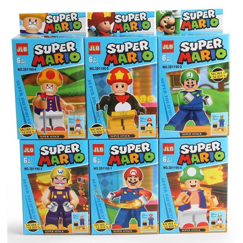
U L T I M A T Ehow the heck can the bootleggers get the facial detail on mario and luigi correct but not even bother with the l on luigi's hat?


