winstein's art thread, with drawings of miscellany

The Mysterious Gait Under Wraps

Anim-Dem-Walking-Legs.gif
(Note: There is a higher-resolution version; the version above is the one that's most commonly shared, due to its lower amount of memory)

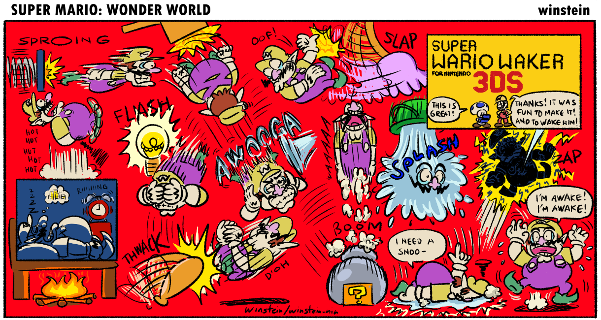
It's a start of a new page, and I decided to start with a piece that got a surprising amount of popularity.

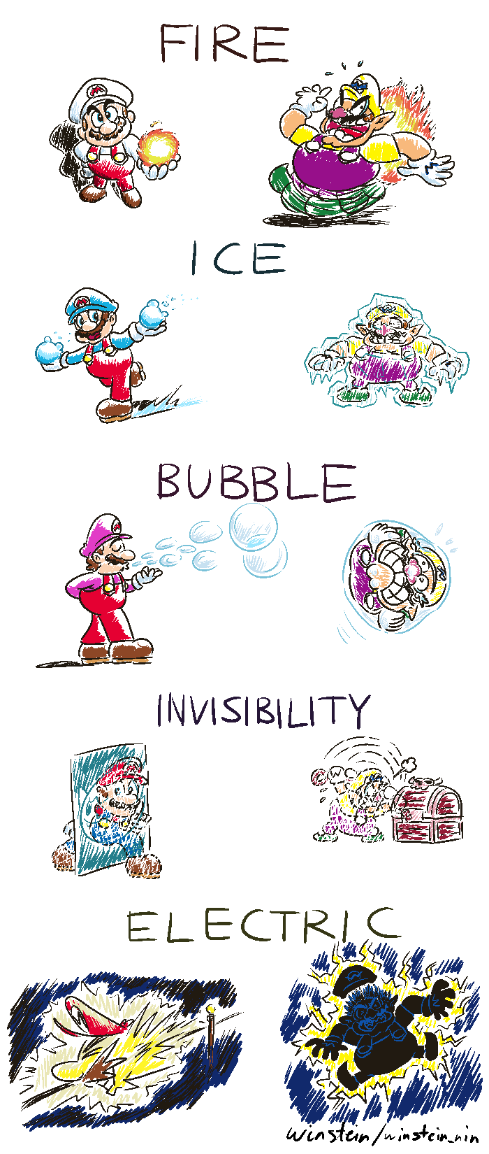
Sometimes, I get some inspiring ideas on unusual thoughts about the Mario series, and if I'm lucky, they get to be drawn. What you see above is a result of one of my ideas that I felt has potential to be something more. The basic idea is: what does Peach's dress look like underneath it? Specifically, how do the legs move under the skirt? You see, in Paper Mario, only three humans exist: Mario, Luigi, and Peach. Mario and Luigi's feet move like a pendulum, which leaves little to the imagination. But Peach is another matter. She is never seen in any other clothing that shows her legs.

Indeed, nobody seems to ask this question but that means it's also a question begging for some natural suggestions, and off-the-wall ones. This idea initially started out as a mere sketch and some strange suggestions, but eventually I wanted to use it as an opportunity to draw animation.
This animated piece is my serious attempt, whereas previous ones were just small stuff. Indeed, the real challenge is coming up with how the legs move in motion. Some, they were easy, but many of them were difficult. For example, the Regular one features normal walking, but animating a walk is not so easy.

A couple of them got revisions. Float had less feet movement but I decided to redraw it to give it clearer movements. Also, wheel initially have the feet moving clockwise until someone pointed out that it looked like it moves backwards, which is a good call because I didn't notice it.

This is a 12-frame animated piece, and it loops every second, so it's 12fps. Within the 12 frames certain things took advantage of the whole 12 frames, while others are 6 unique images stretched across 12 frames (2 frames each). This is most evident in the text, which I should point out were not animated uniquely. Since I had fun with the result, I just threw in the animated text. One thing that I initially also did was to put Paper Peach blinking, but blinking every second looks a bit unnatural, so the blinking motion is omitted. Indeed, I think blinking probably looks best at 2 seconds each time, or maybe more.

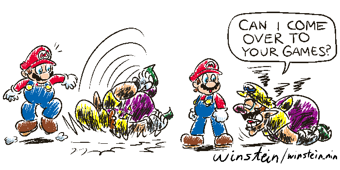
Initially, I shared this piece on Reddit and Tumblr, the former in r/papermario and reposted at r/mario. I left the art overnight, not thinking it to have more popularity compared to the Mario piece I did. I was a bit worried that some people may questioned it too much and dislike it, but to my surprise, it actually took off! It's currently has the most notes of my posts on Tumblr, while on Reddit, it ended up being the third-most upvoted post on r/papermario. I have to thank everyone who resonated with this piece, I certainly didn't expect it to be as popular as it did. It's one thing to have the Garfield styled Mario being popular (which I expect), but this is another level entirely.

By the way, on Tumblr, these are the final results of the poll, after I was only made aware of the option to make a poll.
The final results consist of 1255 votes. Swing (Legs) has 19.3%, Swing (Feet) has 11.4%, Shuffle has 4.8%, Wheel has 8.8%, Regular has 14.3%. Float has 12.3%, Stretch has 0.9%, Hop has 1.8%, Skirt Crawl has 10.7%, Secret Skates has 12.8%, and the others are only 3.1%


The one that seems to garner a surprising amount of popularity is Secret Skates. It's one of the funnier ones, and I am glad that I cranked my head to come up with the idea. I wanted something mechanical for one of them, like riding a cycle, but they seem to be difficult to implement, until I decided I want a pair of skates that magically appear. It also looks nicely animated, which I am surprised on how good it ended up being.

Sadly, Reddit's viewership timeline is gone after 45 days since posting, so I can't share the graph for that post.

Hopefully these look good enough to get some laughs! I felt accomplished looking at all the animation I spent nights doing.

Park Animation Test
Anim-Park-Test.gif
Krita has a feature that allows you to draw animation. Wanting to experiment with it, I decided to start with something simple: a two frame animation. I often like the look of redrawn frames to give the impression of time passing in the scenery, which is what enamored me on Kirby's Dream Land 3 compared to Kirby Super Star (though their art style is not shabby).

I do think that a two-frame animation might be too simple, though. It probably has its uses, so maybe I might find a use for two frames of looping animation.

Thank you for reading.
 
Tower of Goombabel

800px-Q_Panel_13_-_Tower_of_Goombabel.png


Goomba (peak): [Looking through a pair of binoculars] Look, Mario's approaching!
Goomba (others): [Repeating] Mario's approaching!

[Mario stops, looking at one of the Goombas]
Goomba #1: Ha, Mario! You shall not pass!

[Mario looks up at the towering Goombas]
Goomba #2: As you can see, we, the Goombas, have decided that enough is enough: we are not going to get stomped any longer! So, we formed a tower to stop you from stomping us. Impressive, huh?

[Mario rolls his eyes, arms akimbo]
Goomba #1: Nyeh, we even blocked you! We're unstoppable! What are you going to do now, huh?

[Mario rolls over the bottom-most Goomba, which was sleeping, knocking it away and collapsing the entire Goomba Tower]

Goomba #3: Hey, get back here! We have prepared our assault for days! You can't just let it all go to waste! Think about uuuuuuus!
[Mario got out of the roll running off, while the knocked away Goomba remains dazed. Mario grunts "Hoo Hoo!"]

For January 2024, I was feeling inspired to do a comic about Goombas, and how they have a tendency to stack. This comic strip was also done in about two days, the first to write the script, while the second is to finish up the comic. Yes, unlike most comic strips, this one took one day to finish drawing, something that is rare for me to accomplish. I had to do it last minute because I was doing a "character a day" thing but unfortunately I fell off, though I wish to continue it if I can.

Probably one of my favourite things about the art is the title. I thought the title referencing the Tower of Babel with a Goomba twist is inspired, and I can't say for sure if anything else would've come close to this. The fact that this comic gained approval by Shoey for its pacing is also encouraging, which I didn't expect but a compliment's a compliment.

One thing about this comic is that I brought back the bonus panel from two issues ago, because there is simply one joke that I needed to say but is not essential to the comic, and it's the one where Luigi gets knocked out for the effort. I think I must say that the combination of Goomba on Luigi's cap makes it look a bit like Goombuigi, don't you think?

Q_Panel_13-2_-_Tower_of_Goombabel_Bonus.png


[Luigi got knocked into the ground in the small state by the collapsed Goomba tower, implying that he got damaged. One Goomba has a pair of binoculars dropped on it.]
Goomba: Eh, close enough.


Anton's Festive Brew

Anton-s-Festive-Brew.png


Although this piece was completed in 2022, I forgotten to show it off for real this time. This was for issue 189, basically the Christmas and Mario Kart themed issue. Basically Anton wanted an artwork of him making some eggnog. If you ask me what I think of eggnog, I can only say that I have no idea. After all, we aren't in the culture of drinking this type of stuff, but if The Simpsons is of any indication, it's a type of drink that you can't take too much of.

For the artwork, I like the result. One thing I employ is to colour the lines based on the item, so like if a robe is white, it gets a blue-ish line, and the red pattern gets a similar red line. And if shading is involved, then the lines are lighter in tone as well. In some ways, I learned quite some things when doing this, so it ended up quite an experience for me.

Thank you for reading.
 
F9 - Worst Remake

1723390576110.png

Ah, the morning paper! I love the smell of fresh newspaper. What are the latest in the news today? Headlines, hmm, we have the princess opening a school to train the Toads to be able to defend themselves, but it turns out to not do anything. Or how about that scandal involving Wario once again bamboozling his employees. With how often he gets away with it, you would think he would go out of business, but he still finds a way to keep operating and getting his employees to still work under him. You got to respect the hustle.

But what I am actually looking forward is the comic strip section. I love comic strips! Now where could that page be. The entertainment section, hmm, and hmm, the sports section, the TV listings, and the list of Worst Remakes... Ha, I doubt there any remakes worst than what's listed there! Ah, there we go, the comic strip section! Good to see some cartoons from "Super Mario: Wonder World!"

Awards-2024-F9_7.png


Awards-2024-F9_6.png


Awards-2024-F9_5.png


Awards-2024-F9_4.png


Awards-2024-F9_3.png

Awards-2024-F9_2.png

Awards-2024-F9_1.png

1723391345594.png

Whoa, I stand corrected! It is possible for the worst remakes to be even worse! Anyway, off to work. I wonder how my mall crew is faring now. *RING* Huh, may I know who is speaking? There's a problem in the warehouse? I'll be there right away!


#
Nominee
Number of votes
Percentage of votes
1Super Mario Maker for Nintendo 3DS42927.27%
2Super Mario All-Stars Limited Edition21213.48%
3Super Mario 3D All-Stars18011.44%
4New Super Mario Bros. U Deluxe1579.98%
5Mario & Luigi: Bowser's Inside Story + Bowser Jr.'s Journey1368.65%
6Diddy Kong Racing DS1227.76%
7Super Mario Bros. Deluxe754.77%
8Super Mario 64 DS724.58%
9Luigi's Mansion (3DS)422.67%
10Mario Kart 8 Deluxe311.97%
11Super Mario Advance291.84%
12Mario & Luigi: Superstar Saga Bowser's Minions241.53%
13Super Mario World: Super Mario Advance 2231.46%
13Yoshi's Island: Super Mario Advance 3231.46%
15O. Paper Mario: The Thousand-Year Door (Switch)80.51%
16O. Mario Vs. Donkey Kong (Switch)20.13%
16O. Super Mario Bros. Special20.13%
18O. BS Super Mario USA10.06%
18O. Donkey Kong Country 2 (GBA)10.06%
18O. Super Mario All-Stars10.06%
18O. Super Mario Bros. (Game & Watch)10.06%
18O. Super Mario Bros. (Mini Classics)10.06%
18O. Super Mario RPG (Switch)10.06%
Total votes: 1573

For this year's presentation, I wanted to do something punny. Yes, "punny". Even though I heard that every award presentation was already taken, I went to check as the deadline goes nearer, and was surprised that there were vacant slots, clearly from commitments that resulted the original planners dropping them. So I decided to take one of the awards to do what I wanted to do.

When coming up with how to present them in punny form, a stroke of idea struck me: I could do them in a newspaper comic strip format! The lack of colour even helps because colouring compounds the time it takes to complete art. As with a previous presentation, I decided to do 7 of them. But they are all in a "weekday" format, which is a strip. They all follow the same formula, namely:
  1. Seemingly normal situation
  2. Lead-up to the twist
  3. The actual twist
  4. Punny version of the game's title
This is the format basically, but the dialogue in the last panel was added later when I though that more could be added. When everything is planned and has a structure, it makes the drawing process smoother. It wouldn't surprise me if this is how the newspaper comics work, where if they have a framework to follow, the ideas to fit them start to flow.

The trickiest part is coming up with the puns. Some they were easy, like the first one Super Mario Maker is "Super Wario Waker". Some I had to crack my head to come up, one such case is Browser's Inside Story + Bowser Jr.'s Attorney, which I am proud of but it certainly took the time to realise. The puns basically write the comic themselves, which goes back to how proper planning makes everything go smoothly.

Given how newspaper comic this is, it should've been 6 regular strips and one Sunday large-scale strip. I didn't initially think of this, but even if I did, there was no time to do a proper colour panel because when I started it, the deadline was already almost over, so the grandiose idea wasn't realise. In fact, I can't really talk about this without going into the upcoming Shroom (at that time), because I recycled most of the material for it, save for two new cartoons. Which we'll get to in a moment...

Super Mario Wonder World (Extra)

Q_Panel_20_-_SMWW_1.png

{Mario runs towards Peach's castle, while Yoshi is waving on the castle's rooftop}
{As Mario runs, he crosses by two Toads wearing sandwich boards, one of them advertising pizza. He also crosses by a wall that has various ads, including from Daisy's orange, Yoshi's egg, Birdo with a ribbon, Delfino Fruits, Hotel 1UP Mushroom, and Burning DK}

Mario: {Talking to Peach} Peach, I think the advertisements are getting out of hand...

Title drop: Super Mario 64 ADS

{Lakitu positions his camera on an advertisement on Baby Park}

Mario: Wha? Are you in on it too??

Lakitu: Of course! It pays well!
The first is another strip in the same format as the rest! This one is actually #8, and the reason I wanted to do this is that it got a similar amount of votes as the one in #7, and I can imagine someone who lamented that their "favourite" game missed the mark by a margin. The next one is perhaps a way to make up for the lack of a "Sunday" strip...

Q_Panel_20_-_SMWW_8.png

{Wario is sleeping, dreaming about money. The alarm clock is ringing}
Wario: ZZZZ

SFX: RIIIIIIING

{A fire under Wario's bed causes his butt to burn, propelling him high up in the air from the burn}

Wario: Hot hot hot hot hot

{A spring bounces Wario forward in the air}

SFX: SPROING

{A hammer smashes Wario downwards, causing his head to develop a temporary bump}

{A horn blasts near Wario, causing him to cover his ears}

SFX: AWOOGA

{Wario drops in a cannon and gets blasted upwards}

SFX: BOOM

Wario: Waaaaa

{Wario is slapped downwards}

SFX: SLAP

Wario: Oof!

{Wario is flashed by a lightbulb, causing him to cover his eyes}

SFX: FLASH

{Wario is whacked by a bat}

SFX: THWACK

Wario: D'oh

{Wario is doused in water from a bucket}

SFX: SPLASH

{Wario drops on the floor, soaking wet}

Wario: I need a snoo... {was about to say snooze before being interrupted}

{Wario is tapped by a stylus that electrocutes him} SFX: ZAP

Wario: {Fully awake and panicking} I'm awake! I'm awake!

Title drop: Super Wario Waker for Nintendo 3DS

Toad: This is great!

Mario: Thanks! It was fun to make it! And to wake him!

Yes, it's a proper coloured strip! While the previous one took less than a day to complete, this one took longer to do, and it's not just the colouring that took effort. The planning of Wario's travel arc is another challenge to get it, as well as the paneling. I hope that they were worth the effort, because these were very time-consuming to do.

Thank you for reading.
 
Flowers Don't Tell, They Show

Flowers Don't Tell, They Show


{Mario, Luigi, Wario, and Waluigi walking in the flower fields.}
Mario: Here we are guys, a field full of flowers! Perfect to find some flowers for the princess!

{Mario picks some carnations}
Mario: These are a classic pick for a bouquet!
{Luigi picks some daisies}
Luigi: Oh, how about these? She will love these! Especially a certain someone.
{Waluigi picks some roses}
Waluigi: Nothing better than roses, to stop and smell.

Wario: {Points to a flower} Ha! That's nothing! This flower here will impress her!

{Wario grabs a flower, but the flower appears to be stuck}

{Wario struggles to pull the flower}
Wario: Stu... pid... flo... wer!

{Wario successfully pulls out the flower}
Wario: Yah! Here we go!

{Wario sees an angry, red Wiggler who stares at him angrily}

{Wario turns to see that the flower was uprooted from Wiggler's head, who has no more flower on its head}

{Wario puts back the flower on Wiggler's head, haphazardly, surprising the Wiggler}
Wario: Heh-heh...

{Wario gets tackled by the charging Wiggler}
SFX: BONK

{While the Wiggler dashes, the charging Wiggler collides Waluigi, causing him to drop the roses he was holding}
SFX: ZOOOOM
Waluigi: Yeowch!

{Mario and Luigi are holding flowers to put them in a basket; Mario holding a carnation, Luigi holding a daisy}
Wario: WAAAAAH!
Waluigi: Ah-wa-wa-wa-wah!
{Luigi and Mario turns to see Wario being chased by the Wiggler, while Waluigi is saddled on that Wiggler}
Mario: What in carnation!?
Luigi: Oops-a-daisy!
{Red Toad and Purple Toad are nearby; Purple Toad takes a picture of the incident}

Coming from great praise for the previous Shroom article about the tall tower of Goombas, I decided to utilise the energy for another comic strip because that was what was liked about the previous cartoon. Indeed, it's structured like a Sunday comic strip which is more ambitious. Unlike many cartoons that were done in the last minute, this one was done before the proposed deadline because I won't be available about a week before its publication, thanks to the Lunar New Year. I'm glad to get this done way ahead of time, I must say.

The general theme for this cartoon is flowers, inspired by how February is Valentine's Day, so that's why it's kinda "flowery", even including a Mario species associated with flowers, Wiggler. The title of this strip is a result of finding idioms related to flowers, and I decided on this one in the end because it is somewhat related to the subject about Wiggler's seemingly hidden presence. Speaking of the Wiggler, part of the gag is inspired by a classic LeftyGreenMario render of Waluigi pulling out Wiggler's flower by mistake and hilarity is expected to ensue.

One thing I learned from her is that she did a comic about Luigi picking white lilies for Peach, which is usually a flower used for funerals. Of course I didn't know that but that would probably not be a bad inclusion. I went with daisies for Luigi should be obvious, but if not, it's mainly because of Princess Daisy, and to facilitate the punchline where the Mario brothers spout some flower-related puns to react to the hijinks of Wario and Waluigi.

And then there's the bonus panel:
Q_Panel_14-2_-_Flowers_Don%27t_Tell_They_Show_Bonus.png

Toad: Dude, you spelled Wiggler wrong!
{Purple Toad smacks his head with his hand; Not seen: Wiggler was spelled "wigger"}
I do not know how many of you know about this, but Nintendo of America once made a blunder on Twitter where they spelled "Wiggler" wrong, in a post about Waluigi riding Wiggler. Given how the word "wigger" doesn't seem like something appropriate for Mario, naturally it was deleted but this is the type of blunder that gets remembered and brought up at times, so we might never hear the end of it.

Beyond this, the cartoon's colour is simplistic like the last one because again, bonus panels were more "throwaway" to compliment the joke of the main cartoon and is not meant to be a huge artistic piece.

The Two Little Princesses & The Two Little Plumbers

IMG20220313022029.jpg


For our secondary cartoon, I present you one of the art that I did that I wanted to scan, and then trace on a computer. But I decided against this and instead just traced the line art with my ink pen and call it a day.

The first is based on one of BourgyMan's art which is when Peach and Daisy does that goofily excited faces in the original The Three Little Princesses comic that he did a long time ago. That little highlights to indicate excitement near their heads are meant to simulate the amiibo's logo. One thing I do have to say is that while I lament that Peach's face is not made for exaggerated expressions (and I am sure some find it better that way), somehow I still make certain silly expressions for Peach when I do get the chance, within the limitations her face presented. Daisy on the other hand, I see her having a much more flexible face even though the main series never presented that way, mainly because I think she looks better with a big mouth.

The second is more recent where Mario and Waluigi were proportioned similar to the Paper Mario characters. Waluigi without legs look just about right in this style, even though he is known for his long legs. The overalls probably look weird, but probably not as weird as Waluigi's stick arms.

Thank you for reading.
 
Big Red Secret Exposed

Q_Panel_15_-_Red_Secret_Exposed.png

Transcript said:
{Bowser Jr. is playing with a toy aeroplane patterned after the Junior Clown Car, with a LEGO version of him riding it}
Bowser Jr.: Zooom!

{Bowser furiously slams the door of the room, holding a picture}
SFX: SLAM
Bowser: Son, you got some 'splaining to do!
{Bowser Jr. turns to Bowser in surprise}
Bowser Jr.: Wha? Dad?

{Bowser Jr. looks aghast at the photo Bowser holds}
Bowser Jr.: H-how did you get that photo?
{Bowser, still holding the photo}
Bowser: How I get it is not important! What's important is what were you thinking!


{Bowser Jr. and Bowser are arguing when the photo flies off outside the room, where Kamek notices as it flew by him}
Bowser Jr.: You never (let me) do anything (fun outside!)
Bowser: Do you know (how) angry (I get when nobody involves me in anything fun without my permission?)

{Kamek looks at the photo with a surprise}

{The photo shows Mario and friends dressed in Mario's trademark overalls and caps. The group consists of Mario, Luigi, Peach, Daisy, Toad, Toadette, Yoshi, Birdo, Donkey Kong, Diddy Kong, Pauline, Wario, Waluigi, Rosalina, and Bowser Jr.}
Kamek: Oh my!
It's not immediately obvious, but I focused on doing a comic on Mario Day, just as I did last year about "L is not Real" last year. In fact, this is not the original idea! The original idea is basically about Mario and friends doing a photoshoot with Lakitu taking the picture, so basically a straightforward scenario playing out.

Here is the original script, which I saved for the occasion of this summary:
{Mario looks into the camera}
Lakitu: OK, everyone ready?
Lakitu: Hey Donkey Kong, please move to the right a little. There!
Lakitu: All right, perfect!
Lakitu: The camera is all set! Now say...
{The camera focuses on the group of characters, consisting of Mario and his friends, dressed in Mario's overalls}
Everyone: It's-a me!!!
SFX: SNAP!

Lakitu: OK, now act silly!
{Everybody makes silly expressions in front of the camera}
What this comic ended up being is, believe it or not, originally an idea I had for a bonus panel. So, what got me to change gears with the idea? For one, by the time this comic gets published, Mario Day would already be over, so it would be outdated by the time it got there. What better way to take advantage of the publication date than to do an aftermath of the event? That way, it is more adaptive to the different times this comic would be published, not only for The Shroom, but the eventual sharing I did on Reddit (which got over 1.1k upvotes), and later Tumblr (not so soon, I'm only up to the 11th comic!).

Of course, that means the bonus panel was changed to be related to the event. I like the idea that Kamek also secretly likes Mario just as Bowser Jr., which is what this is about. The colouring of this comic was done first as it's the easiest.

Q_Panel_15-2_-_Red_Secret_Exposed_Bonus.png

Transcript said:
{Kamek imagines himself wearing a Mario cap}

Bowser: Kamek, I know what you're thinking and you can forget it!
{Kamek looks to Bowser (off-screen) in surprise}
Kamek: Y-yes, of course...!
Speaking of colouring, the original version of this comic had no colour for the photo! Yes, if you seen this comic when it was published, this was how that part looked like (you can still view it in an archive):
1731843392523.png
Of course, it wasn't intended to be uncoloured, since in the actual comic, the photo had red dots to indicate that it would have colour. What I ended up doing is to only give them limited colour, accentuating the uniform red of the characters and a shaded yellow for any darker bits, like the shoes or the hair. I don't normally come back to fix a cartoon I completed, but as I have a fondness of this piece and did not want to do it injustice, I went back to it and did the job, so that I can submit the intended version.

I forgot to mention that this image above was a remnant of the original idea of the characters posing, before I changed gears. But the group photo is too good to waste, which is why it was incorporated in the final product. Of course, this means no Lakitu but sometimes sacrifices were made. Still, at least now you know the mysterious cameraman is supposed to be Lakitu.

Knock Knock! Who's There? Giovanni! Giovanni Who?

1731843210409.png

I didn't have much secondary cartoon to show, so here's a piece from the past! Mario's Game Gallery, or Mario's FUNdamentals in some versions, had Mario saying "knock knock" jokes. One joke he made was about Giovanni, where the punchline is "Giovanni hurry up and play for crying out loud?!". I didn't recognise the pun that came with it, but I do like the idea that Giovanni took too long to make a move and made Mario impatient.

This was done in Flash when I was using the program, and I can only draw something nice by tracing from a physically drawn paper. The shading is probably primitive, but I guess it looks good enough for what I was able to do back then.

Thank you for reading.
 
Mushroom Kingdom Pop Quiz - Wrong Answers Only!


Birth of the idea

It all started on Discord, when this was posted:
1732542839379.png

The ensuing conversation led to the suggestion that Wario, Mario, and Waluigi would've been the answer, so I took the opportunity to draw up an image of the guys in dresses, because I think it would be a riot. Here's the original sketch:
1732543456156.png

Here's something interesting about this image. If Luigi were even remotely included in the answer, I would never have advanced with this idea. The main reason is that I felt that Luigi crossdressing is a dime a dozen because he does this in a few stories, which makes it unoriginal in my eyes because having it existing in official works means the fan art will follow. With Mario, Wario, and Waluigi? These three combined would never reach the amount of fanart of crossdressing Luigi, and I also think they look fun in them.

Building of the idea

I've sat on this idea because I didn't think of the ambition of doing this. Earlier on, I animated Peach's moving legs or feet because it's a germ of an idea that I had and I want to see it to its full potential. When I looked back at the trio of "princesses" and I checked where it came from (it's from Play Nintendo), I have realised that I could do more with this idea instead of just being content with the three crossdressing men!

I find amusement in picking the wrong answers, even though they are wrong for a reason. But the wrongness can be a source of humour, so I have checked every question to see what is the wrongest-possible option and then draw some funny image out of each. Here are my thoughts on each answer:
  1. Mario's Brother - I ended up picking Bowser, even though I am not fond of him. The biggest reason I had to pick Bowser instead of Waluigi like I wanted, is that Bowser is the only wrongest answer at the third choice. I wanted to spread out my wrong answers, and this is probably for the best. After all, I think it is fine in the end because not using repeat characters adds a bit of consisteny to this chaos.
  2. That Jagged Moustache - The choice is very clear. Princess Daisy is a woman so it's not expected of her to have a moustache.
  3. The Order of the Crowns - Again, very clear choice. The odd one out is the wrongest and best of the lot.
  4. Bowser Jr.'s Bib - This is admittedly a bit trickier to pick but I think "purple nose" is the wrongest because noses are typically not used to print on an image.
  5. The Kongs All Here- There are potentially two wrong answers, but Kong Life is the easier one to realise. Besides, I am not into the Siivagunner nonsense to consider D to the K.
After picking out each of them, it's time to draw. For each of them, these are my thoughts on the drawings.
  1. Brother Takeover (Who is Mario's brother) - The hardest part of the image to draw is Bowser, of course. I am not certain about the wisdom behind Bowser's spiky armbands and his guarded shoes, so I guess the shoes have those guards because of Bowser's strong claws while those armbands are for show. I think the background wouldn't be as appreciated if you don't look at the original. In the original, the background has Luigi's face and the L emblem, but they were changed to Luigi being imprisoned and the Bowser emblem.
  2. That Jagged Moustached Gal (Wario's moustache) - Initially, I made two sketches of Daisy showing her back, and another with her adorning the moustache. However, to keep it consistent with the rest, I cannot put two Daisy drawings together. As such I have to create a separate image and animate it in a way that allows one to segue into the other. That means two backgrounds have to be made: one is basically traced from the original and the other is a more "corrupted" version of the original, to highlight the contrast going into the wrongness of the follow-up image. I initially did a smooth transition but I deemed it too big of a file because of the amount of frames. Ultimately I made only few frames and attempt to segue it. It probably doesn't look perfect but it doesn't cost too much bandwidth so I guess it will have to do.
  3. The Three Manly Princesses (Order of the crowns) - Having the men dressed as princesses is the best part. The Wario pose is probably not reflective to how he behave but I like it when he's not into it. Mario and Waluigi I can see them into the whole crossdressing thing. Of course, the backgrounds have to have the three ladies with the crowns removed, and their reactions to the men that wore their likenesses. I see Rosalina being embarrassed by Wario because of what Wario is, Peach is mighty fine with Mario, and Daisy being very supportive of Waluigi. Toad is there too, so I made him take a picture of them.
  4. Nosey Habits (Bowser Jr.'s bib) - My initial idea for Bowser Jr.'s purple nose bib is for him to tolerate the humiliation of using a purple nose for a bib, like this:
    1732544938881.png

    This got changed to Bowser Jr. being indifferent about his habit, which worked well with Kamek's inclusion. Kamek was not actually saying that in the sketch (all of it was Bowser Jr.), but I like the expression of Kamek so basically he gets included in the final image. Because of the colour description of the nose, I have to use purple to colour the relatively realistic nose in contrast to the rest of the colourless image. The biggest thing to figure out are the enemies in the background. They are unique expressions that aren't in a pattern, which makes them more "personalised" compared to the other backgrounds.
  5. The Kong Life Chose Me (Donkey Kong's tie) - Because of the gangster references when I made this image, I am a bit apprehensive on if this will be accepted. I decided to press on with the idea despite this and see what other people say about it. Turns out that there weren't much of an offended reaction. Every Kong has a fruit of sorts, with Donkey Kong and a coconut, Diddy Kong and a banana (slapping it like he did in Mario Strikers Charged), Dixie Kong and a watermelon, and Cranky Kong with a crystal pineapple. The description also does something I would never have done in a million years, and that is to use the word "badass", which I am not sure how to feel about.
  6. Finally, the "end of quiz" image! This is very challenging but oh so rewarding when it gets done. For this one, I wanted to give every featured Mario character something different to do, which is the most challenging part. Doubly challenging is to make sure each default pair is not doing the same thing. As in, for example Wario and Waluigi are a pair, right? Making them do the same thing diminishes their individuality and so each of them have to do a different thing. That's why they are basically off to interact with others, like Wario being sucked into Birdo's snout while Waluigi wears a shell and swimming in the air. Any characters relating to the aftermath of the previous images (e.g. Luigi punishing Bowser) are coincidences.
In addition to drawing the images, I painstakingly took the original screenshot of the original website to replicate the experience of seeing the unexpected come true. The question portion are the same, but for the answers, I used a texture of a crumpled paper to signify a sort of rejection and sketch, to make it clear that this is not what it seems. I even downloaded a font close enough to the original to replace the text with new ones, or for the right/wrong answers, put them over. This is to make it look genuine. It's not perfect but I think not many people would be able to tell the difference.

All in all, this ended up very splendid and I am glad that I saw the process all the way through.

Aftermath of the drawings

Of course, what's a great idea worth if you are not sharing it? I posted this series of images on Discord, Reddit, and Tumblr. Of these three, I saw the most success on Tumblr (link here). Not many people seen what the fuss is about on Reddit, and I think it has to do with the first impression. When you see the first Mario image, which is unedited, I don't think many people would know that this is original content. Discord-wise, I think it did well, but the nature of fast moving chats means that it is very much a "fifteen minutes of fame" sort of thing.

I do not know if this quiz from Play Nintendo where there are no wrong answers is a response to my idea of wrong answers being the funniest, but I like to imagine that they made a quiz where you can't fail because of that.

In any case, I hope these images made your day!

Thank you for reading.
 
I even downloaded a font close enough to the original to replace the text with new ones, or for the right/wrong answers, put them over. This is to make it look genuine. It's not perfect but I think not many people would be able to tell the difference.
Do you know you can change what a text says by using Inspect Element?
1732551160683.png
 
Last edited:
Do you know you can change what a text says by using Inspect Element?
View attachment 50221
I did use Inspect Element to identify the font (which is probably a non-free one), but I didn't know you can change the text. This would come in handy if I somehow decided to make another similar to that.

Thank you for reading.
 
I did use Inspect Element to identify the font (which is probably a non-free one), but I didn't know you can change the text. This would come in handy if I somehow decided to make another similar to that.

Thank you for reading.
You can also change images on web pages using Inspect Element. I noticed that in the images for the answers, you forgot the "# of 5" at the bottom right.
 
Last edited:
You can also change images on web pages using Inspect Element. I noticed that in the images for the answers, you forgot the "# of 5" at the bottom right.
I did know that it was not there, but as I did this by photo-editing, I didn't feel like adding something that might have not been easily noticed because of the extra effort it would take to add them.

Thank you for reading.
 
I did know that it was not there, but as I did this by photo-editing, I didn't feel like adding something that might have not been easily noticed because of the extra effort it would take to add them.

Thank you for reading.
You wouldn't need to add it had you used Inspect Element to replace the image.
 
Last edited:
You wouldn't need to add it had you used Inspect Element to replace the image.
The use of Inspect Element to modify the webpage certainly have advantages that outweigh the disadvantages, which would've resulted in a more cohesive image. My comment earlier was that I did all this by editing the images (this was completed at the end of August 2024), so adding the "# of 5" on the answer sheet difficult to make it look legit since it's probably going to have the aliased edges that is not worth it unless there's innate transparency.

You're not suggesting that I correct these images after I'm long done with them, are you? I know it sounds like I am making excuses about this, but it is because I get it: it could be better, but a lot of the time I feel that doing a slight correction on an old work that already looks good enough is not worth the effort unless I think it is worth it (like the one titled "Big Red Secret Exposed", where I coloured the photo). Instead, I think making a future one better than the last is easier.

Thank you for reading.
 
Dichotomy of the Elements

Q_Panel_16_-_Dichotomy_of_the_Elements.png
Title: Fire
{Mario, in his fire power-up form where he has red overalls and white shirt and cap, holds a fireball on his left hand}
{Wario frantically runs amok with a panicked expression, with fire burning behind his back}

Title: Ice
{Mario, in his ice power-up form where he has red overalls and light-blue shirt and cap, holds two ice balls while skating}
{Wario is encased in ice, frozen in place}

Title: Bubble
{Mario, in his bubble power-up form where he has red overalls and pink shirt and cap, gracefully blows bubbles, while his left hand is held slightly beneath his mouth and his right hand behind his back}
{Wario is trapped in a bubble, with tears coming out of his eyes}

Title: Invisibility
{Mario, in his invisibility form where he is translucent, phases through a wall with a Boo on it. He is sneaking while raising a finger to encourage silence}
{Wario is currently invisible, and he is holding a red key. He is struggling to open the red chest with the key, attempting to stab the chest with the key}

Title: Electric
{Mario, in his electrical form akin to capturing an electric pole, is speeding through the electric lines}
{Wario gets electrocuted, with crosses in his eyes}

There are times where I have a brilliant idea, but I preferred to keep it secret until I draw and publish them, so that it has the most impact. This is one of the idea. I noticed how Mario and Wario have differing ways they play with the elements, where the main ideas are Fire, Ice, and Bubble. So for example, Mario's take on using fire is to throw fireballs, whereas Wario's take on using fire is to burn himself so that he can use his flaming body to burn things on touch.

The rest of the ideas were more difficult to come up with. Beyond Fire, Ice, and Bubble, I have to find elements that both of them have, and Invisibility is another since we have an invisible Mario and an invisible Wario. The latter's disadvantages are played up, since in Wario Land 3 where this form appears, Wario has debilitating disadvantages that makes it inconvenient. For Electric, I had to resort to a Mario capture because Mario had no power-up form with electricity. One idea that I came up with is the Spring form, between Spring Mario and the Wario reaction where he becomes a spring. This idea was rejected not only because there was little time to draw them all, but also the reaction would've been in favour of Wario since Mario doesn't look like he's enjoying it. That Twitter post noticeably mentioned the Spring form, so in a way, others are attentive on what else could fit into the theme of the cartoon.

I did not intend to have Mario and Wario have an indirect interaction, yet the cartoon very clearly makes it easy to assume that the interacted. So like Mario looked like he's blowing bubbles and then Wario's caught in one of the bubbles. If I were to make them interact, things would've looked different, like maybe Wario facing the other way when he's burned, and Mario's perspective wouldn't be viewed as an above shot. I guess the outcome is a happy accident, since it makes the cartoon better that way. One thing to note is that Bubble Wario was originally upside-down and going up, but rotated it 90 degrees counter-clockwise because then it would look like a different face:

1736265241084.png


Doing a short burst of ideas have its own benefits, like the fact that there's a lot on the plate to savour, and how tying them together for a cohesive theme strengthens the individual parts for a stronger cartoon. This would not be the last of it, since I did publish my comic strip inspired cartoon months after this one.

I had an account on Twitter where I did post art occasionally, but it hardly gained traction. It's very clear that my absence overall is a contributing factor in the art not getting much traction, but I knew that Twitter will never be a place for me to post art precisely because it is very difficult to get attention. Which is why I stuck with Tumblr and Reddit for sharing them. I did have a Bluesky account but I hardly post much there, but maybe I might consider being more active in posting art to see where it can go from there.

However, when Super Mario Wiki's account promoted my section for the cartoon for that month's issue, it managed to get a lot of traction that I would never have gotten otherwise. I do appreciate the attention it got! It really goes to show that good art is not enough, but the willingness to get it out there and more importantly, have the clout to draw attention to it are required for a piece to be more easily enjoyed. Contrasting my account with the cartoon from another account, this is the reality of the matter.
Q_Panel_16-2_-_Dichotomy_of_the_Elements_Bonus.png
{Wario, being worn out by the various reactions and gotten all dirty from them, topples in front of Mario}
{Mario hops in surprise as Wario falls on impact}

{Wario raises his head and looks towards Mario with a tired look, Mario looking at him in awe}
Wario: Can I come over to your games?
I liked how the end panel turned out since I wasn't quite planning on a bonus panel until I realised that I have an idea on what to do in the aftermath. I especially liked the dirtiness Wario accumulated from his constant suffering, which is a great way to cap it all off, since Wario seems to find more success in Mario's parties instead of his own game. But don't tell Wario this, but he's going to get abused in Mario's games so he's gonna suffer more anyway.

Originally, the sequence was reversed. As in, it was originally Wario asking Mario if he could allow him to be in his games before fainting. This is one instance where I found that the other way around fits the sequence better, but there is a remnant where you might be able to see the original flow, which is basically Mario's posing. Were I to originally plan this sequence from the start, Mario would've faced Wario.

While this cartoon isn't a comic like the previous three cartoons, I am very glad to see that this cartoon is still enjoyed by many, at least if winning the Section of the Month poll is to go by.

The Pariah of Two Families

1736263207955.png

Avalanche Kirby coerces his "relatives" to battle him, says "Wazzup chumps? Too chicken to challenge this here pink puff in a sick match of Avalanche??"

Arle Nadja and Kirby walks away from Avalanche Kirby. Arle Nadja tells Kirby "Let's ignore him. Maybe he'll go away when we do that." Kirby agrees with Arle with a "Yep!".

Both Puyo Puyo and Kirby have a fondness in referencing their past games, which I find to be admirable. Kirby is even more so open to acknowledging its side games, including Kirby Super Star Stacker and Kirby Mass Attack.

There is one exception though, and that is Kirby's Avalanche. Whilst this game is a Kirby rebranding of Super Puyo Puyo, this game is pretty much ignored by both Puyo Puyo and Kirby, while Dr. Robotnik's Mean Bean Machine enjoyed reminders of its existence from both Sonic and Puyo Puyo. Sure, it could be chalked up to how Kirby's Avalanche is marred by its components belonging to different companies, but I like to imagine that both Puyo Puyo and Kirby being disapproving of that game and all that it stood for. The surefire way to support this idea is to highligh how Kirby in that game is kind of mean in the way he speaks.

It has been a long time since I drew Puyo Puyo stuff, and the reason is... I am embarrassed by my past Puyo Puyo stuff because it's not anime style and so it might not look right when put together with others. If I may interject a bit, but I have a bit of embarrassment when the anime style stuff is drawn in a non-animesque way because of my assumption that this is one-sided in favour of the animesque stuff, even though I thoroughly enjoyed it when the animesque stuff gets depicted in a non-animesque kind of way. As an example, Yu-Gi-Oh! characters in the style of Garfield.

I've wanted to draw this cartoon for some time, and I am glad that I finally got to do this. The feedback from this cartoon is modest, but it's doesn't have high production values so having a modest amount of attention (100+ upvotes from the Kirby and Puyo Puyo subreddits) is a good result.

Thank you for reading.
 
Last edited:
Losing a Bone Head
Q_Panel_17_-_Losing_A_Bone_Head.png

{Dry Bones balances on a pile of boxes in an attempt to grab something shaggy from high up a cupboard}
{Dry Bones loses balance as the boxes lost their balance, the shaggy costume also dropping}

{Dry Bones' falls head first on impact of the floor, causing the head to bounce into an empty box, along with the shaggy thing, causing it to cover Dry Bone's head}

{Lakitu hurriedly arrives at the scene, unaware of the stowaway, and quickly seals the box and slaps an address slip on the box}

{The Lakitu zips to a Paratroopa postman to send the package. The head of the Dry Bones is unconscious}

{An aeroplane zooms past the sky, showing that the package is delivered over a long distance. Dry Bones is unconscious during the entire flight}

{A Koopa Troopa arrives at a museum with the box to deliver it to the Toad. Toad signs off the proof of delivery while the Koopa Troopa wipes off a sweat due to fatigue}

{The museum displays the Dry Bones' head above the shaggy costume in a glass box labelled "Caveman's Headwear". The Dry Bones' head has a grumbled expression while Toad presents the new "artefact" as a Koopa Troopa and Theet looks at it.}

In the history of The ? Panel, I haven't done a completely silent comic. This is the style of comic that I really enjoyed the most because it makes for a breezier read compared to ones with text, and when I came up with this idea, the opportunity to make one has come. This one's almost completely wordless, though, because of certain labels like "Museum" and "Caveman's Headwear".

The idea that Dry Bones' head will always magnetically go back to its body is funny since apparently lava won't defy it, so I took the idea further, way further in fact. Coming up with the sequence is also challenging, especially when planning out how to do this. Ultimately, I came up to needing 8 panels, all big-sized to make it easier to read.

Originally, certain characters go from right-to-left, one example being the Lakitu stamping a label on the box. But I felt that if everything goes one direction, it makes the flow of travel a lot more logical, especially in regards to the bonus panel (or panels)...


Q_Panel_17_-_Losing_A_Bone_Head_Bonus.png

{The glass of the museum display is shown to be broken, confusing the Toads}

{Meanwhile, a speck is travelling across the sea at high speed}

{Dry Bones' head is in a shocked expression as it zooms towards a castle, where its body is still located at.}

{The castle blows up from the sheer impact of Dry Bones' head returning to where the body is, shattering not only the castle, but Dry Bones as well.}
To highlight the trip back home, the floating disembodied head of Dry Bones is approximately going from right to left. I especially think the last panel turned out nice because doing a mushroom cloud explosion turned out to be pretty challenging, but I knew that this is the best way to end this.

Another thing I need to point out is that this is one instance where the bonus panel is not one panel. In fact, it's like a second comic in itself. The original idea was to have Dry Bones' head wail in the museum as the body gets aimless, which would've been like one panel split into two distant locations. But this idea came up, and rounding it up to a single panel doesn't do it justice so I essentially did a 12 panel comic.


Zatannario

Zatannario.png

Mario conjuring a big pizza by saying "Hand me a big pizza pie" backwards, similar to how Zatanna cites her spells. A Super Mario 64 style rabbit can only look up at it in horror as it is about to fall on it.

Personally, I think Mario's name is an invitation for a lot of puns, and one idea I came up with is to substitute two "n's" with an "m" to form Mario's name. While there were several ideas brainstormed, I decided that Zatannario should have an individual piece, since this one's based on a non-Mario character and so might not belong to other ideas that are decided not based on a foreign character.

Mario crossdressing is something I feel is relatively rare compared to Luigi. In fact, I felt that the combined fan art Mario, Wario, and Waluigi crossdressing is dwarfed by Luigi, since the latter has the benefit of doing so in a story. Anyway, I think the main challenge is to adapt Zatanna's outfit on Mario. While the results were not too shabby, I think one issue I noticed is how Mario's legs ended up being too long, so it looks weird next to his stubby arms.

The sound effect of "Ting!" is to mimic the sound of an oven timer being up, instead of the usual "Poof" or "Zap" that's associated with things conjuring in thin air. After all, what's more befitting for a prepared pizza than the sound of an oven's chime?

The rabbit is added later, as I feel it fits the magician motif that I am going for. This rabbit is based on a mix of MIPS from Super Mario 64 and the generic rabbits in Super Mario 64 DS. Either way, the rabbits about to be hit by a big pizza pie, that's amore.

From early reactions to the image, it doesn't look like it's getting enough traction. Oh well...

Thank you for reading.
 
Scribble Smorgasbord - winstein Edition

Last year's Scribble competition was hosted by Toadbert, who took the trouble to draw lots of comics, which is an interesting choice since every host before that preferred to do picture story. Even before the contest begun, I knew I already wanted an orange since I haven't picked orange. Specifically, I picked Halloween Orange (#EE5921), but I called it "Hallo-win Orange" so that it contains the "win" in the colour.

Something that might not be obvious this time is that each round is not 4 hours long. It's shortened to 3 hours. What does that mean? Basically certain things I can afford to do, like drawing a comic. In fact, I did a couple of comics for 2022's and 2023's contests. Speaking of, I didn't even post about 2023, but since 2024's is fresher in my mind, I felt that I should post about that first.

As for my thoughts about this go-round, well... admittedly I was sort of overconfident about myself, but as the round progresses, my confidence slowly faltered. It's difficult to say what the reason is. First, there is an expectation by others that I would do well, which puts some stress in doing these weekly. Secondly, when I unexpected started losing rounds, I felt like a disappointment to all. All these combined and I wondered if it was all worth it.

Now, it has to be said that nobody's perfect, and I have to come to terms that I will never be the best. Indeed, looking back at certain art, I can tell that there were indeed some area that didn't look as good as it could be. So I think it's important that they are highlighted, in order to keep improving. But it has to be said that the bar for this event has been raised that I cannot guarantee that my art is the best. In fact, the Scribble Labs 2 has already made it clear that I might not be the best in class after all.

But I think that's enough talk. We are here to get right to the art and my thoughts about them, as much as I can remember them, anyway.

Prompt 1: Romance

47766

Romance is an interesting prompt due to not being certain what I wanted to do. But it helps to build an idea from something central. For this, I started with the idea of a rose, since it's a common flower in the context of love. And then comes Waluigi because he's associated with roses. Besides, Waluigi can be quite a ladies' man when he wants to be. With this idea, things fall into place easily.

I always like the art style that is replicated from the Greek vases, known as the black-figure technique. It's used in certain contexts, such as for framing in a story in certain manga (and one webcomic that I can't help but love because of its unique premise). I replicated this artstyle for the surroundings, where certain women were drawn with black skin and white outlines.

This came out perfectly well, not only for the blend of idea and art, but because I finished it with a lot of time to spare since I didn't remember being hurry-scurry about it. It helps that the pun is quite satisfying. It's also the one voted as the best of the five pieces, which can be good, but I also felt that because I peaked early, I feel like I regressed with my art as it progresses.

Prompt 2: Bomb
48086

Given the unique perspective I did for Wah-chelor, I decided that for this Scribble, I wanted to explore different perspective points compared to the norm. This presented not only a challenge, but I hoped that in the end, every piece of art won't feel the same so it won't get boring. With that in mind, blending the idea and a new perspective is also more challenging for the conceptual stage. In this image's case, I drew the ground in a curved manner to indicate that the stage is larger than it looks, that it could even fit lots of characters.

I decided I wanted to do something about Mario Party because it has bombs. There is no actual minigame that it's based on except that it's a combination of various bomb minigames, such as Hot Bob-omb's ability to pass the Bob-omb to characters opposite of them. Reactions of the characters are also something I really enjoyed doing, especially Daisy's big mouth. I usually find Peach to be a disappointing character for basically being static in faces, yet somehow I give her some unique reactions that stem from her getting the "end of the Bob-omb", which by the way, the Mario series is shy in doing (they will never let Peach receive cartoon violence in a narrative sense).

The initial image of Peach was too large, but thankfully I can shrink sketches. However, I also like the sketch of the larger one, so that one basically remained as the top part of the image which gives a closer look at the reaction of the character. The fact that Luigi looks like he's smirking in passing a bomb was a happy accident. If I could tweak the title, I would have all-caps the "BLAST" because well, it's a corny phrase and to make it even cornier, emphasis needs to be put in the one-line.

I think what struck out about this piece was one of my comments about my opponent. It's not so much about what I say about it, but what was said before the submission was up, which I felt might have cursed me for the rest of the days from the guilt of it, and why I probably might not be the best any longer. Saying hurtful things (or at least, as hurtful as I felt it was) wrecks me, which sort of fueled my shyness and self-consciousness in what I say.

Prompt 3: On the Roof

1744407077124.png

For this piece, I decided on the vanishing-point perspective. Because it was Mid-Autumn Festival not long after this piece was drawn, I decided to take advantage of it by drawing a piece related to this. This probably marks the first time I leave the comfort zone of Mario more often. Technically I explored this aspect in the 2023's Scribble Scrabble, but this is the point where it's the norm that I didn't rely on Mario (2021 and 2022's art were all Mario-related). But some encouragement basically made non-Mario art more common from here.

What is also not very clear about this piece is, believe it or not, drawn on a single layer. Yes, I didn't resort to multiple layers beyond the sketch, because I fear that others also drew a single layer and I would have too much advantage if I did multiple layers. The result is that I didn't have enough time to complete everything because of the need to draw certain lines over, since there's no layer to make it convenient. Due to this, I have to rely on tools I didn't normally use at that time. One is the fill bucket, which I didn't use normally because of the need to appear more authentic. But it had to be used as a time-saving measure. It wasn't all that bad, because I like the use of the fill tool to create cleaner shapes to colour in.

Admittedly, part of the reason it was time consuming was how I spent a long time in the sketching phase. It took about an hour, which looking back, was too long. I can never be in the sketching phase for too long because execution is far more time-consuming, which I similarly felt for the second round in Scribble Labs 2 when I did each piece in an hour. Around 12 minutes already felt a bit long, but it was still a fine time limit, about 1/5 of the drawing time.

I feel that there was a lot going against this piece, which I felt doom it in the end:
  • It's non-Mario, where having Mario has an edge in familiarity
  • The theme chosen is not very well-known to the voting public
  • Purposely making things difficult for myself for drawing in one layer
  • Sketching took too long, mainly to retrieve references for the building structure
  • Voting against myself to give the opponent the edge (though to be fair, the opponent's piece was the finest for them)
It's disappointing for me, but as it's already over, I have to live with it.

Prompt 4: Psychic Safari

48553

For Psychic Safari, the first thing that comes to mind is Pokemon naturally, because Pokemon has Psychic-types and has a safari. Continuing the theme of unique perspectives, I decided to do a distorted perspective, which was not a familiar territory for me, but I decided to see how much I can do with it. My inspiration for this is how Magic Room and Wonder Room are portrayed in Pokemon Black and White, where it depicts a room that has distorted surfaces.

Drawing lots of Pokemon was also a huge challenge, since I have to include a lot of Psychic-types, on top of the distorted perspective. Pokemon themselves have specific design references which made them very difficult to draw altogether, meaning that a lot of time was spent in getting the details right. Yes, it's another piece where I was rushing for time to draw, which contributed to its messy look. It felt like a regret precisely because it's difficult to read. My opponent's art is a lot simpler by comparison, only featuring Mew high above a safari. Suffice to say, the simplicity is a lot more engaging so this marks the second loss in a row.

Prompt 5: Conflict Resolution

48847

Dejected at the thought of having two losses in a row, I feel like I was in a slump. This is probably one of the few times I did the piece as early as I could, so that I could get it out of the way. The themes for this round are extra difficult, but I had to eventually come up with something. For this piece, I adopted a two-point perspective. I utilised Krita's in-built two-point perspective to get accurate lines for the sketch, but the drawn lines didn't resort to a straight line to give it an authentic hand-drawn look.

This pieces has several characters that I have to basically sketch out so that I can get a feel on how to portray them. In fact, usually when I draw unique characters, I might sometimes get a feel for them by drawing specific details, even for one-offs. Another aspect this piece has felt comic-like, in which I wanted to portray a "before" and "after" to build on the idea of a conflict resolution.

This piece ended up being cleaner than the previous one based on feedback I got with this piece, which may not be as ambitious but it did end up looking nicer. I also like how the buildings turned out, even if it's not necessarily realistic, like a bakery that's at the corner without some roofs.

My opponent this time was not available, which means it was compared to an anonymous artist. I can't help but feel the contest wasn't fair because it was not against the actual opponent, even though I did win this one. With a record of 3 wins and 2 losses, it's my worst-faring result yet, although the Scribble Labs 2 is looking to beat this from the look of things.

Extra: Classic Workplace Jape

49332

The bonus round is basically a chance to face off against opponents of our choosing, within any agreed rules. I like Uniju's colour and I didn't face this one, so I decided on this one where I can use the colour to see what I can do. Besides, I felt that I can't hold a lot of contests and so certain prospective challengers weren't able to challenge me. In fact, I really have not much time for this piece! Despite the 4 hour limit, I started very close to the deadline, meaning that I might have less than 2 hours to finish this. Since I took leave on that day of the deadline, it was realistic for me to consider completing this.

The perspective I decided on is the isometric perspective, based on what I understand what a "jape" is. Utilising lines drawn on the ruler, I depict an office where all sorts of hijinks are pulled off that is sure to affect productivity. Not that I have much of a leg to stand on, since I had less time with this piece compared to most others. For the colours, while I wouldn't mind having some experimentation, I can't do that and just resorted to using one colour for the characters and the other for the background. This makes the characters stand out very well against the humdrum of the office.

I think I like the way the characters look. I was looking to do characters in a style that was not shown off before, and this is the best time to pull it off. The tiny people with big heads suits the hijinks that took place in the office, even if they are supposed to be adults. Expressions are another thing I liked about it, since toying with expressions to give off a different feeling leaves a sense of satisfaction.

For a piece that's practically have a handicapped period, it somehow won the popular vote.

Bonus Practice Scribbles

1744407364523.png

Last but not least, my practice scribble! It was originally 600x600 pixels in compliance with a scribble's resolution where I experimented with small things, but I drew too much that I extended it 200 pixels taller to draw more things, and then another 100 pixels to experiment dual colours. I hope that they ended up nice to look at, even if they are the small stuff compared to above.

After seeing how certain other people did their practice art, it inspired me to go bigger. In fact, for Scribble Labs 2, my pieces are basically 300x300 pixels compartmentalised in squares, which are what I did for practice. As of now, I did 11 of these and there are sure to be more as unique conditions are introduced that required me to mentally prepare myself.

1744411869627.png

Thank you for reading.
 
Fashionably Late
Q_Panel_18_-_Fashionably_Late.png

{Luigi opens the door to invite Daisy and Peach in. Luigi points and winks at them.}
Luigi: Hello, ladies, lookin' fab!
{Daisy puts her hand on her chest, while Peach waves}

{Luigi knocks on the door to Mario's room}
SFX: *Knock knock knock*
Luigi: Oh, bro! They're both here already!

{Mario points at something with uncertainty and shakes his head}
Mario: Hm...
{Luigi opens the door}
Luigi: Mario, you th-?
{Luigi was going to say "there" but was interrupted by what he is seeing}

{He sees Mario indecisively looking through his huge wardrobe of clothing.}
Luigi: Oh.
Mario: (mumbling) That looks good, but nah...

{Luigi closes the door to Mario's room}
Luigi: Um, sorry. Mario's still not ready.
For the month of June 2024, I decided to draw up a concept that was inspired by "A Plumber's Closet", because I like the idea that Mario has a huge wardrobe since it makes a lot of sense due to him wearing a lot of clothing in his 44-years-and-counting career (not 40 years; remember Mario first appeared in Donkey Kong, a 1981 game). The idea is married by Mario being indecisive about what to wear, which again makes sense because he's got a lot of clothing!

But based on the results, I feel that this is one of the weaker entries. The wardrobe isn't as detailed as I wanted it to be, not helped by the time constraints that I normally subjected myself to. The colouring makes it difficult to recognise most of Mario's swathe of clothes, not helped by how zoomed in they all are.

Not everything is bad, to be fair. I think the worst part is the closet, and probably the bonus panel.

Q_Panel_18-2_-_Fashionably_Late_Bonus.png

{Mario, Luigi, Peach, and Daisy are walking through the night. Mario is shown wearing his classic red overalls, Luigi is frustrated, Daisy has an annoyed expression but still smiling, while Peach is calmly smiling through it}
Luigi: Come on! We waited so long only for you to wear the same old thing!
Mario: Nothing beats the classics! Besides, these are actually freshly made. See?
I felt that using the joke "chooses the most familiar attire despite the wardrobe variety" is kinda weak even if the idea isn't exactly the worst. I have to wonder what would happen if I chose the most outlandish outfit choices as possible. Daisy's expression is actually a copy of one of the expressions I drew up for another character (who I never shown off before).

I guess not every piece can be a winner, even if I felt like I was on a roll for the last few comics.

Picture Pilgrimage (winstein Edition)
PicturePilgrimage-R1.png


Remember Picture Pilgrimage? If you didn't (or just do not know what it is), it's basically a collaborative effort between multiple artists where each artist take about 3 days to complete their piece, cumulating into a large mural that essentially loops horizontally. Some artists had certain limitations in mind, like they don't want to start the piece, nor drawing in between two existing pieces (basically the capstone). After the plan is formed, I ended up being the first to draw in my line, which means I basically got an entire blank canvas for myself (The Pyro Guy is the other who got a blank canvas). Every other artist basically have a portion of image to decide how to continue from the previous artist(s).

My colour of choice is #4E0707, which is called "Wine" since I wanted to continue the trend of using colours with "win" in its name. It's basically dark red, but because it's only used for this image, I never got to explore the possibilities of this colour since I didn't stick to any one colour.

As you can see from my piece, I decided to start with the MarioMart concept that include some characters doing jobs relating to what they specialise at, like the White Mage and the "Mana Blanc" shop, which I think is a name I like. Although the MarioMart staff doesn't contain any popular species like Toads or Koopas as staff, that doesn't mean they can't be visiting the store. In fact, I used them as the basis to kickstart the concept. The hardest part of the image is to do the indoor mall perspective, but once I drew two curved lines to line up the shops, things fell into place.

When I sketched the image, I made sure to draw a line on what I believe the opponent will see. This is how it looked like:
1745161174480.png

Notice that line where the Koopa Troopa and Goomba are? That line is actually 300px from the left, but that was before I knew the cropping would change from 300px to 240px. If I knew less image would be used for the next round, it would've been slightly different to account for that. This image is assuming that only the left would be where the next artist would continue where I left off, so I didn't bother much with the right. Unfortunately, it's only later that the host will draw an art to tie the two starting images. Again, if I knew this would happen, this would've been slightly different.

Something that I found amusing about these images are how most of them are outdoors. I suppose it's easier compared to doing indoors, which I can attest to when I needed to draw two lines (one lining the ceiling and one lining the floor).

Thank you for reading.
 

Scribble Labs 2 - winstein Edition

This time, I decided to partake in the second event of Scribble Labs, which I didn't do for the previous contest. I figured that I could do it this time, so I decided to put my skills to test this time. Given how each of them has a new idea, it sounds interesting to join. However, this time, the Scribble Labs does something different. Instead of a singles format that other versions used, this is a Doubles format. That means everyone needed to have a team member. I decided to open my spot for someone and see who will join me. That person ended up being Power Flotzo, who just came to me and request for a team. I didn't think there was much to it, so I just agreed.

My colour for this time is Wheat (#f5deb3), this is how the colour looks like if you can see it. But why this colour? Well there are two reasons. First is that I am aiming to use a different colour every time I start a contest, and Wheat was in my mind even though the colour didn't have "win" in it. I also picked this because Power Flotzo picked Meteorite Blue (#4455dd). Between Wine (which I used for Picture Pilgrimage) and Wheat, the choice is clear: it's Wheat, because I think the colour gels well with blue. I was afraid that this colour would be too light, but I suppose for the purpose of a scribble, its colour could shine based on how I use it.

Since this is fresh in my mind now, what better time to write down my thoughts on these prompts than now?

Prompt 1: Infestation

1746639350859.png


Concept: Usually, prompts require thinking outside of my comfort zone, and this one's no different. I suspect that this is a very out-there prompt for the theme, but I'm up for it! The tricky part is deciding on what kind of infestation I want to do, until I remembered the C cards in Yu-Gi-Oh, which are basically cockroaches that are characterised by shiny eyes lurking in the darkness (and a dark aura in case they are out in the open). Special mention goes to Maxx "C", which is a card depicting lots of creepy crawlies. Additionally, the kitchen is a hotbed for such insects to roam, therefore a kitchen is a natural place to draw on. The humorous idea of insects warily watching the "intruder" is set, and them opening the door to discover the swarm followed.

The bug spray was only added later when I felt that the other hand wasn't doing anything useful, and because of this, the title "We're gonna need a bigger pesticide" followed.

Drawing: The kitchen took some "remodeling" while it's being drawn. One thing that used to be there was a fridge, but it's since been replaced with a stove. Having a door helps to obscure a bit of image, which basically saves some time in finishing the drawing because it requires fewer details.

For the colouring, I knew I wanted to do a contrast between the dark kitchen and the brighter room outside the kitchen. The cabinet doors, being half-opened, not only are so because of the unseen swarm of insects, but to also do a bit of shading on the doors to indicate that not all the light reached them. Even the light is tiered, so like the wall has a narrower gap of light piercing through while the cupboards are wider by comparison. Shading-wise, I knew I wanted to have blockier colours, and reserve the hatching for if the light isn't at its brightest, best seen on half-opened cupboard doors.

Reflection: It's interesting how, looking back, I limited the use of white. Pretty much the only places white are used are the eyes of the infested, and the shading of the outside. The shading looks a little messy and it was the part that I felt was not exactly perfect, but with limited colours, it's difficult to depict the perfect partial shadows.

As a starting image, I was afraid that I might peak at my first image and go downhill from there, which was basically what happened in 2023 and 2024's contests. But on its own, it's a good start and a fine image in its own right.

Prompt 2a: Airport

1746640439904.png
1746719517756.png


Concept: The only thing I have pretty much communicated with my partner before I started is that I should do a background for him to make use of the scenery to add things into it. Because of the very stringent time limit of 1 hour and the fact that I didn't know what I will be drawing, I have to pretty much do a warm up to use the time well. One of the things I noticed about Power Flotzo is that he drew the characters relatively small, so I had to scale the image for him to suit his style of drawing. Even if the floor has colour, I think this is not an issue because it's trivial to add something in the background compared to setting the scene.

Drawing: With only one hour to draw an airport, I have to spend little time on sketching. In fact, I took about 12 minutes to nail the things and perspective of the airport. Drawing wise, it's basically a race to finish it. The parts of the scenery are tackled by blocks in three parts: the first is the interior, the second is the other building outside the window, and the third is the background. Drawing the big things are the easy part, but it's the smaller stuff that took a bit more time. Notably, the aeroplanes and the potted plants took a while to focus on. As a one hour drawing, I felt that I accomplished in drawing a good-enough airport. One thing I added is a TV screen at the top, which was intended to be filled with a display, but I guess this wasn't clear to my partner later.

Reflection: Some of the teams utilised the power of writing notes in the scribble to allow the other partner to finish up their vision, which sounds like a good idea that would be worth considering. But I think that I could possibly stand to add something exciting in the airport to get the ball rolling on how my partner could basically complete the version. As it stands, the image is open-ended but there is a risk of being too generic.

Prompt 2b: Billboard

1746640380761.png
1746640401063.png


Concept: As soon as I got the prompt and the image, I knew that it's my duty to make the image a lot more pleasing-looking, because I view the image as having a lot of room for improvement. Not wanting my partner's additions to the image to go to waste, I had to think of what I could do to liven up the image. Eventually, I decided to do something about the city in the background by making the board advertising it. Why are the aliens cephalopods? Well, that's simple: it's because my partner's avatar is a cephalopod.

For my caption, it was basically "Hmm... I don't know. Those Earthlings usually mean the opposite of what they say." to enact a more single panel comic strip style. The title in the actual prompt made a slight wording change in my submission, changing "Those" to "These".

Drawing: You can say that I got my work cut out for me to make the image a lot more presentable. One thing I have already set out to do was to sketch over the image on what I wanted to add, such as the buildings lighted up at night, and the billboard becoming straighter. I did my best to preserve everything my partner added in the image, but the only thing that is basically intact is the UFO, because I felt that it would be disrespectful to just redraw everything. The UFO is white surrounding it mainly because I didn't have time to draw over it, so I made clever use of it by making it like a "car light". With only one hour and 15 minutes, it really was little time, and even less so when everything is pretty much redrawn. It was originally 1 hour, so the extra 15 minutes definitely helped out.

Reflection: It's interesting how a lot have mentioned how difficult to vote it was for the double images. Note that the matchup was originally different, with the other team basically wanting to do a swap which we agreed to. I guess in a way it paid off, but I don't remember how close the votes are, except we lost all the matchups.

As a team with a huge skill gap, I felt like I have to shoulder the burden to make both of the artwork good to look at, which makes it stings that we didn't win anything. Worse was that I voted against my team because I wanted to be generous with the other team. I think that the last part was a regretful decision because it felt like I am selling myself short and the end results of the voting made it felt like a missed opportunity. I guess both pictures look good, but knowing that it didn't do well makes the effort disappointing. But I guess losing is part of life, though it feels more common with scribbles these days...

Prompt 3: Dignified

1746640477262.png


Concept: Sabotage Battle is an interesting challenge, because it's basically increasing the requirements for a drawing. As soon as I got my prompt and conditions, I knew the most impactful addition is the manatee. The other condition is the fact that there must be a character facing a camera. I pretty much guessed correctly who suggested each condition. Anyway, with these two conditions, I need to figure out how to make it about Dignified.

One thing I remembered is how dapper The Walrus is in Alice in Wonderland, which is basically my basis on why I dress up the manatee with a tweed suit and a top hat. The next thing is to figure out how to fit in the camera prompt. Problem is, it's very vague. It could be the "breaking the fourth wall" kind, or a literal looking at a camera to have a picture taken kind. Due to the vagueness, I had to fit in both ideas just in case. A gentleman needs a lady, and that's why there's a lady there. Scaling comes next. I had to make the people as realistically tall relative to the manatee, so I looked up heights on the manatee, and basically decided on the heights in the sketching phase.

I didn't have much to say about the caption, except that I had to rush to figure it out. In fact, the caption probably felt the most inessential of the drawings with them.

Drawing: Unlike my Mid Autumn Festival drawing where it's a one-layer drawing, I made extensive use of layers on both the sketch and the drawing, which basically meant that I have more freedom in how to position the characters. With only three characters, it's relatively simpler to get the image out, especially when one of them is drawn with a half body. The biggest challenge is to dressed the characters to look good, namely the ruffles on the dress and the blackness of the dapper suit. By comparison, the background is relatively simple to draw. The one thing I felt is the messiest to look at is the vines in the background, because I was basically winging it with their shadows.

Reflection: Even despite this being a "sabotage" battle, I feel that the conditions help to make for a memorable image. I am especially grateful for my partner for suggesting a manatee, because that alone makes an image memorable (even for my opponent's). I think that this image turned out well overall, where the characters are drawn quite well, and the shading didn't appear to have too much glaring issues, except maybe there could be more. In fact, I forgot to draw the shadows! Since no one mentioned it, I guess it wasn't that obvious.

Other: My conditions for the opposing team are "Must contain a body of water" and the secondary one is about having some form of destruction. I feel like I am lowballing it but I am hoping to make things easier for my partner. The biggest surprise has to be how much trouble it gave my partner's opponent, since a waterfall is technically not a body of water (but the opponent won anyway).

Prompt 4: Tired of my evil recolor

1746640511698.png


Concept: I have never done the first tri-colour in the first Scribble Labs, which basically allowed complete freedom in colours. That much freedom could very well lead to choice paralysis, therefore I am glad that there is a form of limitation in place to more easily figure out the best colours with what could be chosen. Before I started the round, I made sure to experiment with every possible secondary colour, as well as complimentary tertiary colours that I think would complement them.

The two ideas I considered were one person with a shadow that backbites, and the other is Morpeko (since it has two modes that it switches around). I ditched the former because I felt it would be difficult to make a good image out of it, while for the second, I like the Pokemon involved but I wasn't able to think of a scenario where Morpeko gets tired of another Morpeko. Thanks to Pokemon in my thoughts, I decided that Gengar + Clefable have potential because those are similar looking Pokemon and the prompt didn't specify that it has to be clones.

After settling with my idea, I decided to mix and match. I picked my partner's colour because it's the darkest secondary colour and the best fit for the concept. The tertiary colour is a dark purple that I picked but didn't use for practice, but I felt the colour was too good to waste, and when I settled on my idea, I knew this is the colour I wanted to use (though I eventually used this shade of purple in a practice scribble after this round). I think this is a pleasing colour scheme, but in a way it felt like an accident.

The caption is the one I was rushing to figure out because I spent most of my time in drawing. It's not a perfect title in my opinion, but I guess the caption stuck.

Drawing: It's very common for a tri-colour round to have a feel of a light colour, a dark colour, and an in-between colour. My colour is the light colour by default, while the dark colour is the tertiary colour because every possible secondary colour aren't dark. In fact, every single practice round all uses a dark colour as the tertiary colour. Despite this, the lack of black and white basically helped to set a different mood. One that might feel calmer by comparison.

I do not know if this is obvious, but I think Pokemon aren't all that easy to draw. It really comes down to how concrete the Pokemon's details are, and it's thankfully helped by how there are plenty of references to draw from when it comes to drawing them. The two Pokemon are on the easier side, but posing them in service of the prompt is tricky, because the pose I picked for them are not standard (e.g. Clefable sitting). I was concerned that Clefable's expression might be too un-Clefable-like, but it's a funny face so I hope that would be good enough. As for Gengar, I looked up a reference on how Odie licks Garfield, because this comes to mind when it comes to licking characters. Similarly, I was concerned that Gengar's eye might be un-Gengar-like, but I decided that it looked funny so I didn't mess with a good thing.

Reflection: I am far more relaxed with this image and basically took my time to take in the image and get the details right. I sometimes wonder if it's because of the colours I picked, which might fuel a relaxed vibe to it. Because of a lack of feeling rushed, I think this one feels good to draw and finish. Of all the images, this is the only one that references popular culture (Pokemon). Moreover, it appears that a lot of people liked this image based on feedback, not only because it's Pokemon, but it has Gengar in it, basically a fan favourite. I'm glad you liked it, if you're one of them.

Prompt 5: A Body of Water

1746640535339.png


Concept: The last round basically removes a lot of restrictions associated with scribbles, especially the time limit. The most significant addition is the ability to communicate with my partner, so it's easier to know what he's going for. Because my partner is going to do something wintry, I decided on something wintry myself. A Body of Water is a very open-ended subject, so doing something related to that is ideal.

To get an idea on what I wanted to do, I did three mini scribbles to get an idea on how to implement its elements into one big drawing. One image is to get an idea on how to use the colours in relation to the body of water, one takes place in the winter with frozen water, and another one is to use a water person because I wanted a water person to come from the water in order to also fulfill the literal case of a "body of water". My inspiration for the main image is Lake Louise from Alberta, Canada, as well as certain elements from other images.

The caption speaks for itself: I thought of a title "The Iceman Cometh", but change the "ice" to "snow". It's simple but it works.

Drawing: Because of how much detail is packed in this image, I feel like I am drawing on a canvas larger than 600x600 pixels. It's helped by how much I zoom in the image to draw the details. The image is drawn in four parts: the first is the foreground, the second is the farthest background, the third is the lake, and the sequence of the water person is the last. The most time consuming is the background (the second thing drawn). I thought I will never finish, but by some miracle, I completed this image, with a day to spare to touch up the image.

Portraying the details definitely took some trial and error. Trees were the most time-consuming to draw and I basically had to figure out the best way to draw a lot of them without spending too much time. The mountain details and shading are another part where I spent a lot of time to get right. By comparison, the foreground and the sequence (1st and 4th respectively) felt the breeziest to draw.

Reflection: While I like how it turned out, I can't help but felt like I spent too much time drawing it. I'm glad it turned out well, but I think part of the beauty in restricted timers is to innovate on how to depict details in a short time. Now, it has to be stated that it's not all bad, because packing a lot in this image is something I will never be able to do in a round with a time limit, so I am glad to have the opportunity to draw it like this.

Conclusion


I feel that, even with a huge skill gap between me and my partner, I felt that my partner contributed to my drawings in a meaningful way despite a lack of communication for most of it. For the first round, the colour basically complemented well with each other; for the second round's second drawing, I got a drawing to beautify a lot to be presentable; for the third round, I got a prompt that made for a great drawing; for the fourth round, his colour helps a ton; that's not even mentioning the fifth round.

It's not immediately clear from the drawings I posted here, because if you look at them, you might think they look great, don't you? I felt that this time, there weren't any glaring issues with the drawings I did this time, unlike past contests where I felt there were aspects that could've been improved. But in reality, our team had a pretty bad losing streak. We lost the first four rounds, one is a clean sweep by the other team (Round 2). It's only the last round that we somehow won. I didn't think we would win because when we lost that much, what possible reason is there to believe otherwise? The advantage for the fifth round applies to everybody, so even if we communicated and I could provided feedback that I wouldn't otherwise be able to, the other team basically could do the same. I guess we'll take it, I am especially happy for my partner who never won anything in previous rounds. (On a similar not, Yoshi the Space Station Manager won the vote in the last round in his respective matchup).

The favourites of my scribbles are also encouraging. The one that got the highest score is the Tired of my Evil Recolor drawing, which garnered a 52 point score. The second-most is A Body of Water, which had 27 points, followed by the 19-point Infestation and the 18-point Dignified. The sweep is the third image of them, while the scores don't have any low point. It may not be almost roughly equal, but the distribution is satisfactory, since the one with the least points still ended up being enjoyable. It's certainly a better outlook compared to 2023 and 2024's point distribution (though 2022's close votes would never be topped).

If you somehow read all of what I've typed so far, I applaud your effort!

Practice Scribbles for Scribble Labs 2

Scribbles_Practice4.png

1746640555494.png

That's right, I have done more extensive practice for Scribbles this time! There sure are a lot of images, aren't there? The reason I decided to do mini images (each at 300 pixels squared) is that I am inspired to not do small experimentation stuff and do what Uniju did and made complete pictures. But instead of doing full-sized ones, I did them small because they are simpler to picture, and anything that is small will surely be better if the same techniques were applied in a bigger canvas. Each of them basically have a motive to be practised, in the order in which they are completed:

  1. A1 (23/3/2025): Deep in the Cave[Getting the hang of four colours] - With a dark and light colour, the possibilities are endless, so there were experimenting with sketches, starting from the rock. That is until I decided I wanted to do a cave. From there, it's a matter of finishing it. You might notice that, similar to my past works, there are lots of white residue. Even though it would probably look messy, I think it added to the beauty, so it wasn't cleaned up.
  2. B1 (27/3/2025): Midnight Playground[Getting the hang of partner's colour] - Probably one of the messier ones. The objects look very hastily added, and the light portraying a sidewalk wasn't the best. However, the background is good, especially the clouds.
  3. A2 (27/3/2025): Trees in the mist[Getting the hang of my colour] - I have seen a picture depicting trees in the mist, and I knew I wanted to draw something like this with my wheatish colour. Unfortunately, I have forgotten where the photo was found at, so I can't find a proper reference. Therefore, this is going by my memory, so I can't tell if I picture the scenery correctly.
  4. B2 (29/3/2025): Misty forest[Second go at the "trees in the mist"] - This is the one where I managed to find a reference online using keywords consisting of "mist" and a forest or trees. It's not the photo that I recalled seeing in a book, but I decided I like the scenery so I wanted to recapture the look. The mist leaves something to be desired, but the rest turned out really well!
  5. B3 (01/4/2025): All roads lead to the kingdom [Preparation for Relay, the 1st round] - Because I already checked with my partner and a background should be drawn, I had to practice doing a background and doing it fast! The result isn't shabby for its limitation.
  6. C1 (06/4/2025): Candlelit date[Preparation for Relay, the 2nd round] - I do not know what to expect my partner to draw, so I did this in case my partner drew a background for me to fill. I decided on a closer look on two people, and decided to make the guy short and the lady tall because it's different from the norm.
  7. C2 (06/4/2025): Circle chase under the coconut tree[Preparation for Relay, the 2nd round] - The second attempt at this, depicting a bigger scene. Again I don't know what my partner would draw so I am doing a second image as extra practice. Given how I lost both rounds in the Relay Battle, I can't help but feel that the effort didn't pay off.
  8. A3 (10/4/2025): Catching apples[Imitating a Game & Watch display]: I watched Mario's Bombs Away and can't help but admire the way the characters are positioned to make use of the entire screen, so I wanted to something similar. Initially I wanted to do one colour, but I found that it wasn't enough, so the partner's colour is added.
  9. C3 (10/4/2025): Documentary at the paddy terrace [Experimenting drawing a cute girl]: Certain artists drew a cute girl in their art, so I wanted to see if I can pull it off. The entire package ended up splendid, but I think I am not as good as those who did that.
  10. A4 (11/4/2025): Conflagration Calamity [Practice with conditions for Sabotage]: Using the VALID conditions list, I used the randomiser and got "Use a lot of white" and "There must be fire". Deciding on what to draw is difficult! So I can expect the actual Sabotage to be difficult if I have a bit of a hard time deciding on using these two conditions. I ended up doing a fire scene where the village is burned to the ground, because I imagine there would be a lot of white here.
  11. B4 (12/4/2025): Flock Away at Dusk[Experimenting drawing a contemplative scenery]: I felt like I have never drawn one of these scenes as a piece (inspired by Uniju), but the only problem is I wasn't sure what to drawn. When I see a wallpaper of a flock of birds flying away from a dark tree, I knew this is a perfect candidate for a scribble. It wasn't comfortable drawing the silhouette of the trees because the branches might make it look messy, but I think that as long as I draw the branches in a logical way, it works out in the end. The easiest part are the birds, because they don't need to be detailed. The sky took some experimentation to get, but I settled for a half-white, half-wheat image. All-in-all, a satisfying piece.
  12. C4 (13/4/2025): Futuristic City[Wanting to draw a large foreground with a small background]: Initially I wanted to do an ordinary-sized person in a "foreground" with a smaller background, but later I wasn't able to make it look right, so the ordinary-sized "person" is retooled as a robot, and a highway is added. The background is fine and stayed as it is.
  13. D1 (15/4/2025): Tulip Garden [Experimenting tricolour with Roserade's Brilliant Rose]: Before the tricolour round started, I wanted to experiment doing one before I knew who my opponent, and I considered who is my most likely opponent. Roserade is one possibility, so I picked pink and chose a colour that I think would complement the one I had, which is a dark shade of green. One of the biggest challenges is to differentiate the objects but I think this one looked fine. I was more afraid that this image would not have enough colours, but I think I handled it pretty well, all things considered.
  14. D2 (21/4/2025): Desert Sunset [Experimenting tricolour with Fanta's Pineapple]: I read some articles on what colours work well with Wheat, and one of the colour palettes have yellow and orange. That's why orange is opted as a third colour. It's based on Turboo's Blood Orange, but it's a bit darker. Anyway, a bright colour scheme deserves a bright scenery, so a desert mountain it is. If my mother can see the two people on the mountain, I didn't need to worry that nobody can see them.
  15. D4 (21/4/2025): Black-and-white Revival architecture [Experimenting tricolour with Power Flotzo's Meteor Blue]: One of the colour combinations I wanted to do is red, blue, and yellow, and I got the last two down, leaving red left. Because yellow is light and blue is medium, red is going to be a dark colour. Of the three tricolour pieces, this took the longest because I drew lines to get a better sense of perspective. This basically used up a lot of my time before the drawing, leaving little time for the next one.
  16. D3 (21/4/2025): Flying, Flowing Free[Experimenting tricolour with Revin's East Blue]: Initially, I wanted to do a stormy sea with this colour combination, but time was running short to do the actual drawing, so I opted for something simpler: the feeling of freedom in flying... or is it swimming? I couldn't decide, so I did both basically. The scene is meant to depict the joy of doing both. The most challenging part is deciding on how to do the background, but once that is done, the rest basically falls into place. Also, there was a dark purple that I would've used for the tertiary colour, but I ended up using a dark blue based on the Wheat palette recommendations.
  17. D5 (24/4/2025): Storm at the sea [Playing around with tricolour with the Ninelevendo's Electric Blue]: I initially said that Ninelevendo's Electric Blue wasn't in my tricolour practices, even though he's part of the challengers who didn't win any rounds back then. I took his emoji as an obligation to draw something. Remember the idea of a storm over the sea I had? Well, I decided to salvage that. And the purple colour I initially wanted to use? That's salvaged as well. I had a hard time drawing the sea, so I just draw-feel it. The end result looked like the sea is only slightly turbulent, but at least it's not a perfectly calm sea!
  18. A5 (26/4/2025): Still Pond [Practice drawing a body of water]: When my prompt is "A Body of Water", there are lots of things that could be one. I decided to test something simple first, to get an idea on if blue works in depicting a body of water. I think the dominantly yellowish gives it a peaceful vibe, thus I added a picnic mat and tree (that's only seen in reflection).
  19. B5 (26/4/2025): Frozen Stream[Practice in drawing icy body of water due to Power Flotzo's decision to do something wintry]: Because of Power Flotzo's Holiday Time prompt and doing something wintry, I decided that my body of water is going to need to be wintry to match. That's why I looked for frozen stream to depict frozen water. It's also here that I decided that snow should have blue shade to differentiate it from the surroundings.
  20. C5 (27/4/2025):The Thing from the Sea[Practice in drawing a "body of water" coming from a body of water]: A final part of my practice, after deciding what to do for my last piece, is to have a being coming out of water. Problem is: what scenery should I use? I don't remember what was used for reference, but I wasn't sure how to incorporate it with my water-person, until I drew out an idea that I an satisfied with. The two things aren't quite related, but I wanted to draw both. That's why they are together.

    Between the last two practice ideas, I have decided on what to do: a water-person coming out from the water in sequential fashion, and then making him cover in snow to form a snowman. I think this confluence of ideas can only happen in this round where I have enough time to think, draw, and communicate with my partner.

Thank you for reading.
 

A Villain's Dejection​

Q_Panel_19_-_A_Villain%27s_Dejection.png

{Koopa Troopa, Raven, Toad are on the field when there are water drops from the right}
Raven: It's starting to drizzle!
{Koopa Troopa partially covers his head}

{The downpour happens to the left. Raven shakes the water off}
Toad: Huh! that didn't last long.
Koopa Troopa: What's caused the rain, I wonder?

{Bowser is in his Koopa Clown Car crying, tears overflowing from it. The Clown Car has a sad expression. Kammy is flying on her broom slightly behind Bowser.}
Bowser: {Crying face down while pounding the rim of the Koopa Clown Car} Bwaaaaah!!! I *sniff* didn't get to be the *sniff* final boss, and I never got to *sniff* show the boss who's boss! Bwaaaaah!!!
Kammy: {Pats Bowser's shell} There, there. Next time you might have your chance.

The 'Shroom that this The ? Panel was submitted on is themed after Paper Mario: The Thousand Year Door. If it weren't delayed, I would never have done this because I have pretty much gone far with the previous one (about Mario's huge wardrobe) to change gears. Thanks to the delay, I managed to whip out something for the event, and I decided on a three-panel comic, thinking that it should be easy to cover. Right? Well...

First of all, the paper art style. It's not the easiest thing to figure out how to draw it in the style I have been using in most of the cartoons. The outline especially received some experimentation. With that said, the fact that I only need to focus on three panels is an advantage for me because I didn't need to draw as many of them.

And secondly, it's the text. Previously, my words have squarish letters as a feature for easy reading of the letters, but this is more text-dense than the previous cartoons, which means I had to make my letter thinner to accommodate the text. It looks fine because I managed to separate the letters that they didn't touch. In fact, thinner text is pretty much a feature in future cartoons because I liked this setup.

My subject for this cartoon pretty much focuses on an observation I have made a long time ago: that this game was at that time, the only one where Bowser was never the final boss, nor did he fight against the final boss (which would've been a big justification on why he isn't the final boss). In fact, Bowser is treated as a comedy relief in this game, often one step behind Mario and friends and pretty much got out of the picture right before the final boss. But ever since then, there's another Mario RPG that leaves out Bowser as the final boss entirely (he didn't even help Mario and Luigi with the battle). In the context of this cartoon, I am glad to get this idea out before that happened, and also glad that the developers give Bowser a break.

I do not know if anyone noticed it, but the background in the second panel features the same ship that Mario and friends ride on to Rogueport, meaning that they were on the way back to their homeland. The Raven being there is pretty much a sign of this in a way, since they appear in the first Paper Mario.

For reference, the title is the opposite of "A Hero's Welcome".

Q_Panel_19B_-_A_Villain%27s_Dejection_Bonus.png
{Kammy is dazed on the ground, as a result from falling from the sky.}
Raven: What's up?
Kammy: Look, all I said is that he "might" get a chance, and then "POW!" I got smacked right out of my broom! So much for "might makes right", right!
Bowser: "MIGHT"? I don't do "might", I "will" have my chance!
Koopa Troopa (to Toad): I guess he's shown her his right to use his might, all right!
{Toad is smiling smugly}
Sometimes things change in the drawing, but I forgotten to change the transcript. Case in point: the transcript here is more accurate than the one I submitted to the Shroom.

Regarding the bonus punchline, I admit that I wasn't sure if this would make a good post-punchline, but I heard of at least one person who kind of liked it, so I guess it's better than the awkwardness of thinking it's unfunny.

Answer to the Name of Pat- I mean, Partrick

The Name of Partrick.png
(Partrick the block receives a call from a phone. The phone asks "Is this Patrick?" while Partrick looks at the phone. The artstyle is cleaner to indicate a calmer moment. Upon hearing what the caller had to say, Partrick frustratingly yells at the receiver "NO! This is PARtrick!" due to mispronouncing his name. The artstyle is one with rough edges to portray an energy of anger.)

Seeing someone mispronouncing the Brick Block's name as Patrick (his actual name is Partrick) inspired me to make a reference to the joke where Patrick Star received calls at the Krusty Krab and insisting that his name is Patrick when customers asked if they are calling the Krusty Krab place, basically being oblivious about the job.

As for the actual art, I initially thought of doing a simple drawing, but it ended up being an exercise in using a different brush and style to convey different moods. I especially liked how the second Partrick turned out, because it is a lot more expressive compared to the "cleaner" version to the left.

Thank you for reading.
 

Evenly Matched


Q_Panel_21_-_Evenly_Matched.png

Panel 1:
{Mario is playing tennis with an unseen opponent. The score is currently in tiebreaker}
Announcer: The score is now at 6-6, with Mario at a disadvantage. How will he turn this around?
Announcer: It's comes down to this, folks! Will Mario be number one and take the win home, somehow?

Panel 2:
{Mario returns the tennis ball with his racket}

Panel 3:
{Mario returns the tennis ball again with the racket}

Panel 4:
{The scene is black with Lakitu turning his head left and right to observer the ball. The trails of the tennis ball are coloured}

Panel 5:
{Mario jumps up high in the air to deliver a jump shot}

Panel 6:
{The crowd intensely watches the match}

Panel 7:
{High up in the air, Mario returns the shot}

Panel 8:
{Mario lands on the court after jumping, readying the racket}

Panel 9:
{The shot returns past Mario, bouncing past him. Mario is surprised}
Announcer: IN!
Mario: Ah!
Announcer: Game, Set and Match!

Panel 10:
Mario: {Mario shrugs off the loss} Oh well, can't win 'em all.

Panel 11:
{Mario walks towards the net and ready his hand to shake with his opponent}
Mario: That was fantastic! We should play again in the future!

Panel 12:
{Two hands are shown shaking as a gesture of conviviality, close up}

Panel 13:
{Mario is shaking hands with another Mario, one holding the net down while the other is still holding his racquet}
Mario: You play so well too! Let's do this again another time!
{In the sidelines, Toadsworth and Bubbles are talking while each hold a cup of tea}
Toadsworth: That was a splendid match, wouldn't you say, old bean?
Bubbles: Why yes, I enjoy the part where that chap Mario is the winner!
I don't know if anyone asks for it, but I wish more Mario games allow you to pick the same character. Only Mario Kart embraces this fully, while other series have restrictions (such as Mario Tennis Aces only allowing this in 1 vs 1).

In one of my original sketches, I drew two Marios shaking hands with each other in a tennis match, and I like the idea that I expressed interest in expanding it into a comic. That's why I held off sharing the sketch I did so that I could do this, so as to not ruin the surprise.

1752353427409.png


When it comes to drawing this cartoon, the layout is a real issue for me. In fact, this is probably the first time I do the long comic format (the 7th comic, Mario's Confusing Birthday, isn't as long). I felt that I needed a lot of rows, and even then, I stretched one of the panels (the Mario leaping into the air one). The long comic format is pretty much a standard for the webcomic format that is meant to be read on smartphones due to its verticality, which is why I thought it's a decent fit for some comics I did.

Doubly so in how to portray the two Marios. It was when I did some drawing on it that, from a mistake, I could differentiate them by making their dexterity different. Basically, one Mario is left-handed and one Mario is right-handed. This way, the idea is not so apparent but it would make a lot of sense if one re-read. If you somehow figured out the differences between the Marios, I'm glad to be able to communicate the idea.

Backgrounds were a bit difficult to draw, but one panel that I liked is the one with tennis ball trails, because it's easy to draw and the colours are limited. The audience are the most difficult part. For the last panel, I didn't yet decide to draw the characters, but Toadsworth is sort of classy, so I picked him. The one he's talking to is a Beanish because "old bean" is a saying that makes sense with them. I decided on Bubbles because I wasn't sure the Yoshi Theatre guy might be interested in a tennis match.


Q_Panel_21b_-_Evenly_Matched_Bonus.png
Mario 1: Hey paisano, what say we go karting for a friendly race?
Mario 2: Good idea, my man! But first, let's eat! I'm hungry from all the tennis-ing!
Mario (Umpire): {Runs towards the other two Marios} Guys, can I join? I'm craving for spaghetti and driving!
Ace: {Surprised} W-w-huh? Three Marios?
Alex: I stopped asking those kind of things years ago...

The last panel's a fun one. I knew I wanted the umpire to be Mario like in the Nintendo 64 Mario Tennis, but I didn't want to reveal the twist so the umpire in the original is hidden, but because there's no setup, I had to add the "Umpire" indicator to make it clear. The characters were chosen based on their introduction. Alex was an early character so he's suited for being accustomed to the zaniness of the Mario universe, while Ace is relatively new and so would find it surprising that this was originally allowed.

Like Night and Day

1752353083754.png

Title: Mario Kart ver. King Boo
{Luigi shivers in fear while grabbing Mario's shoulders from behind, while Mario reaches out his hand with confidence. Mario Kart King Boo smiles with one eye open and waves at Mario and Luigi}
Mario: Aw Luigi, there's nothing to worry about. This King Boo's just a big ol' goof!

Title: Luigi's Mansion ver. King Boo
{Luigi's Mansion King Boo sticks out his tongue, scaring Mario so intensely that he has a seizure while grabbing his chest. Mario grasps his chest while his heart shatters and makes a frightened face. Luigi looks at the scene with surprise, but is secretly thinking of his superiority}
Mario: Aaaaaaaaargh... *guk*
Luigi: {Thinking smugly} Now who's the braver bro., huh?
In my mind, if Luigi is afraid of the Luigi's Mansion version of King Boo, Mario is a hundred times more afraid of him that he becomes practically a sitting duck in the presence of him. I don't recall Mario facing this version of King Boo (and defeating him) narratively, because the other times, it's the version introduced in Mario Kart: Double Dash, which is a more friendly version.

I don't know what's the popular opinion, but my opinion is that the Luigi's Mansion King Boo is a distinct character from the Mario Kart (and in turn standard) King Boo. It's easier to consider them distinct because they feel like different characters. I know some consider them the same, but I don't see it. Originally there was no line and no title, but because of how easily it could be mistaken for a comic, I had to divide it with a line and add a title to make it clear that, no, they are different versions. King Boo's shading was originally the same in between them, which is sort of yellowish. But I changed the Luigi's Mansion one to a bluish tint because of the official art, and to more easily sell that this is a different version of King Boo.

Luigi's smug expression in his thinking was a happy accident. It was slightly different but it reminded me of Olimar and Louie's smug expressions in Pikmin 2, therefore his expression is adjusted to match those expressions (originally the eyes were half-closed, but was changed to be fully opened and more excited).

One of the challenges, I've noticed, is to make the characters sized the same. The way I get about this is to just compare the heads in the sketch so that they look the same, so that they don't look drastically bigger or smaller when comparing them.

Finally, here are the two pictures before the final product, so that you can see what it looked like before it was done:
1752354665285.png
1752354694821.png


Thank you for reading.
 

Head in the Clouds​

Q_Panel_22_-_Head_in_the_Clouds.png

{Mario, Peach, Yoshi, and Donkey Kong are in separate spaces, Mario on a green Koopa Bank space, Peach on a red space, while Yoshi and Donkey Kong are on blue spaces; Mario's tag is partly blue, indicating that it will be a 1 vs. 3 minigame}
Mario: The turn ended. What shell we play this turn?

{A Bomber Bill flies past the sky and leaves a trail of white smoke. Everybody braces themselves for the minigame they'll be playing. Mario has a determined expression; Yoshi breaks a sweat; Peach has a worried expression; Donkey Kong clasps his fingers}

{The white smoke settles, revealing the next minigame: "Look Away"}
Mario: Looks good! Well then, let's a go!
Yoshi: {Excitedly} Weep woop
Peach: Ooh...
{Peach is disappointed to be the one player in the 1 vs 3 minigame}

Caption: Later...

{The scene cuts to the Look Away minigame background, where the characters' heads are floating in their respective spots: Peach's head at the top of the rainbow, while Mario, Yoshi, and Donkey Kong's heads are at the bottom of the rainbow. They are not in their cowboy clothing during this part}

Caption: Meanwhile...

{On the board proper, the bodies of the characters are lifeless without their heads on their bodies. Koopa Troopa looks at the headless characters with a gaping mouth, indicating dumbfoundedness}

Believe it or not, this comic was originally meant to be a backup comic. That means it was to be published on a rainy day when I need something to fill for the month. The main comic was done before then, but when I decided to push it for that issue, I also completed the bonus panel which wasn't completed. There are couple of circumstances that made this cartoon suited for October 2024's issue when it was published in issue 211.
  1. Super Mario Party Jamboree was released in October 2024. To coincide with that event, I pushed to complete this cartoon to coincide that momentous event.
  2. That was the month I participate in Inktober, but not by the designated prompts. I wanted to do my "Mario characters as Batman villains" for a very long time, preferably on an October for Halloween month, and there's no better time to do it than that month. (Speaking of, I should really continue doing it; the 4th post-October batch is waiting)
As of now, I have two backup comics which I haven't shown off yet, nor did I currently felt it's time to publish them yet.

--

Anyway, back to the comic! The main idea is how in the first three Mario Party games, the main characters' heads can appear detached from their body, and Look Away in particular takes it to the extreme and just make their heads visible. I thought it would be funny to think of what happened to their bodies when their heads drifted away to play minigames.

Because of this quirk, I can't base it on any other Mario Party game. For example, Mario Party Superstars feature the characters with their entire bodies, and Super Mario Party Jamboree doesn't have any minigame that features just the character heads. Because of this, I have to research the Mario Party 2 board and costumes for the authenticity of the comic. It also means that the characters are more limited, so like I wanted to draw Waluigi but can't, because Mario Party 2 doesn't have Waluigi.

It's not all bad, because I like the characters I picked. Mario is the main characters so I just have to pick him, Yoshi and Donkey Kong provided a much needed variety in the lineup, and Peach is because of the humour that would be found the bonus panel. Speaking of Peach, one of my qualms with her is how rigid her expressions are. Here, I decided to draw funny faces on Peach as an experiment, and I think I like it. In fact, that long face she made in The Super Mario Bros. Movie when she failed to convince the Toads (before she set off on her journey with Mario and Toad) is a highlight because it's rare for her to make funny faces. Wario is a potential character to use, but it's already full so there's no room, and Luigi is never considered.

Little did I know that Cow would be more well-known, after the events of Mario Kart World...

1753549023631.png
Caption: After the minigame...

{Coin bags are placed next to Mario's, Yoshi's, and Donkey Kong's bodies, indicating they won the match}
{However, the heads are at the wrong bodies: Yoshi's head is attached to Mario's body, Peach's head is attached to Yoshi's body, Donkey Kong's head is attached to Peach's body, and Mario's head is attached on Donkey Kong's body.}
{Yoshi is surprised at the sight, Peach is frustrated from losing the minigame, Donkey Kong holds Peach's dress and looks at the thin body in disappointment, and Mario is admiring Donkey Kong's tie}
{Koopa Troopa collapses out of witnessing the absurdity}

Toad: Sorry folks, we'll sort this out shortly...
Note: This isn't attached as the image link from 'Shroom because it fixed an issue. Namely, the accidental fill in between Koopa Troopa's legs. If anyone wants to replace the original image in the 'Shroom, feel free to do so.

Koopa Troopa wasn't originally in the original comic, but there was a lot of empty space in the bottom-right, and when thinking of the bonus panel in tandem with the original, that red Koopa Troopa that can't catch a break in that game is the best character to add.

Of course, I do like swapping heads on the characters because they look funny when they are in their out-of-body experiences. Of course, the game can't really continue if they are not their selves. Toad was also a later addition, in order to add a "straight man" into the image.

N is for Natural​

N is for Natural.png

{Hilbert is frustrated with the 4x4x4 Rubik's Cube, to which he is flustered when attempting to solve it. Meanwhile, N is very confident in his ability to solve it, saying to Hilbert, "Are you having trouble? Just leave it to me!"}

{N, being passionate, solves the puzzle with ease, impressing Hilbert}

{Hilbert, astonished at N's ability to solve the puzzle, pushes his arms forward in excitement, and praises N by saying "Whoa! You're a natural!". N replies to Hilbert "I am Natural!"}

{N quickly reaches forward to Hilbert as he hands back the Rubik's Cube and told him "But... please just call me "N". Note that N's full name is "Natural Harmonia Gropius".}
The idea stemmed from an imagined dialogue between a character an N, where they told N that he's a natural, and then him responding that he is natural, which is also his name. This comic originally started a long time ago, but I wanted to complete my incomplete projects, and this was deemed to be a comic worth completing for me.

The most challenging part is to draw the characters, and I must say that Bulbapedia is helpful in providing enough references to get the characters correctly. This comic made me aware of the need to scale the characters consistently, which isn't really the case here. I basically draw each panel usually without consideration of the next, but it's looking back that I think it would be nice if they don't look too big or small compared to the previous/next panels.

My rush to complete the comic means that I did not take the background into consideration, because it's the content that's important, isn't it? Even then, I just use some linelessness to deemphasise the importance of the background. I wanted to draw some city buildings, but I didn't have time to research much about them. I do have enough time to add Natu in the background, which goes well into the "natural" pun.

The Rubik's Cub was originally considered to be 3x3x3, but I heard that those are simpler, so I changed it to a 4x4x4 one, which I imagine N won't have trouble with either. Besides, quarters are easier to draw than thirds, despite the latter's fewer lines.

It's nice to do a Pokemon comic or cartoon every now and then.

Thank you for reading.
 
Last edited:

Scribble Circuit - winstein Edition (Challenge)

For this year's annual Scribble challenge, known as the Scribble Circuit, the host decided to have more homework this time, in the form of challenges. They're optional challenges where each have their own twists that make them not as easy as they seem. And yet, I felt the need to tackle them all because I felt that I can't miss the opportunity to do them.

Note that this post is dedicated to the challenges because doing both the main art and the challenge will lead to a lot of art, and I would like to split them while the actual art gets highlighted on another day.

Challenge 0: Magical Artifact​

55874

1760948065306.png


My initial idea is to do a prosperity tree, but I thought about doing some character with a magical amulet with lots of calamities he's avoided because of his special charm. Thankfully I double-checked the prompts as otherwise I would not have followed the rules. The premise is simple, a tree that grows money, given a Chinese twist because I wanted to include them, along with future challenges. Unfortunately, I forgotten to do this for the third challenge, so the Chinese-inspired trend stopped by Challenge 2.

Challenge 1: Victory Pose​

1760949106263.png


1760949460575.png
1760949490489.png

Character art is something I felt confident with, so I felt at home with this challenge. This doesn't mean I should neglect brainstorming, though. Wanting to do something special, I thought of various body types at first, until I decided I could do an animal later on when I drew a frog and a pig. Much later on, I decided to pick the aspects I like from some of the concepts into one big picture, such as the use of fans and the hat with a small animal inside it. And perhaps the biggest thing that I like is the most obvious, the frog.

As is the case with every drawing whenever there is a freedom of colour, I pick the colours after I am done with the base drawing, because colour is very flexible and it can easily be swapped out for another if something isn't right. For this case, I picked a light blue and a green because green goes well with the frog, and blue felt the most right given that there are also the sky and water. I think a shade of red is a possible option instead of light blue.

When I drew this, one of the concerns that I have was that it isn't obvious that it's meant to be following the prompt "victory pose". And yet, the very fact that it's not obviously a prompt is one of the best aspects of the art based on feedback, which goes to show that life isn't quite black and white. And there's the fact that it's considered my best challenge art! It's voted the most favourite for not only this challenge, but also overall. Thank you for voting for this one!

Challenge 2: Secret Land​

1760949025342.png


This is one challenge where I didn't feel like doing because it is daunting in the larger canvas, but I am committed to do this mainly because I wanted to see more panoramic art as part of my feedback (I specified the canvas of 800x450 pixels). I didn't expect it to be of a larger canvas, though.

I treat this art as an extension of the old canvas in that it allows for more detail to be shown, so it's interesting how some of the other submissions treat it as a standard scribble but larger. In that, those can easily be shrunken down to a smaller standard size, but for mine, it felt like making it smaller makes it lose some details.

Anyway, with so much details, time is not on my side and some things were unable to be depicted fully. For example, I wanted more animals to be there instead of just the fish, and some details are notably simplified in a bid to make it in time, mainly the temple around the left side. I guess it looked good, but it could look even better if I got more time with it.

Challenge 3: Black and White​

1760948741552.png


When I see that the next topic is about comics, doing comic strips is what comes to my mind first and foremost. After all, I did do the "The ? Panel", so I think I can handle comic strips fine. The first idea I have is to do something related to the "lightning in the bottle" pun, though in hindsight I probably could do a triple feature if I wanted to fill all the canvas. On the other hand, I haven't thought of a script for three comics in a row, so it might not have been able to be done anyway.

I think the comic is fine as it is, but there's an aspect of plainness to them that I thought make them not quite memorable as some other challenge submissions are.

Challenge 4: Don't Draw Anything​

1760950681596.png


  • Must not include the sky.: Takes place indoors, so there's no sky
  • Image must include the moon.: Stuffed toy moon
  • Hide a smiling cloud somewhere in your image.
    • Thought cloud has a smile, so it's hidden
    • There's a toy cloud in the corner of the toy box
  • Must include a character facing PoV.: First person view of an unseen character
  • Include a rabbit within your image.: Stuffed toy rabbit
  • There must be a mermaid.: Stuffed toy mermaid
  • The scribble must include a thought bubble......: The text is what the character thinking.
  • Your scribble must include Scott Wozniak/Scott the Woz.: The poster containing said character is on the left wall.
  • Must somewhere include the iconic graffiti character of "Kilroy".: The toy box has the graffiti on the white side
  • Must not contain any Mario characters or references to the Mario franchise.: No Mario characters or mentions. The moon is designed so it doesn't look like the 3-UP Moon, even.
  • Must contain a large region of one entirely single colour, no other colors mixed in.: The right wall is nothing but a single region of colour
  • ALL eyes in the scribble must be covered by sunglasses..
    • All stuffed toys with visible eyes are covered in sunglasses
    • Scott is also covered in sunglasses
    • Kilroy is also in sunglasses
  • Scribble must include a detailed human face.: Scott Wozniak has a detailed human face. Good synergy there.
  • Instead, your scribble must include an object from Round 0's Challenge, OR a character from Round 1's Challenge: The robot from Lakituthequick's Round 1 Challenge

My main primary concern with drawing A is to fit the conditions at the expense of an exciting hook to the drawing. The colours were also given a tint to make the first-person view also wear sunglasses, but when I heard that both drawings have to share between five colours, I have to recolour both images to share the same colours.

  • Must incorporate the object immediately to your left when you read this.
    • The smartphone on the table is that thing.
  • Must include your favourite Mario character.
    • Penguin is a favourite of mine
    • Mario captured the Stork, and Mario is also my favourite character
  • Every character must be a bird.
    • 8 characters in the picture, all birds.
  • Must draw at least one character wearing a Susan Boyle shirt (REP THE QUEEN).
    • The Penguin is wearing one
  • Include a character eating something.
    • D.D. (Wario Land) eating something
  • ANY CHARACTERS DEPICTED MUST BE USING A FIREARM.
    • All 8 characters are shooting at the clock
  • Include a character T-posing somewhere in the scribble.
    • The crane is doing that in the background
  • Must draw a dapper Poochy.
    • Poochy depicted as a bird is at the bottom right.
  • Cannot draw anime girls.
    • With bird characters only, this is easy to meet.
  • Must have a construction hat.
    • The T-posing crane is wearing one.
  • Drawing must include a party hat
    🥳
    • Party Hat worn by Big Bird (SML2) and Craw
  • Drawing must include a reference to The Simpsons.
    • The boat picture, "Scene from Moby Dick", is known as the picture placed above the couch.
  • There has to be a perfect circle clearly visible as part of the piece.,
    • The clock's face is drawn with not one, but two perfect circles
  • Instead, your scribble must include one flora/fauna from Round 2's Challenge, OR include one onomatopoeia from Round 3's Challenge
    • The Tweeter from Toadbert's Round 2's Challenge image is included.
    • It's not immediately visible, but one plant from my Round 2's Challenge image is there, which Tweeter is standing on.

My initial idea is to do something related to the Homer's line about being afraid of that portrait of dogs playing poker, but with the current conditions in this image, them playing poker is enough without the Simpsons reference. In fact, it's changed to be minimal, now being relegated to a drawing. With that said, I love this concept that it's a shame that I already did drawing A. I would have made A to complement art B, but unfortunately, there was no time to reverse course. As it stands, I'm half-satisfied with what I came up with.

Challenge 5: Personal Development​

1760948809173.png


In Scribble Deathmatch (2021), I drew seven images (eight if counting the GBAToad one). A few I do not need to do a continuation of because I think they're fine as it is, namely the A Sticky Situation one. But the one that I wanted to do the most is Lightning, because it is the odd one out in that it was done in a different art program, ironically the same art program I would go on to use for future pieces, Krita (every other art back then was done in GIMP).

The image can constitute a reinterpretation and a sequel. In fact, the first image is inspired by how you can use Lightning to make a character fall into the pit in Waluigi Pinball, which is why in the present image, the setting of Waluigi Pinball is made more obvious, and Waluigi is clearly having the time of his life harassing Luigi after being humiliated during the time when Luigi's death stare became well known. It would be unambiguously a sequel if I added Luigi saying "Not again!" when he was going to fall into the pit.

Omega 1: Word Find​

1760948486133.png


As a challenge that only allows for one colour, I must say that this is an interesting twist. Before I start figuring out what to do with it, I decided to finish the crossword puzzle and then figure out what to do with it. After I have completed the puzzle, the interconnectedness of the words made it look like a railway map, so I leaned on the idea.

The main challenge comes from drawing it in a way that makes it look connected. I considered even going over the words that are not in the search, but it looked too messy, so I abandoned this idea in favour of just using only the correct words. I found out "Man" was there twice, but it already looked too complex so I abandoned that idea.

After the railway art was done, I then fill in the rest. Some words I've found in there like "orb", but the only one that I left that looks vaguely like a word is "Vorlam", which doesn't mean anything. Finally, I added the banner "Metro Map" and some characters. The characters are not related to anyone in particular, but I decided to also add some non-human characters to make it look diversified. The exception is the bottom-right character, which is the avatar I used for this challenge.

I was expecting some unique takes on this crossword puzzle, so to see some take the challenge without a twist is surprising indeed.

Omega 2: Colouring Page​

1760948495835.png


I do not have access to crayons so I decided to do this digitally. For this, I used the colours from the 8 crayon pack from Crayola. Due to the limitation, certain colours were blended to give the illusion that there are more than 8 colours. This is inspired by how some artists managed to make a pretty artful image using only Microsoft Paint colours, and I wanted to do ths ame here.

In order to make the image less generic, I added motion lines to tell a story with the characters. This meant that the image is basically separated into four parts: the title, the enemies below the title, the left half with Mario, and the right half with Luigi.

I thought I was being funny with my use of red for the red coin, but as it turns out, there were more red coin (4, including mine) submissions than yellow coins (3), which I think is funny. I guess there's a very special thing going for these coins than I give credit for.

Omega 3: Anything Goes​

1760948564880.png


1760948507671.png

1760948639833.png
1760948648294.png
1760948658782.png

I have dabbled on a couple of ideas, namely a dance party, and a cast of characters involving a kid and some unique guys. I felt that those were too time consuming at a time when I feel burnt by Scribbles. That's why I did something simpler yet evocative, namely a train trip home. It's inspired by the game Ihavoto Monogatari, which has the intro of a train journey. Instead of going to the right to imply the character going to a new place, I drew it from right to left to imply a return home, fitting for the last scribble I would do for this event.

Given the lack of rules for this one, I just use some watercolour brushes and then let the host reduce the colours. The colours picked were actually two shades of brown and one dark blue, but I didn't really see the dark blue so it might have been unused. Nonetheless, it actually looked great, and some didn't even know that it wasn't actually made with limitations!

---

Score breakdown (Source):
  • ROUND 0 -
    • 2 Pts.
  • ROUND 1 -
    • 29 Pts.
  • ROUND 2 -
    • 14 Pts.
  • ROUND 3 -
    • 10 Pts.
  • ROUND 4 -
    • 3 Pts.
  • ROUND 5 -
    • 12 Pts.
  • ROUND Ω1 -
    • 13 Pts.
  • ROUND Ω2 -
    • 3 Pts.
  • ROUND Ω3 -
    • 6 Pts.

And that's it for my challenge pieces. As for the main drawings, that would come later.

Thank you for reading.
 
Normally I would post one The ? Panel comic a post, but I am kind of behind with these so I might occasionally post two of them together to speed things up a bit.

Space Wail

Space Wail

Transcript said:
Panel 1
{The scene takes place at the Garden's exterior at the Comet Observatory}
{Rosalina goes out of the dome entrance in preparation to show Mario something}
Rosalina: I have a special surprise to show you, brave one.
{Mario walks out of the dome entrance}

Panel 2
{Rosalina looks up and points at the sky with her star wand}
Rosalina: Behold!
{Mario looks up and observe what's in the sky}
Mario: Huh.

Panel 3
Mario: {Puts hand on his hat in disbelief, amazed by what he is seeing} Oh wow! I'm in awe.

Panel 4
Mario: {Motions both hands towards the scenery} This is so... breathtaking.
Rosalina: {Smiles with her wand raised} I'm glad you like it!

Panel 5
Mario: I'm-a so excited, I could cheer! Here I go-
{Rosalina looks towards the scenery}

Panel 6
{The scene zooms out a bit}
Mario: {Wide-eyed, and starting to raise his hands} SUPER...
{Rosalina turns towards Mario, wide-eyed, with a plain expression}

Panel 7
{The scene zooms out further. Mario's head is raised so that his eyes aren't visible but his mouth is, and his hands are raised further}
Mario: MARIO...
{Rosalina looks at Mario in shock, realising that she is about to hear something loud}

Panel 8
{A faraway shot of the comet observatory, revealing the special surprise. The surprise are the Super Mario Galaxy title arranged from stars, the "MARIO" in particular has colour, and also planets of the heads of Mario characters: Birdo, Yoshi, Toadette, Toad, Mario, Luigi, Princess Peach, Princess Daisy, Donkey Kong, and a Mii}
{Mario's hands are raised to the top and his mouth is wide open}
Mario: GALAXY!!!
{Due to the earth-shattering scream from Mario, Rosalina bounced off the platform while putting her hands on her ears, catching her off-guard on Mario's ability to yell}

It's another return to Super Mario Galaxy, and that means Rosalina returns! The comic is inspired by how I imagine Mario shouts whenever the game's title shows up, which I don't know if he does that nowadays (he didn't yell the title in Super Mario Bros. Wonder). But it's especially apparent in Super Mario Galaxy, where in the menu screen, he's practically screaming to say the game's name! It's like he yells so hard, everyone in space can hear him. This is a silly little idea but I am amused by it to create a full comic out of. The Shroom issue of this month (December 2025) is about space, which I thought is a missed opportunity because I already came up with a space-themed idea. However, I did come up with another during the deadline, so it's not all lost.

The most difficult part is to replicate the scenery in the Comet Observatory, which I didn't trace. Which means it's very much drawn by hand in the most organic way possible. The title of "Super Mario Galaxy", on the other hand, is traced. In fact, when it comes to text or large letter, I tend to trace that because it's difficult to beat the perfect lines of a font.

Planet-wise, the save file in Super Mario Galaxy only has five characters (Mario, Luigi, Peach, Toad, Yoshi) and a Mii. But I wanted more characters in, which is why characters who has never been in Super Mario Galaxy were added here too. Also, it's difficult to see, but the Mii is based on my Mii, and if you seen future issues, that won't be the last you'll see from him. There's something I am reminded me of in the third panel, and I noticed no one brought this up. That panel reminded me of the "Ohio from space" panel, so the fact that no one thought of it must mean something, I guess.

I have made a couple changes for this comic when I reposted it on Tumblr and Reddit. One of the changes is to remove the stray red line in the first panel, but that correction is made for a comic where I split it into three (since Reddit is not friendly for tall comics and Tumblr's preview is not conducive for viewing in full size for a tall comic). Speaking of, what I can post is the bonus panel. It's long after I submitted the comic that I thought it would be funny if I change a single detail. Here it is:

1766411411930.png
Transcript said:
{In the background, the ground has a Rosalina-shaped crater that is the result of her falling all the way down. The background is overlaid with a big "WAHOO" as well as various lines that Mario typically say, like "Yahoo" and "Hoo hoo".}
Rosalina: {Thinking with a distressed and eyeshot face, while putting her hands on her ears} I can still hear his exhilarating screams...
{Captain Toad is holding a clipboard and shouting to Rosalina}
Captain Toad: Hello! Can you hear me?
Hint Toad: Save it for later. Mario's loud title screaming is still affecting her.

Originally, the crater is a simple round crater. But I changed it to be Rosalina-shaped because that conjures a funnier image in my mind.

Regarding this panel, the thing I like most about this panel is the image of the loud sounds, a sort of negative space that surrounds the entire scenery that represents how loud Mario shouts that it partially obscures the characters and their sounds. The other thing that I like about this image is the facial expression for Rosalina. Alongside the previous comic about the Head in the Clouds, I felt that there is potential for the female characters to have exaggerated expression. Something the Mario series would hardly do, and even less so for anyone that's not Peach because for example, Daisy is not a regular character in Super Mario-kun (though KC Deluxe Mario is pretty good on the Daisy front).

Another thing: Because I played Mario Party a lot in my younger days where Mario often said "Hoo-hoo!", I view it as more of his catchphrase than "Wahoo!".

Egg on the Face

Egg on the Face


Transcript said:
(Panel 1) {Toad brings to attention that Birdo and Mario are under the mistletoe, and the crowd, including the Koopa Troopa, cheered. Mario and Birdo looks up at the mistletoe.}
(Panel 2) {Birdo and Mario approaches each other and prepare to kiss. Mario is worried at Peach's furious reaction when he kisses Birdo.}

(Panel 3) {Birdo has an uncontrolled irritation in her snout. Mario looks at Birdo, wondering what is happening with her.}

(Panel 4) {Birdo closes her eyes and sneezes.}

(Panel 5) {Birdo opens her eyes and wonders where Mario is.}

(Panel 6) {Birdo notices something that elicits a shocked expression from her.}

(Panel 7) {Birdo has a worried expression when she notices that Mario is propelled against the wall by the egg that she sneezed out, with the egg on his face, and a picture frame (containing a picture of Mario winning a trophy with Princess Peach beside him) dropped on Mario's head. The crowd including Toad, Koopa Troopa, Luigi, and Yoshi is stunned at the accident they witnessed. Yoshi in particular dropped a melon that he was initially holding.}
The unfortunate thing about not writing commentary soon after I made the comic is that I forgotten some details, like the full reason this comic came into being. I think it was made because I thought the idea of Birdo accidentally spitting out an egg is funny from a sneeze. The scenario to make this vision come true comes after that, and the mistletoe tradition is the best vehicle to deliver this joke.

I made two versions of this comic, one where Peach is there and Mario is worried about her, and another where the Peach stuff is not there. I posted the former in the Shroom and Tumblr, while on Reddit I posted the "no Peach" variant because I felt that it's more enjoyable without Peach for them. I guess in a way, the frame of Mario Power Tennis' celebration for Mario didn't have the running gag point when Peach is not there. I don't know if anyone knows it's from Mario Power Tennis, because there's only one celebration I feel everyone remembers the most, and it's the one that no one bothers to learn the full context of (the Luigi one; does no one remember Luigi being arrogant, emphasising the point of a two-sided brotherly rivalry?).

In terms of the colouring, there is a soft light filter added, surely to put you in a mood for some warmth. After all, it's plenty bright in a house with all the lights on, suited for the festive mood.

Q_Panel_24b_-_Egg_on_the_Face_Bonus.png
Transcript said:
{Mario is sleeping while wearing his sleepwear. He has a bandage across his nose that was painful from the accident earlier, and he has a worrisome expression. He is currently having a nightmare of Birdo maliciously spitting eggs at him in a setting similar to the one in Super Mario Bros. 2.}
The bonus panel's idea is simple. Mario, traumatised by the accident with Birdo, had a nightmare where Birdo is an enemy seeking to get Mario. Birdo is one of the most notable cases for what was an enemy easily transitioning to being a friendly character, although there were times when Birdo was pitted against the heroes. Still, more games should put Birdo in a friendly role, not that there aren't, but there should be more to cement the idea.

Colouring-wise, the scene is clearly based on Mario dreaming in the ending of Super Mario Bros. 2, which I think is nice to look at when there's only one tone of colour.


Overshadow Overreaction
1766411457908.png


Transcript said:
{Mario and Luigi are standing around, where Mario's shadow is partially covering Luigi's right shoe}

{Mario shakes his head and shrugs in annoyance, while Luigi shuts his eyes and cover his face partially in dismay, in response to an offhand comment chastising Mario}
Offhand commenter: Mario, you glory hog! Overshadowing poor Luigi again! How dare you!
Between the two brothers, Mario gets the brunt of the internet for the "crime" of supposedly overshadowing Mario. Fact is, this is an opinion that I feel is very overreactive. While Luigi may be overshadowed by Mario, he's not that overshadowed! You don't have to look far to see how well Luigi is treated. He's often there with Mario, has his own series of games where Mario is never allowed to flourish in, and as far as twins go, Luigi is probably one of the best-treated twins out there. If you want an example of a twin that is actually overshadowed, look no further than Mimmy, the twin sister of the popular Kitty (from Hello Kitty).

While this original line art for this cartoon was completed on 18th November 2024, I finally decided to colour it on 3rd of August 2025, because I wanted to submit this art in colour, where it would be more eye-catching. Shading is rudimentary but gets the job done, but the real important reason to do so is to make the shadow easier to tell. The original made it look like there is dirt, which wasn't the intention.

Oh yeah, this post on reddit only got 998 upvotes currently. I can imagine some people are going to get worked up about how close it is to the big number, so if you just want to push it to 1K, now's your chance before that post gets archived.

1766417007215.png


Thank you for reading.
 
Back