Emmett Brown said:
Phyllis said:
The space one put me to sleep, to be honest.
but it had the whoa zone
that was just
whoa
It wasn't really that whoa to me. I mean sure, it has the gravity gimmick, but all in all it's a very bland-looking level. If their goal was for the area to have a trippy, surreal feel to it, they kind of failed.
Like, throw in some Escher-esque mindfuckery, play with the perspectives, or do SOMETHING that doesn't just make your levels look like a bunch of straight lines, sharp angles, and random patterns in the background. So boring to look at.
Emmett Brown said:
the game had a boss who's a fucking nintendo fanboy
is that generic? i dont think so.
That's true, and the last area of chapter 3 is amusing in a meta way I guess. But the boss itself is, again, pretty unspectacular (and the design is rather ugly as well). Like, he turns invisible and you jump on him. That's pretty much the boss fight. If they wanted to go full meta, they could have parodied boss fights from other Nintendo franchises, like Ridley, King Dedede, Ganondorf, whatever.
...
You know, now that I think about it, just cut out the other three levels and make the whole chapter take place in this guy's house entirely. Turn the entire thing into a Nintendo parody. Go the whole way, take the concept and embrace it.
Otherwise it's just a mild chuckle after three levels of bleh.
also all of the npcs had individual designs. none of them were generic. i dont see what is so generic about spm. in fact, it's desperately trying to not be generic.
I've already alluded to this a couple paragraphs ago, but when I look at SPM's art direction, I see one thing mostly: Lots of straight lines and sharp angles. A lot of characters are basically just a basic geometric shape with a face and a body. Squares, rectangles, triangles, circles... Sometimes they have another triangle attached to the side to suggest a nose, but that's mostly it.
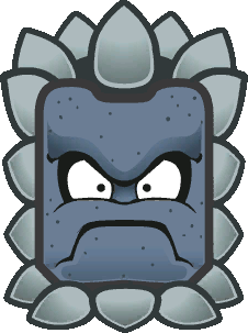
The designs don't look organic. If you look at artwork from already established Mario creatures, the characters use rounded lines, curves, organic, irregular shapes. Even if you have a character who is literally just a stone cube...
...said cube is still drawn with rounded lines and irregular shapes. There's a simple, charming aesthetic to this style, and the original SPM characters clash with it. It's honestly pretty unsightly.
Sometimes SPM does manage to pull off something interesting with the geometry look, like O'Chunks. But I'm going to say: If O'Chunks had been designed with TTYD's artstyle and put in the game that way, he would have looked better.