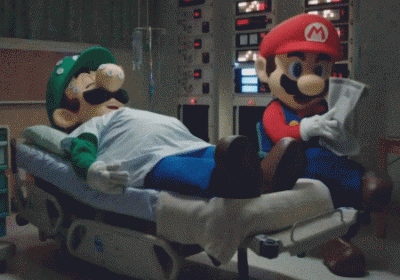
Veneer
Reaction score
3,035

Profile wall Latest activity Post history About

  • Is it just me or is Luigi eyes are wayyy to big?

    notminebtw
    mario_and_luigi_by_thiscgidude_ddebsgh-pre.png
    Ray Trace
    Ray Trace
    What I do see is that you should try out different rendering techniques. I'm very lucky that I have access to both Substance Painter and Marmoset Toolbag, and sometimes, more powerful programs net you better results, even if you posed very well, as lights and other stuff is everything. Is MMD the only program you use to render, or have you ever tried out Blender's in-house rendering or something? Unfortunately, Painter and Toolbag aren't cheap programs so I can't really recommend them unless you really want to try them out.
    LeftyGreenMario
    LeftyGreenMario
    It's not just you. In fact, both brothers' irises appear to take up more space on the model. And I think the fan model has Luigi's eyes *overall* bigger than in the original. While I don't know the artist's intent, but people often overestimate the size of the eyes on people; they're actually a bit smaller than you think.

    I'm assuming both brothers started as a personal sculpt that tried really hard to reference the brothers but there's some quirk from the artist due to the not perfect replication of proportions. I don't want to call them "inaccuracies", but some divergences from the design. Anyway, here's official art of Luigi

    Luigiart7.png
    433px-Luigiart9.png
    600px-Luigiart8.png


    I think the reason the eyes look big is apparent from the eyebrows. I notice in the fan render, Luigi's eyebrows take up less space on the forehead because the eyes are taking up that space. In the official art, you can draw a pretty straight line from the top of the eyes to the top of the ears. Of course, the head angling varies this line somewhat, but you have to draw a much more slanted line in the fan render. The eyes in the fanart overall, as you can compare with the official Luigi render, are bigger both horizontally and vertically. One guideline for establishing Luigi's eye width, Luigi's insignia, is also noticeably bigger which may have accidentally altered the eye size too.

    But the irises themselves actually aren't that much spacier on the official Luigis. But notice the placement of the irises; Luigi's irises are usually situated at the edges of the left and right sides of the eyes, which hides some of the diameter of the irises, while the fan render has them at the middle, which makes the irises take up more space.

    Luigi's mustache too diverges a bit from the official renders. The point where the bottom part of the stache meets isn't as pronounced, so the mustache looks a little thinner but I don't think the mustache itself is actually very different from the official, but I think the official ones do have a little more volume in the stache.

    Luigi's body is actually rounder than in the fan render, too, while the legs are thicker and stubbier, just only slightly thinner than Mario's legs actually. Differences are more pronounced in the fan render.

    While I think Mario is more on-model than Luigi (even the eyes I think are pretty accurately sized), I do think the iris placement doesn't mirror official Mario. Mario's irises, like Luigi's, tend to be at the edges of the left and right sides of the eyes. There are exceptions such as some of Brawl Mario's animations like clapping but in general, Mario and Luigi usually have parts of the left and right of the irises covered.
    It's a cute image! But if you can identify what's making something look "off", it'll greatly improve your skills as an artist, and I really suggest you pay attention to landmarks on characters and the references you're working off as what I did especially if you're the one working off reference.[/URL]
    • Like
    Reactions: zel
    LeftyGreenMario
    LeftyGreenMario
    Anyway, I was able to spot some differences and I outlined some here.
    gntUhN3.png


    The reason the eyes look big has to do with a few things. The distance between eyes is really small. The space between edge of the stache and edge of the eyes is much smaller. The angling of the top of the eye to the top of the ear is much more pronounced. Angle between cap emblem and corner of the mouth is more pronounced. Oh, and one thing I missed was that the top of the eyes don't align with the rim of the cap as in the original (see Luigi's eye from Luigi's left side and the rim of the cap that connects to the cap from Luigi's left side).

    Of course, head angle might account for some of it the inconsistencies since it's not perfect, but some of the inconsistencies are pretty clear.

    The placement of the bottom of the eyes is actually pretty spot on but it took too much width and the top goes up a little too high.
    run_by_rainbowdiamond_smp_ddi5ebr-fullview.png


    How does this look for a start?
    Veneer
    Veneer
    She's mad at Luigi disrupting her so she's chasing after him. Haven't got Luigi done just yet tho. Maybe I should turn the right leg a bit inward so you can see both...
    Veneer
    Veneer
    run_by_rainbowdiamond_smp_ddi5fpe-fullview.png


    Alright after some tweaking I now can show a tiny bit of her foot. Anything more and the pose looks broken to me and the dress would clip into the leg.
    Ray Trace
    Ray Trace
    you should move the spine bones more. look at a reference picture of a character dashing...like...say my own. the spine is rotated in all sorts of ways to convey emotion and urgency. if you want ashley dashing, try rotating her forward a bit. here's a ref pic you might want to take a look at

    animate-run-slide-lineup.jpg


    her left arm should be rotated back. as a general rule of thumb, the arms and legs, while moving, match their alternate areas ie if her right foot is all the way back, her left arm should be rotated around that area.
    I had a dream I got banned. And also someone fricking broke my Luigi's Mansion 2 game wattehheck brain why you gotta be so mean to me.
    Sometimes, I get curious about what's it like to be banned...maybe someone could ban me for a day, preferably on LM3's launch date. :3
    • Haha
    Reactions: Uniju
    Veneer
    Veneer
    Still, I'm interested. Maybe it's bad curiosity.
    Paper Mario
    Paper Mario
    You cant even read the forums unless you're logged out, all you get is an error message with the reason for the ban. Typically the only way to even lurk as a guest is if all cookies related to your account are cleared. At least that's how it was in the old software idk about the new. Except it still shows the error when logged in.
    Veneer
    Veneer
    Sounds lit imo
    I guess this can be a reference for Jazzi in the Car Wash.

    dd8utnr-6ab8ee59-e9d1-4333-8db9-5abfd011f8f8.jpg


    And no, she doesn't always wear overalls. Usually a Purple hoodie with jeans and silver sparkly high tops.
    Another sentence to out-of-contextize:

    "Peasley is SO FRICKEN' HOT,I would be happy to even TOUCH him "
    Gooigi would taste like coffee, since Gooigi is a combination of tasteless ectoplasm and coffee.
    Veneer
    Veneer
    Yas, I did a ton of Gooigi research. Wish it was Lime Jello tho. But coffee's good too~
  • Loading…
  • Loading…
  • Loading…
Back