
Navigation
Install the app
How to install the app on iOS
Follow along with the video below to see how to install our site as a web app on your home screen.
Note: This feature may not be available in some browsers.
More options
You are using an out of date browser. It may not display this or other websites correctly.
You should upgrade or use an alternative browser.
You should upgrade or use an alternative browser.
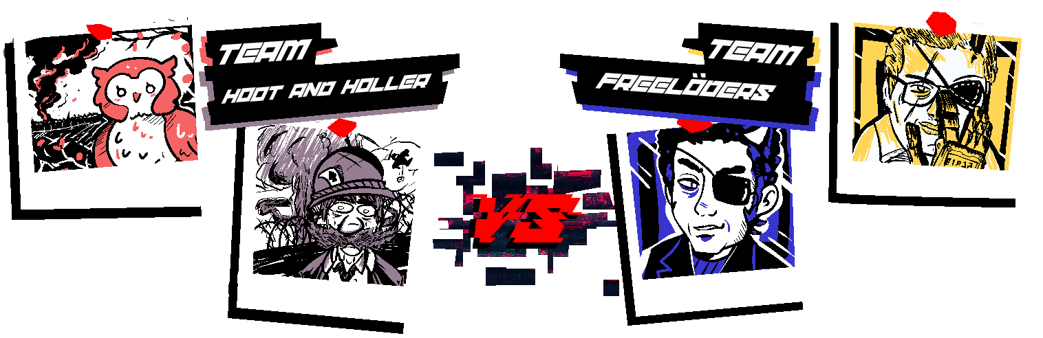
Scribble Labs 3 - The Scribble Sabotage [//:ROUND 1 - SIN AND VIRTUE://]
- Thread starter Dr. Lyra Orpheus
- Start date
- MarioWiki
- Fun With Despair
- Thread starter
- #27
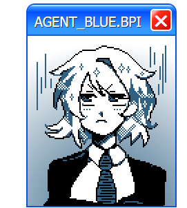
>INITIATING AGENT_BLUE.BPI
>LOADING...
>INSTALLING...
>[▮▮▮▮▮▮▮▮▮▮▮▮▮▮▮▮]
>INSTALLATION COMPLETE
>INITIALIZING...
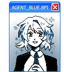
Hello! I am AGENT_BLUE! It is nice to meet you. My role is to guide you through the Bureau of Paranormal Investigation's experimental training program - which I am sure you are currently aware of. I'd like to welcome you all to this unique initiative! I hope that I can make these next few weeks a positive and productive experience for all of us! I see that you have mostly already sorted yourself into teams. Great! This will be helpful during the following activities, and will ensure that no one feels left out or abandoned as we proceed to our first team-building exercise!
For our first activity as part of our initiative to prepare you for anomalous Scribble-based occurrences, let's get to know each other! Studies have proven that the easiest way to initiate and gauge employee compliance is to engage in trust-building excercises as we navigate the world of morality and inter-organizational ethics!
So, let's not waste any time! Between your teams, we'll explore the world of morality, and attempt to develop a comprehensive code of ethics together in order to build a truly cohesive teamwork-oriented environment! To this effect, we will have your teams examine complex moral quandries, and attempt to empathize with and do the opposite of your adversarial influences!
Of course, some of you will have to play the role of villain as well, but this too is a learning opportunity! By doing the opposite in the field of what how you are assigned to perform in this preliminary assignment, you too can excel as an agent of our great Bureau!
Your pairings for this excercise, and more information about the activities we will be conducting, can be found below! Good luck - I believe that you all can be the best versions of yourselves!
//:ROUND 1 - MATCHUPS://
Click the box below to reveal the round's theme and matchups.
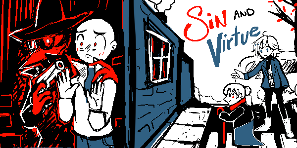
Sin and Virtue
Crimes and punishments. Good deeds, and selfish desires. Actions both constructive and destructive in nature.
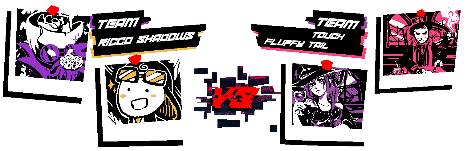
Representing the Inktoplasms this round...
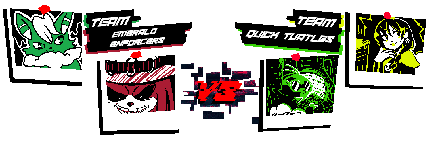
MCD is partnered with Morgan - Kendrick Or Something (#959955)
Fantanoice is partnered with Yoshi the Space Station Manager - BASALT BLUE (#363761)
As a Random Color user, Fantanoice is using CHILL GREY (#B8BCC0)
This round's gimmick is...
[INVERSION]
* You may use the inverted form of your opponent's color in addition to your own and the basic black and white. The corresponding hex code will be provided alongside your prompt. *
*If they choose to utilize this additional color, Physical Scribblers do not have to be exact, just close enough*
Prompts for this round will unlock...
.
(Who's that red guy in the introductory banner...? I'd better report this to our IT department, this doesn't seem like it's supposed to be part of the program... This is what happens when they push a feature like this to live without the bare minimum testing...)
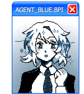
>LOADING...
>INSTALLING...
>[▮▮▮▮▮▮▮▮▮▮▮▮▮▮▮▮]
>INSTALLATION COMPLETE
>INITIALIZING...
Hello! I am AGENT_BLUE! It is nice to meet you. My role is to guide you through the Bureau of Paranormal Investigation's experimental training program - which I am sure you are currently aware of. I'd like to welcome you all to this unique initiative! I hope that I can make these next few weeks a positive and productive experience for all of us! I see that you have mostly already sorted yourself into teams. Great! This will be helpful during the following activities, and will ensure that no one feels left out or abandoned as we proceed to our first team-building exercise!
For our first activity as part of our initiative to prepare you for anomalous Scribble-based occurrences, let's get to know each other! Studies have proven that the easiest way to initiate and gauge employee compliance is to engage in trust-building excercises as we navigate the world of morality and inter-organizational ethics!
So, let's not waste any time! Between your teams, we'll explore the world of morality, and attempt to develop a comprehensive code of ethics together in order to build a truly cohesive teamwork-oriented environment! To this effect, we will have your teams examine complex moral quandries, and attempt to empathize with and do the opposite of your adversarial influences!
Of course, some of you will have to play the role of villain as well, but this too is a learning opportunity! By doing the opposite in the field of what how you are assigned to perform in this preliminary assignment, you too can excel as an agent of our great Bureau!
Your pairings for this excercise, and more information about the activities we will be conducting, can be found below! Good luck - I believe that you all can be the best versions of yourselves!
//:ROUND 1 - MATCHUPS://
Click the box below to reveal the round's theme and matchups.
Sin and Virtue
Crimes and punishments. Good deeds, and selfish desires. Actions both constructive and destructive in nature.
Representing the Inktoplasms this round...
MCD is partnered with Morgan - Kendrick Or Something (#959955)
Fantanoice is partnered with Yoshi the Space Station Manager - BASALT BLUE (#363761)
As a Random Color user, Fantanoice is using CHILL GREY (#B8BCC0)
This round's gimmick is...
[INVERSION]
* You may use the inverted form of your opponent's color in addition to your own and the basic black and white. The corresponding hex code will be provided alongside your prompt. *
*If they choose to utilize this additional color, Physical Scribblers do not have to be exact, just close enough*
Prompts for this round will unlock...
.
(Who's that red guy in the introductory banner...? I'd better report this to our IT department, this doesn't seem like it's supposed to be part of the program... This is what happens when they push a feature like this to live without the bare minimum testing...)
- MarioWiki
- Fun With Despair
- Thread starter
- #29
//:ROUND 1 - START://
Please submit your Scribble before the following deadline:
.
Please submit your Scribble before the following deadline:
.
Some advice before we begin:
- Please DO NOT post your scribble in public before voting goes live. Submit it to me via forum DM or Discord, but public posting will result in disqualification.
- You are allowed to discuss and plan with your partner before either of you receive your prompt, and I will not penalize anyone for sharing information or their finished drawing with their partner after you have both finished your scribbles. Do not, however, discuss your prompt or share your scribble until you have both finished.
- I encourage you to give your drawing a title. This doesn't have to be an actual title, and it can serve as a small single line of dialogue, a punchline, or provide context to your scribble as well. Just mention the title when you send me your drawing - or don't! Sometimes no title is the most impactful thing you can do.
- If you are drawing traditionally, or if you request your prompt via DM instead of Uncle Awards, I'll give some leeway on submission time due to time required to scan and to account for me being late to reply respectively. Normally this will be about 15 minutes, but I won't be an asshole if you don't abuse this.
- Have fun. Or don't. I hope you do, but I'm not the fun police.
- MarioWiki
- Fun With Despair
- Thread starter
- #30
//:ATTENTION://
In order to facilitate additional Scribbling time on the weekend and better align the game's submission end time with my personal availability, submission periods will end approx. 6 hours later, at
In order to facilitate additional Scribbling time on the weekend and better align the game's submission end time with my personal availability, submission periods will end approx. 6 hours later, at
.
This time will apply to all future phases.
SUNNY:
So, this is the Scribblesphere? Wow!
For a place that's been torn apart and remade at least four times, this is looking really spiffy!
I can't wait to see all the colorful sights!
I hope I have the right place? This is where Mel said he wanted to meet, right? I should have asked him to loosen his hood thingy before mumbling directions at me.
Ah well, it can't be helped now. I think I'll explore the local food stuff options while I wait for him! That way, I'll have something to tell Clay once I go back home.
I think that cart over there looks promising!
SUNNY:
Hello, good sir bedsheet ghost!
I would like one of your longmeats, please.
SHIFTY HOT DOG VENDOR:
Uhhh mustard?
SUNNY:
Well, that's not how I'm usually described, but close enough.
SHIFTY HOT DOG VENDOR:
Mmmmm.
SUNNY:
This is... blue.
...
Why is it blue?
SHIFTY HOT DOG VENDOR:
Cyanide.
SUNNY:
...what?
SHIFTY HOT DOG VENDOR:
Uhhh, I meant sriracha!
SUNNY:
.....
You're not really a longmeats vendor, are you?
SHIFTY HOT DOG VENDOR:
Uhm!!! I have to go AFK
SUNNY:
...
Well, he seemed nice.
- MarioWiki
- Fun With Despair
- Thread starter
- #32
Well done! You've all exceeded the expectations of this exercise! Such an excellent and varied set of outputs - It's clear that you are a group with wide-ranging, diverse skills. You certainly rose to the challenge too, despite being handed an unpredictable dataset in the form of your palettes, you have largely created cohesive and inventive artwork. I'm proud to be assigned such a motivated set of trainees!
Now, before we proceed with the next exercise - let's engage in some peer review. Allow me to present your final products for the purpose of admiration and analysis:
[//:ROUND 1 - RESULTS://]
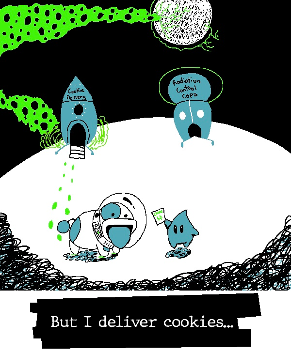
~[FOR RANSOM]~
| 
|
~[TO THE RESCUE]~
| 
|
~[EXPLOSIVE PRESENCE]~
| 
|
~[DEFUSING THE SITUATION]~
| 
|
~[PILLAGE AND PLUNDER]~
| 
|
~[FAIR TRADE]~
| 
|
~[HIT AND RUN]~
| 
|
~[PULLED OVER]~
| 
|
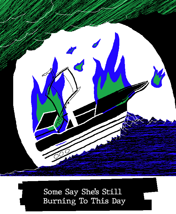
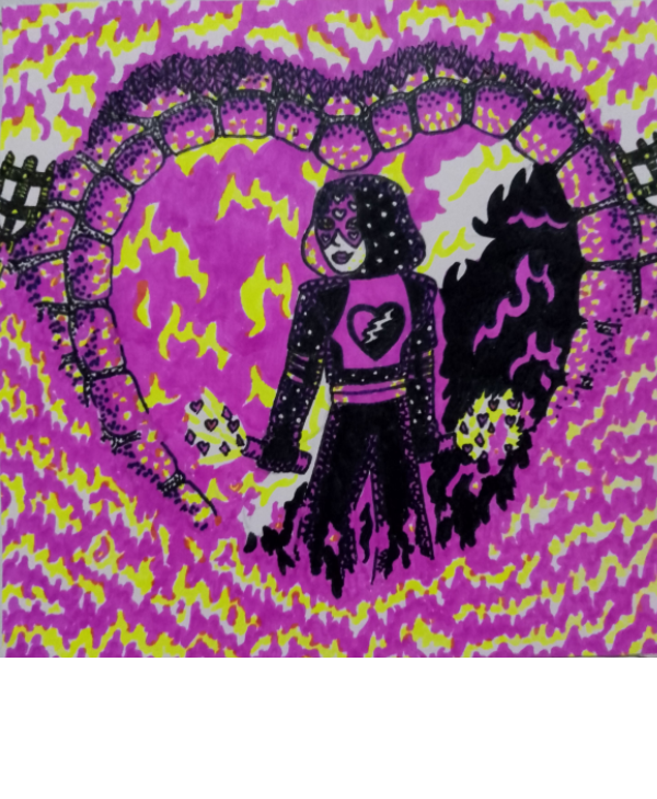
~[BURN IT DOWN]~
| 
|
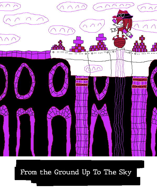
~[BUILD IT UP]~
| 
|
~[IN COLD BLOOD]~
| 
|
~[EYE FOR AN EYE]~
| 
|
Okay! Now, I'll need you to vote, using this form here! Feedback is an important part of growth too, so if there's an image you like, an area someone could improve, or anything you want to say, feel free to comment here or in our verified operative chat venue!
Please note, excessive abuse of the [oh le banger] emote is now discouraged under the employee handbook (pg. 24, Subsection 8). Even writing something as simple as "Nice scribble!" is shown to increase employee satisfaction by up to 30% more!
Voting will end at...
.
Both players and spectators are strongly encouraged to vote.
- Pronouns
- He/him
- MarioWiki
- Hooded Pitohui
Alright, let's do some commentary! Words have proven rather slippery today, evading my attempts to wrangle them, so I cannot promise these will be the best-articulated, but I'll go for it all the same.
Turboo - I haven't played Mina, but that doesn't at all detract from my enjoyment of this piece - which to me is a sign of its quality! There's something especially strong in the contrast of the two characters here. The... blue knight individual has a wide, confident stance. Feet planted apart, arms out, that stance builds them up as a proper obstacle - which then gets reinforced by Mina's leaning forward and her expression. Add to that the sense of motion in the lines rising up from Mina's platform and trailing her flail, and it all comes together to make the confrontation palpable. Everything in the foreground and midground works to support the sense of a tense confrontation here, and I enjoy that kind of tension. I'm really taken by the background, though! Its serenity contrasts the rest of the image, accentuating the main focus! Fitting you had orange and blue to work with, two colors often used to highlight each other through their contrast!
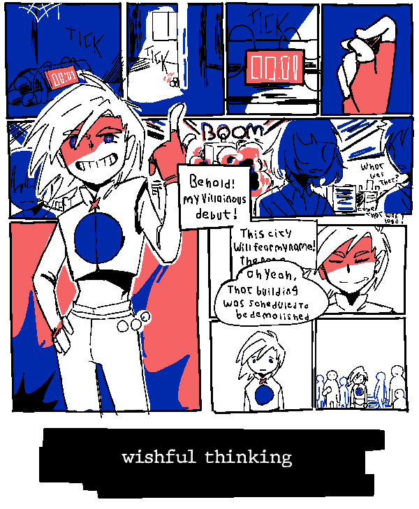
Yap - It's impressive how much you were able to incorporate into this image without sacrificing readability. There's a lot going on here between the text exchange, the various text and thought bubbles, the onomatopoeia, and the emphasis on the expressions of the characters, but I didn't have to sort through it to understand what was going on. It was immediately readable, with the extra details like the sobbing noises being something I discovered the longer I looked at it, rather than something that clouded the focus. I don't know all the technical terms, but I imagine that reflects a mastery of using different sizing, line weights, color contrast, and placements to direct the eyes to the most important parts of the image. It strikes me that the sobbing is all purely blue on black, making them lower-contrast than the shaded thought bubbles, which are in turn lower contrast than the speech bubbles, which are in turn lower contrast than the heavily-shaded and dual-colored characters - I suppose that creates a hierarchy that guides the eye.
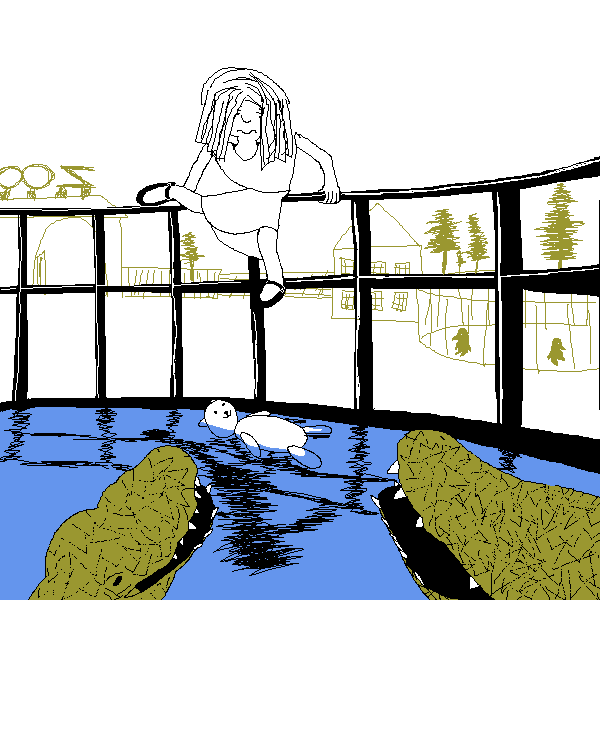
Uniju - Uniju, you are incredibly skilled at making peaceful and wistful scenes. Even though there is a dangerous rescue mission going on here, the image still feels... almost oddly nostalgic? The thin scratchy lines of the background and the cute details like the penguins in silhouette give this the feeling of a hazy memory. It's like I'm recalling a zoo I barely remember visiting at the age of five. Even the relative lack of detail on the girl climbing into the enclosure contributes. Her hair mostly obscuring her face, her plain outfit... it feels like I'm struggling to recall the face of a playmate from my early years. All of that creates an interesting interplay with your detailed and nicely-textured alligators. Thinking of this like a memory from childhood, are they so concrete in form and texture because they stood out as dangerous? Perhaps this is even the rescuer's memory! Perhaps she's recalling this rescue operation, and the alligators she vividly recalls because they were so frightening!
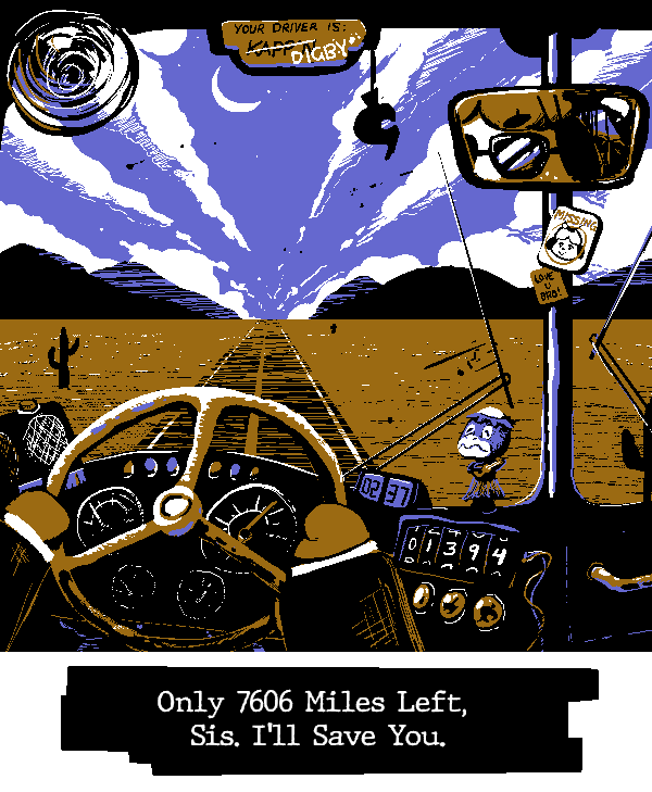
GBA - I'm a big fan of the openness here. Your palette and the choice to cleanly separate land from sky make it feel as though this landscape truly stretches on forever. I particularly like the choice to make this a nighttime sky. It'd have been easy to do a daytime sky with that blue, piggybacking off the general perceptions of deserts as searing hot landscapes, but you saw the softer hue of your blue and went with a nighttime scene. I feel like that enhances the loneliness of this image. Imagining the desert sands illuminated only by headlights makes me feel like I've been confined to some sort of pleasant purgatory, where I will never reach my destination but I will always have the pleasure of a spiritual adventure. Digby's endless journey... and all because Isabelle forgot to tell him she was working late...
woglirl - woglirl, your character designs and expressions never cease to blow me away. You always leave me with a feeling of "I want to read a story about these characters..." She's amazing. The short sleeves and fingerless gloves are nice touches for rounding out that punk look. This may be an odd comparison, but I was recently thinking about Pokestar Studios from B2W2, and its mechanic of "Strange Endings", where films could garner more attention by doing something unconventional. If I remember correctly, the tutorial for that mechanic is playing an utter failure of a hero. I know this character is a villain, but I'm reminded of that scenario... I want to see this character fail more...
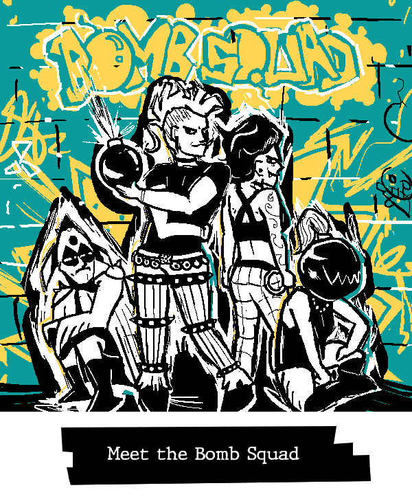
TPG - It's neat that both you and your opponent went for punks. I'm feeling Andrew Hussie strongly in this one, and I mean that entirely positively. The second character from the left reminds me of Zhen. Big personality to these characters that meshes well with the striking color scheme of the graffiti behind them.
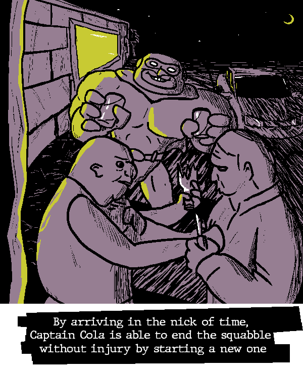
TB - I feel unsafe. I say that humorously, but, like, also, that seems to be the intention and you delivered. These two men are threatening each other with broken bottles and knives and yet I fear for their safety. Captain Cola's size, expression, and slightly askew stance combine with the minimal light and pervasive scratchy shadowing make me worry these men are going to end up floating down a river in pieces.
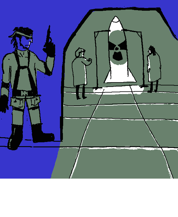
kramer - Great use of your palette for light and shadow, here. The way the green flows out of the doorway clearly positions it as illumination spilling out of the room even though you're working with such a dark color, and blue naturally lends itself well to draping Snake in shadow. The sparing use of white makes its abundance on the missile draw my eye first, which in effect conceals Snake from view immediately - so mission accomplished, soldier.
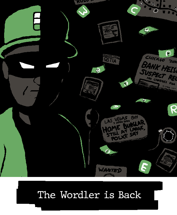
MCD - Way to make the Wordler threatening with the striking use of shadow and the off-center posing. Great use of subtle touches of grey to keep his face readable on the shadowed side. I'm mesmerized by the way those little touches manage to make his mask feel blacker than black. I know it's a trick, but I can still see the outline of his mask over the shadowed part of his face!
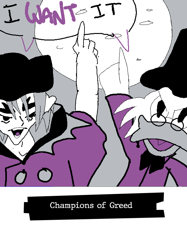
Fanta - I don't know who the fella next to Scrooge is, but I like how they both spill out of the frame. It gives the impression of them jostling to be the focus of the piece, and all without them needing to overlap or needing to figure out how they would press against each other. I also like how their color schemes mirror each other, both going from purple to grey to white to black as they ascend. That coloring parallel accentuates their similar personalities.
Morgan - You know what this reminds me of? This feels like those shots in animation where a character is suddenly drawn in a more detailed, realistic style to express some strong emotion. We're two seconds away from a shattering screen transition to a spotlight shining down on this kid while they falls to their knees and pounds a fist against the ground. It's something about the way you drew the face with the eyes in shadow but the nose so prominent.
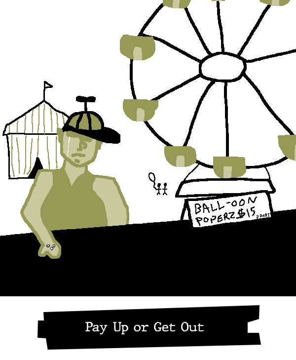
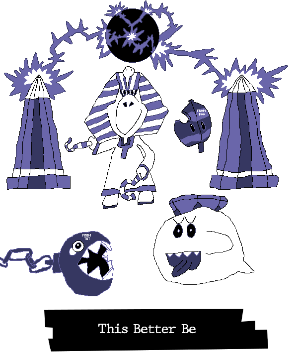
YtSSM (Ink) - Mario Pinball Land mention, wooh! Seriously, though, I enjoy seeing ol' King Tut get his due. I like the layering to this one. They are indeed making a (ideally) fair trade, but also Pinball Land was set at... a fair. Good joke. I also want to highlight your Chain-Chomp and Super Leaf, which both have great depth to them. I can see you put a lot of care into the Chomp's chain and teeth, as well as giving the Super Leaf depth through its little missing bit.
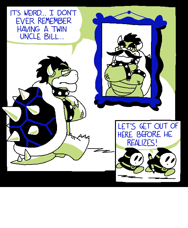
Hint Toad - Ahahaha, I cracked a huge smile seeing this! The comic with these two troublemaking Shy Guys has stuck in my head for its absurdity, so it was a treat to see it referenced. Even if one didn't know the original comic, there's much to appreciate here. You do an excellent job of drawing Bowser, and I'm especially taken with the way you've drawn his shell spikes. I'm going to have to take notes on the way you shade them - it gives them a great deal of depth! There's also the positioning of the panel with the Shy Guys, so small and tucked into the bottom right, a natural endpoint for the eyes to reach so it can deliver the punchline. That you're a professional comic artist shines through here!
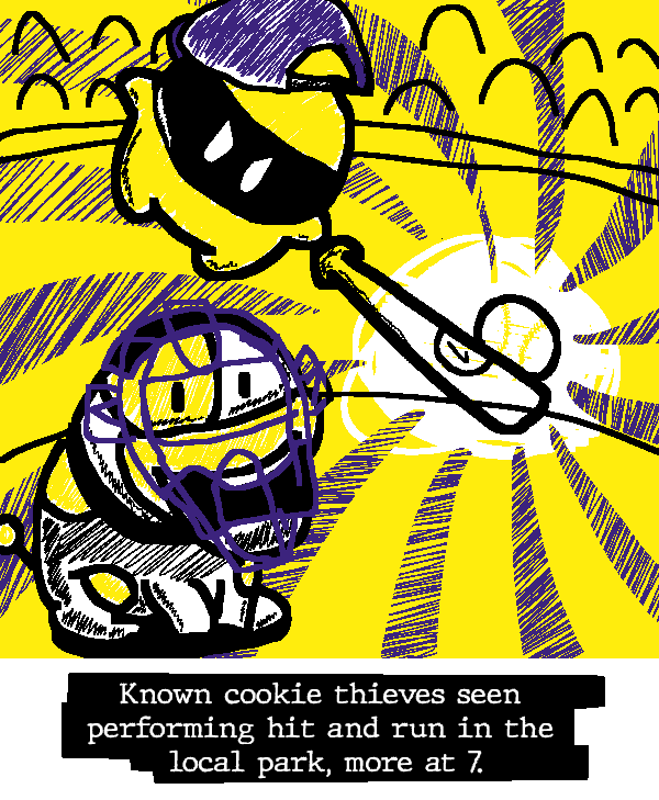
Nine - There's that Ninelevendo action scene! You're skilled at capturing moments of intense action in a still image, and this is another prime example of that. Again, I'm noticing a sparse use of white that draws attention to the baseball in conjunction with the swirling lines of blue. You use a lot of white on Poochy but wisely temper it with some black so that it doesn't distract from the main focus. The looseness to your white and the fact that it's the brightest color in the image impart the ball with tremendous energy. I wouldn't want to be the outfielder here!
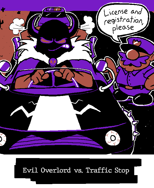
Waluigi Time - As always, your ability to create scrimblos are unparalleled. I see a little bit of Zurg and Chief Palmer in these two, but they have distinct energies that are all their own, too. That police officer in particular feels muppetish to me. He just got done harassing Kermit the Frog, y'know? He pops up with an exaggerated accent and starts requesting increasingly ridiculous documentation. He goes from wanting to see your driver's license to wanting your birth certificate to wanting to see your medical records to wanting to see your online shopping orders to wanting to see your mmorpg login information, then goes "well, everything appears to be in order. I'll let you- oh, whoops. Can't let you go yet! I need your fishing license". Then you can't find your fishing license and he writes you a citation. Meanwhile, this villain - look at that shawl, he's got flair. I feel like he's on his way to compete in a televised car race. I know I spent this time talking about the scrimblos and not the art, but, I mean, I think that's a testament to the strength of your pieces - I can immediately spin up skits and stories from what you draw.
PoochyPie - I like the relative simplicity of this piece. Everything is nicely spread, there's no clutter, and it's just got a good, readable premise.
BBQ - I haven't the words. I mean, I think I would exhaust all of my available time if I tried to comment in detail on everything there is to adore in your piece. GBA articulated thoughts much better than I could, but I am enamored with the ferocity and style of this character. They are not content with simply razing the land - they're doing it with flair. They're a villain's villain, forming that heart shape around themselves while setting the world ablaze. Powerful and confident energy, they have. I'm a big fan of the way you rendered the flames, layering them in a chaotic-yet-controlled way to capture the amorphous nature of a raging fire. The pink-on-black to create this trail of destruction is especially striking.
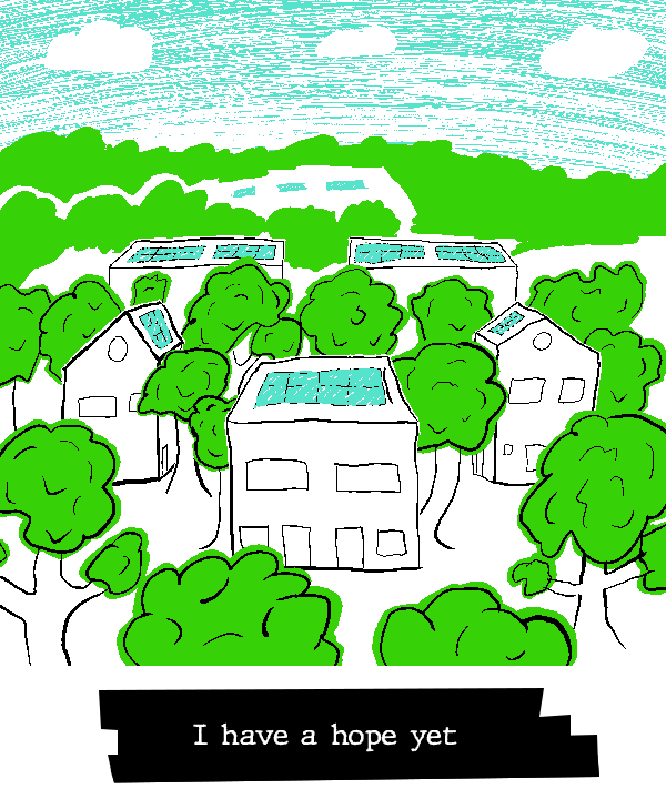
LTQ - This image resonates with me. There is a palpable optimism in this image, even disregarding the title. The perspective offering a look at that beautiful, boundless blue sky communicates not only a world of reduced pollution, but a hope that we look beyond ourselves and surpass the boundaries which presently hold us back. The intermixing of homes and trees, too, points to a literal physical harmony between civiliazation and nature, but also, I feel, to a broader metaphorical directive to look beyond ourselves. "We are bound together," this image says, "by complex webs of relationships both human and ecological." This image, to me, is an affirmation that humanity can show its better nature and rise above individualistic thinking, and I adore it for that. I also really like the decision to let the green spill outside of the outlines of the leaves. it gives the trees a softer, gentler feel.
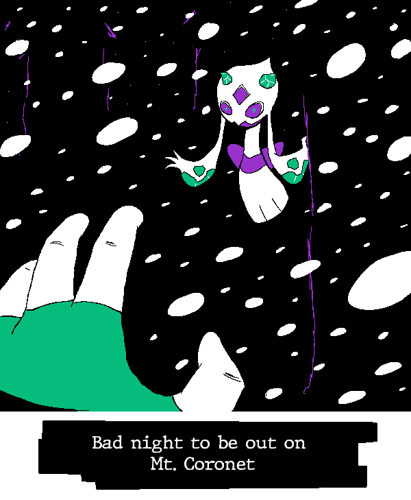
Rose - Giiiiiiive it up for threatening ghost Pokémon! My second-favorite genre of threatening Pokémon images, only after threatening Fairy-types! You did a bang-up job making this Froslass feel dynamic and intimidating. By the former, I mean, like, it feels like it's in motion. Froslass is rapidly approaching and actively spreading her arms to come grab the POV character as they freeze. Fan of the minimal-but-not-absent background detailing to suggest a snowy nighttime scene where the blizzard and the darkness conspire to leave this character unable to see but a few feet in front of them. There's something to be said for how small you made Froslass' eyes. It is an interesting choice to eschew more "on-model" anime-style eyes here, and it pays off handsomely. That these read as more pinprick eyes until I zoom in gives them a more ghostly and threatening feel. This isn't a ~friend and companion to join you on your Pokémon journey~; this is a Creature (TM). Shrinking the eyes turns Froslass into a proper vengeful spirit driven only by a desire for revenge and adding to its collection, and that is a great design choice for this image.
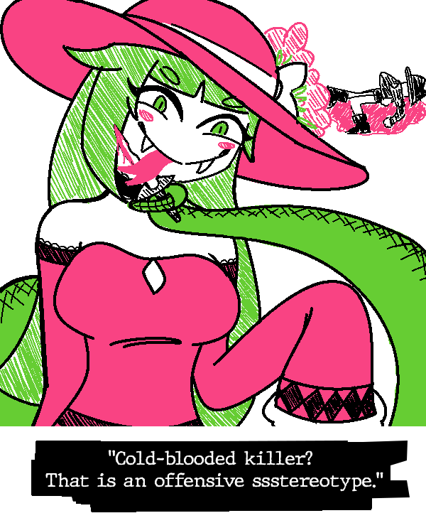
Hearts - Cascabela!!! Interesting that both you and your teammate have someone licking up blood (and more, in your teammates case). Was that a pre-coordinated design element? I doubt it, which makes it cooler that it shook out that way. Nice use of striped colors to suggest a softer texture for Cascabela's hair and the flowers on her hat. Great expression and posing. Free her. She did everything she's accused of, but, like, free her. #Women'sWrongs etc etc.
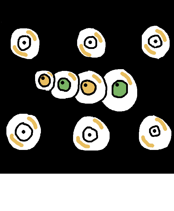
Paradox - What most intrigues me about this image is the chain of eyes. There being these relatively evenly-spaced, evenly-size eyeballs makes for an intriguing contrast with the connected, snake-like eyeballs. The eyesnake reminds me of a... I believe it's Link's Awakening? It reminds me of a Link's Awakening boss, but I digress. The fact that eyesnake eyeballs have colored irises and pupils that are looking somewhere, whereas the other eyeballs look straight ahead and have white iris, suggests that the eyesnake has a degree of intelligence which the regular eyeballs lack. Does it perhaps consume them? Is this is a creature in a surreal world, looking to add to itself? Interesting questions arise from your design choices!
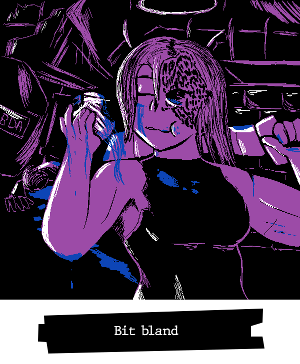
Koops - #Women'sWron- what do you mean I "already used that bit"? Who said it was a bit? I like the definiton on your character. You've got a knack for interesting body styles. It's neat how you contrast how clearly readable and defined she is with how messy and incomplete the background clutter is. It's intentionally left vague to contrast with the central focus of the image. That lets you get the most out of your purple while leaving the blue for striking touches of blood and vitreous fluids. It's nice.
Yap - It's impressive how much you were able to incorporate into this image without sacrificing readability. There's a lot going on here between the text exchange, the various text and thought bubbles, the onomatopoeia, and the emphasis on the expressions of the characters, but I didn't have to sort through it to understand what was going on. It was immediately readable, with the extra details like the sobbing noises being something I discovered the longer I looked at it, rather than something that clouded the focus. I don't know all the technical terms, but I imagine that reflects a mastery of using different sizing, line weights, color contrast, and placements to direct the eyes to the most important parts of the image. It strikes me that the sobbing is all purely blue on black, making them lower-contrast than the shaded thought bubbles, which are in turn lower contrast than the speech bubbles, which are in turn lower contrast than the heavily-shaded and dual-colored characters - I suppose that creates a hierarchy that guides the eye.
Uniju - Uniju, you are incredibly skilled at making peaceful and wistful scenes. Even though there is a dangerous rescue mission going on here, the image still feels... almost oddly nostalgic? The thin scratchy lines of the background and the cute details like the penguins in silhouette give this the feeling of a hazy memory. It's like I'm recalling a zoo I barely remember visiting at the age of five. Even the relative lack of detail on the girl climbing into the enclosure contributes. Her hair mostly obscuring her face, her plain outfit... it feels like I'm struggling to recall the face of a playmate from my early years. All of that creates an interesting interplay with your detailed and nicely-textured alligators. Thinking of this like a memory from childhood, are they so concrete in form and texture because they stood out as dangerous? Perhaps this is even the rescuer's memory! Perhaps she's recalling this rescue operation, and the alligators she vividly recalls because they were so frightening!
GBA - I'm a big fan of the openness here. Your palette and the choice to cleanly separate land from sky make it feel as though this landscape truly stretches on forever. I particularly like the choice to make this a nighttime sky. It'd have been easy to do a daytime sky with that blue, piggybacking off the general perceptions of deserts as searing hot landscapes, but you saw the softer hue of your blue and went with a nighttime scene. I feel like that enhances the loneliness of this image. Imagining the desert sands illuminated only by headlights makes me feel like I've been confined to some sort of pleasant purgatory, where I will never reach my destination but I will always have the pleasure of a spiritual adventure. Digby's endless journey... and all because Isabelle forgot to tell him she was working late...
woglirl - woglirl, your character designs and expressions never cease to blow me away. You always leave me with a feeling of "I want to read a story about these characters..." She's amazing. The short sleeves and fingerless gloves are nice touches for rounding out that punk look. This may be an odd comparison, but I was recently thinking about Pokestar Studios from B2W2, and its mechanic of "Strange Endings", where films could garner more attention by doing something unconventional. If I remember correctly, the tutorial for that mechanic is playing an utter failure of a hero. I know this character is a villain, but I'm reminded of that scenario... I want to see this character fail more...
TPG - It's neat that both you and your opponent went for punks. I'm feeling Andrew Hussie strongly in this one, and I mean that entirely positively. The second character from the left reminds me of Zhen. Big personality to these characters that meshes well with the striking color scheme of the graffiti behind them.
TB - I feel unsafe. I say that humorously, but, like, also, that seems to be the intention and you delivered. These two men are threatening each other with broken bottles and knives and yet I fear for their safety. Captain Cola's size, expression, and slightly askew stance combine with the minimal light and pervasive scratchy shadowing make me worry these men are going to end up floating down a river in pieces.
kramer - Great use of your palette for light and shadow, here. The way the green flows out of the doorway clearly positions it as illumination spilling out of the room even though you're working with such a dark color, and blue naturally lends itself well to draping Snake in shadow. The sparing use of white makes its abundance on the missile draw my eye first, which in effect conceals Snake from view immediately - so mission accomplished, soldier.
MCD - Way to make the Wordler threatening with the striking use of shadow and the off-center posing. Great use of subtle touches of grey to keep his face readable on the shadowed side. I'm mesmerized by the way those little touches manage to make his mask feel blacker than black. I know it's a trick, but I can still see the outline of his mask over the shadowed part of his face!
Fanta - I don't know who the fella next to Scrooge is, but I like how they both spill out of the frame. It gives the impression of them jostling to be the focus of the piece, and all without them needing to overlap or needing to figure out how they would press against each other. I also like how their color schemes mirror each other, both going from purple to grey to white to black as they ascend. That coloring parallel accentuates their similar personalities.
Morgan - You know what this reminds me of? This feels like those shots in animation where a character is suddenly drawn in a more detailed, realistic style to express some strong emotion. We're two seconds away from a shattering screen transition to a spotlight shining down on this kid while they falls to their knees and pounds a fist against the ground. It's something about the way you drew the face with the eyes in shadow but the nose so prominent.
YtSSM (Ink) - Mario Pinball Land mention, wooh! Seriously, though, I enjoy seeing ol' King Tut get his due. I like the layering to this one. They are indeed making a (ideally) fair trade, but also Pinball Land was set at... a fair. Good joke. I also want to highlight your Chain-Chomp and Super Leaf, which both have great depth to them. I can see you put a lot of care into the Chomp's chain and teeth, as well as giving the Super Leaf depth through its little missing bit.
Hint Toad - Ahahaha, I cracked a huge smile seeing this! The comic with these two troublemaking Shy Guys has stuck in my head for its absurdity, so it was a treat to see it referenced. Even if one didn't know the original comic, there's much to appreciate here. You do an excellent job of drawing Bowser, and I'm especially taken with the way you've drawn his shell spikes. I'm going to have to take notes on the way you shade them - it gives them a great deal of depth! There's also the positioning of the panel with the Shy Guys, so small and tucked into the bottom right, a natural endpoint for the eyes to reach so it can deliver the punchline. That you're a professional comic artist shines through here!
Nine - There's that Ninelevendo action scene! You're skilled at capturing moments of intense action in a still image, and this is another prime example of that. Again, I'm noticing a sparse use of white that draws attention to the baseball in conjunction with the swirling lines of blue. You use a lot of white on Poochy but wisely temper it with some black so that it doesn't distract from the main focus. The looseness to your white and the fact that it's the brightest color in the image impart the ball with tremendous energy. I wouldn't want to be the outfielder here!
Waluigi Time - As always, your ability to create scrimblos are unparalleled. I see a little bit of Zurg and Chief Palmer in these two, but they have distinct energies that are all their own, too. That police officer in particular feels muppetish to me. He just got done harassing Kermit the Frog, y'know? He pops up with an exaggerated accent and starts requesting increasingly ridiculous documentation. He goes from wanting to see your driver's license to wanting your birth certificate to wanting to see your medical records to wanting to see your online shopping orders to wanting to see your mmorpg login information, then goes "well, everything appears to be in order. I'll let you- oh, whoops. Can't let you go yet! I need your fishing license". Then you can't find your fishing license and he writes you a citation. Meanwhile, this villain - look at that shawl, he's got flair. I feel like he's on his way to compete in a televised car race. I know I spent this time talking about the scrimblos and not the art, but, I mean, I think that's a testament to the strength of your pieces - I can immediately spin up skits and stories from what you draw.
PoochyPie - I like the relative simplicity of this piece. Everything is nicely spread, there's no clutter, and it's just got a good, readable premise.
BBQ - I haven't the words. I mean, I think I would exhaust all of my available time if I tried to comment in detail on everything there is to adore in your piece. GBA articulated thoughts much better than I could, but I am enamored with the ferocity and style of this character. They are not content with simply razing the land - they're doing it with flair. They're a villain's villain, forming that heart shape around themselves while setting the world ablaze. Powerful and confident energy, they have. I'm a big fan of the way you rendered the flames, layering them in a chaotic-yet-controlled way to capture the amorphous nature of a raging fire. The pink-on-black to create this trail of destruction is especially striking.
LTQ - This image resonates with me. There is a palpable optimism in this image, even disregarding the title. The perspective offering a look at that beautiful, boundless blue sky communicates not only a world of reduced pollution, but a hope that we look beyond ourselves and surpass the boundaries which presently hold us back. The intermixing of homes and trees, too, points to a literal physical harmony between civiliazation and nature, but also, I feel, to a broader metaphorical directive to look beyond ourselves. "We are bound together," this image says, "by complex webs of relationships both human and ecological." This image, to me, is an affirmation that humanity can show its better nature and rise above individualistic thinking, and I adore it for that. I also really like the decision to let the green spill outside of the outlines of the leaves. it gives the trees a softer, gentler feel.
Rose - Giiiiiiive it up for threatening ghost Pokémon! My second-favorite genre of threatening Pokémon images, only after threatening Fairy-types! You did a bang-up job making this Froslass feel dynamic and intimidating. By the former, I mean, like, it feels like it's in motion. Froslass is rapidly approaching and actively spreading her arms to come grab the POV character as they freeze. Fan of the minimal-but-not-absent background detailing to suggest a snowy nighttime scene where the blizzard and the darkness conspire to leave this character unable to see but a few feet in front of them. There's something to be said for how small you made Froslass' eyes. It is an interesting choice to eschew more "on-model" anime-style eyes here, and it pays off handsomely. That these read as more pinprick eyes until I zoom in gives them a more ghostly and threatening feel. This isn't a ~friend and companion to join you on your Pokémon journey~; this is a Creature (TM). Shrinking the eyes turns Froslass into a proper vengeful spirit driven only by a desire for revenge and adding to its collection, and that is a great design choice for this image.
Hearts - Cascabela!!! Interesting that both you and your teammate have someone licking up blood (and more, in your teammates case). Was that a pre-coordinated design element? I doubt it, which makes it cooler that it shook out that way. Nice use of striped colors to suggest a softer texture for Cascabela's hair and the flowers on her hat. Great expression and posing. Free her. She did everything she's accused of, but, like, free her. #Women'sWrongs etc etc.
Paradox - What most intrigues me about this image is the chain of eyes. There being these relatively evenly-spaced, evenly-size eyeballs makes for an intriguing contrast with the connected, snake-like eyeballs. The eyesnake reminds me of a... I believe it's Link's Awakening? It reminds me of a Link's Awakening boss, but I digress. The fact that eyesnake eyeballs have colored irises and pupils that are looking somewhere, whereas the other eyeballs look straight ahead and have white iris, suggests that the eyesnake has a degree of intelligence which the regular eyeballs lack. Does it perhaps consume them? Is this is a creature in a surreal world, looking to add to itself? Interesting questions arise from your design choices!
Koops - #Women'sWron- what do you mean I "already used that bit"? Who said it was a bit? I like the definiton on your character. You've got a knack for interesting body styles. It's neat how you contrast how clearly readable and defined she is with how messy and incomplete the background clutter is. It's intentionally left vague to contrast with the central focus of the image. That lets you get the most out of your purple while leaving the blue for striking touches of blood and vitreous fluids. It's nice.
- Pronouns
- He/him
- MarioWiki
- Turboo
Yap - I always really love how you draw Isabelle, for starters, and this is easily one of my favorites of the round especially in combination with GBA's; even standalone, I think its a very eye-popping piece. "bro the color contrast!" is a sentiment I have about a good chunk of images this time around, but the shading contrast on her face is genuinely nuts to me, especially with how well you use all four colors there & on her hair - idk how to fully describe this, but the way its so defined on her in comparison to Tom Nook sells her being pissed off, if that makes sense?
Very strong space usage as well IMO with how the image is split between the text messages and the follow-up scene. I'm big on the delineation of thought bubbles vs out-loud speech (i.e., the solid white vs the hatching, creates a really cool visual effect looking at it from a distance) vs the sniffling in the background. The office bg itself still feels pretty defined too with the blue lines, not crowded out by the sfx. Im always astounded by how much you can get out of a 600x600 canvas LOL.... pls destroy Phyllis
Uniju - Im happy I was able to impart that your other color was green.... the texturing on the crocodiles is really good as other people have said. big fan of the girl's expression plus the contrast between the crocodile enclosure and the background with the penguins. Idk if this was mentioned before but I think my personal favorite detail is the reflection of the bars and the girl in the water. the delineation of foreground vs. background feels really noticeable with that in mind, and I think the usage of the green back there also sells distance really well espec with the "reversed" zoo sign
GBA - My first thought was Desert Bus, which, it is Desert Bus in the most literal form lmao. I love this one as well and the way my eye kind of naturally spreads out from the horizon, if that makes sense - I think theres a LOT of environmental storytelling in this one with all the details. Like the build out from "oooo my god pretty scenery" to "Digby is driving" to "Digby stole an entire bus to help his sister" was genuinely how I "progressed" through this picture, with how a lot of details are on the periphery and the way that they're outlined/shaded. Im gonna imagine a follow up where he runs over Phyllis's car in the parking lot next time she's there
I've said this elsewhere, but I really love how yours and Yap's came together with just character matching and having broad enough dialogue/concepts that they tell a full story. imo people using the order their pictures appear in or collaborating on a running theme with their teammate is something that doesnt get used as much as it could, and im glad you two decided to collab on characters; I really can only think of Hearts doing this all the way in Year 1 with his DK/diddy drawing and FWD/Kright having their characters in most of their images.
Wogl - as usual I adore your comic setup and characters, especially the way you make them pop out of/past the panels. I think its really underrated how their top has a bomb design on it with the lit fuse as a kind of zipper/button, I genuinely only noticed that on a second look somehow and I think it adds to the design a lot. To me the character stands out the most for good reason, and my eyes go to the left side of the scribble immediately (probably what they would have wanted!), and I think thats sold really well by how the background characters in the middle are mostly dark blue and lit only by the explosion in the background. I wanna know the backstory of the guy telling them the building was supposed to be demolished tbh, if he's dealt with them before
TPG - I've said this elsewhere as well, but the contrast is REALLY popping in this one and I think it was a super smart choice to have the Bomb Squad themselves in predominantly black and white with some slight colors on the outside for effect - they look awesome against the background. I really like the stylization of their graffiti tag too, its just an overall super stylish piece. I get a big webcomic character vibe from them which tracks with what Pitohui said, like I think they have a lot of personality that comes through from just this singular image
Tb - I mean this as lovingly as possible because I know we were all riffing on you for getting vomit green at the start of the round, but I honestly think you figured out the play with it lol. using it as a lightsource in a scene thats predominantly black & Flintstones Vitamin-colored makes it blend nicely without being as strong as a full white would've been in the same spots. Big fan of the light/shadow distribution with the hatching on the right side toward the car, etc.
Should I assume the background lore of Captain Cola is that he came from the same nuclear accident as Captain Cannon and solves violence with more violence in a different way..... I don;t know if this is backed up by the way the cans are drawn, but now Im thinking of him starting a coke vs pepsi war on the street in relation to the caption. He seems like a friendly man to me personally <-- read tb's commentary on his own image right before writing this sentence
Kramer - I have to agree im a big fan of the use of light and shadow here; I think the way the nuke area is lit up with white/etc. makes the contrast with Snake a lot stronger, espec the choice to not use white on him at all outside him facing the room. I think my eye's drawn to Snake for the "hey it's solid snake!" factor alone lol, but like with the way bright colors are eye-catching as well, I think the nuke does a really good job of that and then leading you out to Snake in the hallway from there. More environmental storytelling present here (the villains have moved on from Metal Gears into even more blatant weapons of mass destruction)
woglril
Goomba
i wring my brain out like a sponge and this is whatseeps out
Turb:
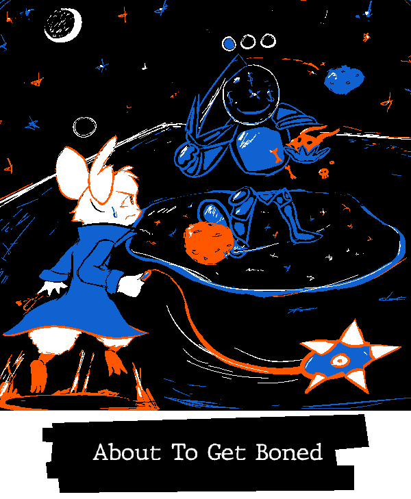
I don't know these characters but the mouse is cute and the expression is very well drawn, and the motion and perspective of the flail is quite nice.
The overall picture is very well balanced with a clear focus, the way the enemy is drawn and colored clearly sets them apart from the character in the foreground without causing them to blend into or get lost in background.
Yap:
Isabella's deeply irritated face staring straight ahead as she comforts an incredibly pathetic Tom Nook is so funny.
On the more technical side of things, the shape of the panels and layout of the speech bubbles guides your eyes across the picture incredibly well, and I really like the choice to add hatching to the thought bubbles to further distinguish them from whats being spoken out loud, the lettering itself is also really nice.
Uniju:
I love this very, like, grounded? for lack of a better word, interpretation of the prompt, and it's executed splendidly.
The pose is really well done, with a good sense of how someone would be holding themselves and distributing their weight while climbing over a fence, her expression and how her eyeline seems to be focused squarely on the plushy show how she's feeling super well.
Beyond that the background being drawn with colored line art gives it a nice sense of depth.
Choosing to believe someone came and helped her shortly after this
GBA:
Really like the framing and perspective here, the darker, detailed interior of the bus nicely contrasting the brighter, wide open desert environment outside, just all around lovely to look at, I love how the sky is drawn especially, and all little things inside the bus, like Isabelle's note under her picture and Digby crossing out Kapp'n's name and writing his own
Really interested in the narrative that leads up to Digby getting Kapp'n's bus, did Kapp'n sell it to him? is he just borrowing it? did he steal it? is he going to give it back? is he going to leave it in the parking space Isabelle suffered so much to get back?
wogiliril:

TPG:
I love this cast of characters they all look so fun, my favorite is the one with a bomb for a head.
I love the wall of graffiti background, excellent use of color, and the characters designs have a very good balance of black and white, the whole piece is just very eye catching and visually striking. I really want to know more about the bomb squad now.
TB:
This has the vibe of a, like, mid-2000s cartoon that I would have seen on adult swim after staying up too late as kid(laudatory) very fond of captain cola's good-natured grin as he walks up to two guys ready shank each other.
The shading is fantastic, from the hatching of the dark background to the rim lighting that makes very good use of the color palette, just excellent work all around.
Kramer:
Snake is drawn really well here, and the picture has very nice composition and color balance.
The poses of the two scientist in the background are also really nice, their posture and the way they're standing feels very natural.
MCD:
Very nice piece, it feels like the opening scene of a heist or maybe mystery movie.
Great color balance, the sparing use of white works really well, and the subtle rim lighting on the half of the face that's in shadow instead of just having it blend into the background is good
Fanta:
This is a very well drawn Scrooge McDuck, I don't know who the other character is, but I imagine they will be getting into many splatstick situations while they fight over who gets the moon.
Morgan:
The sombre tear-stained face being cast into shadow by a propeller hat is such an incredibly funny visual.
YTSSM:
I like how all these characters are drawn they look very cute, and the perspective on chain chomp's teeth is very well done.
Poor chain chomp doesn't seem too happy about being traded
The sombre tear-stained face being cast into shadow by a propeller hat is such an incredibly funny visual.
YTSSM:
I like how all these characters are drawn they look very cute, and the perspective on chain chomp's teeth is very well done.
Poor chain chomp doesn't seem too happy about being traded
Hint Toad:
Nice joke and really great line art and color balance, I like the choice to use green to outline the speech bubbles.
Bowser is very well drawn, his shell especially, and the shy guys running away are sooo cute
Ninelevendo:
Very cute drawing and a fun subversion of the phrase hit and run, the title really helps sell the joke.
Fantastic job drawing the rather complicated shape of a catchers' mask as well.
WT:
The car is very well drawn, I'm tickled by it's bloodshot eyes in particular.
The angry expression of the driver is also excellent, the variety in line weight is good through out the whole piece, but I find its especially well utilized for the face, the way both them and the traffic cop are drawn is very charming.
PoochyPie:
This makes good use of the color palette, and I find the balance between the black, white, and two colors very pleasing
Poochy is very cute here, and the irradiated paw prints they've left behind them are quite funny.
Pitohui:
A rather sombre piece and the title compliments that quite well, it brings to mind the image of a survivor of the wreck telling the story years later, their final look at the ships visage permanently seared into their memory.
The ship itself is really well drawn, the fire as well, especially considering you only had cool colors to work with.
BBQ:
Excellent character design, and the image of them smiling while engulfing everything around them in flames is incredibly striking.
Black being reserved for the character and the background and leaving the flames lineless really makes it feel like they're overwhelming and consuming everything around them
YTSSM:
I haven't actually played any sonic games so I'm not sure what this is referencing, but I think you did a really bang up job capturing the look of a 2d sonic level, and knuckles is very well drawn here.
LTQ:
A very pleasant and calming piece, and I find the title quite moving.
The perspective of the buildings and trees is very well done, with the way the lines become thinner as the fade into the background until they're just completely lineless, I also really like the way you chose to color sky.
Roserade:
I love how spooky this is! the hand is incredibly well drawn, showing the characters desperation perfectly even with it being the only part we see of them.
The froslass is also super good, they're one of my favorite pokemon so i was really happy to see them. I knoooow they're killing someone or maybe just taunting them as they freeze to death , BUT they are also very cute
Hearts:
This snake lady is also very cute, her wide grin and the way she's holding the (definitely unused) dagger with her tail is incredibly charming.
I like how you went for different coloring style for hair to set it apart from the tail, the family guy death pose of the person lying dead in the background is also very good.
Paradox:
The floating, disconnected eyes make for a veryeye-catching striking visual, the chain of four in the middle especially.
Koops:
I really like the dark and kind of grim vibes of this, its a good way to spin a more literal interpretation of the prompt, and I like how the focus characters rather nonchalant expression contrasts the situation and environment they're in.
The floating, disconnected eyes make for a very
Koops:
I really like the dark and kind of grim vibes of this, its a good way to spin a more literal interpretation of the prompt, and I like how the focus characters rather nonchalant expression contrasts the situation and environment they're in.