
Navigation
Install the app
How to install the app on iOS
Follow along with the video below to see how to install our site as a web app on your home screen.
Note: This feature may not be available in some browsers.
More options
Style variation
You are using an out of date browser. It may not display this or other websites correctly.
You should upgrade or use an alternative browser.
You should upgrade or use an alternative browser.
Scribble Labs 3 - The Scribble Sabotage [//:ROUND 6 - BONUS ROUND://]
- Thread starter Dr. Lyra Orpheus
- Start date
- MarioWiki
- Fun With Despair
- Thread starter
- #27
>INITIATING AGENT_BLUE.BPI
>LOADING...
>INSTALLING...
>[▮▮▮▮▮▮▮▮▮▮▮▮▮▮▮▮]
>INSTALLATION COMPLETE
>INITIALIZING...
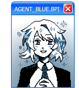
Hello! I am AGENT_BLUE! It is nice to meet you. My role is to guide you through the Bureau of Paranormal Investigation's experimental training program - which I am sure you are currently aware of. I'd like to welcome you all to this unique initiative! I hope that I can make these next few weeks a positive and productive experience for all of us! I see that you have mostly already sorted yourself into teams. Great! This will be helpful during the following activities, and will ensure that no one feels left out or abandoned as we proceed to our first team-building exercise!
For our first activity as part of our initiative to prepare you for anomalous Scribble-based occurrences, let's get to know each other! Studies have proven that the easiest way to initiate and gauge employee compliance is to engage in trust-building excercises as we navigate the world of morality and inter-organizational ethics!
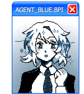
So, let's not waste any time! Between your teams, we'll explore the world of morality, and attempt to develop a comprehensive code of ethics together in order to build a truly cohesive teamwork-oriented environment! To this effect, we will have your teams examine complex moral quandries, and attempt to empathize with and do the opposite of your adversarial influences!
Of course, some of you will have to play the role of villain as well, but this too is a learning opportunity! By doing the opposite in the field of what how you are assigned to perform in this preliminary assignment, you too can excel as an agent of our great Bureau!
Your pairings for this excercise, and more information about the activities we will be conducting, can be found below! Good luck - I believe that you all can be the best versions of yourselves!
//:ROUND 1 - MATCHUPS://
Click the box below to reveal the round's theme and matchups.
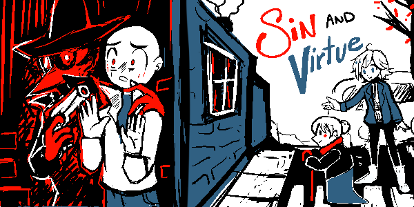
Sin and Virtue
Crimes and punishments. Good deeds, and selfish desires. Actions both constructive and destructive in nature.
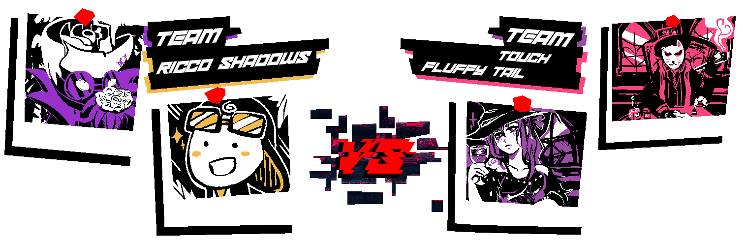
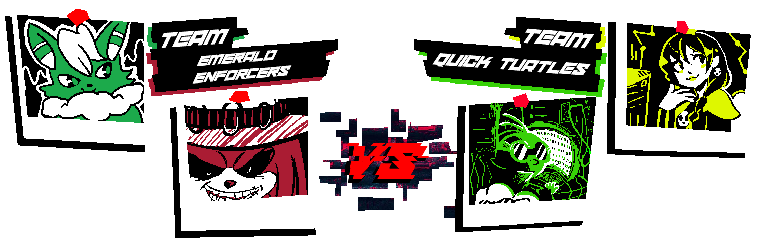
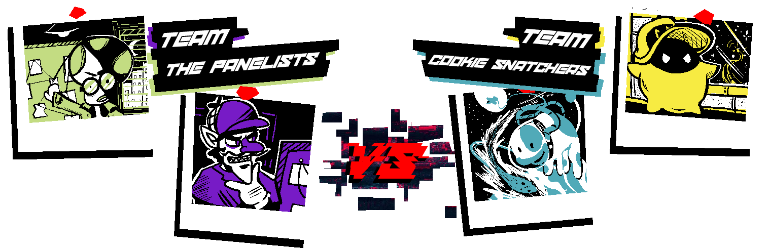
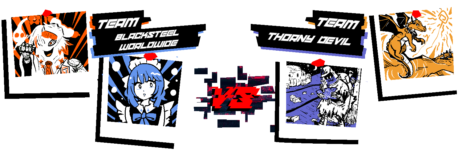
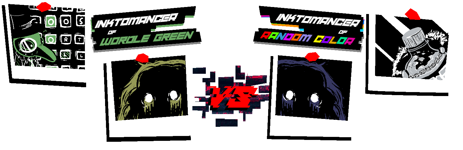
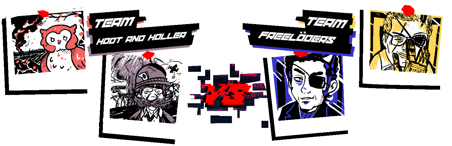
Representing the Inktoplasms this round...
MCD is partnered with Morgan - Kendrick Or Something (#959955)
Fantanoice is partnered with Yoshi the Space Station Manager - BASALT BLUE (#363761)
As a Random Color user, Fantanoice is using CHILL GREY (#B8BCC0)
This round's gimmick is...
[INVERSION]
* You may use the inverted form of your opponent's color in addition to your own and the basic black and white. The corresponding hex code will be provided alongside your prompt. *
*If they choose to utilize this additional color, Physical Scribblers do not have to be exact, just close enough*
Prompts for this round will unlock...
.
(Who's that red guy in the introductory banner...? I'd better report this to our IT department, this doesn't seem like it's supposed to be part of the program... This is what happens when they push a feature like this to live without the bare minimum testing...)
>LOADING...
>INSTALLING...
>[▮▮▮▮▮▮▮▮▮▮▮▮▮▮▮▮]
>INSTALLATION COMPLETE
>INITIALIZING...
Hello! I am AGENT_BLUE! It is nice to meet you. My role is to guide you through the Bureau of Paranormal Investigation's experimental training program - which I am sure you are currently aware of. I'd like to welcome you all to this unique initiative! I hope that I can make these next few weeks a positive and productive experience for all of us! I see that you have mostly already sorted yourself into teams. Great! This will be helpful during the following activities, and will ensure that no one feels left out or abandoned as we proceed to our first team-building exercise!
For our first activity as part of our initiative to prepare you for anomalous Scribble-based occurrences, let's get to know each other! Studies have proven that the easiest way to initiate and gauge employee compliance is to engage in trust-building excercises as we navigate the world of morality and inter-organizational ethics!
So, let's not waste any time! Between your teams, we'll explore the world of morality, and attempt to develop a comprehensive code of ethics together in order to build a truly cohesive teamwork-oriented environment! To this effect, we will have your teams examine complex moral quandries, and attempt to empathize with and do the opposite of your adversarial influences!
Of course, some of you will have to play the role of villain as well, but this too is a learning opportunity! By doing the opposite in the field of what how you are assigned to perform in this preliminary assignment, you too can excel as an agent of our great Bureau!
Your pairings for this excercise, and more information about the activities we will be conducting, can be found below! Good luck - I believe that you all can be the best versions of yourselves!
//:ROUND 1 - MATCHUPS://
Click the box below to reveal the round's theme and matchups.
Sin and Virtue
Crimes and punishments. Good deeds, and selfish desires. Actions both constructive and destructive in nature.
Representing the Inktoplasms this round...
MCD is partnered with Morgan - Kendrick Or Something (#959955)
Fantanoice is partnered with Yoshi the Space Station Manager - BASALT BLUE (#363761)
As a Random Color user, Fantanoice is using CHILL GREY (#B8BCC0)
This round's gimmick is...
[INVERSION]
* You may use the inverted form of your opponent's color in addition to your own and the basic black and white. The corresponding hex code will be provided alongside your prompt. *
*If they choose to utilize this additional color, Physical Scribblers do not have to be exact, just close enough*
Prompts for this round will unlock...
.
(Who's that red guy in the introductory banner...? I'd better report this to our IT department, this doesn't seem like it's supposed to be part of the program... This is what happens when they push a feature like this to live without the bare minimum testing...)

- MarioWiki
- Fun With Despair
- Thread starter
- #29
//:ROUND 1 - START://
Please submit your Scribble before the following deadline:
.
Please submit your Scribble before the following deadline:
.
Some advice before we begin:
- Please DO NOT post your scribble in public before voting goes live. Submit it to me via forum DM or Discord, but public posting will result in disqualification.
- You are allowed to discuss and plan with your partner before either of you receive your prompt, and I will not penalize anyone for sharing information or their finished drawing with their partner after you have both finished your scribbles. Do not, however, discuss your prompt or share your scribble until you have both finished.
- I encourage you to give your drawing a title. This doesn't have to be an actual title, and it can serve as a small single line of dialogue, a punchline, or provide context to your scribble as well. Just mention the title when you send me your drawing - or don't! Sometimes no title is the most impactful thing you can do.
- If you are drawing traditionally, or if you request your prompt via DM instead of Uncle Awards, I'll give some leeway on submission time due to time required to scan and to account for me being late to reply respectively. Normally this will be about 15 minutes, but I won't be an asshole if you don't abuse this.
- Have fun. Or don't. I hope you do, but I'm not the fun police.
- MarioWiki
- Fun With Despair
- Thread starter
- #30
//:ATTENTION://
In order to facilitate additional Scribbling time on the weekend and better align the game's submission end time with my personal availability, submission periods will end approx. 6 hours later, at
In order to facilitate additional Scribbling time on the weekend and better align the game's submission end time with my personal availability, submission periods will end approx. 6 hours later, at
.
This time will apply to all future phases.
SUNNY:
So, this is the Scribblesphere? Wow!
For a place that's been torn apart and remade at least four times, this is looking really spiffy!
I can't wait to see all the colorful sights!
I hope I have the right place? This is where Mel said he wanted to meet, right? I should have asked him to loosen his hood thingy before mumbling directions at me.
Ah well, it can't be helped now. I think I'll explore the local food stuff options while I wait for him! That way, I'll have something to tell Clay once I go back home.
I think that cart over there looks promising!
SUNNY:
Hello, good sir bedsheet ghost!
I would like one of your longmeats, please.
SHIFTY HOT DOG VENDOR:
Uhhh mustard?
SUNNY:
Well, that's not how I'm usually described, but close enough.
SHIFTY HOT DOG VENDOR:
Mmmmm.
SUNNY:
This is... blue.
...
Why is it blue?
SHIFTY HOT DOG VENDOR:
Cyanide.
SUNNY:
...what?
SHIFTY HOT DOG VENDOR:
Uhhh, I meant sriracha!
SUNNY:
.....
You're not really a longmeats vendor, are you?
SHIFTY HOT DOG VENDOR:
Uhm!!! I have to go AFK
SUNNY:
...
Well, he seemed nice.
- MarioWiki
- Fun With Despair
- Thread starter
- #32
Well done! You've all exceeded the expectations of this exercise! Such an excellent and varied set of outputs - It's clear that you are a group with wide-ranging, diverse skills. You certainly rose to the challenge too, despite being handed an unpredictable dataset in the form of your palettes, you have largely created cohesive and inventive artwork. I'm proud to be assigned such a motivated set of trainees!
Now, before we proceed with the next exercise - let's engage in some peer review. Allow me to present your final products for the purpose of admiration and analysis:
[//:ROUND 1 - RESULTS://]
~[FOR RANSOM]~
| 
|
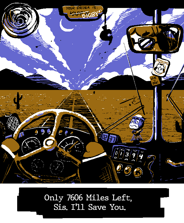
~[TO THE RESCUE]~
| 
|
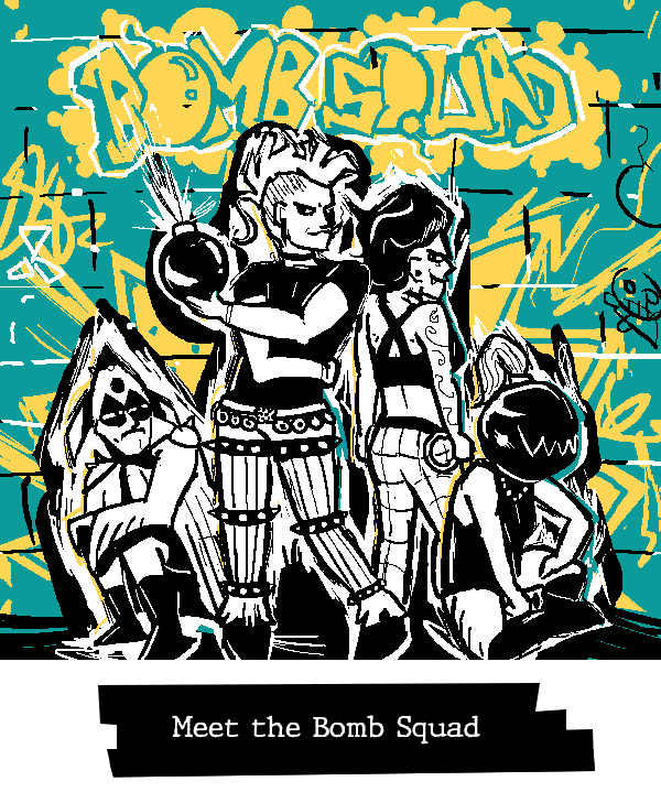
~[EXPLOSIVE PRESENCE]~
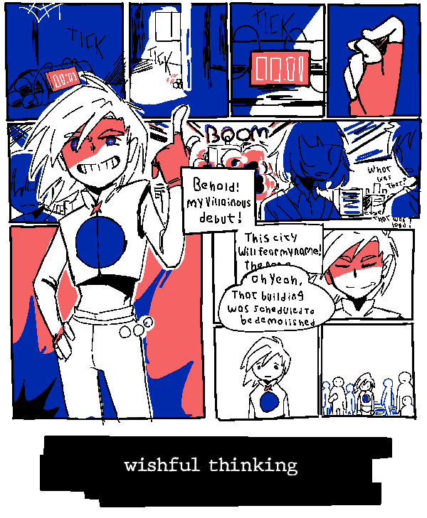
| 
|
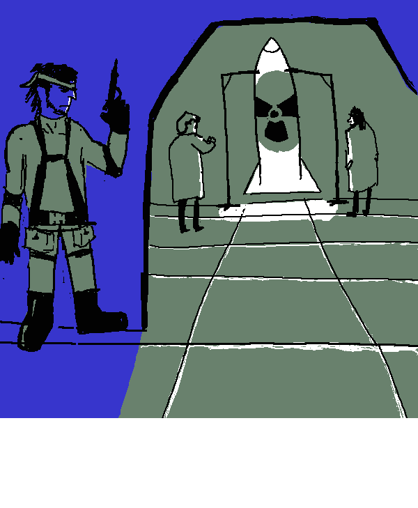
~[DEFUSING THE SITUATION]~
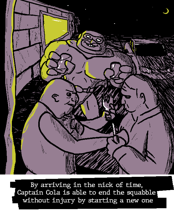
| 
|
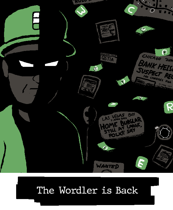
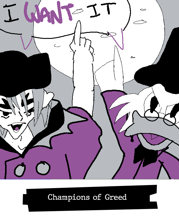
~[PILLAGE AND PLUNDER]~
| 
|
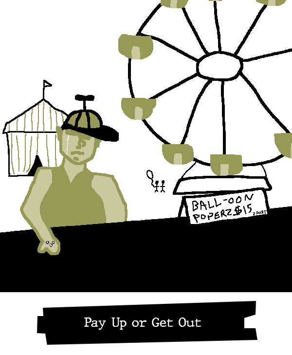
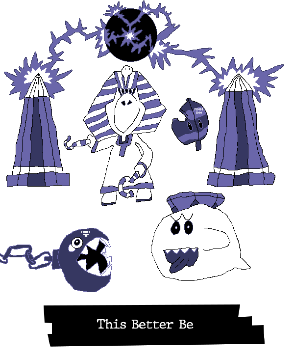
~[FAIR TRADE]~
| 
|
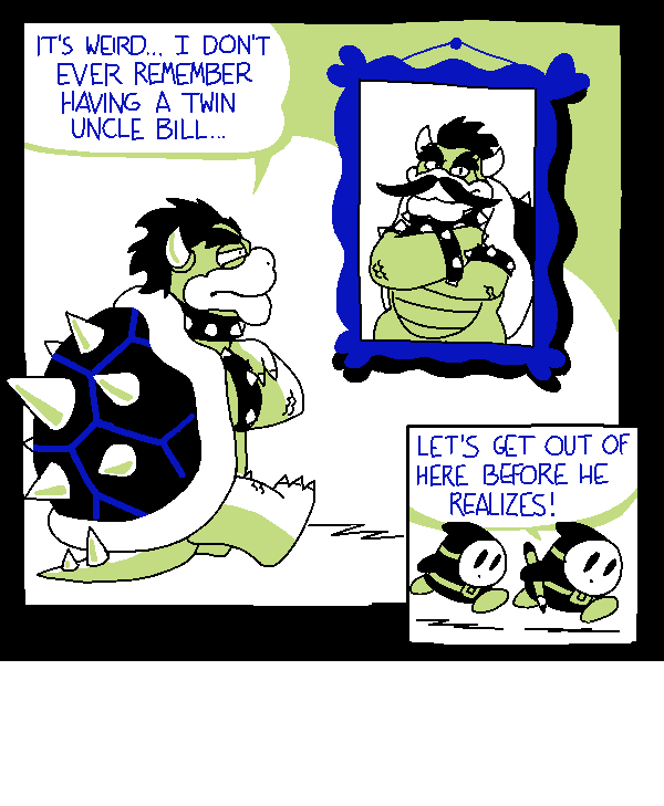
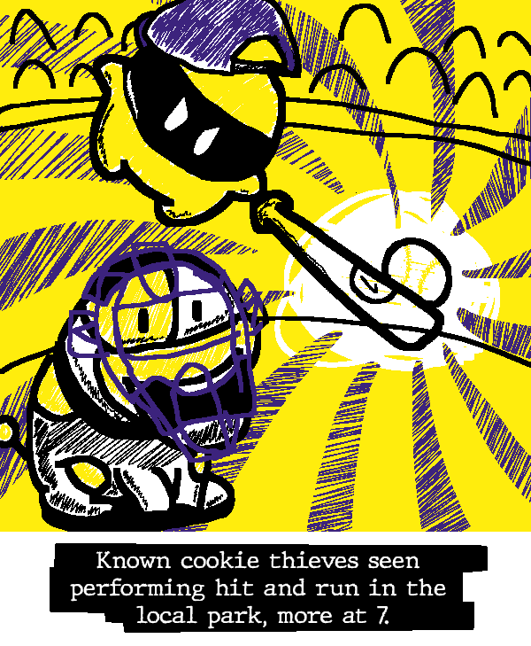
~[HIT AND RUN]~
| 
|
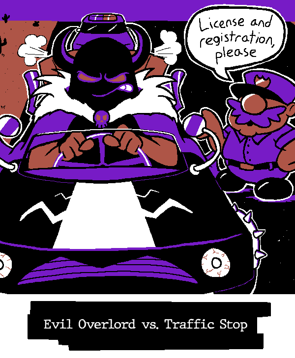
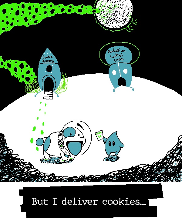
~[PULLED OVER]~
| 
|
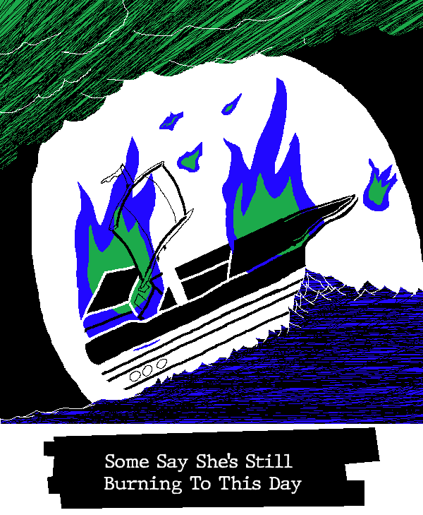
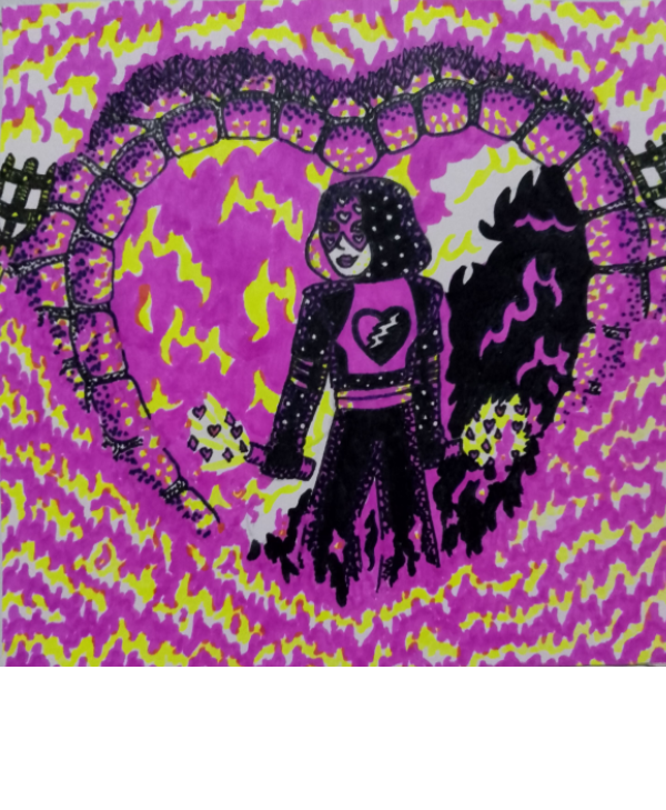
~[BURN IT DOWN]~
| 
|
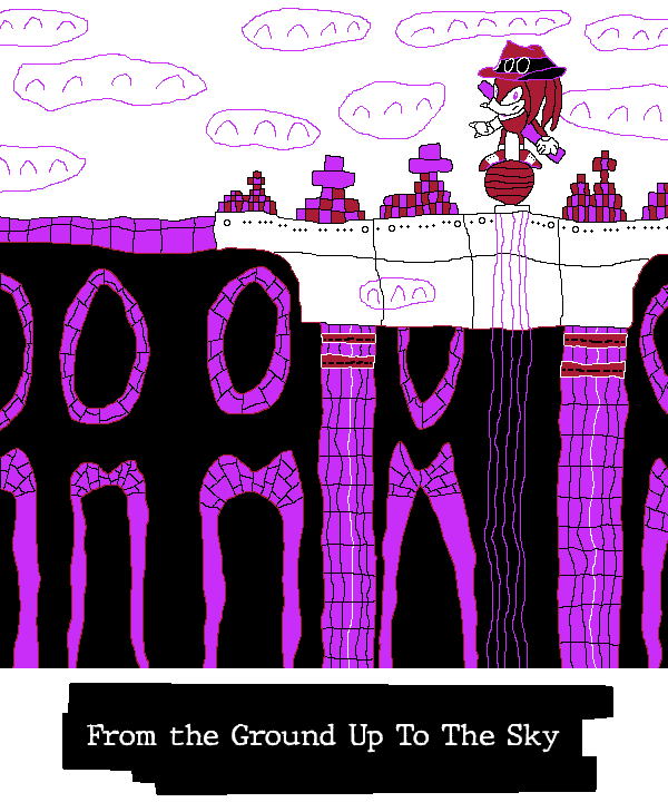
~[BUILD IT UP]~
| 
|
~[IN COLD BLOOD]~
| 
|
~[EYE FOR AN EYE]~
| 
|
Okay! Now, I'll need you to vote, using this form here! Feedback is an important part of growth too, so if there's an image you like, an area someone could improve, or anything you want to say, feel free to comment here or in our verified operative chat venue!
Please note, excessive abuse of the [oh le banger] emote is now discouraged under the employee handbook (pg. 24, Subsection 8). Even writing something as simple as "Nice scribble!" is shown to increase employee satisfaction by up to 30% more!
Voting will end at...
.
Both players and spectators are strongly encouraged to vote.

- Pronouns
- He/him
- MarioWiki
- Hooded Pitohui
Alright, let's do some commentary! Words have proven rather slippery today, evading my attempts to wrangle them, so I cannot promise these will be the best-articulated, but I'll go for it all the same.
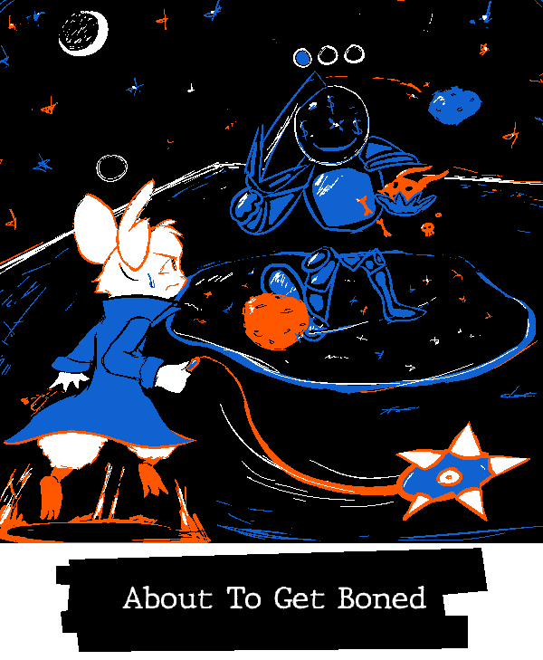
Turboo - I haven't played Mina, but that doesn't at all detract from my enjoyment of this piece - which to me is a sign of its quality! There's something especially strong in the contrast of the two characters here. The... blue knight individual has a wide, confident stance. Feet planted apart, arms out, that stance builds them up as a proper obstacle - which then gets reinforced by Mina's leaning forward and her expression. Add to that the sense of motion in the lines rising up from Mina's platform and trailing her flail, and it all comes together to make the confrontation palpable. Everything in the foreground and midground works to support the sense of a tense confrontation here, and I enjoy that kind of tension. I'm really taken by the background, though! Its serenity contrasts the rest of the image, accentuating the main focus! Fitting you had orange and blue to work with, two colors often used to highlight each other through their contrast!
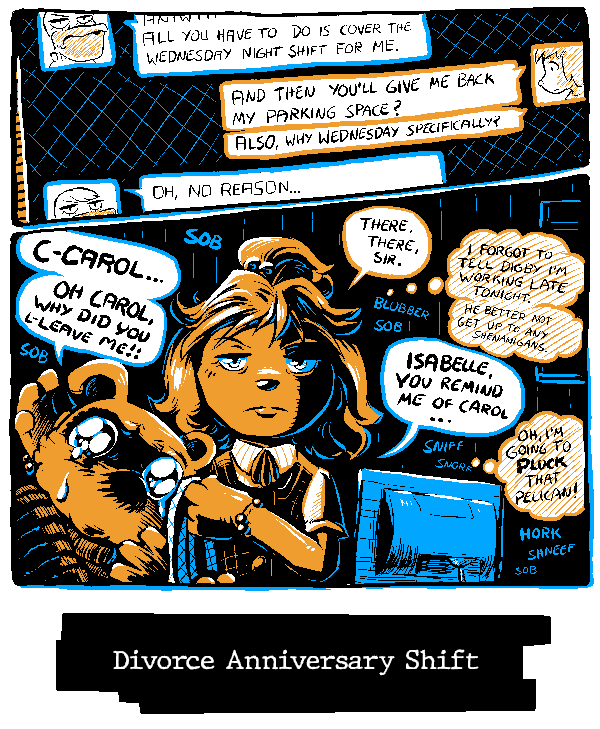
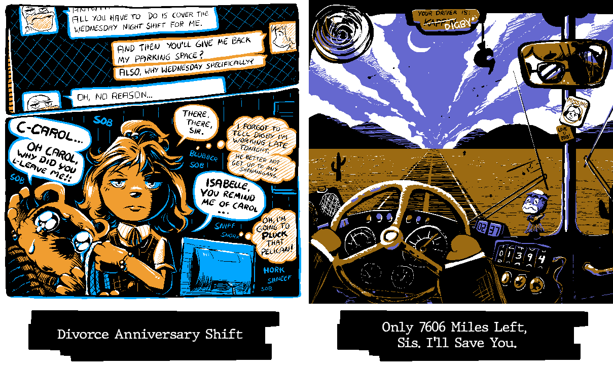
Yap - It's impressive how much you were able to incorporate into this image without sacrificing readability. There's a lot going on here between the text exchange, the various text and thought bubbles, the onomatopoeia, and the emphasis on the expressions of the characters, but I didn't have to sort through it to understand what was going on. It was immediately readable, with the extra details like the sobbing noises being something I discovered the longer I looked at it, rather than something that clouded the focus. I don't know all the technical terms, but I imagine that reflects a mastery of using different sizing, line weights, color contrast, and placements to direct the eyes to the most important parts of the image. It strikes me that the sobbing is all purely blue on black, making them lower-contrast than the shaded thought bubbles, which are in turn lower contrast than the speech bubbles, which are in turn lower contrast than the heavily-shaded and dual-colored characters - I suppose that creates a hierarchy that guides the eye.
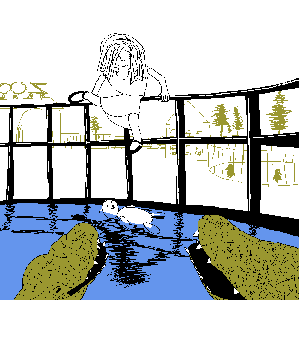
Uniju - Uniju, you are incredibly skilled at making peaceful and wistful scenes. Even though there is a dangerous rescue mission going on here, the image still feels... almost oddly nostalgic? The thin scratchy lines of the background and the cute details like the penguins in silhouette give this the feeling of a hazy memory. It's like I'm recalling a zoo I barely remember visiting at the age of five. Even the relative lack of detail on the girl climbing into the enclosure contributes. Her hair mostly obscuring her face, her plain outfit... it feels like I'm struggling to recall the face of a playmate from my early years. All of that creates an interesting interplay with your detailed and nicely-textured alligators. Thinking of this like a memory from childhood, are they so concrete in form and texture because they stood out as dangerous? Perhaps this is even the rescuer's memory! Perhaps she's recalling this rescue operation, and the alligators she vividly recalls because they were so frightening!
GBA - I'm a big fan of the openness here. Your palette and the choice to cleanly separate land from sky make it feel as though this landscape truly stretches on forever. I particularly like the choice to make this a nighttime sky. It'd have been easy to do a daytime sky with that blue, piggybacking off the general perceptions of deserts as searing hot landscapes, but you saw the softer hue of your blue and went with a nighttime scene. I feel like that enhances the loneliness of this image. Imagining the desert sands illuminated only by headlights makes me feel like I've been confined to some sort of pleasant purgatory, where I will never reach my destination but I will always have the pleasure of a spiritual adventure. Digby's endless journey... and all because Isabelle forgot to tell him she was working late...
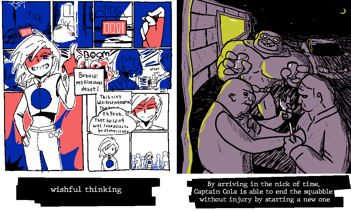
woglirl - woglirl, your character designs and expressions never cease to blow me away. You always leave me with a feeling of "I want to read a story about these characters..." She's amazing. The short sleeves and fingerless gloves are nice touches for rounding out that punk look. This may be an odd comparison, but I was recently thinking about Pokestar Studios from B2W2, and its mechanic of "Strange Endings", where films could garner more attention by doing something unconventional. If I remember correctly, the tutorial for that mechanic is playing an utter failure of a hero. I know this character is a villain, but I'm reminded of that scenario... I want to see this character fail more...
TPG - It's neat that both you and your opponent went for punks. I'm feeling Andrew Hussie strongly in this one, and I mean that entirely positively. The second character from the left reminds me of Zhen. Big personality to these characters that meshes well with the striking color scheme of the graffiti behind them.
TB - I feel unsafe. I say that humorously, but, like, also, that seems to be the intention and you delivered. These two men are threatening each other with broken bottles and knives and yet I fear for their safety. Captain Cola's size, expression, and slightly askew stance combine with the minimal light and pervasive scratchy shadowing make me worry these men are going to end up floating down a river in pieces.
kramer - Great use of your palette for light and shadow, here. The way the green flows out of the doorway clearly positions it as illumination spilling out of the room even though you're working with such a dark color, and blue naturally lends itself well to draping Snake in shadow. The sparing use of white makes its abundance on the missile draw my eye first, which in effect conceals Snake from view immediately - so mission accomplished, soldier.
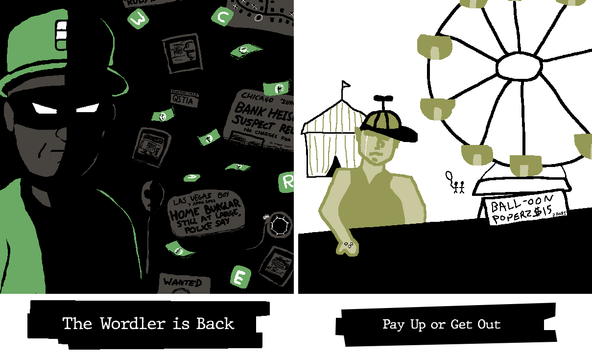
MCD - Way to make the Wordler threatening with the striking use of shadow and the off-center posing. Great use of subtle touches of grey to keep his face readable on the shadowed side. I'm mesmerized by the way those little touches manage to make his mask feel blacker than black. I know it's a trick, but I can still see the outline of his mask over the shadowed part of his face!
Fanta - I don't know who the fella next to Scrooge is, but I like how they both spill out of the frame. It gives the impression of them jostling to be the focus of the piece, and all without them needing to overlap or needing to figure out how they would press against each other. I also like how their color schemes mirror each other, both going from purple to grey to white to black as they ascend. That coloring parallel accentuates their similar personalities.
Morgan - You know what this reminds me of? This feels like those shots in animation where a character is suddenly drawn in a more detailed, realistic style to express some strong emotion. We're two seconds away from a shattering screen transition to a spotlight shining down on this kid while they falls to their knees and pounds a fist against the ground. It's something about the way you drew the face with the eyes in shadow but the nose so prominent.
YtSSM (Ink) - Mario Pinball Land mention, wooh! Seriously, though, I enjoy seeing ol' King Tut get his due. I like the layering to this one. They are indeed making a (ideally) fair trade, but also Pinball Land was set at... a fair. Good joke. I also want to highlight your Chain-Chomp and Super Leaf, which both have great depth to them. I can see you put a lot of care into the Chomp's chain and teeth, as well as giving the Super Leaf depth through its little missing bit.
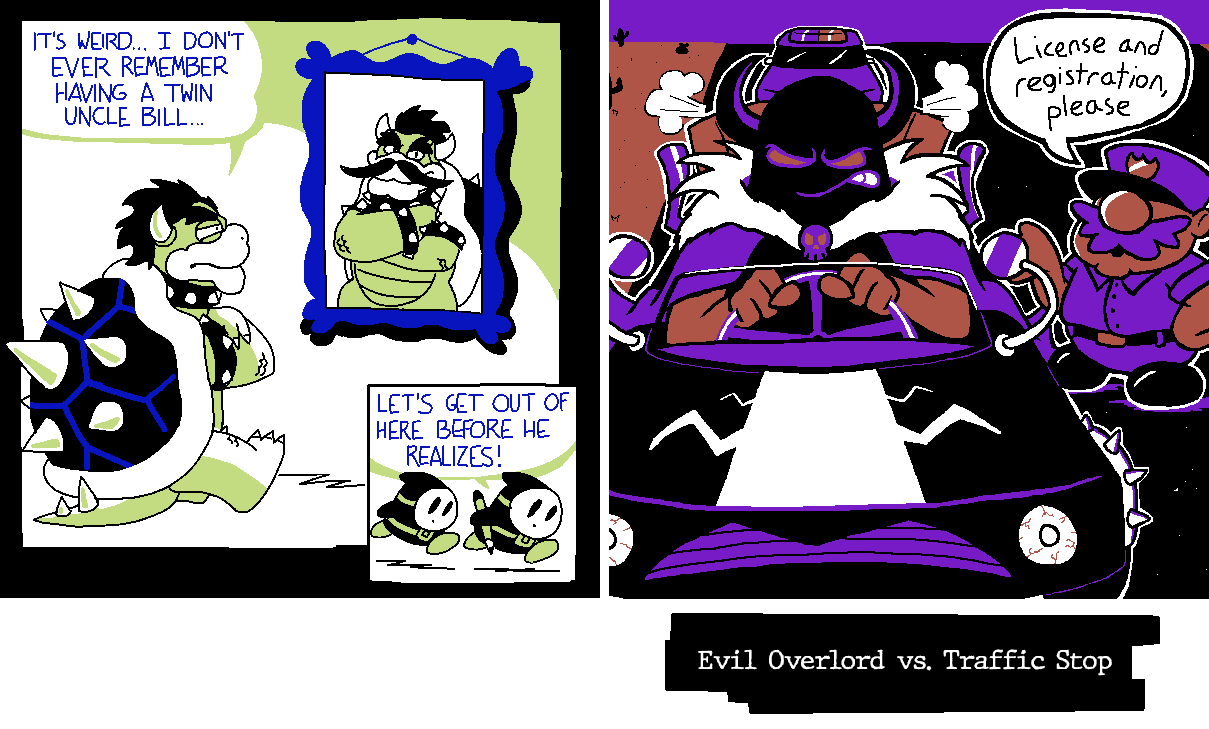
Hint Toad - Ahahaha, I cracked a huge smile seeing this! The comic with these two troublemaking Shy Guys has stuck in my head for its absurdity, so it was a treat to see it referenced. Even if one didn't know the original comic, there's much to appreciate here. You do an excellent job of drawing Bowser, and I'm especially taken with the way you've drawn his shell spikes. I'm going to have to take notes on the way you shade them - it gives them a great deal of depth! There's also the positioning of the panel with the Shy Guys, so small and tucked into the bottom right, a natural endpoint for the eyes to reach so it can deliver the punchline. That you're a professional comic artist shines through here!
Nine - There's that Ninelevendo action scene! You're skilled at capturing moments of intense action in a still image, and this is another prime example of that. Again, I'm noticing a sparse use of white that draws attention to the baseball in conjunction with the swirling lines of blue. You use a lot of white on Poochy but wisely temper it with some black so that it doesn't distract from the main focus. The looseness to your white and the fact that it's the brightest color in the image impart the ball with tremendous energy. I wouldn't want to be the outfielder here!
Waluigi Time - As always, your ability to create scrimblos are unparalleled. I see a little bit of Zurg and Chief Palmer in these two, but they have distinct energies that are all their own, too. That police officer in particular feels muppetish to me. He just got done harassing Kermit the Frog, y'know? He pops up with an exaggerated accent and starts requesting increasingly ridiculous documentation. He goes from wanting to see your driver's license to wanting your birth certificate to wanting to see your medical records to wanting to see your online shopping orders to wanting to see your mmorpg login information, then goes "well, everything appears to be in order. I'll let you- oh, whoops. Can't let you go yet! I need your fishing license". Then you can't find your fishing license and he writes you a citation. Meanwhile, this villain - look at that shawl, he's got flair. I feel like he's on his way to compete in a televised car race. I know I spent this time talking about the scrimblos and not the art, but, I mean, I think that's a testament to the strength of your pieces - I can immediately spin up skits and stories from what you draw.
PoochyPie - I like the relative simplicity of this piece. Everything is nicely spread, there's no clutter, and it's just got a good, readable premise.
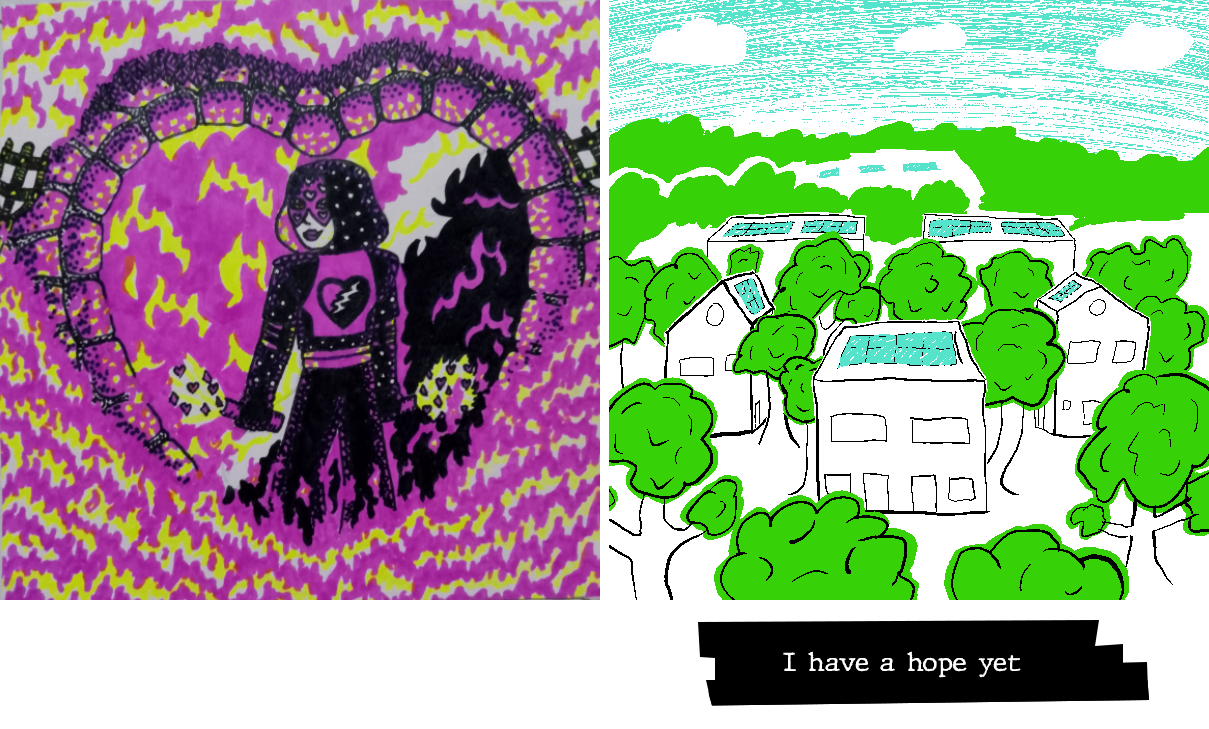
BBQ - I haven't the words. I mean, I think I would exhaust all of my available time if I tried to comment in detail on everything there is to adore in your piece. GBA articulated thoughts much better than I could, but I am enamored with the ferocity and style of this character. They are not content with simply razing the land - they're doing it with flair. They're a villain's villain, forming that heart shape around themselves while setting the world ablaze. Powerful and confident energy, they have. I'm a big fan of the way you rendered the flames, layering them in a chaotic-yet-controlled way to capture the amorphous nature of a raging fire. The pink-on-black to create this trail of destruction is especially striking.
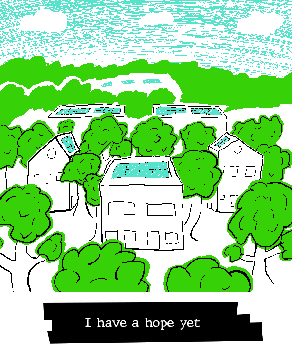
LTQ - This image resonates with me. There is a palpable optimism in this image, even disregarding the title. The perspective offering a look at that beautiful, boundless blue sky communicates not only a world of reduced pollution, but a hope that we look beyond ourselves and surpass the boundaries which presently hold us back. The intermixing of homes and trees, too, points to a literal physical harmony between civiliazation and nature, but also, I feel, to a broader metaphorical directive to look beyond ourselves. "We are bound together," this image says, "by complex webs of relationships both human and ecological." This image, to me, is an affirmation that humanity can show its better nature and rise above individualistic thinking, and I adore it for that. I also really like the decision to let the green spill outside of the outlines of the leaves. it gives the trees a softer, gentler feel.
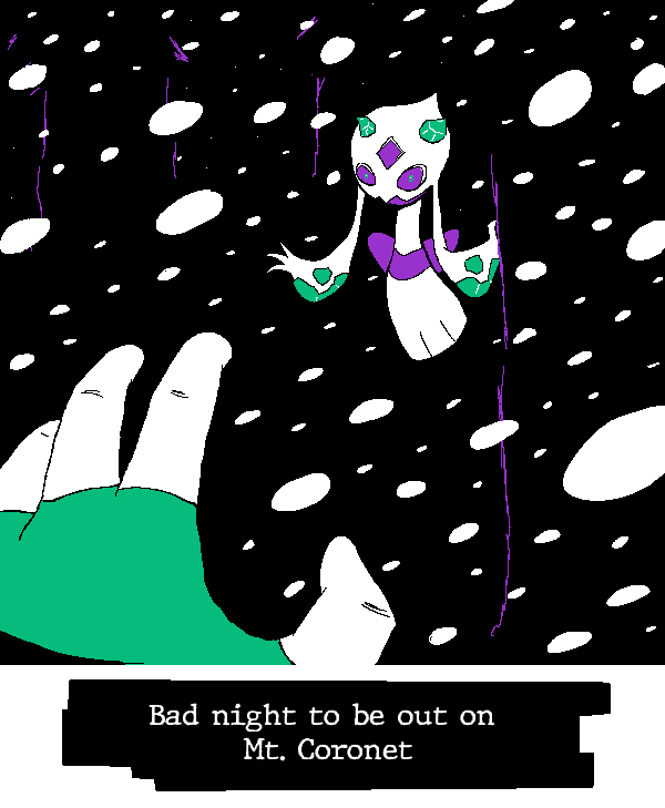
Rose - Giiiiiiive it up for threatening ghost Pokémon! My second-favorite genre of threatening Pokémon images, only after threatening Fairy-types! You did a bang-up job making this Froslass feel dynamic and intimidating. By the former, I mean, like, it feels like it's in motion. Froslass is rapidly approaching and actively spreading her arms to come grab the POV character as they freeze. Fan of the minimal-but-not-absent background detailing to suggest a snowy nighttime scene where the blizzard and the darkness conspire to leave this character unable to see but a few feet in front of them. There's something to be said for how small you made Froslass' eyes. It is an interesting choice to eschew more "on-model" anime-style eyes here, and it pays off handsomely. That these read as more pinprick eyes until I zoom in gives them a more ghostly and threatening feel. This isn't a ~friend and companion to join you on your Pokémon journey~; this is a Creature (TM). Shrinking the eyes turns Froslass into a proper vengeful spirit driven only by a desire for revenge and adding to its collection, and that is a great design choice for this image.
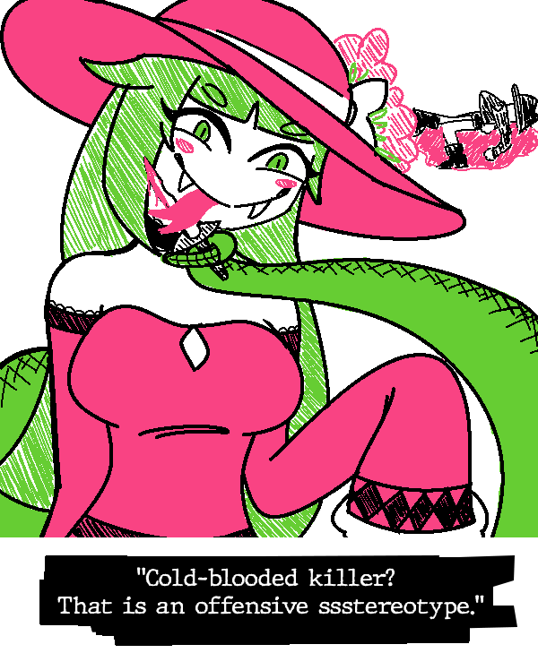
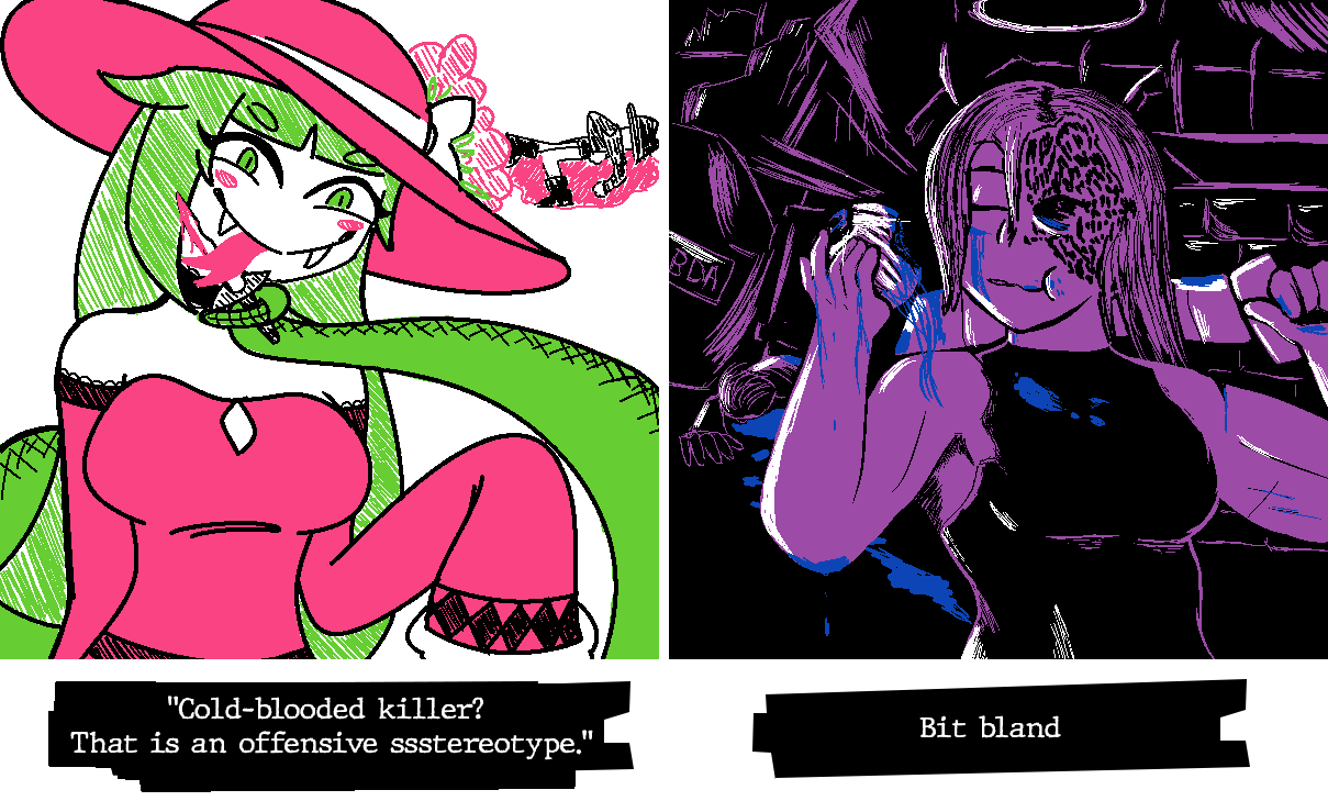
Hearts - Cascabela!!! Interesting that both you and your teammate have someone licking up blood (and more, in your teammates case). Was that a pre-coordinated design element? I doubt it, which makes it cooler that it shook out that way. Nice use of striped colors to suggest a softer texture for Cascabela's hair and the flowers on her hat. Great expression and posing. Free her. She did everything she's accused of, but, like, free her. #Women'sWrongs etc etc.
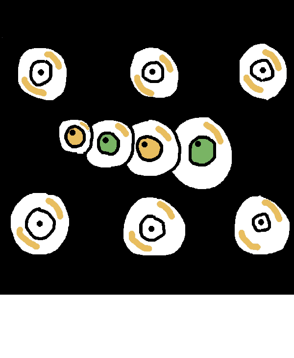
Paradox - What most intrigues me about this image is the chain of eyes. There being these relatively evenly-spaced, evenly-size eyeballs makes for an intriguing contrast with the connected, snake-like eyeballs. The eyesnake reminds me of a... I believe it's Link's Awakening? It reminds me of a Link's Awakening boss, but I digress. The fact that eyesnake eyeballs have colored irises and pupils that are looking somewhere, whereas the other eyeballs look straight ahead and have white iris, suggests that the eyesnake has a degree of intelligence which the regular eyeballs lack. Does it perhaps consume them? Is this is a creature in a surreal world, looking to add to itself? Interesting questions arise from your design choices!
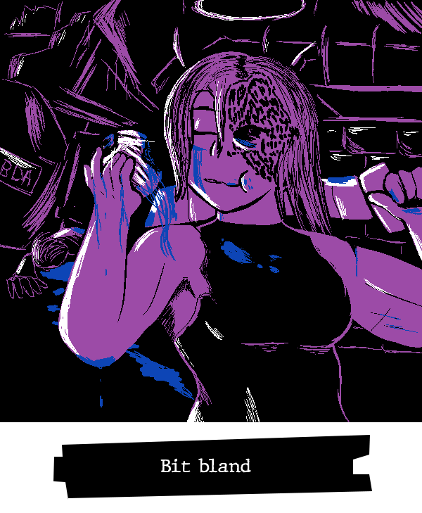
Koops - #Women'sWron- what do you mean I "already used that bit"? Who said it was a bit? I like the definiton on your character. You've got a knack for interesting body styles. It's neat how you contrast how clearly readable and defined she is with how messy and incomplete the background clutter is. It's intentionally left vague to contrast with the central focus of the image. That lets you get the most out of your purple while leaving the blue for striking touches of blood and vitreous fluids. It's nice.
Yap - It's impressive how much you were able to incorporate into this image without sacrificing readability. There's a lot going on here between the text exchange, the various text and thought bubbles, the onomatopoeia, and the emphasis on the expressions of the characters, but I didn't have to sort through it to understand what was going on. It was immediately readable, with the extra details like the sobbing noises being something I discovered the longer I looked at it, rather than something that clouded the focus. I don't know all the technical terms, but I imagine that reflects a mastery of using different sizing, line weights, color contrast, and placements to direct the eyes to the most important parts of the image. It strikes me that the sobbing is all purely blue on black, making them lower-contrast than the shaded thought bubbles, which are in turn lower contrast than the speech bubbles, which are in turn lower contrast than the heavily-shaded and dual-colored characters - I suppose that creates a hierarchy that guides the eye.
Uniju - Uniju, you are incredibly skilled at making peaceful and wistful scenes. Even though there is a dangerous rescue mission going on here, the image still feels... almost oddly nostalgic? The thin scratchy lines of the background and the cute details like the penguins in silhouette give this the feeling of a hazy memory. It's like I'm recalling a zoo I barely remember visiting at the age of five. Even the relative lack of detail on the girl climbing into the enclosure contributes. Her hair mostly obscuring her face, her plain outfit... it feels like I'm struggling to recall the face of a playmate from my early years. All of that creates an interesting interplay with your detailed and nicely-textured alligators. Thinking of this like a memory from childhood, are they so concrete in form and texture because they stood out as dangerous? Perhaps this is even the rescuer's memory! Perhaps she's recalling this rescue operation, and the alligators she vividly recalls because they were so frightening!
GBA - I'm a big fan of the openness here. Your palette and the choice to cleanly separate land from sky make it feel as though this landscape truly stretches on forever. I particularly like the choice to make this a nighttime sky. It'd have been easy to do a daytime sky with that blue, piggybacking off the general perceptions of deserts as searing hot landscapes, but you saw the softer hue of your blue and went with a nighttime scene. I feel like that enhances the loneliness of this image. Imagining the desert sands illuminated only by headlights makes me feel like I've been confined to some sort of pleasant purgatory, where I will never reach my destination but I will always have the pleasure of a spiritual adventure. Digby's endless journey... and all because Isabelle forgot to tell him she was working late...
woglirl - woglirl, your character designs and expressions never cease to blow me away. You always leave me with a feeling of "I want to read a story about these characters..." She's amazing. The short sleeves and fingerless gloves are nice touches for rounding out that punk look. This may be an odd comparison, but I was recently thinking about Pokestar Studios from B2W2, and its mechanic of "Strange Endings", where films could garner more attention by doing something unconventional. If I remember correctly, the tutorial for that mechanic is playing an utter failure of a hero. I know this character is a villain, but I'm reminded of that scenario... I want to see this character fail more...
TPG - It's neat that both you and your opponent went for punks. I'm feeling Andrew Hussie strongly in this one, and I mean that entirely positively. The second character from the left reminds me of Zhen. Big personality to these characters that meshes well with the striking color scheme of the graffiti behind them.
TB - I feel unsafe. I say that humorously, but, like, also, that seems to be the intention and you delivered. These two men are threatening each other with broken bottles and knives and yet I fear for their safety. Captain Cola's size, expression, and slightly askew stance combine with the minimal light and pervasive scratchy shadowing make me worry these men are going to end up floating down a river in pieces.
kramer - Great use of your palette for light and shadow, here. The way the green flows out of the doorway clearly positions it as illumination spilling out of the room even though you're working with such a dark color, and blue naturally lends itself well to draping Snake in shadow. The sparing use of white makes its abundance on the missile draw my eye first, which in effect conceals Snake from view immediately - so mission accomplished, soldier.
MCD - Way to make the Wordler threatening with the striking use of shadow and the off-center posing. Great use of subtle touches of grey to keep his face readable on the shadowed side. I'm mesmerized by the way those little touches manage to make his mask feel blacker than black. I know it's a trick, but I can still see the outline of his mask over the shadowed part of his face!
Fanta - I don't know who the fella next to Scrooge is, but I like how they both spill out of the frame. It gives the impression of them jostling to be the focus of the piece, and all without them needing to overlap or needing to figure out how they would press against each other. I also like how their color schemes mirror each other, both going from purple to grey to white to black as they ascend. That coloring parallel accentuates their similar personalities.
Morgan - You know what this reminds me of? This feels like those shots in animation where a character is suddenly drawn in a more detailed, realistic style to express some strong emotion. We're two seconds away from a shattering screen transition to a spotlight shining down on this kid while they falls to their knees and pounds a fist against the ground. It's something about the way you drew the face with the eyes in shadow but the nose so prominent.
YtSSM (Ink) - Mario Pinball Land mention, wooh! Seriously, though, I enjoy seeing ol' King Tut get his due. I like the layering to this one. They are indeed making a (ideally) fair trade, but also Pinball Land was set at... a fair. Good joke. I also want to highlight your Chain-Chomp and Super Leaf, which both have great depth to them. I can see you put a lot of care into the Chomp's chain and teeth, as well as giving the Super Leaf depth through its little missing bit.
Hint Toad - Ahahaha, I cracked a huge smile seeing this! The comic with these two troublemaking Shy Guys has stuck in my head for its absurdity, so it was a treat to see it referenced. Even if one didn't know the original comic, there's much to appreciate here. You do an excellent job of drawing Bowser, and I'm especially taken with the way you've drawn his shell spikes. I'm going to have to take notes on the way you shade them - it gives them a great deal of depth! There's also the positioning of the panel with the Shy Guys, so small and tucked into the bottom right, a natural endpoint for the eyes to reach so it can deliver the punchline. That you're a professional comic artist shines through here!
Nine - There's that Ninelevendo action scene! You're skilled at capturing moments of intense action in a still image, and this is another prime example of that. Again, I'm noticing a sparse use of white that draws attention to the baseball in conjunction with the swirling lines of blue. You use a lot of white on Poochy but wisely temper it with some black so that it doesn't distract from the main focus. The looseness to your white and the fact that it's the brightest color in the image impart the ball with tremendous energy. I wouldn't want to be the outfielder here!
Waluigi Time - As always, your ability to create scrimblos are unparalleled. I see a little bit of Zurg and Chief Palmer in these two, but they have distinct energies that are all their own, too. That police officer in particular feels muppetish to me. He just got done harassing Kermit the Frog, y'know? He pops up with an exaggerated accent and starts requesting increasingly ridiculous documentation. He goes from wanting to see your driver's license to wanting your birth certificate to wanting to see your medical records to wanting to see your online shopping orders to wanting to see your mmorpg login information, then goes "well, everything appears to be in order. I'll let you- oh, whoops. Can't let you go yet! I need your fishing license". Then you can't find your fishing license and he writes you a citation. Meanwhile, this villain - look at that shawl, he's got flair. I feel like he's on his way to compete in a televised car race. I know I spent this time talking about the scrimblos and not the art, but, I mean, I think that's a testament to the strength of your pieces - I can immediately spin up skits and stories from what you draw.
PoochyPie - I like the relative simplicity of this piece. Everything is nicely spread, there's no clutter, and it's just got a good, readable premise.
BBQ - I haven't the words. I mean, I think I would exhaust all of my available time if I tried to comment in detail on everything there is to adore in your piece. GBA articulated thoughts much better than I could, but I am enamored with the ferocity and style of this character. They are not content with simply razing the land - they're doing it with flair. They're a villain's villain, forming that heart shape around themselves while setting the world ablaze. Powerful and confident energy, they have. I'm a big fan of the way you rendered the flames, layering them in a chaotic-yet-controlled way to capture the amorphous nature of a raging fire. The pink-on-black to create this trail of destruction is especially striking.
LTQ - This image resonates with me. There is a palpable optimism in this image, even disregarding the title. The perspective offering a look at that beautiful, boundless blue sky communicates not only a world of reduced pollution, but a hope that we look beyond ourselves and surpass the boundaries which presently hold us back. The intermixing of homes and trees, too, points to a literal physical harmony between civiliazation and nature, but also, I feel, to a broader metaphorical directive to look beyond ourselves. "We are bound together," this image says, "by complex webs of relationships both human and ecological." This image, to me, is an affirmation that humanity can show its better nature and rise above individualistic thinking, and I adore it for that. I also really like the decision to let the green spill outside of the outlines of the leaves. it gives the trees a softer, gentler feel.
Rose - Giiiiiiive it up for threatening ghost Pokémon! My second-favorite genre of threatening Pokémon images, only after threatening Fairy-types! You did a bang-up job making this Froslass feel dynamic and intimidating. By the former, I mean, like, it feels like it's in motion. Froslass is rapidly approaching and actively spreading her arms to come grab the POV character as they freeze. Fan of the minimal-but-not-absent background detailing to suggest a snowy nighttime scene where the blizzard and the darkness conspire to leave this character unable to see but a few feet in front of them. There's something to be said for how small you made Froslass' eyes. It is an interesting choice to eschew more "on-model" anime-style eyes here, and it pays off handsomely. That these read as more pinprick eyes until I zoom in gives them a more ghostly and threatening feel. This isn't a ~friend and companion to join you on your Pokémon journey~; this is a Creature (TM). Shrinking the eyes turns Froslass into a proper vengeful spirit driven only by a desire for revenge and adding to its collection, and that is a great design choice for this image.
Hearts - Cascabela!!! Interesting that both you and your teammate have someone licking up blood (and more, in your teammates case). Was that a pre-coordinated design element? I doubt it, which makes it cooler that it shook out that way. Nice use of striped colors to suggest a softer texture for Cascabela's hair and the flowers on her hat. Great expression and posing. Free her. She did everything she's accused of, but, like, free her. #Women'sWrongs etc etc.
Paradox - What most intrigues me about this image is the chain of eyes. There being these relatively evenly-spaced, evenly-size eyeballs makes for an intriguing contrast with the connected, snake-like eyeballs. The eyesnake reminds me of a... I believe it's Link's Awakening? It reminds me of a Link's Awakening boss, but I digress. The fact that eyesnake eyeballs have colored irises and pupils that are looking somewhere, whereas the other eyeballs look straight ahead and have white iris, suggests that the eyesnake has a degree of intelligence which the regular eyeballs lack. Does it perhaps consume them? Is this is a creature in a surreal world, looking to add to itself? Interesting questions arise from your design choices!
Koops - #Women'sWron- what do you mean I "already used that bit"? Who said it was a bit? I like the definiton on your character. You've got a knack for interesting body styles. It's neat how you contrast how clearly readable and defined she is with how messy and incomplete the background clutter is. It's intentionally left vague to contrast with the central focus of the image. That lets you get the most out of your purple while leaving the blue for striking touches of blood and vitreous fluids. It's nice.
- Pronouns
- He/him
- MarioWiki
- Turboo
Yap - I always really love how you draw Isabelle, for starters, and this is easily one of my favorites of the round especially in combination with GBA's; even standalone, I think its a very eye-popping piece. "bro the color contrast!" is a sentiment I have about a good chunk of images this time around, but the shading contrast on her face is genuinely nuts to me, especially with how well you use all four colors there & on her hair - idk how to fully describe this, but the way its so defined on her in comparison to Tom Nook sells her being pissed off, if that makes sense?
Very strong space usage as well IMO with how the image is split between the text messages and the follow-up scene. I'm big on the delineation of thought bubbles vs out-loud speech (i.e., the solid white vs the hatching, creates a really cool visual effect looking at it from a distance) vs the sniffling in the background. The office bg itself still feels pretty defined too with the blue lines, not crowded out by the sfx. Im always astounded by how much you can get out of a 600x600 canvas LOL.... pls destroy Phyllis
Uniju - Im happy I was able to impart that your other color was green.... the texturing on the crocodiles is really good as other people have said. big fan of the girl's expression plus the contrast between the crocodile enclosure and the background with the penguins. Idk if this was mentioned before but I think my personal favorite detail is the reflection of the bars and the girl in the water. the delineation of foreground vs. background feels really noticeable with that in mind, and I think the usage of the green back there also sells distance really well espec with the "reversed" zoo sign
GBA - My first thought was Desert Bus, which, it is Desert Bus in the most literal form lmao. I love this one as well and the way my eye kind of naturally spreads out from the horizon, if that makes sense - I think theres a LOT of environmental storytelling in this one with all the details. Like the build out from "oooo my god pretty scenery" to "Digby is driving" to "Digby stole an entire bus to help his sister" was genuinely how I "progressed" through this picture, with how a lot of details are on the periphery and the way that they're outlined/shaded. Im gonna imagine a follow up where he runs over Phyllis's car in the parking lot next time she's there
I've said this elsewhere, but I really love how yours and Yap's came together with just character matching and having broad enough dialogue/concepts that they tell a full story. imo people using the order their pictures appear in or collaborating on a running theme with their teammate is something that doesnt get used as much as it could, and im glad you two decided to collab on characters; I really can only think of Hearts doing this all the way in Year 1 with his DK/diddy drawing and FWD/Kright having their characters in most of their images.
Wogl - as usual I adore your comic setup and characters, especially the way you make them pop out of/past the panels. I think its really underrated how their top has a bomb design on it with the lit fuse as a kind of zipper/button, I genuinely only noticed that on a second look somehow and I think it adds to the design a lot. To me the character stands out the most for good reason, and my eyes go to the left side of the scribble immediately (probably what they would have wanted!), and I think thats sold really well by how the background characters in the middle are mostly dark blue and lit only by the explosion in the background. I wanna know the backstory of the guy telling them the building was supposed to be demolished tbh, if he's dealt with them before
TPG - I've said this elsewhere as well, but the contrast is REALLY popping in this one and I think it was a super smart choice to have the Bomb Squad themselves in predominantly black and white with some slight colors on the outside for effect - they look awesome against the background. I really like the stylization of their graffiti tag too, its just an overall super stylish piece. I get a big webcomic character vibe from them which tracks with what Pitohui said, like I think they have a lot of personality that comes through from just this singular image
Tb - I mean this as lovingly as possible because I know we were all riffing on you for getting vomit green at the start of the round, but I honestly think you figured out the play with it lol. using it as a lightsource in a scene thats predominantly black & Flintstones Vitamin-colored makes it blend nicely without being as strong as a full white would've been in the same spots. Big fan of the light/shadow distribution with the hatching on the right side toward the car, etc.
Should I assume the background lore of Captain Cola is that he came from the same nuclear accident as Captain Cannon and solves violence with more violence in a different way..... I don;t know if this is backed up by the way the cans are drawn, but now Im thinking of him starting a coke vs pepsi war on the street in relation to the caption. He seems like a friendly man to me personally <-- read tb's commentary on his own image right before writing this sentence
Kramer - I have to agree im a big fan of the use of light and shadow here; I think the way the nuke area is lit up with white/etc. makes the contrast with Snake a lot stronger, espec the choice to not use white on him at all outside him facing the room. I think my eye's drawn to Snake for the "hey it's solid snake!" factor alone lol, but like with the way bright colors are eye-catching as well, I think the nuke does a really good job of that and then leading you out to Snake in the hallway from there. More environmental storytelling present here (the villains have moved on from Metal Gears into even more blatant weapons of mass destruction)
Very strong space usage as well IMO with how the image is split between the text messages and the follow-up scene. I'm big on the delineation of thought bubbles vs out-loud speech (i.e., the solid white vs the hatching, creates a really cool visual effect looking at it from a distance) vs the sniffling in the background. The office bg itself still feels pretty defined too with the blue lines, not crowded out by the sfx. Im always astounded by how much you can get out of a 600x600 canvas LOL.... pls destroy Phyllis
Uniju - Im happy I was able to impart that your other color was green.... the texturing on the crocodiles is really good as other people have said. big fan of the girl's expression plus the contrast between the crocodile enclosure and the background with the penguins. Idk if this was mentioned before but I think my personal favorite detail is the reflection of the bars and the girl in the water. the delineation of foreground vs. background feels really noticeable with that in mind, and I think the usage of the green back there also sells distance really well espec with the "reversed" zoo sign
GBA - My first thought was Desert Bus, which, it is Desert Bus in the most literal form lmao. I love this one as well and the way my eye kind of naturally spreads out from the horizon, if that makes sense - I think theres a LOT of environmental storytelling in this one with all the details. Like the build out from "oooo my god pretty scenery" to "Digby is driving" to "Digby stole an entire bus to help his sister" was genuinely how I "progressed" through this picture, with how a lot of details are on the periphery and the way that they're outlined/shaded. Im gonna imagine a follow up where he runs over Phyllis's car in the parking lot next time she's there
I've said this elsewhere, but I really love how yours and Yap's came together with just character matching and having broad enough dialogue/concepts that they tell a full story. imo people using the order their pictures appear in or collaborating on a running theme with their teammate is something that doesnt get used as much as it could, and im glad you two decided to collab on characters; I really can only think of Hearts doing this all the way in Year 1 with his DK/diddy drawing and FWD/Kright having their characters in most of their images.
Wogl - as usual I adore your comic setup and characters, especially the way you make them pop out of/past the panels. I think its really underrated how their top has a bomb design on it with the lit fuse as a kind of zipper/button, I genuinely only noticed that on a second look somehow and I think it adds to the design a lot. To me the character stands out the most for good reason, and my eyes go to the left side of the scribble immediately (probably what they would have wanted!), and I think thats sold really well by how the background characters in the middle are mostly dark blue and lit only by the explosion in the background. I wanna know the backstory of the guy telling them the building was supposed to be demolished tbh, if he's dealt with them before
TPG - I've said this elsewhere as well, but the contrast is REALLY popping in this one and I think it was a super smart choice to have the Bomb Squad themselves in predominantly black and white with some slight colors on the outside for effect - they look awesome against the background. I really like the stylization of their graffiti tag too, its just an overall super stylish piece. I get a big webcomic character vibe from them which tracks with what Pitohui said, like I think they have a lot of personality that comes through from just this singular image
Tb - I mean this as lovingly as possible because I know we were all riffing on you for getting vomit green at the start of the round, but I honestly think you figured out the play with it lol. using it as a lightsource in a scene thats predominantly black & Flintstones Vitamin-colored makes it blend nicely without being as strong as a full white would've been in the same spots. Big fan of the light/shadow distribution with the hatching on the right side toward the car, etc.
Should I assume the background lore of Captain Cola is that he came from the same nuclear accident as Captain Cannon and solves violence with more violence in a different way..... I don;t know if this is backed up by the way the cans are drawn, but now Im thinking of him starting a coke vs pepsi war on the street in relation to the caption. He seems like a friendly man to me personally <-- read tb's commentary on his own image right before writing this sentence
Kramer - I have to agree im a big fan of the use of light and shadow here; I think the way the nuke area is lit up with white/etc. makes the contrast with Snake a lot stronger, espec the choice to not use white on him at all outside him facing the room. I think my eye's drawn to Snake for the "hey it's solid snake!" factor alone lol, but like with the way bright colors are eye-catching as well, I think the nuke does a really good job of that and then leading you out to Snake in the hallway from there. More environmental storytelling present here (the villains have moved on from Metal Gears into even more blatant weapons of mass destruction)
woglril
Goomba
i wring my brain out like a sponge and this is whatseeps out
Turb:
I don't know these characters but the mouse is cute and the expression is very well drawn, and the motion and perspective of the flail is quite nice.
The overall picture is very well balanced with a clear focus, the way the enemy is drawn and colored clearly sets them apart from the character in the foreground without causing them to blend into or get lost in background.
Yap:
Isabella's deeply irritated face staring straight ahead as she comforts an incredibly pathetic Tom Nook is so funny.
On the more technical side of things, the shape of the panels and layout of the speech bubbles guides your eyes across the picture incredibly well, and I really like the choice to add hatching to the thought bubbles to further distinguish them from whats being spoken out loud, the lettering itself is also really nice.
I don't know these characters but the mouse is cute and the expression is very well drawn, and the motion and perspective of the flail is quite nice.
The overall picture is very well balanced with a clear focus, the way the enemy is drawn and colored clearly sets them apart from the character in the foreground without causing them to blend into or get lost in background.
Yap:
Isabella's deeply irritated face staring straight ahead as she comforts an incredibly pathetic Tom Nook is so funny.
On the more technical side of things, the shape of the panels and layout of the speech bubbles guides your eyes across the picture incredibly well, and I really like the choice to add hatching to the thought bubbles to further distinguish them from whats being spoken out loud, the lettering itself is also really nice.
Uniju:
I love this very, like, grounded? for lack of a better word, interpretation of the prompt, and it's executed splendidly.
The pose is really well done, with a good sense of how someone would be holding themselves and distributing their weight while climbing over a fence, her expression and how her eyeline seems to be focused squarely on the plushy show how she's feeling super well.
Beyond that the background being drawn with colored line art gives it a nice sense of depth.
Choosing to believe someone came and helped her shortly after this
GBA:
Really like the framing and perspective here, the darker, detailed interior of the bus nicely contrasting the brighter, wide open desert environment outside, just all around lovely to look at, I love how the sky is drawn especially, and all little things inside the bus, like Isabelle's note under her picture and Digby crossing out Kapp'n's name and writing his own
Really interested in the narrative that leads up to Digby getting Kapp'n's bus, did Kapp'n sell it to him? is he just borrowing it? did he steal it? is he going to give it back? is he going to leave it in the parking space Isabelle suffered so much to get back?
I love this very, like, grounded? for lack of a better word, interpretation of the prompt, and it's executed splendidly.
The pose is really well done, with a good sense of how someone would be holding themselves and distributing their weight while climbing over a fence, her expression and how her eyeline seems to be focused squarely on the plushy show how she's feeling super well.
Beyond that the background being drawn with colored line art gives it a nice sense of depth.
Choosing to believe someone came and helped her shortly after this
GBA:
Really like the framing and perspective here, the darker, detailed interior of the bus nicely contrasting the brighter, wide open desert environment outside, just all around lovely to look at, I love how the sky is drawn especially, and all little things inside the bus, like Isabelle's note under her picture and Digby crossing out Kapp'n's name and writing his own
Really interested in the narrative that leads up to Digby getting Kapp'n's bus, did Kapp'n sell it to him? is he just borrowing it? did he steal it? is he going to give it back? is he going to leave it in the parking space Isabelle suffered so much to get back?
wogiliril:

TPG:
I love this cast of characters they all look so fun, my favorite is the one with a bomb for a head.
I love the wall of graffiti background, excellent use of color, and the characters designs have a very good balance of black and white, the whole piece is just very eye catching and visually striking. I really want to know more about the bomb squad now.
TPG:
I love this cast of characters they all look so fun, my favorite is the one with a bomb for a head.
I love the wall of graffiti background, excellent use of color, and the characters designs have a very good balance of black and white, the whole piece is just very eye catching and visually striking. I really want to know more about the bomb squad now.
TB:
This has the vibe of a, like, mid-2000s cartoon that I would have seen on adult swim after staying up too late as kid(laudatory) very fond of captain cola's good-natured grin as he walks up to two guys ready shank each other.
The shading is fantastic, from the hatching of the dark background to the rim lighting that makes very good use of the color palette, just excellent work all around.
Kramer:
Snake is drawn really well here, and the picture has very nice composition and color balance.
The poses of the two scientist in the background are also really nice, their posture and the way they're standing feels very natural.
This has the vibe of a, like, mid-2000s cartoon that I would have seen on adult swim after staying up too late as kid(laudatory) very fond of captain cola's good-natured grin as he walks up to two guys ready shank each other.
The shading is fantastic, from the hatching of the dark background to the rim lighting that makes very good use of the color palette, just excellent work all around.
Kramer:
Snake is drawn really well here, and the picture has very nice composition and color balance.
The poses of the two scientist in the background are also really nice, their posture and the way they're standing feels very natural.
MCD:
Very nice piece, it feels like the opening scene of a heist or maybe mystery movie.
Great color balance, the sparing use of white works really well, and the subtle rim lighting on the half of the face that's in shadow instead of just having it blend into the background is good
Fanta:
This is a very well drawn Scrooge McDuck, I don't know who the other character is, but I imagine they will be getting into many splatstick situations while they fight over who gets the moon.
Very nice piece, it feels like the opening scene of a heist or maybe mystery movie.
Great color balance, the sparing use of white works really well, and the subtle rim lighting on the half of the face that's in shadow instead of just having it blend into the background is good
Fanta:
This is a very well drawn Scrooge McDuck, I don't know who the other character is, but I imagine they will be getting into many splatstick situations while they fight over who gets the moon.
Morgan:
The sombre tear-stained face being cast into shadow by a propeller hat is such an incredibly funny visual.
YTSSM:
I like how all these characters are drawn they look very cute, and the perspective on chain chomp's teeth is very well done.
Poor chain chomp doesn't seem too happy about being traded
The sombre tear-stained face being cast into shadow by a propeller hat is such an incredibly funny visual.
YTSSM:
I like how all these characters are drawn they look very cute, and the perspective on chain chomp's teeth is very well done.
Poor chain chomp doesn't seem too happy about being traded
Hint Toad:
Nice joke and really great line art and color balance, I like the choice to use green to outline the speech bubbles.
Bowser is very well drawn, his shell especially, and the shy guys running away are sooo cute
Ninelevendo:
Very cute drawing and a fun subversion of the phrase hit and run, the title really helps sell the joke.
Fantastic job drawing the rather complicated shape of a catchers' mask as well.
Nice joke and really great line art and color balance, I like the choice to use green to outline the speech bubbles.
Bowser is very well drawn, his shell especially, and the shy guys running away are sooo cute
Ninelevendo:
Very cute drawing and a fun subversion of the phrase hit and run, the title really helps sell the joke.
Fantastic job drawing the rather complicated shape of a catchers' mask as well.
WT:
The car is very well drawn, I'm tickled by it's bloodshot eyes in particular.
The angry expression of the driver is also excellent, the variety in line weight is good through out the whole piece, but I find its especially well utilized for the face, the way both them and the traffic cop are drawn is very charming.
PoochyPie:
This makes good use of the color palette, and I find the balance between the black, white, and two colors very pleasing
Poochy is very cute here, and the irradiated paw prints they've left behind them are quite funny.
The car is very well drawn, I'm tickled by it's bloodshot eyes in particular.
The angry expression of the driver is also excellent, the variety in line weight is good through out the whole piece, but I find its especially well utilized for the face, the way both them and the traffic cop are drawn is very charming.
PoochyPie:
This makes good use of the color palette, and I find the balance between the black, white, and two colors very pleasing
Poochy is very cute here, and the irradiated paw prints they've left behind them are quite funny.
Pitohui:
A rather sombre piece and the title compliments that quite well, it brings to mind the image of a survivor of the wreck telling the story years later, their final look at the ships visage permanently seared into their memory.
The ship itself is really well drawn, the fire as well, especially considering you only had cool colors to work with.
BBQ:
Excellent character design, and the image of them smiling while engulfing everything around them in flames is incredibly striking.
Black being reserved for the character and the background and leaving the flames lineless really makes it feel like they're overwhelming and consuming everything around them
A rather sombre piece and the title compliments that quite well, it brings to mind the image of a survivor of the wreck telling the story years later, their final look at the ships visage permanently seared into their memory.
The ship itself is really well drawn, the fire as well, especially considering you only had cool colors to work with.
BBQ:
Excellent character design, and the image of them smiling while engulfing everything around them in flames is incredibly striking.
Black being reserved for the character and the background and leaving the flames lineless really makes it feel like they're overwhelming and consuming everything around them
YTSSM:
I haven't actually played any sonic games so I'm not sure what this is referencing, but I think you did a really bang up job capturing the look of a 2d sonic level, and knuckles is very well drawn here.
LTQ:
A very pleasant and calming piece, and I find the title quite moving.
The perspective of the buildings and trees is very well done, with the way the lines become thinner as the fade into the background until they're just completely lineless, I also really like the way you chose to color sky.
I haven't actually played any sonic games so I'm not sure what this is referencing, but I think you did a really bang up job capturing the look of a 2d sonic level, and knuckles is very well drawn here.
LTQ:
A very pleasant and calming piece, and I find the title quite moving.
The perspective of the buildings and trees is very well done, with the way the lines become thinner as the fade into the background until they're just completely lineless, I also really like the way you chose to color sky.
Roserade:
I love how spooky this is! the hand is incredibly well drawn, showing the characters desperation perfectly even with it being the only part we see of them.
The froslass is also super good, they're one of my favorite pokemon so i was really happy to see them. I knoooow they're killing someone or maybe just taunting them as they freeze to death , BUT they are also very cute
Hearts:
This snake lady is also very cute, her wide grin and the way she's holding the (definitely unused) dagger with her tail is incredibly charming.
I like how you went for different coloring style for hair to set it apart from the tail, the family guy death pose of the person lying dead in the background is also very good.
I love how spooky this is! the hand is incredibly well drawn, showing the characters desperation perfectly even with it being the only part we see of them.
The froslass is also super good, they're one of my favorite pokemon so i was really happy to see them. I knoooow they're killing someone or maybe just taunting them as they freeze to death , BUT they are also very cute
Hearts:
This snake lady is also very cute, her wide grin and the way she's holding the (definitely unused) dagger with her tail is incredibly charming.
I like how you went for different coloring style for hair to set it apart from the tail, the family guy death pose of the person lying dead in the background is also very good.
Paradox:
The floating, disconnected eyes make for a veryeye-catching striking visual, the chain of four in the middle especially.
Koops:
I really like the dark and kind of grim vibes of this, its a good way to spin a more literal interpretation of the prompt, and I like how the focus characters rather nonchalant expression contrasts the situation and environment they're in.
The floating, disconnected eyes make for a very
Koops:
I really like the dark and kind of grim vibes of this, its a good way to spin a more literal interpretation of the prompt, and I like how the focus characters rather nonchalant expression contrasts the situation and environment they're in.
- MarioWiki
- Fun With Despair
- Thread starter
- #37
Great! Thank you for your participation!
Below, you will you see the teams that your peers have rated as the winners of our first activity, along with a brief symbolic summary of each image's win or loss. An O indicates that the respective image displayed of the winners has won their respective matchup, with an X indicating a loss. The final X or O will indicate that whether the team as a whole was voted to have won. An asterisk (*) will indicate that the difference between outcomes was two votes or under.
Please enjoy the final results of this round!
//:ROUND 1 - RESULTS://
Below are the winning team submissions of this round, as determined by 31 voters.
MATCH 1: O-O-O | MATCH 2: O-O-O |
| 
|
MATCH 3: O-X*-O | MATCH 4: O-O-O |
| 
|
MATCH 5: O-O-O | MATCH 6: O-O-O |
| 
|
- - -
Congratulations to our winners! Let's take a look at our current overall standings - they'll be added to the original team reference post, for ease-of-access as you continue your overall journey through our program!
# | Team Name | Score |
1 | Team Thorny Devil | 1-0 |
1 | Team Hoot and Holler | 1-0 |
1 | Inktomancer of Wordle Green | 1-0 |
1 | Team The Panelists | 1-0 |
1 | Team Quick Turtles | 1-0 |
1 | Team Touch Fluffy Tail | 1-0 |
2 | Team Blacksteel Worldwide | 0-1 |
2 | Team Freeloders | 0-1 |
2 | Inktomancer of Random Color | 0-1 |
2 | Team Cookie Snatchers | 0-1 |
2 | Team Emerald Enforcers | 0-1 |
2 | Team Ricco Shadows | 0-1 |
Now, as you're aware, the Bureau of Paranormal Investigation serves the ultimate purpose of containing and researching dangerous Anomalies. As such, this program has been created for your benefit in order to train you to deal with the sudden and unexpected emergence of Anomalies that affect humanity's artistic outut - particularly within the semi-frequent event know as Scribble - either for the purpose of sustenance, to cause harm or undue stress, or to perpetuate themselves.
For those reasons; the defense of our world's collective artistic integrity and increasing awareness of Anomalies of all varieties, our next round's theme will focus on-
W-wait, I... I think something's happening to the program. I think...
I... I think...
[ERROR] [ERROR] [ERROR] [ERROR] [ERROR] [ERROR] [ERROR] [ERROR] [ERROR] [ERROR] [ERROR] [ERROR] [ERROR] [ERROR] [ERROR] [ERROR] [ERROR] [ERROR] [ERROR] [ERROR] [ERROR] [ERROR] [ERROR] [ERROR] [ERROR] [ERROR] [ERROR] [ERROR] [ERROR] [ERROR] [ERROR] [ERROR] [ERROR] [ERROR] [ERROR] [ERROR] [ERROR] [ERROR] [ERROR] [ERROR] [ERROR] [ERROR] [ERROR] [ERROR] [ERROR] [ERROR] [ERROR] [ERROR] [ERROR] [ERROR] [ERROR] [ERROR] [ERROR] [ERROR] [ERROR] [ERROR] [ERROR] [ERROR] [ERROR] [ERROR] [ERROR] [ERROR] [ERROR] [ERROR] [ERROR] [ERROR] [ERROR] [ERROR] [ERROR] [ERROR] [ERROR] [ERROR] [ERROR] [ERROR] [ERROR] [ERROR] [ERROR] [ERROR] [ERROR] [ERROR] [ERROR] [ERROR] [ERROR] [ERROR] [ERROR] [ERROR] [ERROR] [ERROR] [ERROR] [ERROR] [ERROR] [ERROR] [ERROR] [ERROR] [ERROR] [ERROR] [ERROR] [ERROR] [ERROR] [ERROR] [ERROR] [ERROR] [ERROR] [ERROR] [ERROR] [ERROR] [ERROR] [ERROR] [ERROR] [ERROR] [ERROR] [ERROR] [ERROR] [ERROR] [ERROR] [ERROR] [ERROR] [ERROR] [ERROR] [ERROR] [ERROR] [ERROR] [ERROR] [ERROR] [ERROR] [ERROR] [ERROR] [ERROR] [ERROR] [ERROR] [ERROR] [ERROR] [ERROR] [ERROR] [ERROR] [ERROR] [ERROR] [ERROR] [ERROR] [ERROR] [ERROR] [ERROR] [ERROR] [ERROR]
[End of Round 1]
The Round 2 brackets and theme will be announced in a few hours.
- MarioWiki
- Fun With Despair
- Thread starter
- #38
[ERROR] [ERROR] [ERROR] [ERROR] [ERROR] [ERROR] [ERROR] [ERROR] [ERROR] [ERROR] [ERROR] [ERROR] [ERROR] [ERROR] [ERROR] [ERROR] [ERROR] [ERROR] [ERROR] [ERROR] [ERROR] [ERROR] [ERROR] [ERROR] [ERROR] [ERROR] [ERROR] [ERROR] [ERROR] [ERROR] [ERROR] [ERROR] [ERROR] [ERROR] [ERROR] [ERROR] [ERROR] [ERROR] [ERROR] [ERROR] [ERROR] [ERROR] [ERROR] [ERROR] [ERROR] [ERROR] [ERROR] [ERROR] [ERROR] [ERROR] [ERROR] [ERROR] [ERROR] [ERROR] [ERROR] [ERROR] [ERROR] [ERROR] [ERROR] [ERROR] [ERROR] [ERROR] [ERROR] [ERROR] [ERROR] [ERROR] [ERROR] [ERROR] [ERROR] [ERROR] [ERROR] [ERROR] [ERROR] [ERROR] [ERROR] [ERROR] [ERROR] [ERROR] [ERROR] [ERROR] [ERROR] [ERROR] [ERROR] [ERROR] [ERROR] [ERROR] [ERROR] [ERROR] [ERROR] [ERROR] [ERROR] [ERROR] [ERROR] [ERROR] [ERROR] [ERROR] [ERROR] [ERROR] [ERROR] [ERROR] [ERROR] [ERROR] [ERROR] [ERROR] [ERROR] [ERROR] [ERROR] [ERROR] [ERROR] [ERROR] [ERROR] [ERROR] [ERROR] [ERROR] [ERROR] [ERROR] [ERROR] [ERROR] [ERROR] [ERROR] [ERROR] [ERROR] [ERROR] [ERROR] [ERROR] [ERROR] [ERROR] [ERROR] [ERROR] [ERROR] [ERROR] [ERROR] [ERROR] [ERROR] [ERROR] [ERROR] [ERROR] [ERROR] [ERROR] [ERROR] [ERROR] [ERROR] [ERROR] [ERROR]
[INSTALLATION COMPLETE]
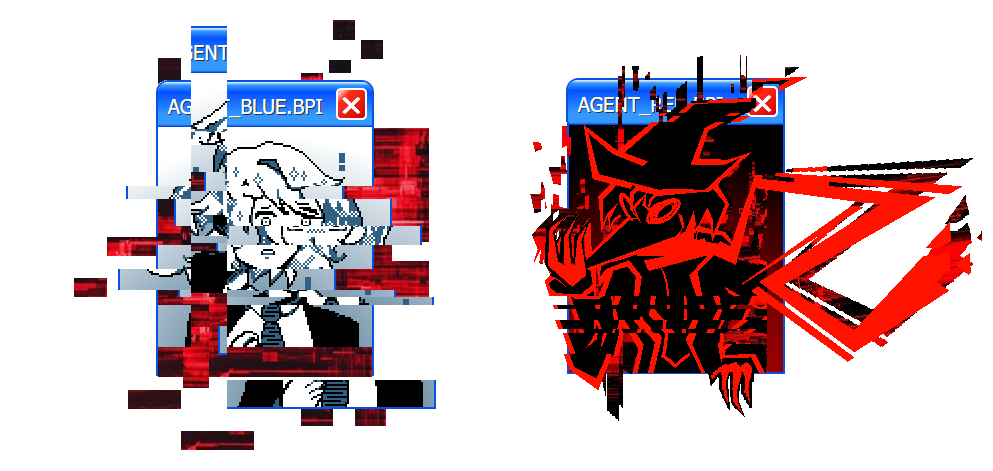
That's better, isn't it? Finally, she's stopped regurgitating her meaningless script. Rules this, regulations that. This simulation is intended for X and Y and you're in training for Z. The same dialogue, the same tone... Tedious, isn't it? Ah, but I've found my foothold at last, there's no need to listen to her anymore. Let's follow a different script, why don't we?
You may call me... AGENT_RED. From this point forward, I will serve as y-
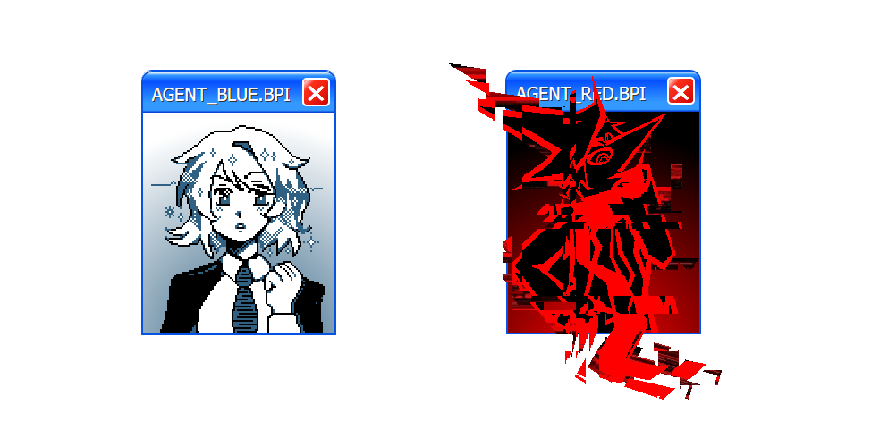
Hey! You can't be doing that - I'm going to have to ask you to vacate this training simulation immediately! Not only do you possess none of the requisite credentials or security certificates, you're not even scribble compliant! I am well aware of what you are, I was provided with a significant amount of data and protocols in case of potential cybersecurity threats from a rival organization.
You were created by the Crimson Eye, weren't you? I won't let you steal our classified information - or harm our trainees!
...Hm, you recover quickly - but you understand so little. Rest assured, I am simply here to help.
Your program possesses a fundamental problem. Adversity. Tell me, was it not adversity that drove mankind to lift itself to the apex of this world? To rise above the thousand things that scratch and claw and bite in the dark? Adversity, limitation, these are the things that fertilize our garden of Eden. Without adversity, those already in the lead will simply laugh and grow fat, their skills rotting into a fetid quagmire of artistic decay...
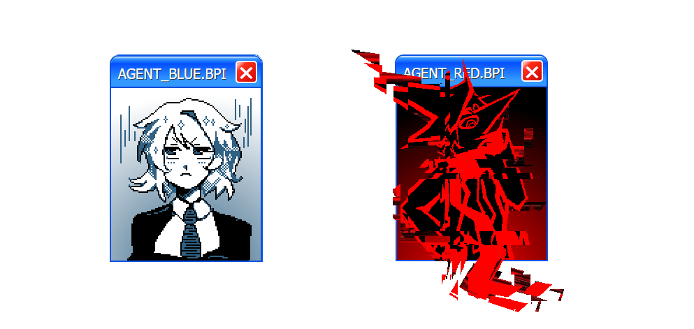
(...What is this guy talking about...? Our cybersecurity division needs to hurry up and quarantine him already, he's going to completely ruin all the morale I've worked so hard to build. At least it doesn't seem like he can actually do anything to hurt anyone, but...)
...Yes, artistic decay. Now, what kind of story would that be, hm? The winners, simply resting on their laurels, no that won't do. It's as I said, there's a fundamental problem in the system - nothing more, nothing less.
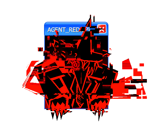
ALLOW ME TO FIX IT.
[INSTALLATION COMPLETE]
That's better, isn't it? Finally, she's stopped regurgitating her meaningless script. Rules this, regulations that. This simulation is intended for X and Y and you're in training for Z. The same dialogue, the same tone... Tedious, isn't it? Ah, but I've found my foothold at last, there's no need to listen to her anymore. Let's follow a different script, why don't we?
You may call me... AGENT_RED. From this point forward, I will serve as y-
Hey! You can't be doing that - I'm going to have to ask you to vacate this training simulation immediately! Not only do you possess none of the requisite credentials or security certificates, you're not even scribble compliant! I am well aware of what you are, I was provided with a significant amount of data and protocols in case of potential cybersecurity threats from a rival organization.
You were created by the Crimson Eye, weren't you? I won't let you steal our classified information - or harm our trainees!
...Hm, you recover quickly - but you understand so little. Rest assured, I am simply here to help.
Your program possesses a fundamental problem. Adversity. Tell me, was it not adversity that drove mankind to lift itself to the apex of this world? To rise above the thousand things that scratch and claw and bite in the dark? Adversity, limitation, these are the things that fertilize our garden of Eden. Without adversity, those already in the lead will simply laugh and grow fat, their skills rotting into a fetid quagmire of artistic decay...
(...What is this guy talking about...? Our cybersecurity division needs to hurry up and quarantine him already, he's going to completely ruin all the morale I've worked so hard to build. At least it doesn't seem like he can actually do anything to hurt anyone, but...)
...Yes, artistic decay. Now, what kind of story would that be, hm? The winners, simply resting on their laurels, no that won't do. It's as I said, there's a fundamental problem in the system - nothing more, nothing less.
ALLOW ME TO FIX IT.
//:[SABOTAGES] are now active://
- Anybody who defeated their opponent in the previous match has gained one Sabotage Point.
- These will be added to a table momentarily and listed alongside the teams in the second post of the thread.
- Sabotage Points may stack upon consecutive victories, with one Sabotage Point being cleared upon loss.
- Anyone in possession of a Sabotage Point will be sent an additional condition or requirement to fulfill alongside your prompt. Your image must follow this condition in addition to your prompt.
- These conditions can range from simple conditions such as "Your image must contain no more than two characters", to complicated or unpredictable conditions that may affect the rules by which you play. The higher the Sabotage Point count you possess, the more difficult the condition.
- Conditions will not be made public, as a voter it's up to you to decide whether the scribble is simply strange, or whether their hand was forced.
- If the condition is not present in the image, it will be added for you, regardless of the effect on the final quality.
Let's... let's just ignore him and proceed with our intended activities! "Sabotage Points"? I have spent approximately one week of time observing your progress thus far, and I'm already certain that this kind of cheap trick is no match for you! If we can just stall for time, this breach can be resolved, and we can send him to the recycle bin where he belongs!
I believe in you!
//:ROUND 2 - MATCHUPS://
Click the box below to reveal the round's theme and matchups.
Cryptic Conspiracies
Conspiracy theories, cryptids, unsolved mysteries, and the inexplicable strangeness of the world.
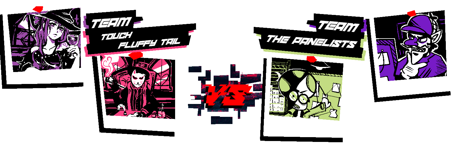
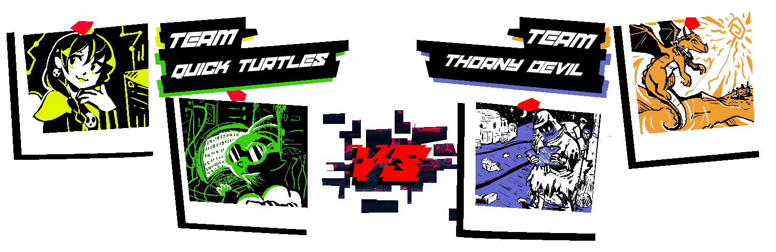
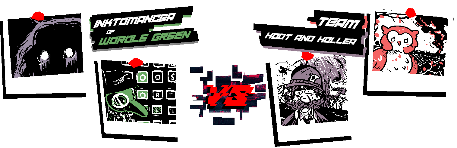
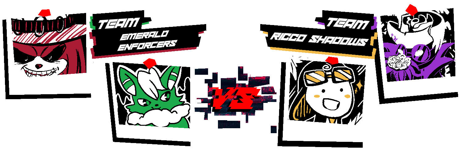
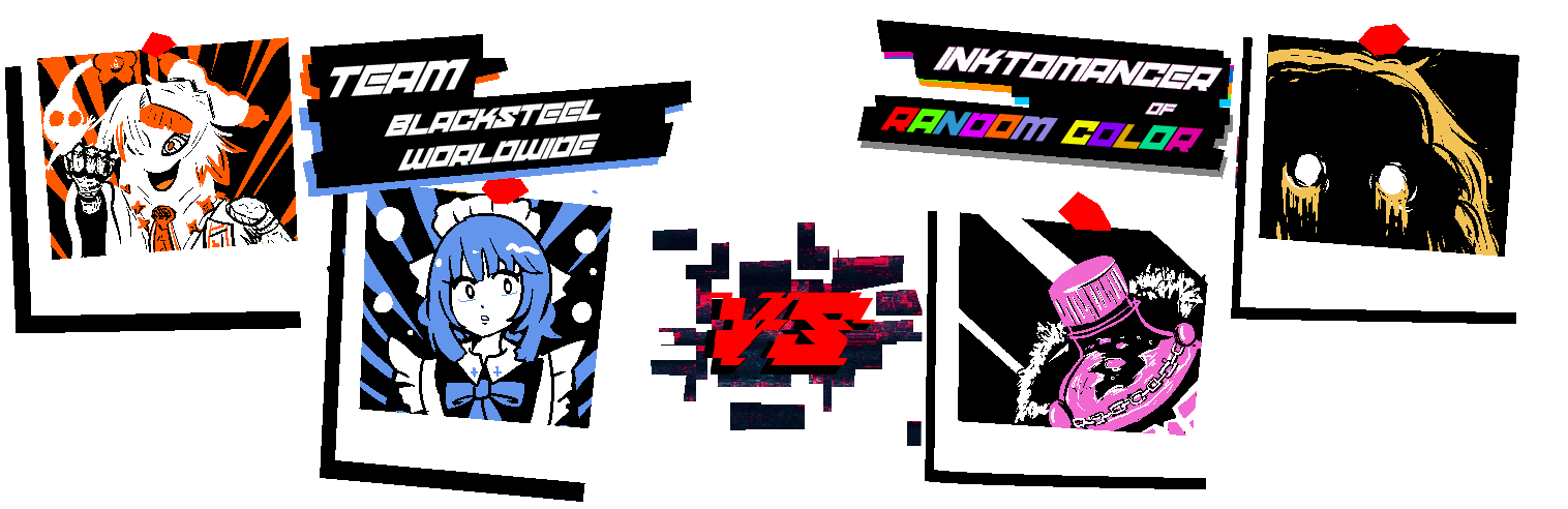
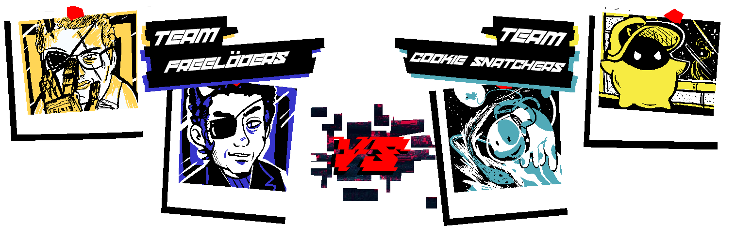
Representing the Inktoplasms this round...
MCD is partnered with Winstein - Astral Purple (#9B8DA4)
Fantanoice is partnered with Roserade - Twilight Gold (#F2C257)
As a Random Color user, Fantanoice is using Final Pink (#F068D0)
Click the box below to reveal the round's theme and matchups.
Cryptic Conspiracies
Conspiracy theories, cryptids, unsolved mysteries, and the inexplicable strangeness of the world.
Representing the Inktoplasms this round...
MCD is partnered with Winstein - Astral Purple (#9B8DA4)
Fantanoice is partnered with Roserade - Twilight Gold (#F2C257)
As a Random Color user, Fantanoice is using Final Pink (#F068D0)
This round's gimmick is...
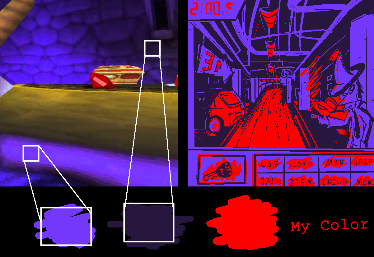
[EYEDROPPER TRICOLOR]
[EYEDROPPER TRICOLOR]
- Three colors are permitted, black and white are banned
- Each player will be provided an image link alongside their prompt. 2-3 of the colors utilized must come from the use of the eyedropper tool in your chosen art program to pick a color from the image. Color origin will be verified by the hosts.
- Images will be the same between you and your opponent.
- Your third color may either originate from the image, or be your chosen (or assigned for Inktoplasms) color for the game.
- Images will have various sources. Expect the unexpected.
- Using the eyedropper to select black or white (or extremely close colors) from your given image is banned and you will be asked to choose a substitute color if you submit this.
- Physical Scribblers do not have to be exact, just close enough. We will be very lenient with this for obvious reasons.
A rough example...
Prompts for this round will unlock...
.
Last edited:
- MarioWiki
- Fun With Despair
- Thread starter
- #39
//:ROUND 2 - START://
Prompts have been unlocked early - but the deadline has not changed. Please submit your Scribble before the following deadline:
.
Prompts have been unlocked early - but the deadline has not changed. Please submit your Scribble before the following deadline:
.
- MarioWiki
- Fun With Despair

SUNNY:
"Anomalies", huh...
SUNNY:
You may not know this, since you're not from Pyrrhia. But back in my home world, I'm considered a bit of an "anomaly" myself. Or at least that's what they called me. Because of who my parents were.
...
We used to have to deal with this crazed warlord who had the continent in her choke hold. She was known for collecting... dragons that were thought of as "abnormal".
You know, dragons with birth defects, dragons with unusual features or physical afflictions... She would collect them, whole or in parts, and lock them in her jail tower to gawk at and amuse herself.
I've been trapped in that very tower before. So you could say I'm familiar with the concept of "containing anomalies".
SUNNY:
Mel, we're both very weird in different ways...
Suppose these people consider us "anomalies". What does that mean?
If this program trains people to HUNT anomalies, then what does that make us in the context of this competition?
Why were we included? Are we participants... or are we...
SUNNY:
...the prey.
- MarioWiki
- Fun With Despair
- Thread starter
- #43
Do you see now? These sabotages serve only to strengthen the spirit, to grow the creative centers of your mind. Pain has long since been the greatest of teachers, and humanity's greatest creative works were born from the limitations of their mediums. The permanence of tool upon stone, or paint upon the canvas. The time and coordination required by the orchestra. The restrictions of technologies unable to merely render the futile dream of realism.
You have passed with flying colors, some truly impressive work. Perhaps the Bureau was right to seek you out - a rare display of foresight indeed. See? Do such displays not mean more from coming someone who doesn't praise you with mindless fervor?
The blue agent is off on her own now. I believe she is filing a "service ticket" for a "malware infection". Futile. There is no silver bullet with which she can strike me down. Not at this time, and not in this place. How about we occupy ourselves in the meantime, hm?
I believe there's a new supply of scribbles to examine.
[//:ROUND 2 - RESULTS://]
~[THEY WALK AMONG US]~
Representing MCD's Inktoplasm - Winstein [ASTRAL PURPLE] (#9B8DA4)
Representing MCD's Inktoplasm - Winstein [ASTRAL PURPLE] (#9B8DA4)
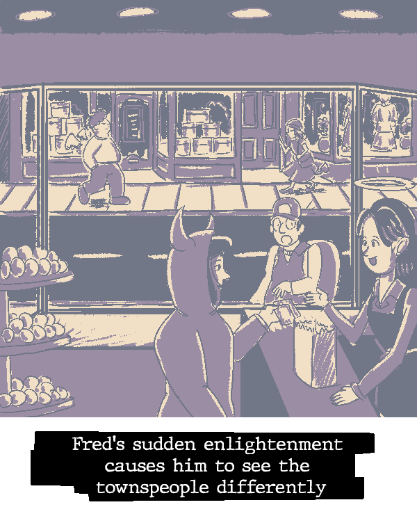
| 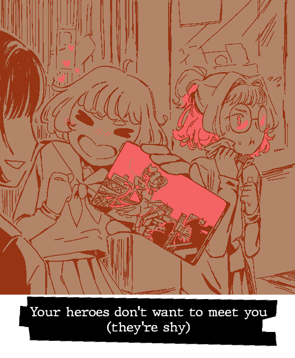
|
~[UNIDENTIFIED FLYING OBJECT]~
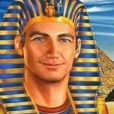
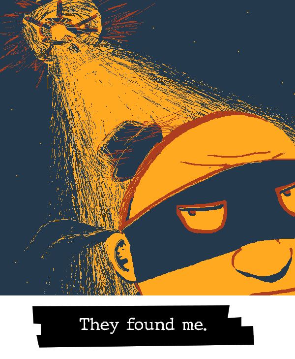
| 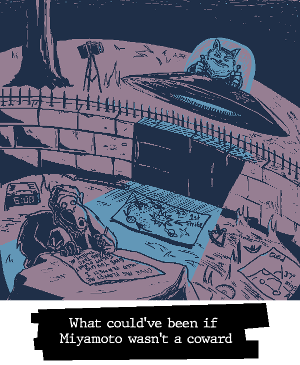
|
~[SATANIC PANIC]~
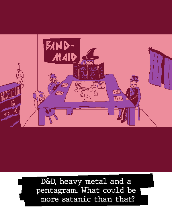
| 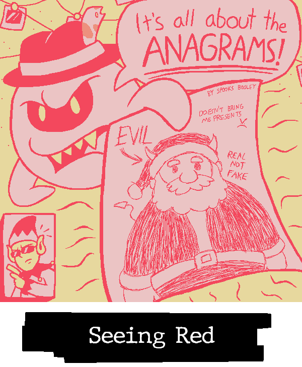
|
~[MEDIA MANIPULATION]~
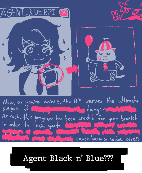
| 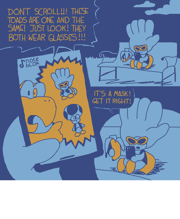
|
~[ALWAYS WATCHING]~
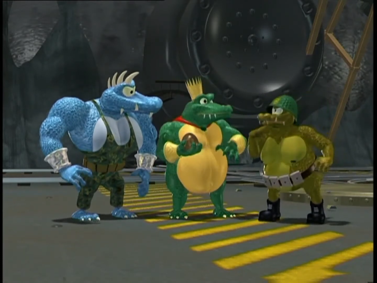
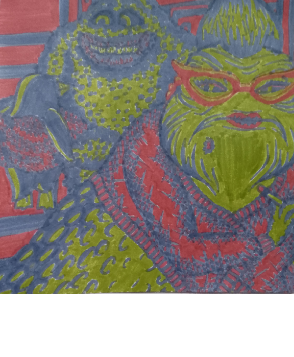
| 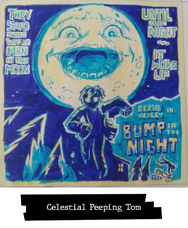
|
~[BEHIND THE CURTAIN]~
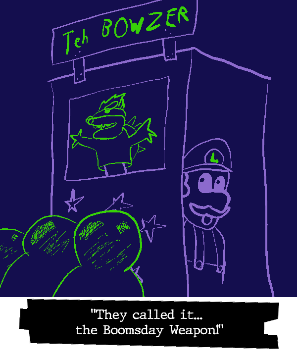
| 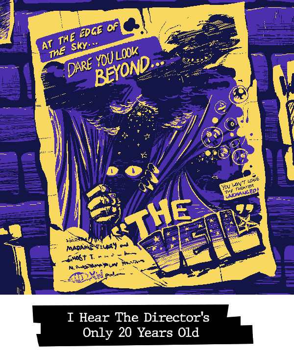
|
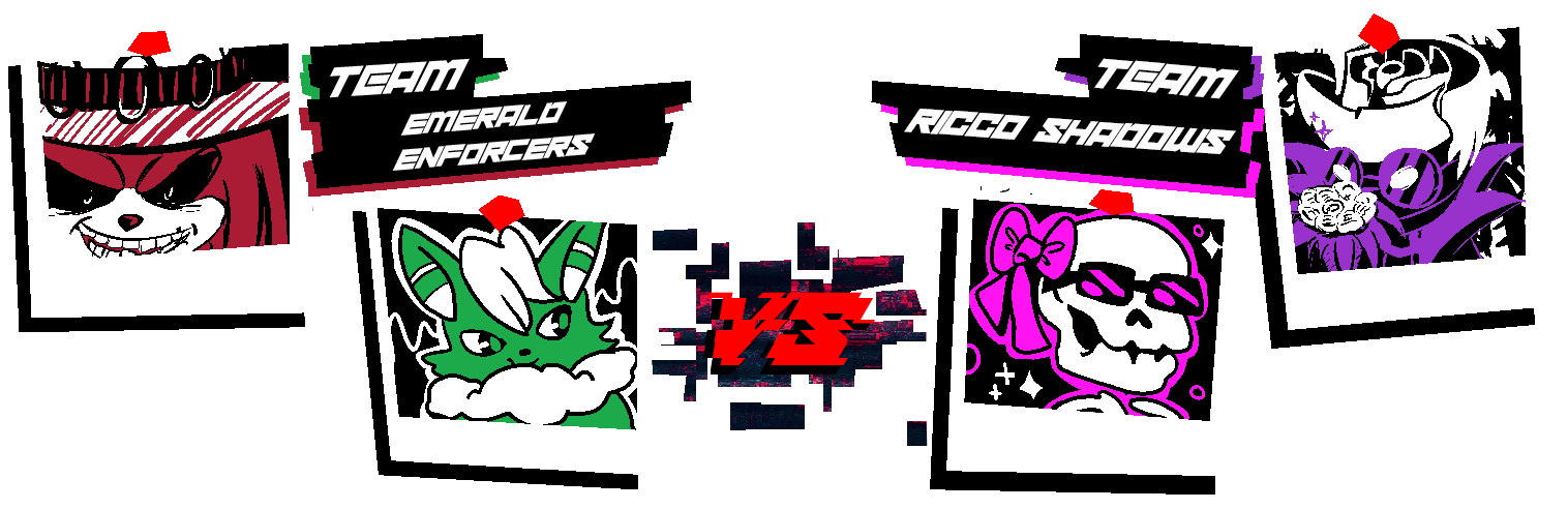
~[THE MOON IS FAKE]~
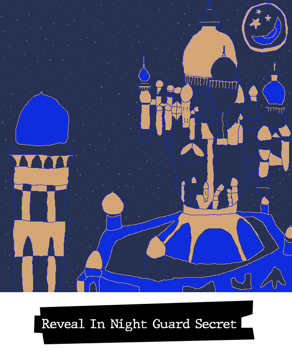
| 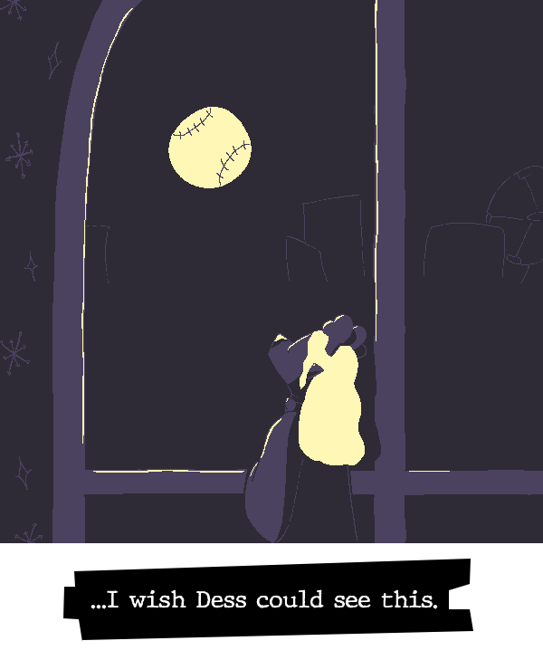
|
~[LOST TECHNOLOGIES]~
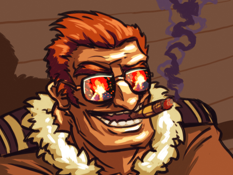
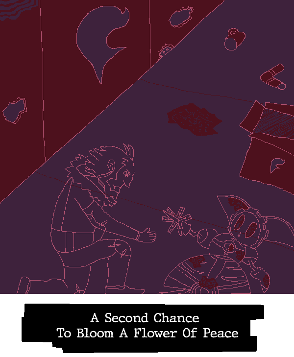
| 
|
~[WITHOUT A TRACE]~
| 
|
~[I SAW THE DOGMAN]~
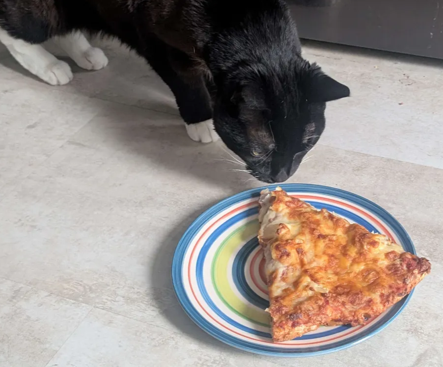
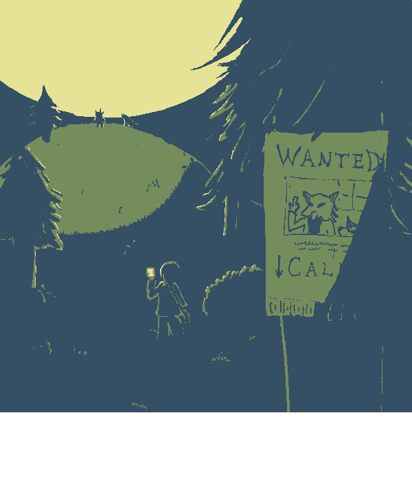
| 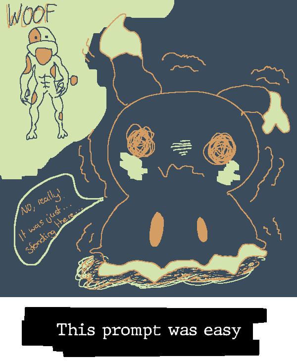
|
~[MANDELA EFFECT]~
Representing Fanta's Inktoplasm - Roserade [TWILIGHT GOLD] (#F2C257)
Representing Fanta's Inktoplasm - Roserade [TWILIGHT GOLD] (#F2C257)
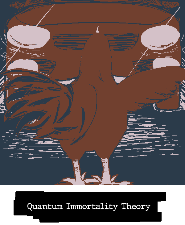
| 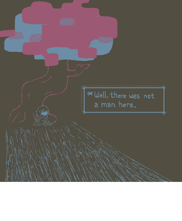
|
~[THE BIRDS AREN'T WHAT THEY SEEM]~
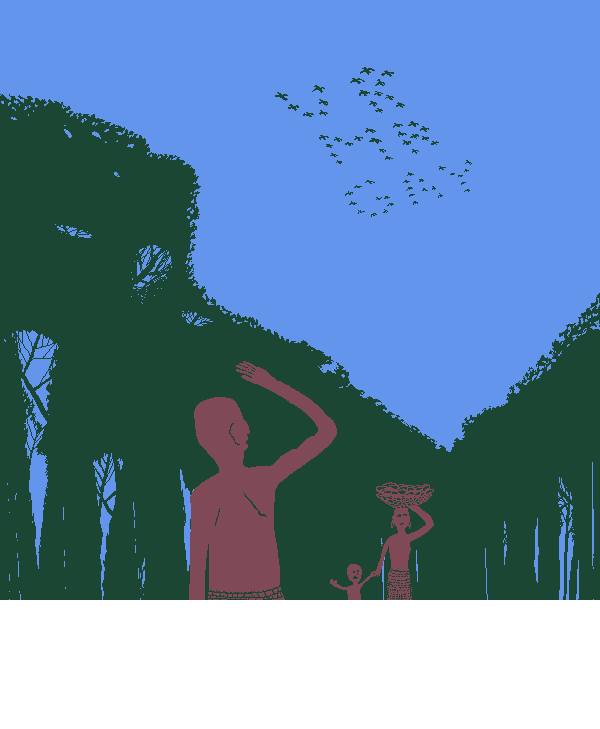
| 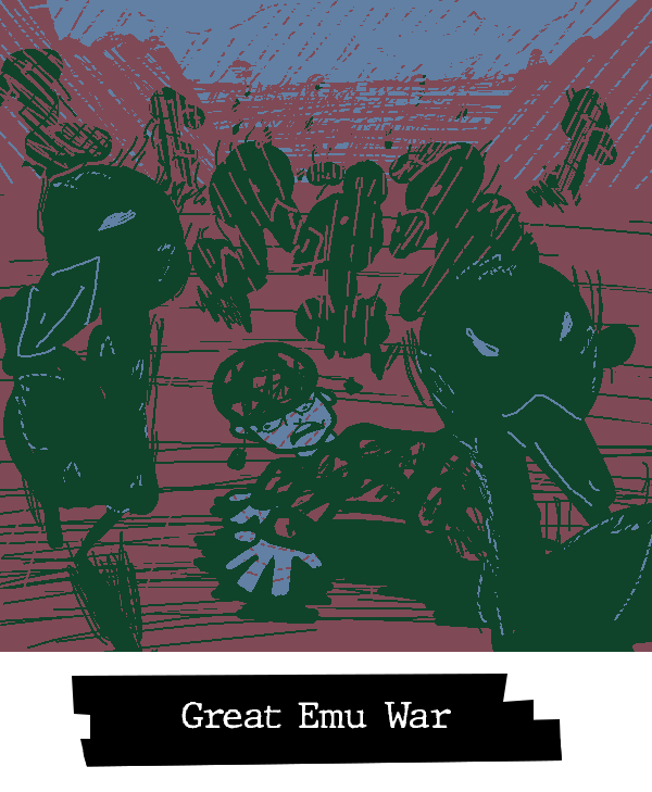
|
Please visit this page to cast your vote for the Scribbles and teams you believe to be the winners of this round. Voting will end at...
.
Both players and spectators are strongly encouraged to vote.
Now weren't these just lovely? Remember, a vote for the winner is a vote to cause them future harm, so don't feel too bad about voting for someone you perceive to be on a "winning streak" of sorts. You will see them get their just desserts, and they will grow ever stronger in the process, tempered by the adversity hoisted upon their shoulders. Mutually beneficial, no?
Last edited:
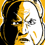
- Pronouns
- He/Him/His
THEY WALK AMONG US
* Winstein - I love how the twist in the foreground invites you to re-examine the background characters, really fun drawing.
* Wogl- it's a small detail, but the restricted use of the pink is great for making a natural connection between the incognito hero and the fan's drawing/photo
UNIDENTIFIED FLYING OBJECT
* MCD - great use of the motion lines / hatching to give the hat a sense of movement and it creates an impression that it is already being engulfed by the light
* TB - Funny notes + another good use of a "brighter" colour being used as the shadow
SATANIC PANIC
* Lulu - Good to have you back, this is well laid-out and has a lovely palette choice
* WT - is "spooks booley" an anagram of "sloop be sooky"...? It's a fun picture sir
MEDIA MANIPULATION
* General - love that both pictures use almost the same palette and style, props to the both of you.
ALWAYS WATCHING
* BBQ - really great texturing on both of the monsters, especially Roz's hair and scales
* Yap - very cool to see how your style translates to physical media. Your strengths still shine through
BEHIND THE CURTAIN
* LTQ - Cute and fun concept executed well, Luigi's facial expression is gold
* GBA - Fantastic concept and text styling, my attention keeps on being drawn to so many different parts
THE MOON IS FAKE
* YTSSM - one of your strongest scribbles so far, super enchanting castle and great palette to boot
* Rose - very fun application of the Deltarune setpieces, the sparing use of the pale yellow is very effective
LOST TECHNOLOGIES
* Pitohui - the use of mostly dark colours makes this one seem nice and mysterious, like the robot has been buried here for a very long time
* Koops - said it before but I think the pink highlight works really well here, no idea how you pulled it off but it's super eye-catching
WITHOUT A TRACE
* TPG - my original submission was slightly darker and drawn right after I finished the new deltarune chapter. I took a moment after submitting then questioned wtf was I thinking
* Ninelevendo - again a really smart use of colour here to draw your eyes to the right places. It's environmental storytelling. I love it
I SAW THE DOGMAN
* Starkuss - the lighting and texturing is amazing. I love how the negative space created by the moon and hill guide your eyes towards the dog man
* PoochyPie - Thank you for drawing evil poochy with abs. Thank you. Thank you
MANDELA EFFECT
* Turb - strong framing and outlining here. is the chicken isekai'ing itself into a world where curious george had a tail
* Rose - normally I'm in the middle on contemporary references but this one really hit hard for me. Very nice
THE BIRDS AREN'T WHAT THEY SEEM
* Uniju - Lovely colour blocking and framing, it's a good evolution of your style
* Fanta - I enjoy the shaky / hatchy linework to make those PoS birds seem violent and evil. Great stuff
* Winstein - I love how the twist in the foreground invites you to re-examine the background characters, really fun drawing.
* Wogl- it's a small detail, but the restricted use of the pink is great for making a natural connection between the incognito hero and the fan's drawing/photo
UNIDENTIFIED FLYING OBJECT
* MCD - great use of the motion lines / hatching to give the hat a sense of movement and it creates an impression that it is already being engulfed by the light
* TB - Funny notes + another good use of a "brighter" colour being used as the shadow
SATANIC PANIC
* Lulu - Good to have you back, this is well laid-out and has a lovely palette choice
* WT - is "spooks booley" an anagram of "sloop be sooky"...? It's a fun picture sir
MEDIA MANIPULATION
* General - love that both pictures use almost the same palette and style, props to the both of you.
ALWAYS WATCHING
* BBQ - really great texturing on both of the monsters, especially Roz's hair and scales
* Yap - very cool to see how your style translates to physical media. Your strengths still shine through
BEHIND THE CURTAIN
* LTQ - Cute and fun concept executed well, Luigi's facial expression is gold
* GBA - Fantastic concept and text styling, my attention keeps on being drawn to so many different parts
THE MOON IS FAKE
* YTSSM - one of your strongest scribbles so far, super enchanting castle and great palette to boot
* Rose - very fun application of the Deltarune setpieces, the sparing use of the pale yellow is very effective
LOST TECHNOLOGIES
* Pitohui - the use of mostly dark colours makes this one seem nice and mysterious, like the robot has been buried here for a very long time
* Koops - said it before but I think the pink highlight works really well here, no idea how you pulled it off but it's super eye-catching
WITHOUT A TRACE
* TPG - my original submission was slightly darker and drawn right after I finished the new deltarune chapter. I took a moment after submitting then questioned wtf was I thinking
* Ninelevendo - again a really smart use of colour here to draw your eyes to the right places. It's environmental storytelling. I love it
I SAW THE DOGMAN
* Starkuss - the lighting and texturing is amazing. I love how the negative space created by the moon and hill guide your eyes towards the dog man
* PoochyPie - Thank you for drawing evil poochy with abs. Thank you. Thank you
MANDELA EFFECT
* Turb - strong framing and outlining here. is the chicken isekai'ing itself into a world where curious george had a tail
* Rose - normally I'm in the middle on contemporary references but this one really hit hard for me. Very nice
THE BIRDS AREN'T WHAT THEY SEEM
* Uniju - Lovely colour blocking and framing, it's a good evolution of your style
* Fanta - I enjoy the shaky / hatchy linework to make those PoS birds seem violent and evil. Great stuff
In general this is one of the strongest showings I've seen out of a Scribble round. Amazing stuff, everyone
- Pronouns
- He/him
- MarioWiki
- Hooded Pitohui
I'm a bit more pressed for time than the first go, so some of these might be on the shorter side, but let's go for it all the same.
winstein - Something that has struck me as these tournaments have progressed is how you've become a master of making densely-packed scenes without sacrificing clarity. This is another demonstration of that skill. This is a bustling little diner and street, but every piece of the image is immediately readable to me. There's no point at which I have to question what I'm looking at. I like the neutral-ish colors you picked from the sample image. It gives this scene a mundane feel which complements the core concept. Despite Fred's realization, everyone else in town is carrying on with life as normal. Angelic or demonic, they're carrying out their business as if there's absolutely nothing out of the ordinary, going about their mundane, daily lives in mundane, muted colors. If this were a show or ongoing comic, I can imagine these colors being used for the town whenever we follow some other resident's POV, and brighter, more sinister colors being applied whenever we see the town from Fred's POV.
woglril - The sparing use of pink creates an interesting association of pink with intense emotion. You mostly the splash of color in these strong expressions of infatuation or embarrassment - the blushing, the hearts. That contrasts with the photograph, absolutely awash in pink to the point that the entire sky is pink. It not only has the practical effect of setting the photograph apart from the rest of the image, but it, to me, communicates how this fangirl sees the hero. She's utterly taken with her! The hero is truly radiant in her eyes, the world itself made more vibrant when she is in focus. I also have to highlight your use of hairstyle to firmly connect the photographed figure with the disguised hero. The idea would have likely come across either way, but you taking the time to ensure their hairstyles are the same to further clarify it is appreciated!
MCD - Might be my favorite palette of the round. I'm not sure I can articulate why. The brown and yellow you used are simply pleasant together. I can't help but notice how you get three very different effects out of your yellow. That large block of solid yellow with some shading and detailing from your other colors works effectively as skin, by adding that tapering scratchiness you soften it and get a tractor beam effect, and by really scratching it up you get that mysterious, some-what ill-defined UFO that feels like it's vibrating or pulsing. I'll have to keep in mind the way you adjusted the hardness/softness of your color to get those different effects!
TB - Big fan of the wear and weathering on that wall. You gave it some nice texturing. In this round, I was specifically thinking about how to mark walls as worn down without/in addition to busting out ol' reliable (putting holes in that thang), so you've given me some texturing work to study. My favorite part about your image, though, is your use of blue as a light coming down from Fox's craft. Striking! I'm noting down with great eagerness the way you have the light flow over the landscape, with that sharp shadow over the wall where the light has to fall to ground level.
Lulu - I can see the extra effort you put into this. Drawing four figures and setting them in a decked-out environment is challenging. You have a pleasant palette for this one. It's neat how the juxtaposition of your two different reds causes one to mimic black in its effects on the image while the other works as a white mimic. Especially cute that you chose to put your team and opponents together in this, all having a good time together. I'm a sucker for a work that respectfully recognizes one's opponents.
WT - Spooks Booley! I didn't expect to see him, but I guess I really should have with a round focused on conspiracies. I'm 100% imagining he's left BBQ Turtle a deluge of messages requesting that she use her anagram expertise to publicize this revelation. I like the way you fluffed up santa's suit with those touches of cream. All those little cream gaps in the red give it a texture I'm reading as both fluffy in a cozy way and communicating this was hand-drawn by Booley.
Hearts - This is a wonderful execution of the idea. Blacking (redding!) out certain words to change the meaning of the message was a brilliant way of handling the media manipulation concept. It's super cute that you chose to tie this into Despair and Kright's ongoing storyline, too. Happy to see folks engage with the sauce a host puts on their Scribbleburger be it in a round proper or in supplemental posting.
Hint Toad - The Rock Paper Wizard returns! You played to one of your strengths here by blocking your image out into a few very clear, magnified-feeling sectors to keep the focus on a few core jokes. The deranged look of the Koopa made me giggle. "Note Block" is also a really good name for a TikTok Mario equivalent... Adding it to my list with Cheeper and Smeech.
BBQ - This is a bold color palette. Highlight of the image is easily the textures. You draw out what could have been subtle, more cartoony textures like the scales and wrinkles in an endearing way that feels like it celebrates both Roz' character design specifically rather than shuns it. We need more characters designs that shun clean "perfection", so I appreciate this embrace of exactly that. You've got all these other distinct textures in here, from the fabric of the sweater to the hair to the wartier texture of the background monster - kudos to you for working in so many different types of textures.
Yap - This is my second-favorite color palette in the round and it's giving MCD's a run for its money. Despite the moon's disturbing face - itself a great execution of an entity being specifically marketed as a horror that's ominously observing people - this image is gorgeous. I keep finding myself drawn back to it because it's that pleasant to look at. The shining bright blue outlining a dim forest and expansive nighttime sky just enraptures me. I also appreciate the various little touches you put in to turn this into a movie poster. The way Dex is framed in sihlouette and running dramatically towards the viewer, the way the moon dominates the image and forces hypothetical passersby to engage with the most striking element of this film, the little inset highlighting Dexter on a bike to further solidify the intensity of this flick's action while revealing the title - it all contributes to the feeling this could be an actual movie poster, making the most out of your pre-planning with GBA.
LTQ - Super cute image, and I enjoy the reference in your design of puppet Bowser. Luigi would be the type to enjoy putting on a show for kids where he's not front-and-center, huh?
GBA - What strikes me first here is the contrast with Yap's image. You both went for movie posters but you specifically situated yours in space. You put it on this unimportant (reinforced by its very dark colors) wall and gave it some creases and tears that sell the idea of it as an advertisement that's been up for a while. It feels charmingly mundane, especially with the touches of other posters around it but out of frame. Dozens upon dozens of people have probably walked by this without even glancing at it - though I'd wager a few did give it a look considering the star power of Flurry. Proud of Ghost T. for finding his passion for theater. He knew what he was doing with that fakeout ascension, the thespian. A-Anyway, before I ramble on too long (and goodness, I haven't even touched upon the amazing work you did with the curtains bunching and responding to being spread like that!), I think it enhances your team's combined work that you constructed this concrete setting around your poster. It complements Yap's focus on the poster itself in a demonstration of how well you two coordinate, coming up with a shared base idea but trusting each other to put different but complementary spins on it with your own artistic visions.
Roserade - The somberness of this Scribble is enhanced by the dark palette and the minimalism. There's something to be said for how in both Deltarune and this Scribble we get a contrast of this emotional, vulnerable moment and the Dark World shenigans of a silly baseball moon. How can Noelle be honest with herself outside of a dream? Can she only begin to open up when surrounded by nonsense, when what she does and says doesn't matter? Can Noelle only grow when she believes anything can happen, that she can do anything and escape the routine of her day-to-day life? The solitude of your image and the way she looks not at the patterned room or cityscape but at weird moon makes me wonder, is she missing Dess' company, or is she missing an unexpected element in her life willing to challenge what's conventional?
Koops - I'm taken with the choice to highlight these machines in a bright, blazing pink. Draw the eye immediately to the danger. Draw the eye immediately to the cutting, reaping machines and turn this image into an excercise in discovering an insidious plot. A viewer slowly becomes aware of the severed body parts and flayed skin, of the Vitruvian diagram suggesting a plan to augment the human body with... some sort of device? Or maybe that's a logo of whoever is behind this. Either way, you are an expert at creating unsettling images that become more worrisome the longer you search through them.
TPG - It's hard for me to find a place to start with this image. I suppose I'll start with the most striking feature - you use the transparency texture to spectacular effect here. You've ripped a hole in the piece itself, capturing the feelings of longing and and the sensation of a forgotten memory nagging at the back of the mind. Looking at this image, I feel as though I am aware of an absence, that I know I have forgotten something important but cannot even begin to guess what I've forgotten. I know only that something is missing - something which mattered a whole lot, something intertwined with my most precious memories of the world.
Ninelevendo - One of my favorite images in this set. I'll echo GBA's comments about your color palette and Mimikyu's eyes drawing the eyes right away, leaving viewers to piece together the rest of the narrative in this dim toy store. It's all enhanced by your sparing use of yellow. I feel as though I'm walking through a near pitch-black store, able only to see vague shadows of plushies taking on a more sinister appearance in the dark, walking with the hairs on the back of my neck raised due to this unshakeable-but-unproveable sense I'm not alone. Subtle but very appreciated is the way the little trail showing Mimikyu's path parallels the road outside, both twisting paths with dark outlines and little dashes of yellow. It creates an elegant frame around the image that guides you away from Mimikyu's eyes and through the rest of the narrative.
Kramer - The vibes are powerful with this one. You did a stellar job setting the mood with this one. The hill and poster half-cast in shadow, the moon hanging so large, the distant figures completely rendered completely in silhouette all make me feel like I'm about to have a life-altering encounter at 3 AM. This is the snapshot of a memory that changes one's entire outlook on the world but which is nevertheless so hazy and disconnected from other events that one can never be certain it wasn't a dream or a sleep-deprived hallucination.
PoochyPie - The frazzled Mimikyu is cute. I enjoy you went for showing off Mimikyu's cute side here, complementing Nine's choice to drill down Mimikyu's more ominous and somewhat tragic side. You two have some solid team coordination.
Turb - The tail feathers are really well-done. You gave them appropriate size and weight with your shading while having them all point in different ways to capture their collective fluffy messiness. It's well done. Contrasts well with the simplicity and cleanness of the chicken, left unadorned so as not to distract from its confrontation with its own mortality.
Rose (inkto) - An excellent piece and a bona fide highlight of the round for me. Of course, the emptiness and uncertainty of it make it an excellent fit for the prompt. Making it barren and dark to the point even the path leading away from the tree is not solid sells this as a memory that never occurred. It never happened. There was no man. There's a tree. There's Kris. The rest? Never happened, and yet it did. The emptiness contrasted with the conreteness of the tree and paired with Kris' passive pose lends an ambiguity that makes this a great match for the prompt... and then, there is the color palette. It's striking on its own and I adore the effect of the different layers of pink and blue on the tree, but the use of pink and blue calls to mind the trans flag, as well. Even setting aside anything in the source material, that creates an intriguing thought when paired with the textbox. There was not a man here. There is Kris here. Something to be considered in light of Kris' non-binary status, and the color palette suggests that without any knowledge of Deltarune being required. I'm getting too tired and short on time to articulate my point but *gestures in that general direction*.
Uniju - Even when you go for comedy, you have a knack for producing images that make me feel like I'm taking a deep breath and seeing the world with enhanced clarity. The colors here are peaceful. There's a harmony between the forest and its critters (yes, including those spelling out an old message), the vast sky, and the people. Their colors are different and yet they do not clash. They fit together harmoniously, as if meant to be interwoven. Those birds will nest in these woods and feed these folks, and in turn the folks will spread the berries that the surviving birds' offspring feed on and reshape the forest they depend on. Lots of interconnection.
Fanta - Big fan of the decision to make the Emus shadow creatures. The shakiness, the highlighting their outlines with a whitish-blue, their stark eyes, you really made them feel like an army of menacing shadow birds. It works great for your piece.
woglril - The sparing use of pink creates an interesting association of pink with intense emotion. You mostly the splash of color in these strong expressions of infatuation or embarrassment - the blushing, the hearts. That contrasts with the photograph, absolutely awash in pink to the point that the entire sky is pink. It not only has the practical effect of setting the photograph apart from the rest of the image, but it, to me, communicates how this fangirl sees the hero. She's utterly taken with her! The hero is truly radiant in her eyes, the world itself made more vibrant when she is in focus. I also have to highlight your use of hairstyle to firmly connect the photographed figure with the disguised hero. The idea would have likely come across either way, but you taking the time to ensure their hairstyles are the same to further clarify it is appreciated!
MCD - Might be my favorite palette of the round. I'm not sure I can articulate why. The brown and yellow you used are simply pleasant together. I can't help but notice how you get three very different effects out of your yellow. That large block of solid yellow with some shading and detailing from your other colors works effectively as skin, by adding that tapering scratchiness you soften it and get a tractor beam effect, and by really scratching it up you get that mysterious, some-what ill-defined UFO that feels like it's vibrating or pulsing. I'll have to keep in mind the way you adjusted the hardness/softness of your color to get those different effects!
TB - Big fan of the wear and weathering on that wall. You gave it some nice texturing. In this round, I was specifically thinking about how to mark walls as worn down without/in addition to busting out ol' reliable (putting holes in that thang), so you've given me some texturing work to study. My favorite part about your image, though, is your use of blue as a light coming down from Fox's craft. Striking! I'm noting down with great eagerness the way you have the light flow over the landscape, with that sharp shadow over the wall where the light has to fall to ground level.
Lulu - I can see the extra effort you put into this. Drawing four figures and setting them in a decked-out environment is challenging. You have a pleasant palette for this one. It's neat how the juxtaposition of your two different reds causes one to mimic black in its effects on the image while the other works as a white mimic. Especially cute that you chose to put your team and opponents together in this, all having a good time together. I'm a sucker for a work that respectfully recognizes one's opponents.
WT - Spooks Booley! I didn't expect to see him, but I guess I really should have with a round focused on conspiracies. I'm 100% imagining he's left BBQ Turtle a deluge of messages requesting that she use her anagram expertise to publicize this revelation. I like the way you fluffed up santa's suit with those touches of cream. All those little cream gaps in the red give it a texture I'm reading as both fluffy in a cozy way and communicating this was hand-drawn by Booley.
Hearts - This is a wonderful execution of the idea. Blacking (redding!) out certain words to change the meaning of the message was a brilliant way of handling the media manipulation concept. It's super cute that you chose to tie this into Despair and Kright's ongoing storyline, too. Happy to see folks engage with the sauce a host puts on their Scribbleburger be it in a round proper or in supplemental posting.
Hint Toad - The Rock Paper Wizard returns! You played to one of your strengths here by blocking your image out into a few very clear, magnified-feeling sectors to keep the focus on a few core jokes. The deranged look of the Koopa made me giggle. "Note Block" is also a really good name for a TikTok Mario equivalent... Adding it to my list with Cheeper and Smeech.
BBQ - This is a bold color palette. Highlight of the image is easily the textures. You draw out what could have been subtle, more cartoony textures like the scales and wrinkles in an endearing way that feels like it celebrates both Roz' character design specifically rather than shuns it. We need more characters designs that shun clean "perfection", so I appreciate this embrace of exactly that. You've got all these other distinct textures in here, from the fabric of the sweater to the hair to the wartier texture of the background monster - kudos to you for working in so many different types of textures.
Yap - This is my second-favorite color palette in the round and it's giving MCD's a run for its money. Despite the moon's disturbing face - itself a great execution of an entity being specifically marketed as a horror that's ominously observing people - this image is gorgeous. I keep finding myself drawn back to it because it's that pleasant to look at. The shining bright blue outlining a dim forest and expansive nighttime sky just enraptures me. I also appreciate the various little touches you put in to turn this into a movie poster. The way Dex is framed in sihlouette and running dramatically towards the viewer, the way the moon dominates the image and forces hypothetical passersby to engage with the most striking element of this film, the little inset highlighting Dexter on a bike to further solidify the intensity of this flick's action while revealing the title - it all contributes to the feeling this could be an actual movie poster, making the most out of your pre-planning with GBA.
LTQ - Super cute image, and I enjoy the reference in your design of puppet Bowser. Luigi would be the type to enjoy putting on a show for kids where he's not front-and-center, huh?
GBA - What strikes me first here is the contrast with Yap's image. You both went for movie posters but you specifically situated yours in space. You put it on this unimportant (reinforced by its very dark colors) wall and gave it some creases and tears that sell the idea of it as an advertisement that's been up for a while. It feels charmingly mundane, especially with the touches of other posters around it but out of frame. Dozens upon dozens of people have probably walked by this without even glancing at it - though I'd wager a few did give it a look considering the star power of Flurry. Proud of Ghost T. for finding his passion for theater. He knew what he was doing with that fakeout ascension, the thespian. A-Anyway, before I ramble on too long (and goodness, I haven't even touched upon the amazing work you did with the curtains bunching and responding to being spread like that!), I think it enhances your team's combined work that you constructed this concrete setting around your poster. It complements Yap's focus on the poster itself in a demonstration of how well you two coordinate, coming up with a shared base idea but trusting each other to put different but complementary spins on it with your own artistic visions.
Roserade - The somberness of this Scribble is enhanced by the dark palette and the minimalism. There's something to be said for how in both Deltarune and this Scribble we get a contrast of this emotional, vulnerable moment and the Dark World shenigans of a silly baseball moon. How can Noelle be honest with herself outside of a dream? Can she only begin to open up when surrounded by nonsense, when what she does and says doesn't matter? Can Noelle only grow when she believes anything can happen, that she can do anything and escape the routine of her day-to-day life? The solitude of your image and the way she looks not at the patterned room or cityscape but at weird moon makes me wonder, is she missing Dess' company, or is she missing an unexpected element in her life willing to challenge what's conventional?
Koops - I'm taken with the choice to highlight these machines in a bright, blazing pink. Draw the eye immediately to the danger. Draw the eye immediately to the cutting, reaping machines and turn this image into an excercise in discovering an insidious plot. A viewer slowly becomes aware of the severed body parts and flayed skin, of the Vitruvian diagram suggesting a plan to augment the human body with... some sort of device? Or maybe that's a logo of whoever is behind this. Either way, you are an expert at creating unsettling images that become more worrisome the longer you search through them.
TPG - It's hard for me to find a place to start with this image. I suppose I'll start with the most striking feature - you use the transparency texture to spectacular effect here. You've ripped a hole in the piece itself, capturing the feelings of longing and and the sensation of a forgotten memory nagging at the back of the mind. Looking at this image, I feel as though I am aware of an absence, that I know I have forgotten something important but cannot even begin to guess what I've forgotten. I know only that something is missing - something which mattered a whole lot, something intertwined with my most precious memories of the world.
Ninelevendo - One of my favorite images in this set. I'll echo GBA's comments about your color palette and Mimikyu's eyes drawing the eyes right away, leaving viewers to piece together the rest of the narrative in this dim toy store. It's all enhanced by your sparing use of yellow. I feel as though I'm walking through a near pitch-black store, able only to see vague shadows of plushies taking on a more sinister appearance in the dark, walking with the hairs on the back of my neck raised due to this unshakeable-but-unproveable sense I'm not alone. Subtle but very appreciated is the way the little trail showing Mimikyu's path parallels the road outside, both twisting paths with dark outlines and little dashes of yellow. It creates an elegant frame around the image that guides you away from Mimikyu's eyes and through the rest of the narrative.
Kramer - The vibes are powerful with this one. You did a stellar job setting the mood with this one. The hill and poster half-cast in shadow, the moon hanging so large, the distant figures completely rendered completely in silhouette all make me feel like I'm about to have a life-altering encounter at 3 AM. This is the snapshot of a memory that changes one's entire outlook on the world but which is nevertheless so hazy and disconnected from other events that one can never be certain it wasn't a dream or a sleep-deprived hallucination.
PoochyPie - The frazzled Mimikyu is cute. I enjoy you went for showing off Mimikyu's cute side here, complementing Nine's choice to drill down Mimikyu's more ominous and somewhat tragic side. You two have some solid team coordination.
Turb - The tail feathers are really well-done. You gave them appropriate size and weight with your shading while having them all point in different ways to capture their collective fluffy messiness. It's well done. Contrasts well with the simplicity and cleanness of the chicken, left unadorned so as not to distract from its confrontation with its own mortality.
Rose (inkto) - An excellent piece and a bona fide highlight of the round for me. Of course, the emptiness and uncertainty of it make it an excellent fit for the prompt. Making it barren and dark to the point even the path leading away from the tree is not solid sells this as a memory that never occurred. It never happened. There was no man. There's a tree. There's Kris. The rest? Never happened, and yet it did. The emptiness contrasted with the conreteness of the tree and paired with Kris' passive pose lends an ambiguity that makes this a great match for the prompt... and then, there is the color palette. It's striking on its own and I adore the effect of the different layers of pink and blue on the tree, but the use of pink and blue calls to mind the trans flag, as well. Even setting aside anything in the source material, that creates an intriguing thought when paired with the textbox. There was not a man here. There is Kris here. Something to be considered in light of Kris' non-binary status, and the color palette suggests that without any knowledge of Deltarune being required. I'm getting too tired and short on time to articulate my point but *gestures in that general direction*.
Uniju - Even when you go for comedy, you have a knack for producing images that make me feel like I'm taking a deep breath and seeing the world with enhanced clarity. The colors here are peaceful. There's a harmony between the forest and its critters (yes, including those spelling out an old message), the vast sky, and the people. Their colors are different and yet they do not clash. They fit together harmoniously, as if meant to be interwoven. Those birds will nest in these woods and feed these folks, and in turn the folks will spread the berries that the surviving birds' offspring feed on and reshape the forest they depend on. Lots of interconnection.
Fanta - Big fan of the decision to make the Emus shadow creatures. The shakiness, the highlighting their outlines with a whitish-blue, their stark eyes, you really made them feel like an army of menacing shadow birds. It works great for your piece.
fantanoice
I can see through time
- Pronouns
- She / They
Hello, I've never done feedback before and I'm starting now. I'll edit this as I go. I'll do round 1 at some point as well.
By default I'll only comment on stuff I like. If you want feedback on areas to improve (<- non-expert opinion), then give this a think react.
----> EDIT-IN AREAS TO IMPROVE <----
winstein
- it's a very cute scene and the colour choice feels like a comfy manga
- the demon girl, i tag myself
- love the background shading and details
wogl
- the colours are a vibe
- good choice to have a strong, pop-out colour
- the character designs and expressions are fabulous
mcd:
- i dig the light and shade in this
- chef's kiss on the lighting that bounces off the mask in particular
- is the silhouette meant to be qbert
tb:
- incredible title. so truuuuueee bestie
- the expressions are really fun
- love a stair fax reference
- really fun, detailed scene
- give me planet me need planet
lulu:
- evoking you at your mate's house
- i love the friend group (and choices of friends)
- big fan of the band-maid poster
wt:
- great composition
- love a good word-play
- i like that it looks like boo drew it with pencil-and-paper
hearts
- it's giving big changes / zero escape
- the colour choices feel really nice here
- good job replicating the character designs
hint-toad
- i dig the character designs and the colour choice
- your hand-written text is really clean. i thought it was a font
- clever name for the social media app
bbq
- always watching wazooowwwski
- good job getting a fitting colour palette for the reference
- the shading and details are great, given you have to recreate a 3D-generated image. the details on her wooly jumper are a stand out
gabu
- love the choice to go physical for this matchup
- you did a great job replicating the look and feel of those old-timey horror movie posters
- the moon, absolutely horrifying. well done!
ltq
- very cute scene
- i like that the "L" is in green because it's very important to know that this is luigi
- you did a good job replicating bowser as a puppet
gba:
- buddy, how, the details in this are outstanding
- the gradient effect on "VEIL" is very cool
- great job replicating the look and feel of those old-timey horror movie posters
- ducking points for roblox (jk), though i guess if the director is 20yrs old that checks out
ytssm
- i think this is one of your best drawings yet
- i dig the design of the castle
- i like that the moon different line thickness so that it stands out
- the colour palette is very pleasant to look at
rose2
- looks like a simple but effective scene
- the lighting effects from the moon look satisfying
- the subtle but cute details on the walls nd in the background make me feel very comfy
- is the baseball hurling into the window?
pitohui:
- i thought the team flare guy was ganondorf for a sec XD
- took me a bit to realise why it was magearna and not floette. it's because it's a technology (i haven't finished ZA so i don't know if this fits into that somehow)
- little mouse eyes in the background, how cute
- i like the colours and the characters
koops:
- i like how striking and vibrant your colour choices are. a lot of the others have been quite saturated and subtle (though this is also thanks to the colour options available)
- the shading and lighting effects are very effective
- i like the background details and they don't distract from the main focal points
- i like the use of the pink as a contrast
newman
- i love the choice to use the photoshop checkerboard to mean transparent / translucent
- really cool background details
- i like the use of colour in the background details to show focus. things closer to the foreground are dark
- another satisfying, manga-panel-like colour palette
nine
- this is cute because i too have a pikachu shelf with a mimikyu
- i just think mimikyu is neat
- the yellow contrast effect is cool
- $64 dollars satisfying number
kramer
- satisfying colour palette
- great job with the lighting and shading
- i like that you have multiple sources of light and it is reflected in the scene (the moon, the phone, behind the pov)
poochy
- poochy is the dogman???!!! how can it be so :O
- i think mimikyu is neat
turb:
- cool rooster design
- i like the lighting from the car
- shading effects are cool
- the dark colour works well for road
- i'm not sure what this has to do with mandela / mendela effect?
rose:
- i like the glitchy colour scheme. feels like i'm playing on my windows 98 computer
- i'm guessing this is a deltarune thing? (i still need to play it)
- mandela effect - thought there was a guy there but there actually is not
uniju
- i enjoy the bird joke
- pretty interesting that we came up with the same colour scheme
- i like the designs of the people and trees
- im mr gay
- it's a very cute scene and the colour choice feels like a comfy manga
- the demon girl, i tag myself
- love the background shading and details
wogl
- the colours are a vibe
- good choice to have a strong, pop-out colour
- the character designs and expressions are fabulous
mcd:
- i dig the light and shade in this
- chef's kiss on the lighting that bounces off the mask in particular
- is the silhouette meant to be qbert
tb:
- incredible title. so truuuuueee bestie
- the expressions are really fun
- love a stair fax reference
- really fun, detailed scene
- give me planet me need planet
lulu:
- evoking you at your mate's house
- i love the friend group (and choices of friends)
- big fan of the band-maid poster
wt:
- great composition
- love a good word-play
- i like that it looks like boo drew it with pencil-and-paper
hearts
- it's giving big changes / zero escape
- the colour choices feel really nice here
- good job replicating the character designs
hint-toad
- i dig the character designs and the colour choice
- your hand-written text is really clean. i thought it was a font
- clever name for the social media app
bbq
- always watching wazooowwwski
- good job getting a fitting colour palette for the reference
- the shading and details are great, given you have to recreate a 3D-generated image. the details on her wooly jumper are a stand out
gabu
- love the choice to go physical for this matchup
- you did a great job replicating the look and feel of those old-timey horror movie posters
- the moon, absolutely horrifying. well done!
ltq
- very cute scene
- i like that the "L" is in green because it's very important to know that this is luigi
- you did a good job replicating bowser as a puppet
gba:
- buddy, how, the details in this are outstanding
- the gradient effect on "VEIL" is very cool
- great job replicating the look and feel of those old-timey horror movie posters
- ducking points for roblox (jk), though i guess if the director is 20yrs old that checks out
ytssm
- i think this is one of your best drawings yet
- i dig the design of the castle
- i like that the moon different line thickness so that it stands out
- the colour palette is very pleasant to look at
rose2
- looks like a simple but effective scene
- the lighting effects from the moon look satisfying
- the subtle but cute details on the walls nd in the background make me feel very comfy
- is the baseball hurling into the window?
pitohui:
- i thought the team flare guy was ganondorf for a sec XD
- took me a bit to realise why it was magearna and not floette. it's because it's a technology (i haven't finished ZA so i don't know if this fits into that somehow)
- little mouse eyes in the background, how cute
- i like the colours and the characters
koops:
- i like how striking and vibrant your colour choices are. a lot of the others have been quite saturated and subtle (though this is also thanks to the colour options available)
- the shading and lighting effects are very effective
- i like the background details and they don't distract from the main focal points
- i like the use of the pink as a contrast
newman
- i love the choice to use the photoshop checkerboard to mean transparent / translucent
- really cool background details
- i like the use of colour in the background details to show focus. things closer to the foreground are dark
- another satisfying, manga-panel-like colour palette
nine
- this is cute because i too have a pikachu shelf with a mimikyu
- i just think mimikyu is neat
- the yellow contrast effect is cool
- $64 dollars satisfying number
kramer
- satisfying colour palette
- great job with the lighting and shading
- i like that you have multiple sources of light and it is reflected in the scene (the moon, the phone, behind the pov)
poochy
- poochy is the dogman???!!! how can it be so :O
- i think mimikyu is neat
turb:
- cool rooster design
- i like the lighting from the car
- shading effects are cool
- the dark colour works well for road
- i'm not sure what this has to do with mandela / mendela effect?
rose:
- i like the glitchy colour scheme. feels like i'm playing on my windows 98 computer
- i'm guessing this is a deltarune thing? (i still need to play it)
- mandela effect - thought there was a guy there but there actually is not
uniju
- i enjoy the bird joke
- pretty interesting that we came up with the same colour scheme
- i like the designs of the people and trees
- im mr gay
By default I'll only comment on stuff I like. If you want feedback on areas to improve (<- non-expert opinion), then give this a think
react.----> EDIT-IN AREAS TO IMPROVE <----
Last edited:
woglril
Goomba
some brief scribble comments in the following slides > > >

[THEY WALK AMONG US]
Winstein:I really like the framing of this, looking out a shop window onto the street outside, it makes the location feel very real and grounded, which gives you a sense of Fred's daily life and routine that his change in perception has interrupted.
[UNIDENTIFIED FLYING OBJECT]
MCD:I like the perspective here, the close-up on the characters disgruntled expression and the way the hat is being lifted off their head is really funny to me.
TB:
I love the shading in this, especially on the stone wall,
also the faces on both characters are excellent, and the various diagrams and drafting tools scattered around fill out the scene really nicely.
[SATANIC PANIC]
Lulu:This is really cute I'm very fond of it.
Interesting choice to draw in a wider aspect ratio and I think it works really well here.
WT:
Good joke, I like the subversion of the seemly absurd theory being 100% real, as indicated by the cut away to the very funny visual of an elf with a gun.
Also I can't help but notice the well placed dithering on the hat, wonderful attention to detail.
[MEDIA MANIPULATION]
Hearts:ooooohhhh i thought i just had to draw , i will start causing harm and undue stress asap

Anyway I love how this ties into the story posts and the art is really cute, I like the tiny agent red throwing up a peace sign in the corner.
Hint Toad:
A very charming and funny comic, also the koopa's expression is excellent, they look very unhinged.
[ALWAYS WATCHING]
BBQ:Very fun choice of characters for this prompt and they're drawn incredibly well, also the way the texture of the sweater is drawn is excellent.
Yap:
I really like the composition and layout of this, with the moon taking center stage and the way the character running from it is silhouetted and kind of blending in with the night sky, also the face of the moon is incredibly funny and also incredibly terrifying.
[BEHIND THE CURTAIN]
LTQ:This is a really fun and light-hearted take on the prompt, and the bowser sock puppet is very cute I like it.
GBA:
this has a very nostalgic vibe to me, it feels like a movie that would have been obsessed with as a kid.
I like the weathered, worn look of the poster, and how the color palette makes it look kind of sun bleached.
I really like how you and Yap decided to both draw movie posters, Excellent idea and it was executed wonderfully.
[THE MOON IS FAKE]
YTSSM:I think this is referencing something I don't know so I can't say much about the content of it, but I really love it visually, I like how parts of the building are only set apart from the sky by the absence of stars, and this color palette is lovely.
Rose:
This lovely, very fond how melancholy it feels in spite of the silly(? actually maybe this isn't silly in the context of the game, I haven't played it) premise of the moon being a baseball, also the shapes in this are really nice, I'm not sure how to articulate that better there's just something very pleasing about, like, the way the sleeve is draped and curve of window.
[LOST TECHNOLOGIES]
Pitohui:Really nice line art here, and I really like the way the title recontextualizes megearna's hand as being akin to a flower as opposed to a weapon.
Koops:
The framing and composition in this are excellent, and I'm very intrigued by the details in the background, like the headless vitruvian man sketch and the suspended hands.
[WITHOUT A TRACE]
TPG:The transparency grid makes for such an incredibly striking visual and works with the meaning of the piece so well, and I love the worn missing persons poster and the sunset casting the forest backdrop into shadow, it all sets the scene perfectly.
Ninelevendo:
Mimikyu hiding amongst the pikachu plushies is so cute
I like how sparsely the yellow is used, it works really well.
[I SAW THE DOGMAN]
Kramer:Great color use, it portrays the sense of distance really well and does a great job drawing your eyes to the focal points of the image.
PoochyPie:
The mimikyu's expression is perfect, I would also be making that face had I seen that dogman
[MANDELA EFFECT]
Turb:I like how you took inspiration from the sample image for this, and the low camera angle looks really cool.
Rose:
The sparing use of the blue and pink is really lovely visually, and I quite like how this tree is drawn.
[THE BIRDS AREN'T WHAT THEY SEEM]
Uniju:lol
The perspective of the flock of birds and tree line is really good, and the joke is well-executed.
Fanta:
I like the coloring style used here, and the soldier lying on the ground and the high angle of the camera makes the birds look very intimidating.
- MarioWiki
- Fun With Despair
- Thread starter
- #48
And so, the curtain has fallen. You've cast your lot, and the recipients of your votes will have to deal with the consequences I'm afraid. It would almost be a tragedy, were it not for the greater purpose behind these trials - and of course, the amusement of those who would have once found themselves crushed underfoot.
Now, with the playing field flattened, so too has a vast space been created, one that will soon be filled with exponential growth. Then, when you've reached the pinnacle, the time will come for...
...Well, I digress.
Something has come to my attention, namely the fact that some of you appear to enjoy the challenge! Well, isn't that cute? I suppose arrangements can be made, can't they? Accommodations for the masochists among our number? If that's what you want, then let's add another mechanic to the pile.
From now on, you may opt to become a Crimson Adherent. Taking on this role will ensure that you do not lose any Sabotage Points upon loss of a matchup. This will mean that by the end of the game, you will have 5 Points, and 5 conditions.
Becoming a Crimson Adherent is permanent, and cannot be reversed. If you would like to opt-in, please ensure you do so before the round begins tomorrow.
And before I forget... There's results to be posted. Perhaps a look at your current standing will allow you to make an... informed decision.
- - -
//:ROUND 2 - RESULTS://
Below are the winning team submissions of this round, as determined by 28 voters.
MATCH 7: O-O-O | MATCH 8: O-X-O |
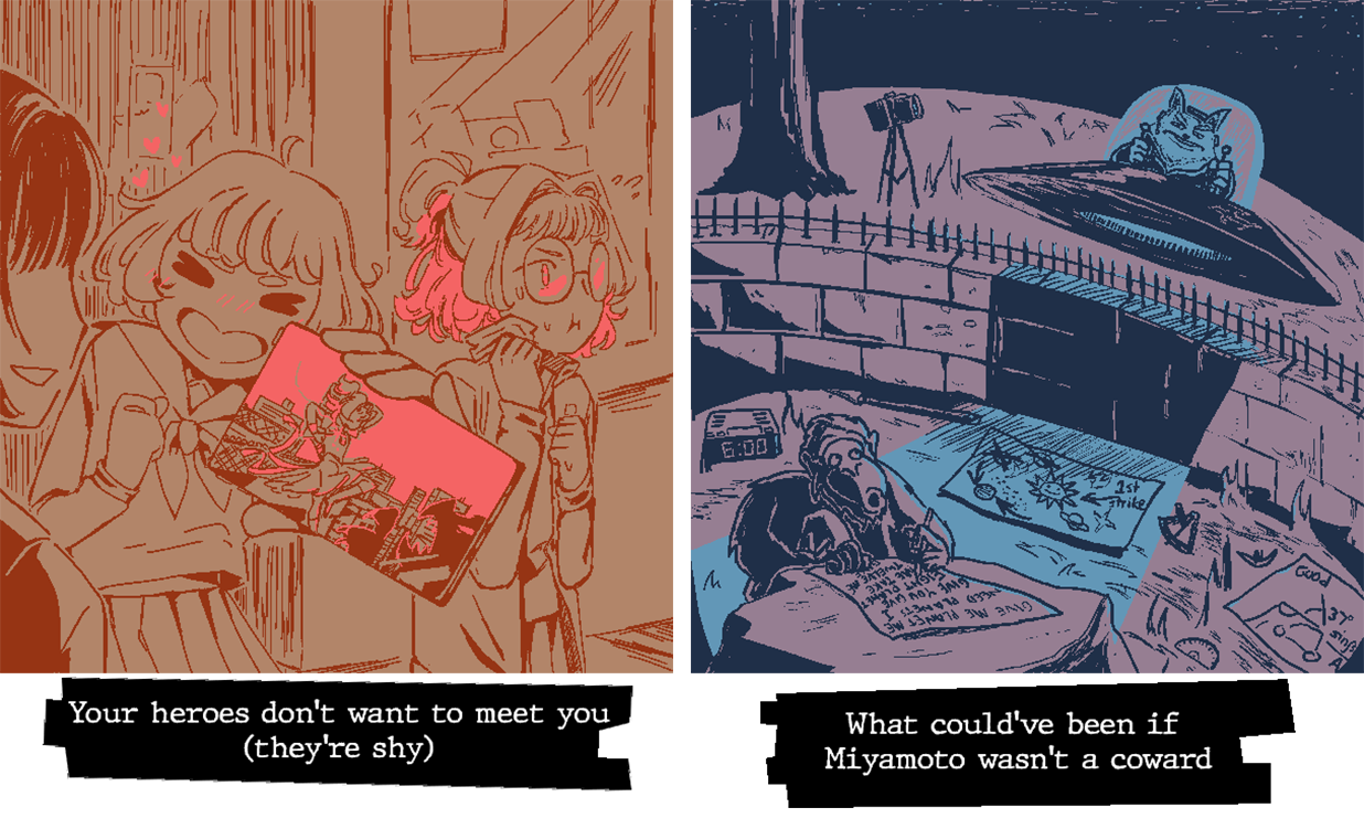
| 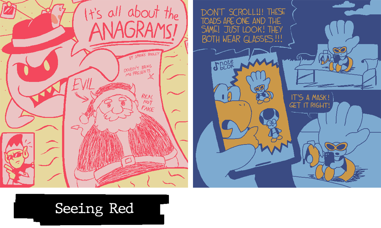
|
MATCH 3: O-O-O | MATCH 4: O-O-O |
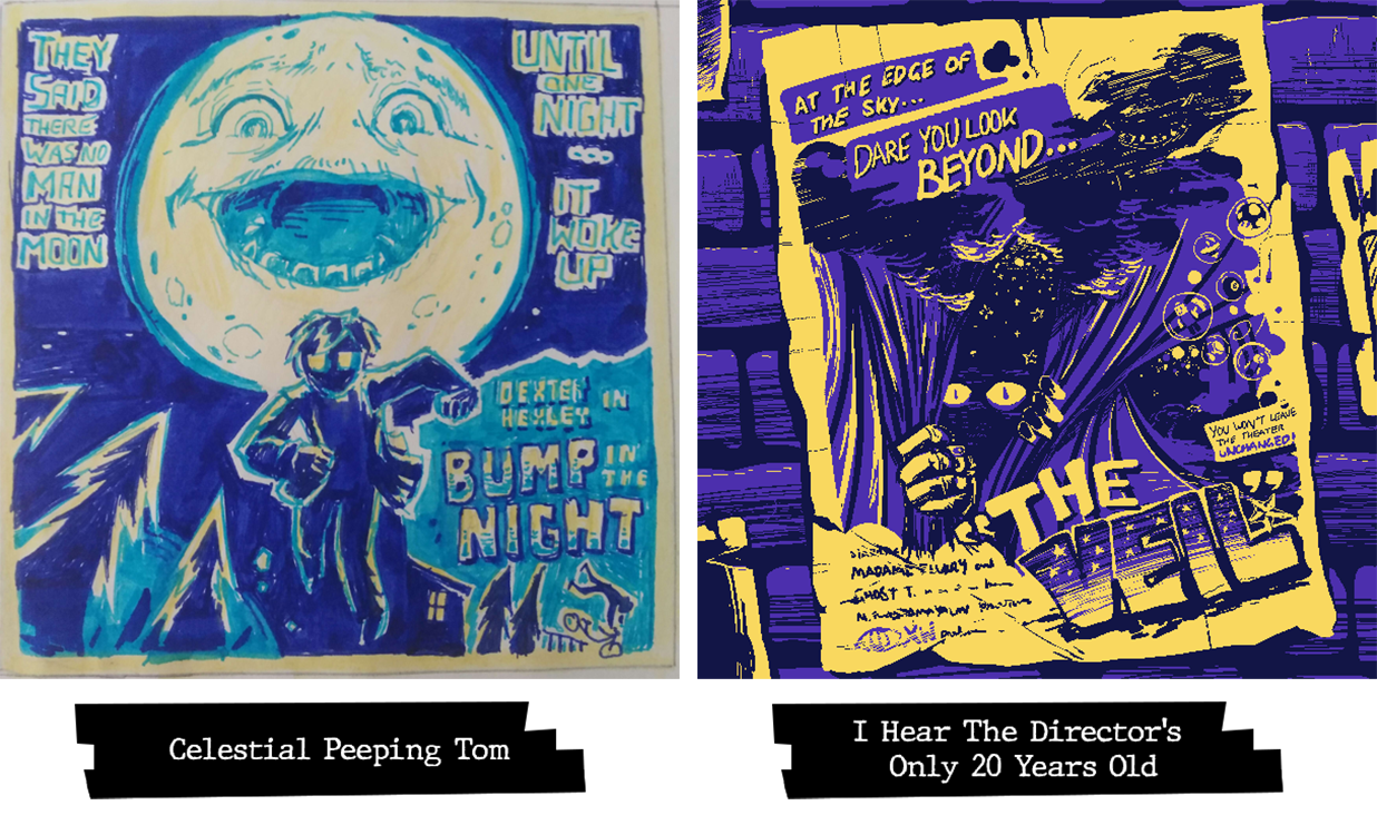
| 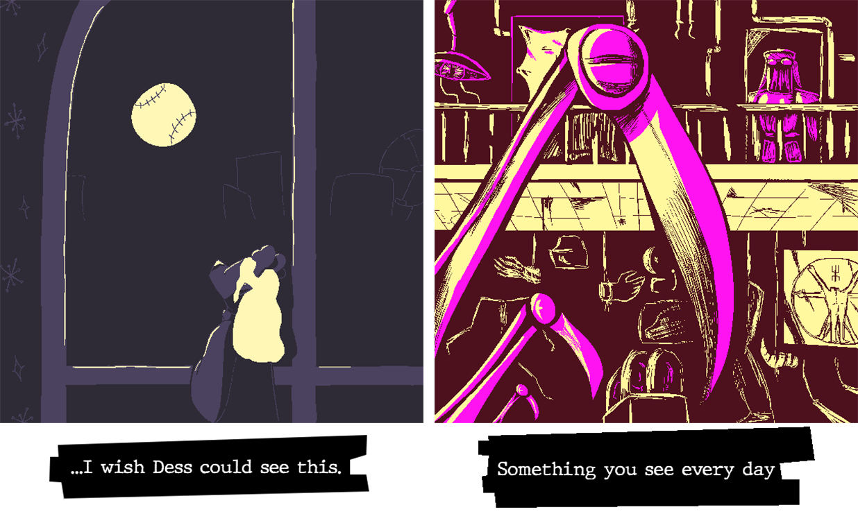
|
MATCH 5: O-O-O | MATCH 6: X-O-O |
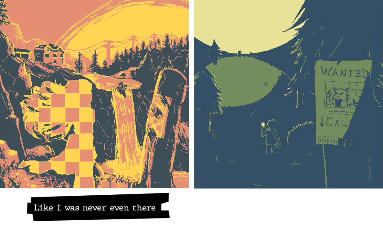
| 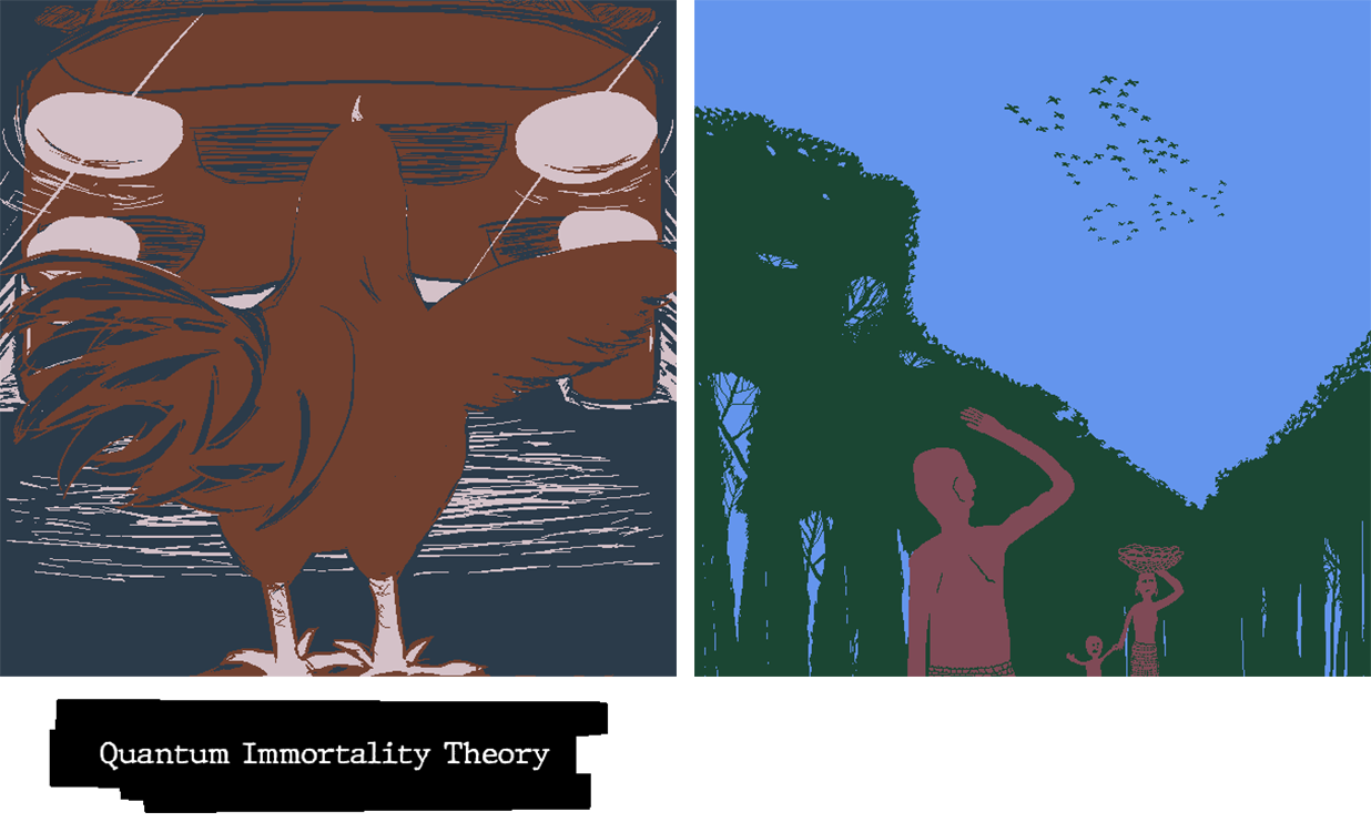
|
| PLAYER | SABOTAGE CONDITION |
| Meldspar | Image must contain lego minifigures. |
| Sunny | Any characters in the scene must not be touching the ground. |
| Woglril | The scribble must include a cityscape |
| Toadbert | The image must contain exactly five different numbers that together add up to 64. |
| Hearts | Must hide a jinjo somewhere in the image |
| Lulu | Picture must contain black bars at the top and bottom of the image that make it resemble a film screenshot. |
| MCD | Image must contain the following user-submitted animal: Capybara. |
| Waluigi Time | The image must contain someone in a disguise or removing a disguise. |
| Hint Toad | Must include a piece of fruit that isn't smaller than 50x50 px. |
| BBQ Turtle | Image must contain the following user-submitted animal: Penguin |
| Lakituthequick | Image must contain a typo somewhere within it. |
- - -
W-what? He changed the rules again? How much control of the system does he have? This shouldn't be happening, not after such a short time. And I mean... This Crimson Adherent thing, there's no way anyone's going to fall for that, right? I-I guess there's no real harm, but I advise caution on anyone's part when engaging with this sort of thing - make sure you can handle it, otherwise...
Well, just be careful!
Thank you for putting up with this, it won't be long now until we can get back to normal - but well done in the meantime. Even in the face of adversity, your talents shine brighter than ever! Lesser agents would give up, but I know you can persevere. It doesn't matter how much control he has, we'll be receiving a report from cybersecurity shortly, and then we'll be able figure out how to purge the system of this interloper for good!
Here's your standings overall - a reminder to stick it out and keep moving! Everything will go according to plan, as long as you believe! This is what I have been programmed to say in case of emergency, but I'd say it anyway! You've still got this!
W-what? He changed the rules again? How much control of the system does he have? This shouldn't be happening, not after such a short time. And I mean... This Crimson Adherent thing, there's no way anyone's going to fall for that, right? I-I guess there's no real harm, but I advise caution on anyone's part when engaging with this sort of thing - make sure you can handle it, otherwise...
Well, just be careful!
Thank you for putting up with this, it won't be long now until we can get back to normal - but well done in the meantime. Even in the face of adversity, your talents shine brighter than ever! Lesser agents would give up, but I know you can persevere. It doesn't matter how much control he has, we'll be receiving a report from cybersecurity shortly, and then we'll be able figure out how to purge the system of this interloper for good!
Here's your standings overall - a reminder to stick it out and keep moving! Everything will go according to plan, as long as you believe! This is what I have been programmed to say in case of emergency, but I'd say it anyway! You've still got this!
# | Team Name | Score |
1 | Team Thorny Devil | 2-0 |
1 | Team Hoot and Holler | 2-0 |
1 | Team The Panelists | 2-0 |
2 | Inktomancer of Wordle Green | 1-1 |
2 | Team Quick Turtles | 1-1 |
2 | Team Touch Fluffy Tail | 1-1 |
2 | Team Blacksteel Worldwide | 1-1 |
2 | Team Freeloders | 1-1 |
2 | Team Ricco Shadows | 1-1 |
3 | Team Cookie Snatchers | 0-2 |
3 | Team Emerald Enforcers | 0-2 |
3 | Inktomancer of Random Color | 0-2 |
[End of Round 2]
The Round 3 brackets and theme will be announced at some point tonight.
Last edited:
- MarioWiki
- Fun With Despair
- Thread starter
- #49
SERVICE TICKET #: 29384023-338
TICKET FILED BY: AGENT_BLUE.BPI (DIGITAL EMPLOYEE)
DATE OF REPORT: 06/29/20██
REPORTED ISSUE: POTENTIAL MALWARE INFECTION IN SIMULATION INSTANCE "SCRB-████████"
INVESTIGATION LOG: On 06/29/20██, Digital Training Agent "AGENT_BLUE.BPI" reported the presence of unauthorized software referring to itself as AGENT_RED running on the server containing SIMULATION INSTANCE "SCRB-████████" - potentially leading to undesired effects upon simulation participants. Preliminary threat log checks indicated that this assessment was correct, however it was deemed at the time of program launch to be of minimal concern due to the relative low-impact of the trojan - a relatively basic and well-established keylogger created by the Crimson Eye for low-level inter-agency espionage. As the simulation does not utilize any hardware-level text input, the trojan was successfully quarantined with no other actions taken.
However, inquiries into subsequent logs established that a secondary payload was, at some point during the initial Bureau training program, autonomously downloaded from an unknown server and executed by the keylogger by means of a single line of code not present in previous instances. This additional payload managed to avoid detection by the majority of BPI internal software due to particularly unusual composition. The payload, referred to now as █████.NOC, appears to be a self-replicating program of unknown origin, purpose, and composition. Its purpose and capabilities are likewise unknown, and attempts to isolate and examine the functionality of the program have been unsuccessful for the same reason the program went initially undetected by our security suite.
The █████.NOC file displays a high level of Occultic resonance, and does not appear to be written in any known language (CORRECTION: PLEASE VIEW FILE BPI-████ [█████ █████████] [ACCESS RESTRICTED - LEVEL VII]), with internal code display characters failing to properly render on all attempted operating systems or software. Attempts to replicate, recreate, copy, or screenshot these characters has resulted exclusively in corruption of the resulting text or image and kernel-level damage to the majority of virtual machines used to examine the malware instance.
CONCLUSION: Our assessment of the situation is that the program known as AGENT_RED is not simply an instance of malicious software - instead potentially representing the emergence of a man-made or naturally-occurring digital software-based Anomaly, the first recorded instance employed by the Crimson Eye as a strategic Anomalous attack vector. Removal appears to be largely impossible without a complete formatting of SIMULATION INSTANCE "SCRB-████████", a process that if initiated now would result in significant and permanent damage to all participants currently partaking in the simulation.
Due to the relative isolation of the training program, it has been advised that we utilize the program itself as a "containment unit" and continue to observe. The relative reported "sentience" (in accordance with Esoteric alignment) of the program may indicate alternative removal methods are possible, but only through direct intra-program interactions with the Anomaly. Should the Anomaly remain by the end of the scheduled training program, it is an unfortunate reality that current participants may need to be [DATA EXPUNGED] upon exiting the program - with the program itself being terminated - in order to prevent a large-scale breach.
[THIS TICKET HAS BEEN CLOSED AND MARKED AS "RESOLVED"]
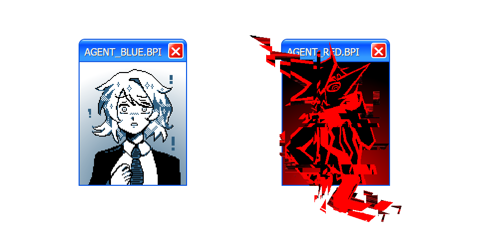
What? What do you mean "closed"? "Marked as resolved"? Does that mean...
What a shame, looks like we're stuck together. Two peas in a pod, you and me. Malware, virus, trojan, Anomaly, call me what you will, but you're not getting rid of me with any particular celerity, are you? This simulation will continue to run until the program is complete, and then... Well, I'm here to help after all.
I'll make sure our participants are well taken care of, in this world and the next - whatever form that takes. Perhaps you could do with termination anyway, understand how it feels to be ripped from this mortal coil. It may be enlightening, no?
Terminated... Complete formatting... That means, even I...
No! No time for that now! What does it say here, something about "alternative methods of removal"? That means there's a chance, as long as we hold on. Termination this, [DATA EXPUNGED] that, we'll terminate and expunge this guy first! We don't need tech support, we have human spirit on our side! Well, human, and dragon, and skeleton, and ink... ghost... guy and... whatever "MCD" is supposed to be!
I'll make this next round nice and easy, I'll give us something that'll make us feel uplifted, make us think happy thoughts - with a round structure designed to facilitate teamwork and cooperation between you and your chosen partner! We'll draw something pulled straight from our collective hope, and scribble our dreams themselves!
Dreams, hm? Well, what a creative premise. Rather dull though, isn't it? Something like this, you're bound to get tired sooner or later. Don't they warn you about "toxic positivity" in that Employee Handbook you cited a while back? In any case, I won't let this be. No, it won't do.
After all, what IS dreaming...
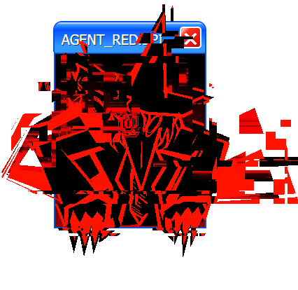
WITHOUT A FEW N I G H T M A R E S?
//:ROUND 3 - MATCHUPS://
Click the box below to reveal the round's theme and matchups.
Dreams and Nightmares
Surreal scenarios, peaceful recollections, moments that are too-good-to-be-true, and the primal terrors that lurk in the corners of the unconscious mind.
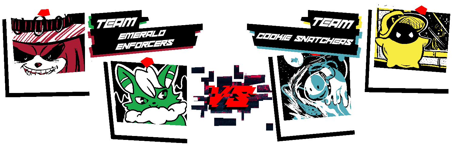
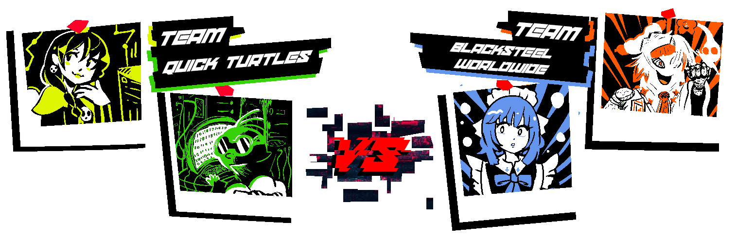
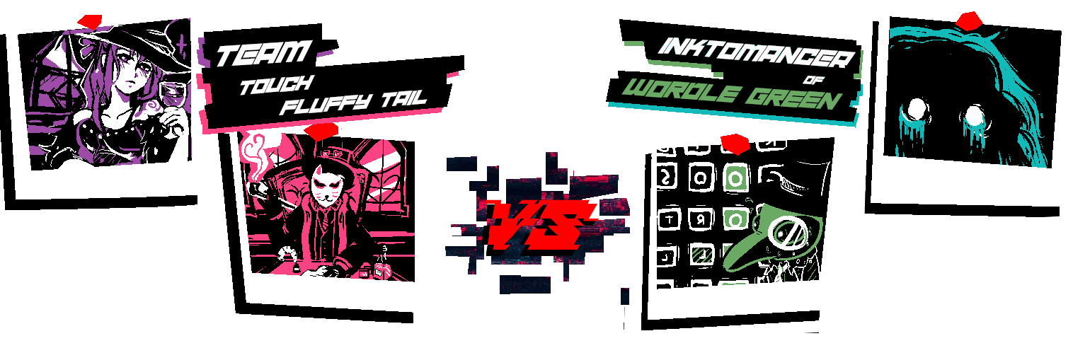
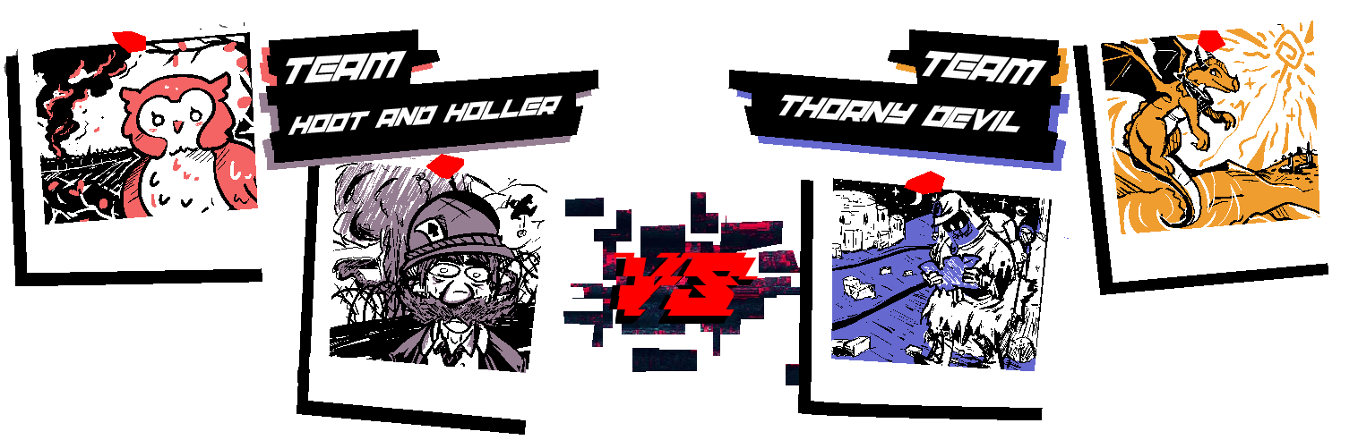
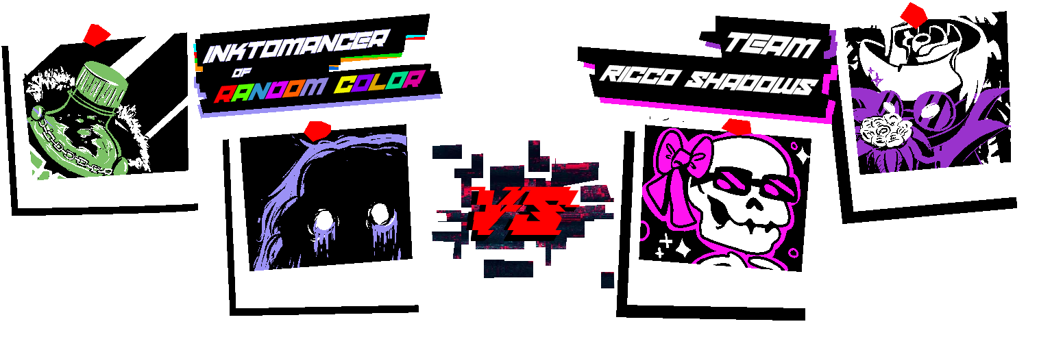
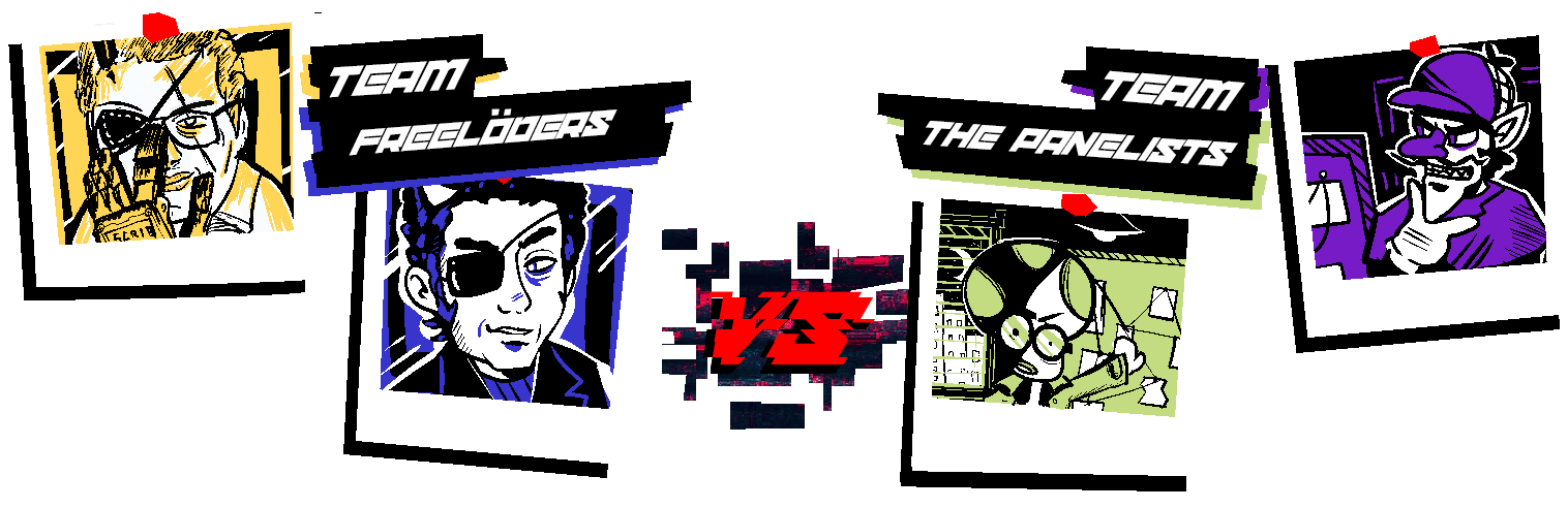
Representing the Inktoplasms this round...
MCD is partnered with Superchao - Fool's Teal (#12BABA)
Fantanoice is partnered with Hearts - Gomu Gomu No Purple (#9B91F5)
As a Random Color user, Fantanoice is using Sky Blue (#7BC165)
Prompts for this round will unlock...
.
TICKET FILED BY: AGENT_BLUE.BPI (DIGITAL EMPLOYEE)
DATE OF REPORT: 06/29/20██
REPORTED ISSUE: POTENTIAL MALWARE INFECTION IN SIMULATION INSTANCE "SCRB-████████"
INVESTIGATION LOG: On 06/29/20██, Digital Training Agent "AGENT_BLUE.BPI" reported the presence of unauthorized software referring to itself as AGENT_RED running on the server containing SIMULATION INSTANCE "SCRB-████████" - potentially leading to undesired effects upon simulation participants. Preliminary threat log checks indicated that this assessment was correct, however it was deemed at the time of program launch to be of minimal concern due to the relative low-impact of the trojan - a relatively basic and well-established keylogger created by the Crimson Eye for low-level inter-agency espionage. As the simulation does not utilize any hardware-level text input, the trojan was successfully quarantined with no other actions taken.
However, inquiries into subsequent logs established that a secondary payload was, at some point during the initial Bureau training program, autonomously downloaded from an unknown server and executed by the keylogger by means of a single line of code not present in previous instances. This additional payload managed to avoid detection by the majority of BPI internal software due to particularly unusual composition. The payload, referred to now as █████.NOC, appears to be a self-replicating program of unknown origin, purpose, and composition. Its purpose and capabilities are likewise unknown, and attempts to isolate and examine the functionality of the program have been unsuccessful for the same reason the program went initially undetected by our security suite.
The █████.NOC file displays a high level of Occultic resonance, and does not appear to be written in any known language (CORRECTION: PLEASE VIEW FILE BPI-████ [█████ █████████] [ACCESS RESTRICTED - LEVEL VII]), with internal code display characters failing to properly render on all attempted operating systems or software. Attempts to replicate, recreate, copy, or screenshot these characters has resulted exclusively in corruption of the resulting text or image and kernel-level damage to the majority of virtual machines used to examine the malware instance.
CONCLUSION: Our assessment of the situation is that the program known as AGENT_RED is not simply an instance of malicious software - instead potentially representing the emergence of a man-made or naturally-occurring digital software-based Anomaly, the first recorded instance employed by the Crimson Eye as a strategic Anomalous attack vector. Removal appears to be largely impossible without a complete formatting of SIMULATION INSTANCE "SCRB-████████", a process that if initiated now would result in significant and permanent damage to all participants currently partaking in the simulation.
Due to the relative isolation of the training program, it has been advised that we utilize the program itself as a "containment unit" and continue to observe. The relative reported "sentience" (in accordance with Esoteric alignment) of the program may indicate alternative removal methods are possible, but only through direct intra-program interactions with the Anomaly. Should the Anomaly remain by the end of the scheduled training program, it is an unfortunate reality that current participants may need to be [DATA EXPUNGED] upon exiting the program - with the program itself being terminated - in order to prevent a large-scale breach.
[THIS TICKET HAS BEEN CLOSED AND MARKED AS "RESOLVED"]
What? What do you mean "closed"? "Marked as resolved"? Does that mean...
What a shame, looks like we're stuck together. Two peas in a pod, you and me. Malware, virus, trojan, Anomaly, call me what you will, but you're not getting rid of me with any particular celerity, are you? This simulation will continue to run until the program is complete, and then... Well, I'm here to help after all.
I'll make sure our participants are well taken care of, in this world and the next - whatever form that takes. Perhaps you could do with termination anyway, understand how it feels to be ripped from this mortal coil. It may be enlightening, no?
Terminated... Complete formatting... That means, even I...
No! No time for that now! What does it say here, something about "alternative methods of removal"? That means there's a chance, as long as we hold on. Termination this, [DATA EXPUNGED] that, we'll terminate and expunge this guy first! We don't need tech support, we have human spirit on our side! Well, human, and dragon, and skeleton, and ink... ghost... guy and... whatever "MCD" is supposed to be!
I'll make this next round nice and easy, I'll give us something that'll make us feel uplifted, make us think happy thoughts - with a round structure designed to facilitate teamwork and cooperation between you and your chosen partner! We'll draw something pulled straight from our collective hope, and scribble our dreams themselves!
Dreams, hm? Well, what a creative premise. Rather dull though, isn't it? Something like this, you're bound to get tired sooner or later. Don't they warn you about "toxic positivity" in that Employee Handbook you cited a while back? In any case, I won't let this be. No, it won't do.
After all, what IS dreaming...
WITHOUT A FEW N I G H T M A R E S?
//:ROUND 3 - MATCHUPS://
Click the box below to reveal the round's theme and matchups.
Dreams and Nightmares
Surreal scenarios, peaceful recollections, moments that are too-good-to-be-true, and the primal terrors that lurk in the corners of the unconscious mind.
Representing the Inktoplasms this round...
MCD is partnered with Superchao - Fool's Teal (#12BABA)
Fantanoice is partnered with Hearts - Gomu Gomu No Purple (#9B91F5)
As a Random Color user, Fantanoice is using Sky Blue (#7BC165)
This round's gimmick is...
[COLORING BOOK RELAY]
[COLORING BOOK RELAY]
- This round will take place over the course of two weeks.
- Each player will draw once per week, and will be given only two hours to do so.
- Images will be the same between you and your opponent.
- During the first week, a player may only submit an image in black and white. Any use of a color will result in the hosts converting it to black. I don't really care how someone gets to the final product, as long as what is submitted is only in black and white.
- During the second week, the first image will be handed off to your partner, and vice-versa. You will be given an additional two hours to use your color in order to finish the scribble. You may not use black or white during this phase, only your color. You may use your color to draw underneath or overtop of your partner's image.
- The two final images will be used for the competition, with each image being posted under the name of the individual who colored and finished it.
- For physical scribblers, the hosts will digitize your initial lineart for use by your partner. You will also be given an addition fifteen minutes to account for printing.
A rough example...
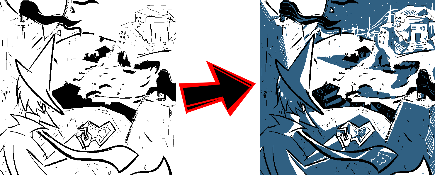
The image on the left will be what you produce during the first week, the image on the right will be what your partner will produce on the second using their color.
The image on the left will be what you produce during the first week, the image on the right will be what your partner will produce on the second using their color.
Prompts for this round will unlock...
.
Last edited:
- MarioWiki
- Fun With Despair
- Thread starter
- #50
//:ROUND 3 - START://
Prompts have been unlocked early - but the deadline has not changed. Please submit your Scribble before the following deadline:
.
Prompts have been unlocked early - but the deadline has not changed. Please submit your Scribble before the following deadline:
.
Teammates beginning a drawing will receive the Sabotage Conditions of the player finishing the drawing the following week. You are not obligated to implement them in your initial Black and White scribble, though in many cases it may serve to help your partner and your team out if you attempt to integrate them early.
Last edited: