- Thread starter
- #76
To start this thread with a bang, it's time to post my commentary on a community that's came to pass. I posted about the Challenges before, so this time, I will post about the actual Rounds that involve the time limit.
This is it, the fifth year of Scribbles, and I had a feeling that this is going to be another serious effort to draw some pictures with time constraints! For my colour, I wanted a colour from a different spectrum. I picked purple (2021), violet (2022), green (2023), red (Pilgrimage), orange (2024), and yellow (2025). Thus, it's natural that I go for blue this time, and a name that has "win" in it. I went with "Wild Wind" (#657088) for my blue, though it ended up looking like a grey colour. Still, grey's not the worst colour to go. It can still look good. Perhaps I could even pick a more obvious blue next time, even.

Most of the time, I don't do complete art in between rounds or before them. But this time, I drew this one to show that I mean business! Perhaps kind of literally given how I reused my Mario Mart concept with Mario as the Mall Manager, which is the title I picked for participating. It's a chance to get some shading experimentation, doing Mario with the half shadow image. The shading under the desk is something that didn't look right, but at least this is just a warm up. Also, that Mario figurine is from the Picture Pilgrimage, which was added by Gabumon at the counter at the reception. I decided to just add that as a fun detail.

~ Title: Farming Lives Paid Off ~


Barring an anomaly like my first ever match against The Pyro Guy in the first ever Scribble match, I often view the first match as the more relaxing ones, like a warm up if you will. That's because opponents are randomised, so it's less likely to be matched up against someone at my skill level or one that surpassed it. This one is no different, but one aspect made me felt that I should not be overconfident: the fact that concept matters. Even the ones who might not draw as well might be able to sell through with the concept, which I thought Fantanoice might do. Interestingly, third time's the charm here since we weren't able to have our match until this one.
I have drafted a few concepts here and there. The ideas include: (1) a hero running over his dead body, (2) a hoarder hoarding over extra lives like they matter even though they've got too many of them, (3) a hero respawning over lots of corpses, (4) a short guy surprised at the other guy holding a heart (don't quite remember the context, sorry), and (5) a hammer wielder walking slowly towards a barrage of bullets. If you look at the side, it's easy to guess which one made it through as the main concept. With that said, the multitude of dead bodies still made it, in a way. the original perspective was that the shooter was at the top-left, but I felt it worked out better when the shooter is at the bottom-right while the action takes place at the other parts.
One facet of the concept that is serendipitous is the devil horns of the villain and the angel halo of the hero, as a way to demonstrate the good and the evil. Even then, the hero's halo is not actually part of the design, more that it's a signifier that the hero is up and determined again, similar to how video games have this mercy invincibility where they get a chance of survival instead of getting knocked down again to death. Coming up with differing poses of being shot down is interesting from the point of view of drawing different ways that the character is shot.
The colours are an aspect that I think turned out decently. The main subjects are all cleanly shaded, while the gunned down versions of the heroes are striped without shading to indicate their loss of life, and then there are the dead ones. I liked the differently-toned lines of the hero, so it's a bit of a shame that the rest didn't have that dynamic lines. I must say that, throughout all these scribbles, I never have a time where I completed the picture to perfection in time, because there were often moments of rushing to finish the picture in time.
Fantanoice's concept reminded me of Marie from Splatoon, even though she claimed it's supposed to be Peach or Rosalina. I don't know if she only noticed the similarities with the Splatoon character after that.
I guess my rather morbid image made a good impression, so it's onwards to a more skilled opponent next round.

~ Title: There's Treasure Everywhere ~


My opponent is one of those who joined the event, but retire before any thing was done. It was also the establishment of a second random opponent for the Amalgamation. I don't know if I somehow convinced the host to have a second person, but it made sense to have one, since there are a lot of volunteers, and when an even amount of participants remain, it would make sense to have two if the concept were to remain.
For the main piece, it's clear that I have a pretty good idea on what the concept is going to be: one of them is gathering knowledge and experience from the ancients whose time were long past, and another is escaping for their lives from grabbing treasures for themselves. I picked the less cliché choice of the guy being the information gatherer while the girl being the treasure hunter. Of course, the mummies react to their exploits differently.
The picture itself isn't quite perfect, given how the hieroglyphs look scribbly (ahahaha) and the shading is kinda rough. The thing that I don't know if I did right is the lighting. However, I think the posing is probably the best part of it, and one I felt is a strength to the piece. All things considered, it probably turned fine, just kinda rough around the edges.
My opponent was volunteered by Roserade, who have an interesting interpretation of what a tomb is, being that this "tomb" is a sunken ship near a sea trench. One of the nice things about these kinds of open-ended prompts is how others interpret them creatively.

~ Title: Up and Down and All Around ~


One funny conversation came up during this round, and I mentioned how I find my opponent, Uniju, to be scary. He seems to have the same feeling for me, and then some folks chime in for the opponents they are scared of for their formidable talent. I guess fear can be quite roundabout. Speaking of rounds, that's the title and I think it's a fun one.
Early concepts indicate that I wanted to do something original like previous art, but the phrase "Up and Down and All Around" came to me and it's something from Sonic (Yoshi's Woolly World inexplicable use this phrase too). So it's settled: I will do a Sonic picture involving one of the upside-down corkscrews. I then spruced it up by doing a long course at Green Hill Zone. The pathing too a lot to figure out, as with fitting in all the Sonics and some wildlife critters.
Given how time-consuming the sketching turned out to be, so too is fully drawing the picture. There are a lot going on in this image, so I had to take it a little at a time. Even with that, some details were not included due to time constraints, such as the flower on the left edge. The picture didn't get harmed by certain excluded details, even if I would like to get them included. As much as the perfect picture is desired, certain sacrifices need to be made, especially the ones that can be constitute as extras.
I think it's funny how one of my concepts for different people doing the ring around the roses ended up being used by Uniju. It's like a coincidence, except I travelled a different path so there were no parallels this time. One has to wonder what would happen if both my opponent and I came up with the same idea, which I don't feel have happened so far.

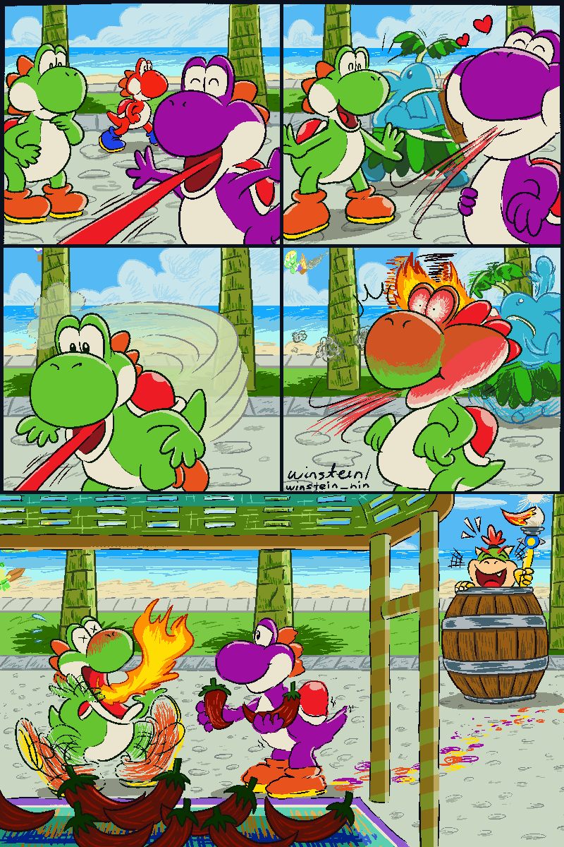
~ Title: Banana Party, BYOD (Bring Your Own Dragon)! ~


I knew this would happen as I go through the matches: the inevitable match with The Pyro Guy. I expected this to be the last match, but somehow, this ended up being the second-to-last match, which gave it higher stakes than I thought. The complex prompt, alongside being matched with the artistically skilled The Pyro Guy, makes this one the most intense match I have ever had for this event.
Never mind that it is about dragons, something that I didn't feel familiar with, but then it's combined with potassium to make for an interesting combination. I knew that Gabumon is clearly going to have an easy time with this, not knowing that he's the one who came up with the "dragons" part. I don't know if I came up with "freefalling gadabout" (which he was settled with), but I felt that it could very well be since I thought about how Splatoon 3 had a rare title "Ace Gadabout". Which would mean that it's a pretty funny exchange.
I spent pretty much an hour of this match coming up with dragon designs, looking up certain ideas on the internet for some unique designs. You can see what those were in the "Concept" spoiler. The one that I thought was the most unique is the bottom-right one, because of the long hair. With all those designs and an exorbitant time spent on the designs, I knew I have to use them somehow, in relation to potassium. Since bananas are most associated with potassium, it's clear that they are to be featured. Playing to my strengths instead of attempting to imitating TPG, I have decided to go for a more bustling image featuring a picnic party involving the dragons I drew. Most of them are incorporated in the image, except for that dragon with the ball at the bottom-middle. When everything's so busy as they are, there really is no place or action to fit it in.
I have to mention how I didn't expect TPG to go in a more tranquil and contemplative, when I was expecting a more majestic art similar to the gigantic horse skeleton being unearth in a quarry. But more than that, I didn't expect that in the end, our match ended up in a draw, which is not something you see every time, lest of all being a top-ranked match. I am glad that the host GBAToad picked mine to win, since I never have won this before.

~ Title: A Chance Encounter at Mother Nature Doing God's Work (that no humans witness) ~


When I see that the title is "Creation", I knew Woglril is going to do something about the robot and the mechanic who fixes the robot. I felt that this is an advantage for her because there's already something to work with. I wasn't quite sure what to use with this art, but then! I was looking at one of my sketched art and found something I could reuse for this, so she's not the only one who reuse characters. This is what basically driven what I will do with my art:

It's very handy to have notes in my drawing because all the inspirations will eventually be forgotten. In this case, this sketch was drawn because I was inspired by Ostara as a concept for a character, and that eventually morphed into Mother Nature.
Of the drawings, this is the one where the white dominates the backdrop, in contrast to my chosen colour that most other artwork opted for. I think this creates a stronger impression with the image, and I am glad that I decided to let the white do the talking this time. I drew a path for the river, and then added lines to indicate uneven terrain. The top part of the river felt like the river had some odd gravity, but perhaps by looking at it as though it's winding, it wouldn't look too bad. The animals are another part that I added that I see fit. One animal, the otter, was added a bit later when I drew this picture.
When drawing this picture for real, the trees were among the first to get drawn, followed by the river. The animals were sprinkled through. The last and surprisingly time-consuming part is the Mother Nature, because I thought it would be the easiest, but these kinds of things can surprise you by their difficulty later. I somehow managed to juggle the amount of details to complete the piece as good as I thought it could be.
Woglril's piece is as expected, about the robot character she did earlier. I felt that this is the decisive match because this is the ultimate one, and I hoped that I made it this time, coming from how I not only didn't make it for previous Scribbles tournaments, but lost quite handily in the Scribbles Labs 2. To my surprise, I won! Yes, I somehow outvoted all my opponents in a pretty strong showing, and I am glad that I took the effort to do not only all the drawings, but also practice pieces.

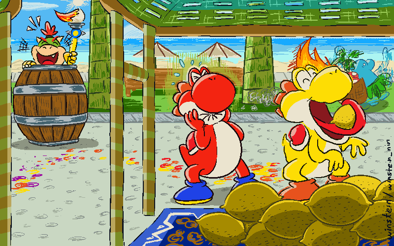
~ Title: Following the Musical Road ~
 Finally, there is this piece. This is an extra contest between BBQ Turtle and I, where we decided on a prompt from a user submission for this event. The title "Something Musical" inspires me to do a musical kingdom. Coming up with all the musical instrument ideas is difficult to do when you want to populate the kingdom, but I eventually somehow manage to get all the scenery completed for drawing.
As I have to go somewhere in the evening, I only have basically 2.5 hours to complete the art. What does this mean? One of the key aspects of this art had to be dropped. The backdrop with musical themed environment and objects remained, except the sky which I felt didn't have the desirable look, but the real omission is the folks travelling down the musical road. Despite this, the title "Following the Musical Road" remained. If one were confused on why it's titled this, this concept should explain. Even though I told GBAToad that this was the title I would've gone with were I to be able to complete the piece, he still included it. It's fine to include it, I felt, because I might have forgotten about it eventually.
BBQ Turtle's art is about three of the Mario ladies dressed as musical idols. It's a nice piece, I like it.
The results for best-voted artwork are:
Thank you to all of you for granting me the opportunity for the victory! I felt like my efforts paid off. As to the idea of hosting it, I am not totally sure about this because I never hosted tournaments before, lest of all something as big of a scale as this. I do have an idea on what to do for the next one, so it's not like I am unprepared for this. It's more that I wonder if I would have the time to do this. I do think I would like to do it once, if I know what such a commitment would entail.
I do like how this final image turned out with my colour. The colour I picked gives off a sense of contemplation and conclusion to the entire event in this image; makes me glad to go with it.

Thank you for reading.
Scribble Circuit - winstein Edition
This is it, the fifth year of Scribbles, and I had a feeling that this is going to be another serious effort to draw some pictures with time constraints! For my colour, I wanted a colour from a different spectrum. I picked purple (2021), violet (2022), green (2023), red (Pilgrimage), orange (2024), and yellow (2025). Thus, it's natural that I go for blue this time, and a name that has "win" in it. I went with "Wild Wind" (#657088) for my blue, though it ended up looking like a grey colour. Still, grey's not the worst colour to go. It can still look good. Perhaps I could even pick a more obvious blue next time, even.
Avatar Image (Warm-Up)
Round 1: Extra Life
~ Title: Farming Lives Paid Off ~
Barring an anomaly like my first ever match against The Pyro Guy in the first ever Scribble match, I often view the first match as the more relaxing ones, like a warm up if you will. That's because opponents are randomised, so it's less likely to be matched up against someone at my skill level or one that surpassed it. This one is no different, but one aspect made me felt that I should not be overconfident: the fact that concept matters. Even the ones who might not draw as well might be able to sell through with the concept, which I thought Fantanoice might do. Interestingly, third time's the charm here since we weren't able to have our match until this one.
I have drafted a few concepts here and there. The ideas include: (1) a hero running over his dead body, (2) a hoarder hoarding over extra lives like they matter even though they've got too many of them, (3) a hero respawning over lots of corpses, (4) a short guy surprised at the other guy holding a heart (don't quite remember the context, sorry), and (5) a hammer wielder walking slowly towards a barrage of bullets. If you look at the side, it's easy to guess which one made it through as the main concept. With that said, the multitude of dead bodies still made it, in a way. the original perspective was that the shooter was at the top-left, but I felt it worked out better when the shooter is at the bottom-right while the action takes place at the other parts.
One facet of the concept that is serendipitous is the devil horns of the villain and the angel halo of the hero, as a way to demonstrate the good and the evil. Even then, the hero's halo is not actually part of the design, more that it's a signifier that the hero is up and determined again, similar to how video games have this mercy invincibility where they get a chance of survival instead of getting knocked down again to death. Coming up with differing poses of being shot down is interesting from the point of view of drawing different ways that the character is shot.
The colours are an aspect that I think turned out decently. The main subjects are all cleanly shaded, while the gunned down versions of the heroes are striped without shading to indicate their loss of life, and then there are the dead ones. I liked the differently-toned lines of the hero, so it's a bit of a shame that the rest didn't have that dynamic lines. I must say that, throughout all these scribbles, I never have a time where I completed the picture to perfection in time, because there were often moments of rushing to finish the picture in time.
Fantanoice's concept reminded me of Marie from Splatoon, even though she claimed it's supposed to be Peach or Rosalina. I don't know if she only noticed the similarities with the Splatoon character after that.
I guess my rather morbid image made a good impression, so it's onwards to a more skilled opponent next round.
Round 2: Ancient Tomb
~ Title: There's Treasure Everywhere ~
My opponent is one of those who joined the event, but retire before any thing was done. It was also the establishment of a second random opponent for the Amalgamation. I don't know if I somehow convinced the host to have a second person, but it made sense to have one, since there are a lot of volunteers, and when an even amount of participants remain, it would make sense to have two if the concept were to remain.
For the main piece, it's clear that I have a pretty good idea on what the concept is going to be: one of them is gathering knowledge and experience from the ancients whose time were long past, and another is escaping for their lives from grabbing treasures for themselves. I picked the less cliché choice of the guy being the information gatherer while the girl being the treasure hunter. Of course, the mummies react to their exploits differently.
The picture itself isn't quite perfect, given how the hieroglyphs look scribbly (ahahaha) and the shading is kinda rough. The thing that I don't know if I did right is the lighting. However, I think the posing is probably the best part of it, and one I felt is a strength to the piece. All things considered, it probably turned fine, just kinda rough around the edges.
My opponent was volunteered by Roserade, who have an interesting interpretation of what a tomb is, being that this "tomb" is a sunken ship near a sea trench. One of the nice things about these kinds of open-ended prompts is how others interpret them creatively.
Round 3: Round and Around
~ Title: Up and Down and All Around ~
One funny conversation came up during this round, and I mentioned how I find my opponent, Uniju, to be scary. He seems to have the same feeling for me, and then some folks chime in for the opponents they are scared of for their formidable talent. I guess fear can be quite roundabout. Speaking of rounds, that's the title and I think it's a fun one.
Early concepts indicate that I wanted to do something original like previous art, but the phrase "Up and Down and All Around" came to me and it's something from Sonic (Yoshi's Woolly World inexplicable use this phrase too). So it's settled: I will do a Sonic picture involving one of the upside-down corkscrews. I then spruced it up by doing a long course at Green Hill Zone. The pathing too a lot to figure out, as with fitting in all the Sonics and some wildlife critters.
Given how time-consuming the sketching turned out to be, so too is fully drawing the picture. There are a lot going on in this image, so I had to take it a little at a time. Even with that, some details were not included due to time constraints, such as the flower on the left edge. The picture didn't get harmed by certain excluded details, even if I would like to get them included. As much as the perfect picture is desired, certain sacrifices need to be made, especially the ones that can be constitute as extras.
I think it's funny how one of my concepts for different people doing the ring around the roses ended up being used by Uniju. It's like a coincidence, except I travelled a different path so there were no parallels this time. One has to wonder what would happen if both my opponent and I came up with the same idea, which I don't feel have happened so far.
Round 4: "DRAGONS IN EVERYDAY SCENARIOS, NOW THAT'S WHAT I CALL #RELATABLE #POTASSIUM"
~ Title: Banana Party, BYOD (Bring Your Own Dragon)! ~
I knew this would happen as I go through the matches: the inevitable match with The Pyro Guy. I expected this to be the last match, but somehow, this ended up being the second-to-last match, which gave it higher stakes than I thought. The complex prompt, alongside being matched with the artistically skilled The Pyro Guy, makes this one the most intense match I have ever had for this event.
Never mind that it is about dragons, something that I didn't feel familiar with, but then it's combined with potassium to make for an interesting combination. I knew that Gabumon is clearly going to have an easy time with this, not knowing that he's the one who came up with the "dragons" part. I don't know if I came up with "freefalling gadabout" (which he was settled with), but I felt that it could very well be since I thought about how Splatoon 3 had a rare title "Ace Gadabout". Which would mean that it's a pretty funny exchange.
I spent pretty much an hour of this match coming up with dragon designs, looking up certain ideas on the internet for some unique designs. You can see what those were in the "Concept" spoiler. The one that I thought was the most unique is the bottom-right one, because of the long hair. With all those designs and an exorbitant time spent on the designs, I knew I have to use them somehow, in relation to potassium. Since bananas are most associated with potassium, it's clear that they are to be featured. Playing to my strengths instead of attempting to imitating TPG, I have decided to go for a more bustling image featuring a picnic party involving the dragons I drew. Most of them are incorporated in the image, except for that dragon with the ball at the bottom-middle. When everything's so busy as they are, there really is no place or action to fit it in.
I have to mention how I didn't expect TPG to go in a more tranquil and contemplative, when I was expecting a more majestic art similar to the gigantic horse skeleton being unearth in a quarry. But more than that, I didn't expect that in the end, our match ended up in a draw, which is not something you see every time, lest of all being a top-ranked match. I am glad that the host GBAToad picked mine to win, since I never have won this before.
Round 5: Creation
~ Title: A Chance Encounter at Mother Nature Doing God's Work (that no humans witness) ~
When I see that the title is "Creation", I knew Woglril is going to do something about the robot and the mechanic who fixes the robot. I felt that this is an advantage for her because there's already something to work with. I wasn't quite sure what to use with this art, but then! I was looking at one of my sketched art and found something I could reuse for this, so she's not the only one who reuse characters. This is what basically driven what I will do with my art:
It's very handy to have notes in my drawing because all the inspirations will eventually be forgotten. In this case, this sketch was drawn because I was inspired by Ostara as a concept for a character, and that eventually morphed into Mother Nature.
Of the drawings, this is the one where the white dominates the backdrop, in contrast to my chosen colour that most other artwork opted for. I think this creates a stronger impression with the image, and I am glad that I decided to let the white do the talking this time. I drew a path for the river, and then added lines to indicate uneven terrain. The top part of the river felt like the river had some odd gravity, but perhaps by looking at it as though it's winding, it wouldn't look too bad. The animals are another part that I added that I see fit. One animal, the otter, was added a bit later when I drew this picture.
When drawing this picture for real, the trees were among the first to get drawn, followed by the river. The animals were sprinkled through. The last and surprisingly time-consuming part is the Mother Nature, because I thought it would be the easiest, but these kinds of things can surprise you by their difficulty later. I somehow managed to juggle the amount of details to complete the piece as good as I thought it could be.
Woglril's piece is as expected, about the robot character she did earlier. I felt that this is the decisive match because this is the ultimate one, and I hoped that I made it this time, coming from how I not only didn't make it for previous Scribbles tournaments, but lost quite handily in the Scribbles Labs 2. To my surprise, I won! Yes, I somehow outvoted all my opponents in a pretty strong showing, and I am glad that I took the effort to do not only all the drawings, but also practice pieces.
Extra Round: Something Musical
~ Title: Following the Musical Road ~
As I have to go somewhere in the evening, I only have basically 2.5 hours to complete the art. What does this mean? One of the key aspects of this art had to be dropped. The backdrop with musical themed environment and objects remained, except the sky which I felt didn't have the desirable look, but the real omission is the folks travelling down the musical road. Despite this, the title "Following the Musical Road" remained. If one were confused on why it's titled this, this concept should explain. Even though I told GBAToad that this was the title I would've gone with were I to be able to complete the piece, he still included it. It's fine to include it, I felt, because I might have forgotten about it eventually.
BBQ Turtle's art is about three of the Mario ladies dressed as musical idols. It's a nice piece, I like it.
Conclusion
The results for best-voted artwork are:- ROUND 1 -
- 10 Pts.
- ROUND 2 -
- 11 Pts.
- ROUND 3 -
- 17 Pts.
- ROUND 4 -
- 17 Pts.
- ROUND 5 -
- 36 Pts.
- ROUND Ω -
- 13 Pts.
Thank you to all of you for granting me the opportunity for the victory! I felt like my efforts paid off. As to the idea of hosting it, I am not totally sure about this because I never hosted tournaments before, lest of all something as big of a scale as this. I do have an idea on what to do for the next one, so it's not like I am unprepared for this. It's more that I wonder if I would have the time to do this. I do think I would like to do it once, if I know what such a commitment would entail.
I do like how this final image turned out with my colour. The colour I picked gives off a sense of contemplation and conclusion to the entire event in this image; makes me glad to go with it.
Thank you for reading.