Navigation
Install the app
How to install the app on iOS
Follow along with the video below to see how to install our site as a web app on your home screen.
Note: This feature may not be available in some browsers.
More options
Style variation
You are using an out of date browser. It may not display this or other websites correctly.
You should upgrade or use an alternative browser.
You should upgrade or use an alternative browser.
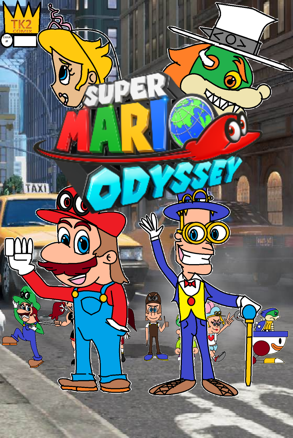
Super Mario Odyssey: Mario and Friends Edition Fan Comic Book (Fan Comic Review)
- Thread starter Harold Roxby
- Start date
Harold Roxby
Goomba
- Thread starter
- #2
And about the Rabbit Mobster Spy named Horace? Well, That's just the Rabbit Boss FC that I just made up.
BEEEEEAAARRRS
how about a rousing game of pool
it seems like you've got big ideas for characters and plot, and that's cool, but overall it could use some work.
For starters, I'd practice drawing the characters more so you can free hand them, instead of using circle tool and line splice for most of their lines. The dialogue is kinda strange and doesn't read well in a few places, "mutilize" isn't a word, and I'm not sure why there's an electric fence on the roof of a skyscraper at all.
None of the characters on the cover appear in this first issue at all (those that aren't covered up by Mario and the blue guy that is), which makes me wonder who's more important in this story.
But that said, I'm sure a lot of work went into this and there'd be more potential in it if it was refined.
For starters, I'd practice drawing the characters more so you can free hand them, instead of using circle tool and line splice for most of their lines. The dialogue is kinda strange and doesn't read well in a few places, "mutilize" isn't a word, and I'm not sure why there's an electric fence on the roof of a skyscraper at all.
None of the characters on the cover appear in this first issue at all (those that aren't covered up by Mario and the blue guy that is), which makes me wonder who's more important in this story.
But that said, I'm sure a lot of work went into this and there'd be more potential in it if it was refined.
Harold Roxby
Goomba
- Thread starter
- #4
That Blue Guy is actually Peach's Brother from My Mario and Friends Comics named Count Cosmo Toadstool on Deviant. I'm alot sure this Fan Comic is half Different than Super Mario Odyssey Game Itself where Mario Rescues Peach alone then with the Mushroom Knights in the Comic Chapter Book Version.
In addition to what tb said above, you seem to use swear words quite a bit in this. It almost comes across as gratuitous. There's nothing wrong with some profanity now and then, but it just seems to me that you're using them because either you think they're inherently funny words or you just don't want kids reading this.
Harold Roxby
Goomba
- Thread starter
- #6
I sadly didn't want kids to read MY Fan Comics unless they are like 13 and up. Also, what about Horace Calling Harriet a "Pig" just because she works for the police?

- Pronouns
- she/her
- MarioWiki
- Mario
You need to proofread as I caught several spelling and grammar errors, so you need to clean that up. Not to mention, the text within the text bubbles seem to be all over the place and not laid in a very neat manner. Overall, I think this needs to be refined a bit more (especially the drawings here, keep the fingers at a consistent size for instance) if you want more feedback.
Harold Roxby
Goomba
- Thread starter
- #9
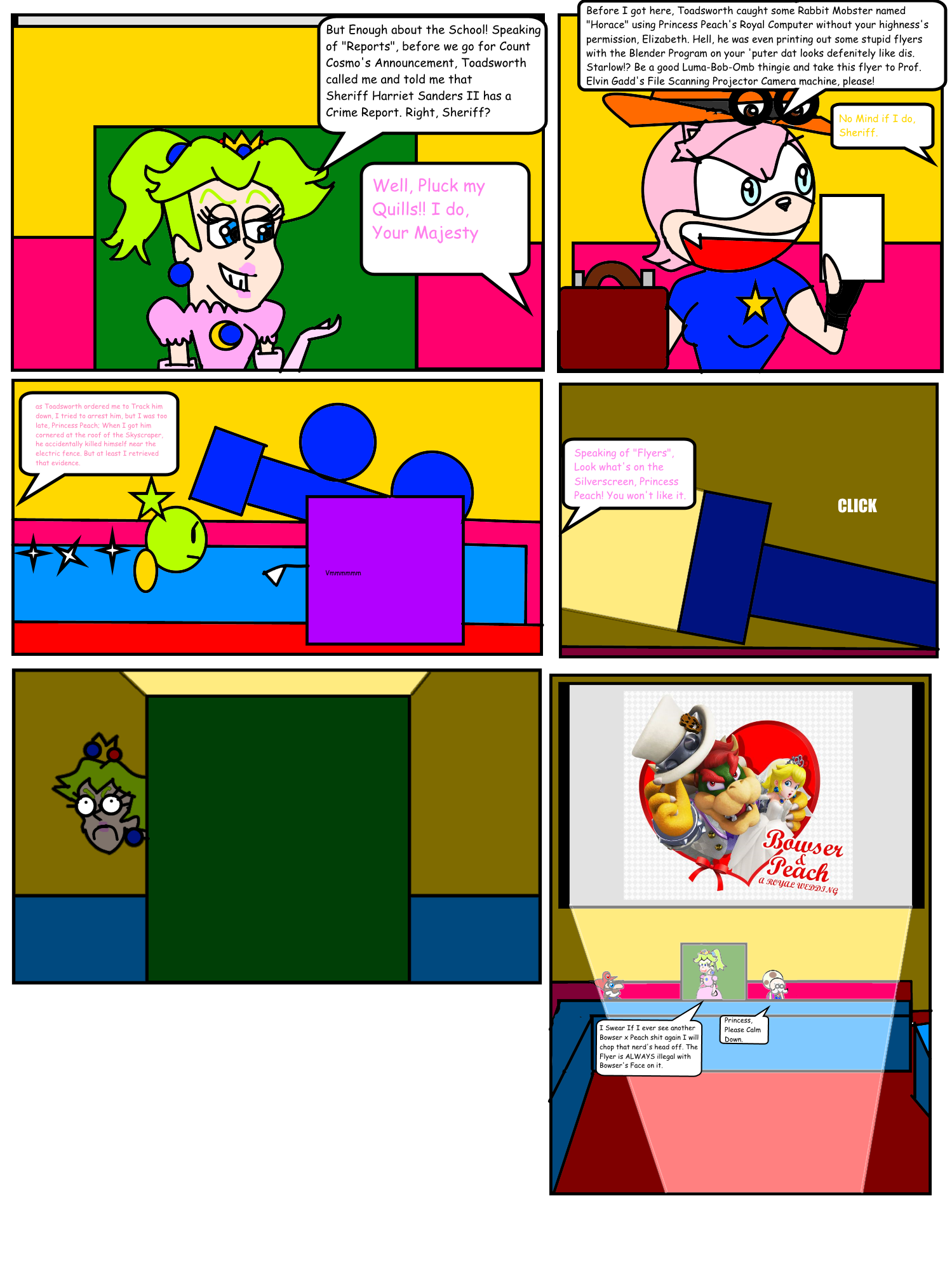
UP TO DATE: New Comic Pages Arrived

Harold Roxby
Goomba
- Thread starter
- #10
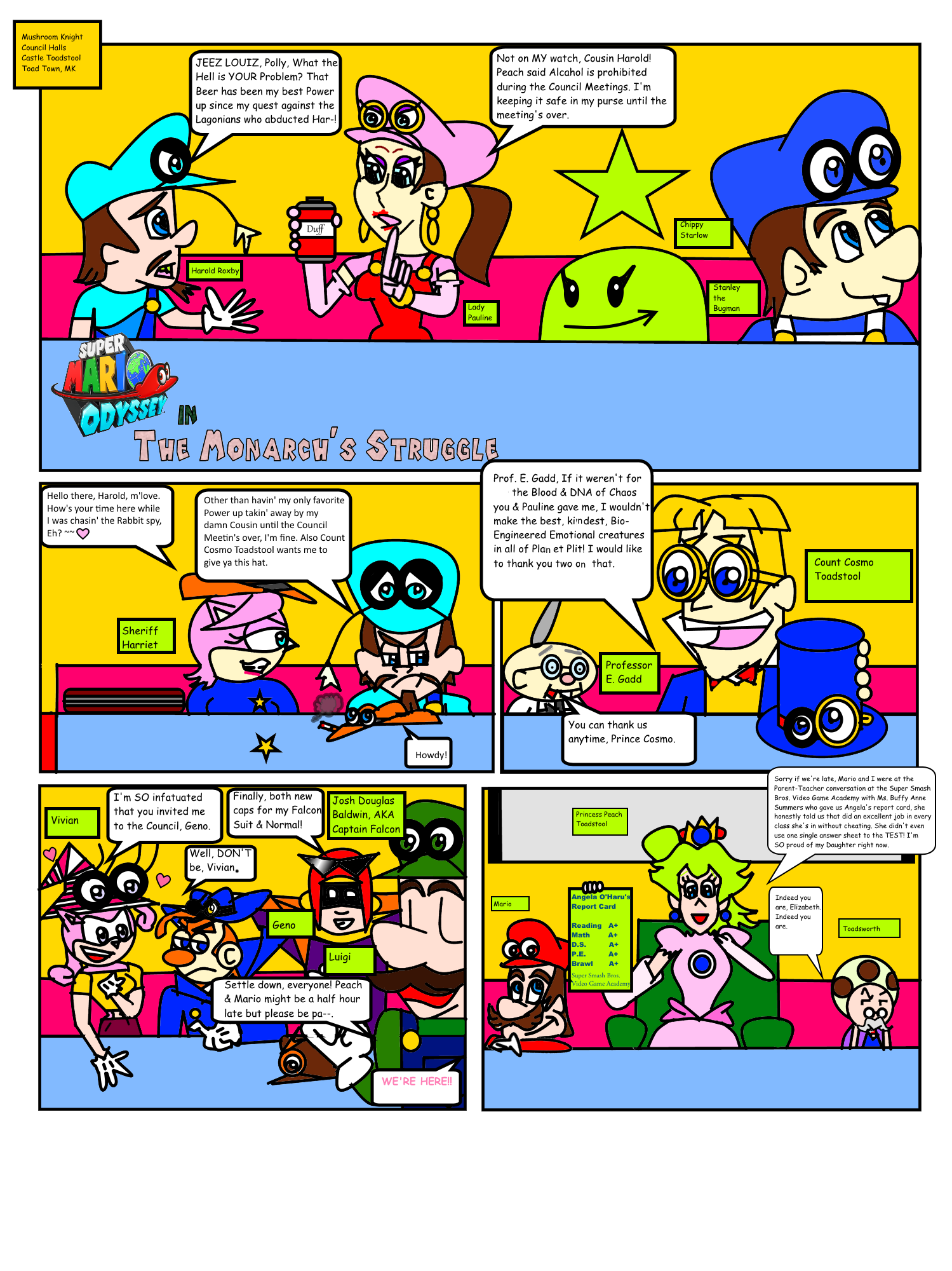
So, Any criticism on the next update pages to the comic book

- Pronouns
- They
- MarioWiki
- Roserade
The artwork is definitely improving. I appreciate the different shapes you gave the character faces.
Two criticisms:
The text is far too much. Seeing that wall of text does not make me interested at all. I'd recommend condensing how much the characters are saying, and have them only say what is necessary.
A lot of characters were introduced here, without much reasoning. I very much appreciate the callbacks to other characters you have here mixed in with new characters, but why are they here? Why do they all have special caps? These are all questions that should be answered upon introducing.
Two criticisms:
The text is far too much. Seeing that wall of text does not make me interested at all. I'd recommend condensing how much the characters are saying, and have them only say what is necessary.
A lot of characters were introduced here, without much reasoning. I very much appreciate the callbacks to other characters you have here mixed in with new characters, but why are they here? Why do they all have special caps? These are all questions that should be answered upon introducing.
Harold Roxby
Goomba
- Thread starter
- #12
Yeah, I know and the reason why I put "?????" on the Female rabbit boss is because she's canon from the Game and Neither of the Canon Rabbit Boss's Names are to be shown until the game is released or that the Rabbit Bosses are Previewed some more.