- Pronouns
- He/Him/His
I figured that since we seem to be redoing all of the wiki banners, the project deserves its own thread.
So in case you were wondering, the general understanding is that the banners that appear on some of our MarioWiki:__ pages are outdated; they're edgy, haven't aged well and are poorly put together. I think this old one represents everything wrong with 'em- the creator dumped some artworks onto a document, ran some random filters through them (making them look ugly and unidentifiable), and slapped some generic font "The 'Shroom" onto it.
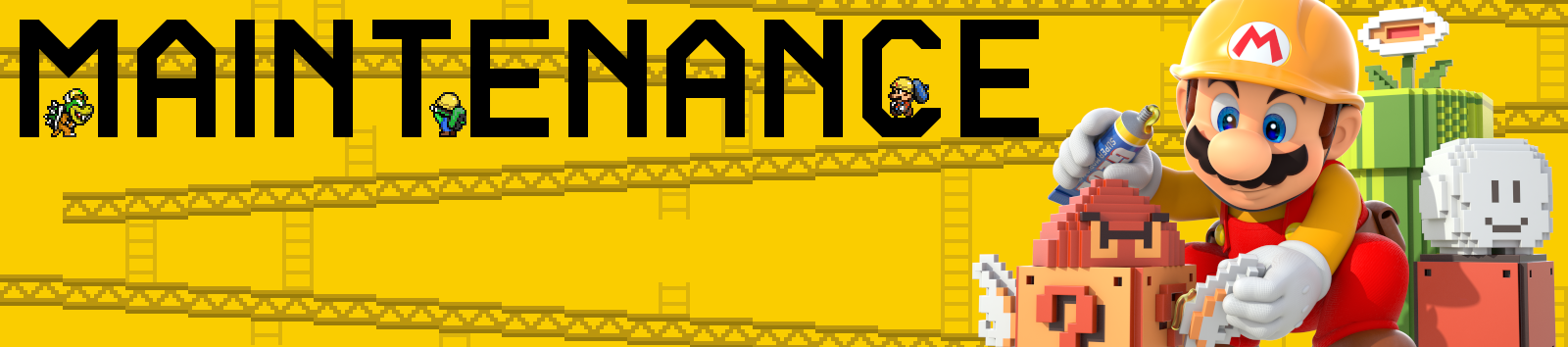
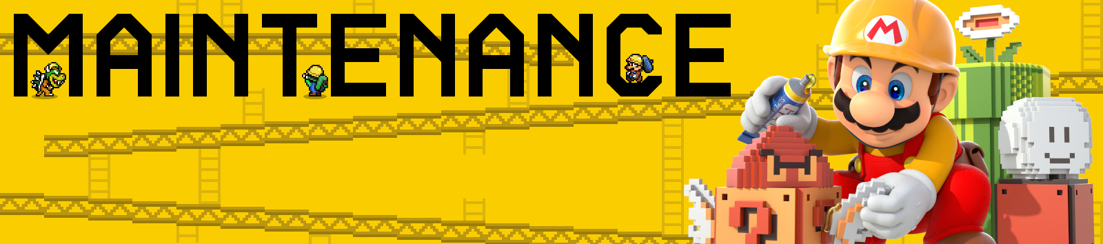
I made a critique of the ones I could find here, and so far we've added a new banner for the Poll page, designed one for the Maintenance page, drafted a proposals one, and discussed a Featured Articles one.
List of banners in order of progress:
Poll Banner: Created, on the wiki, completed project.
Maintenance banner: Created, on the wiki, completed project.
Proposals banner: Created, on the wiki, completed project.
Featured articles banner: Created, on the wiki, completed project.
'Shroom banners (1, 2) will have to be ignored since its not our problem; its something that the 'Shroom Staff will deal with, not us.
So first things first, I think that the new maintenance banner is ready to be uploaded! However, I'd like to get confirmation from the wiki staff before going ahead and uploading it.
If that shoddy list up there is missing anything, tell me and I'll add it in.
So in case you were wondering, the general understanding is that the banners that appear on some of our MarioWiki:__ pages are outdated; they're edgy, haven't aged well and are poorly put together. I think this old one represents everything wrong with 'em- the creator dumped some artworks onto a document, ran some random filters through them (making them look ugly and unidentifiable), and slapped some generic font "The 'Shroom" onto it.
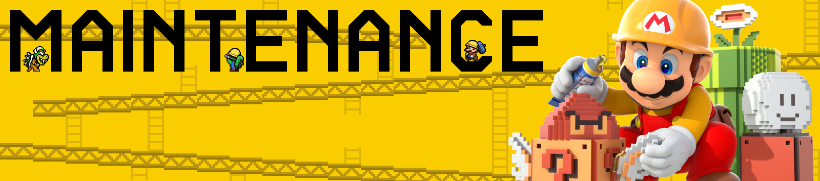
I made a critique of the ones I could find here, and so far we've added a new banner for the Poll page, designed one for the Maintenance page, drafted a proposals one, and discussed a Featured Articles one.
List of banners in order of progress:
Poll Banner: Created, on the wiki, completed project.
Maintenance banner: Created, on the wiki, completed project.
Proposals banner: Created, on the wiki, completed project.
Featured articles banner: Created, on the wiki, completed project.
'Shroom banners (1, 2) will have to be ignored since its not our problem; its something that the 'Shroom Staff will deal with, not us.
So first things first, I think that the new maintenance banner is ready to be uploaded! However, I'd like to get confirmation from the wiki staff before going ahead and uploading it.
If that shoddy list up there is missing anything, tell me and I'll add it in.