UltraMario
Donkey Kong
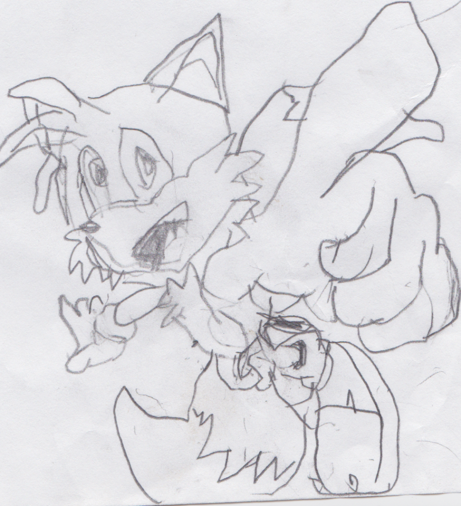
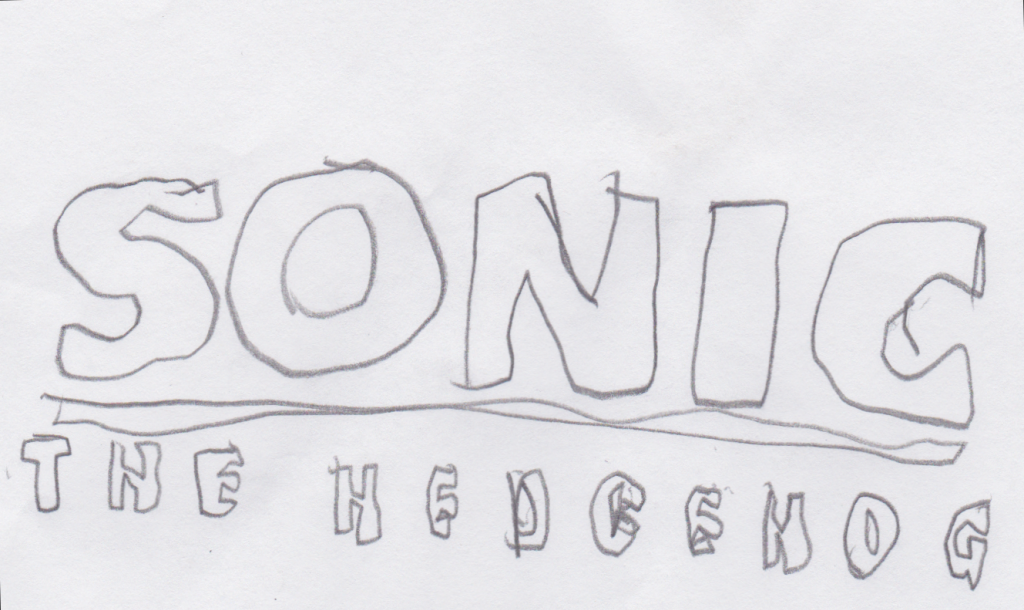
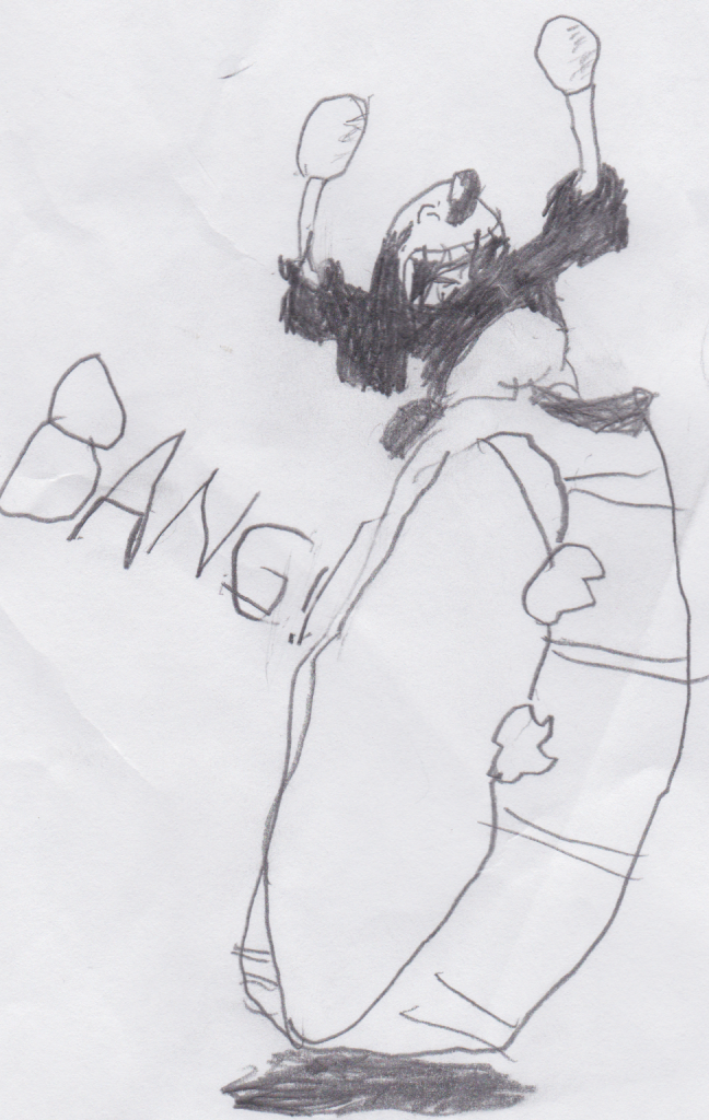
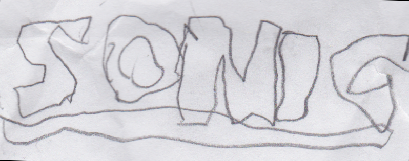
Drawings ahoy!

Follow along with the video below to see how to install our site as a web app on your home screen.
Note: This feature may not be available in some browsers.
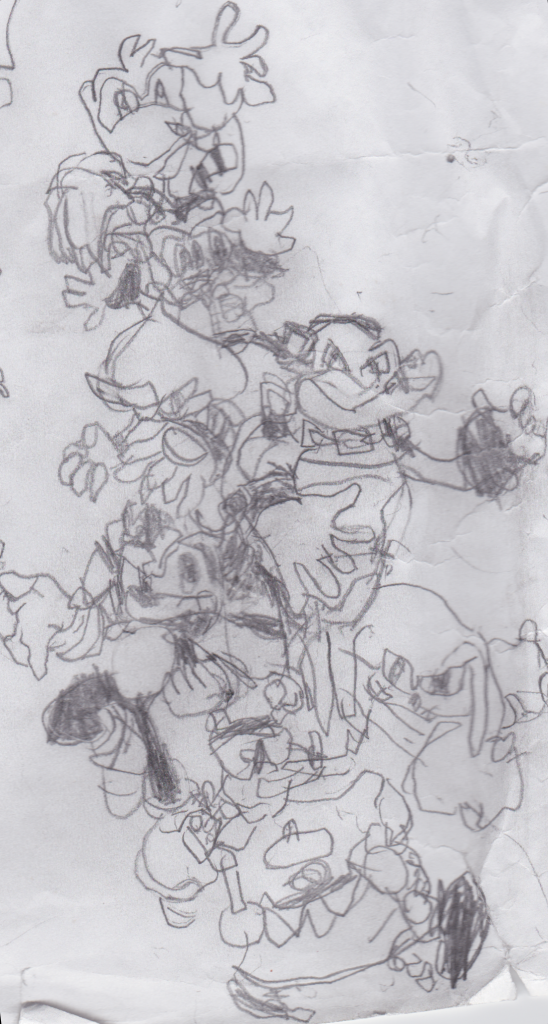
:|chillv said:No offense, but I was able to draw better than that since I was 8 years old, literally. (No flames please)
Then again, it looks like you drew these with celerity.


No, traced.Cranky said:I am quite frankly surprised how you can make TEXT look badly drawn. Handwritten text.
Turbo-Tastic said:No, traced.Cranky said:I am quite frankly surprised how you can make TEXT look badly drawn. Handwritten text.
Turbo-Tastic said:You do not know how much that truly hurt me, do you?
You shouldn't have done that
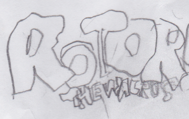
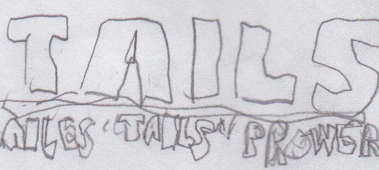
Sorry, but you don't think I will not take offense to THIS? I'VE NEVER BEEN SO INSULTED IN ALL MY LIFE.chillv said:The logos on the other hand look like they were drawn by a 1 year old. (No offense!)
It was not an insult. Also please tell me that you did these with a poorly sharpened pencil or something and you can draw better than this.Turbo-Tastic said:Sorry, but you don't think I will not take offense to THIS? I'VE NEVER BEEN SO INSULTED IN ALL MY LIFE.chillv said:The logos on the other hand look like they were drawn by a 1 year old. (No offense!)
Yes.chillv said:poorly sharpened pencilTurbo-Tastic said:Sorry, but you don't think I will not take offense to THIS? I'VE NEVER BEEN SO INSULTED IN ALL MY LIFE.chillv said:The logos on the other hand look like they were drawn by a 1 year old. (No offense!)
Also, please say that it was so poorly sharpened that it was hard to write with.Turbo-Tastic said:Yes.chillv said:poorly sharpened pencilTurbo-Tastic said:Sorry, but you don't think I will not take offense to THIS? I'VE NEVER BEEN SO INSULTED IN ALL MY LIFE.chillv said:The logos on the other hand look like they were drawn by a 1 year old. (No offense!)
Let me rephrase that, I meant hard to draw with.Turbo-Tastic said:Hard to write with? What does writing have to do with this? This aint mah Turbo-Tastic Literature Dump now! xP

chillv said:Okay, no offensive but that one right there looks lazily made. You can do way better than that.
Turbo-Tastic said:This was made the same time as the other logos.
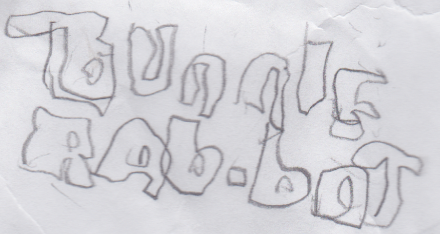
bunniePhantom L said:Sorry but I can't even work out what that says :/. Maybe tracing isn't the best idea.