
Navigation
Install the app
How to install the app on iOS
Follow along with the video below to see how to install our site as a web app on your home screen.
Note: This feature may not be available in some browsers.
More options
You are using an out of date browser. It may not display this or other websites correctly.
You should upgrade or use an alternative browser.
You should upgrade or use an alternative browser.
Badposter rates every country flag
- Thread starter badposter
- Start date
- Thread starter
- #77
That's actually Portuguese (understandable mistake, Portugues is a Romance language and thus descended from Latin)DragonFreak said:This was a few entries ago but I wish America had a cool latin phrase like Ordem e Progresso.
Flag of Burundi

The following spoiler is optional, but it gives some context to the flag's symbolism. It's a rather sad read, though.
Before I begin, a not fun at all fact: Just like neighboring Rwanda, Burundi has three main ethnicities, which are in decreasing order of population, the Hutu the Tutsi, and the Twa. If you've heard of the Rwandan Genocide, you have at least known the name of the first two ethnicities. Even though the Rwandan Genocide is the most famous instance of conflict between the Hutu and Tutsi, there were others, and some happened in Burundi (there have two genocides in Burundi: the first one against Hutus in 1972 and the second one agaisnt Tutsis in 1993, one year before the Rwandan Genocide).
Oh, and for the Twa:
Oh, and for the Twa:
Burundian history is depressing (this a very abridged version. Its full history is even more depressing)Wikipedia said:Due to clearing of the forests for agriculture, logging, development projects, and the creation of conservation areas, the [Twa have been forced to leave the mountain forests and establish new homes. As they seek to develop new means of sustaining their communities (such as agriculture and livestock development) most are currently landless and live in poverty. The ancestral land rights of the Twa have never been recognized by their governments and no compensation has been made for lands lost.
Twa children have little access to education and their communities have limited representation in local and national government. Due to their pygmy ancestry, they continue to suffer ethnic prejudice, discrimination, violence, and general exclusion from society.[6][7] Batwa men struggle with alcoholism, known to occur in communities facing cultural collapse as men can no longer carry out traditional roles and provide for families.[8] By 2007, begging was the primary source of livelihood for 40% of the Batwa in Rwanda.[9]
The World Happiness Report 2016 Update ranked Burundi as the world's least happy nation
Rule 1: I think a child can draw this flag from memory.
Rule 2: White represents peace (Burundi definetly needs peace), green represents Burundi's hope for the future of Burundi, red represents Burundi's suffering in history (that's some depressing but accurate symbolism) and the stars represent Burundi's three main ethnicities: the Hutu, the Tutsi and the Twa.
Rule 3: Red, white and green. The colors look good, except for the ugly and unnessecary green outline on the stars.
Rule 4: The stars are rather ugly, but they're simple.
Rule 5: I don't think there are many, if any, flags that look like this one
Part 2
November 28-29, 1966

November 29, 1966-March 28, 1967

Rule 3
I don't like the green outline on the flag, but Burundi also has a lor of other, much bigger problems to deal with.
- Thread starter
- #78
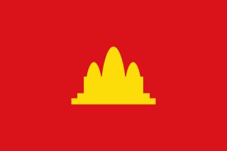
Flag of Cambodia

Part 1
Rule 1: Angkor Wat is a complex temple.
Rule 2: The temple is Angkor Wat, which is the largest religious monument in the world and represents Theravada Buddhism, the country's main religion (around 95% percent of Cambodians are Theravada Buddhists). The blue represents the king (Cambodia is a monarchy) and the red represents the Cambodian people. That was short
Rule 3: Red, white and blue.
Rule 5: Angkor Wat makes this flag pretty distinctive. Without it, it'd look like the flags of Thailand, Costa Rica or North Korea (flags with this desighn are surprisingly popular), though I think the lack of white in an Angkor Wat‐less flag (all the other flags have a white band) could maybe make this flag distinctive.
Rule 2
Pre-1863
 I wish non-quadrilateral flags were more popular.
MarchOctober 1945 (Japanese occupation)
 I despise the Japanase Empire, but this flag is actually pretty nice. I still hate the Japanese Empire.
(not at all) Democratic Kampuchea (19751979)
 I actually think this flag is okay. However, *bleep* the Khmer Rouge. Cambodia should never go back to the flag of a regime which killed a quarter of its population.
United Nations Transitional Authority in Cambodia.
 Has text and a map. Still, it wasn't made by the Japanese Empire or the Khmer Rouge.
Part 3
Angkor Wat is too complex.
Part 1
Rule 1: Angkor Wat is a complex temple.
Rule 2: The temple is Angkor Wat, which is the largest religious monument in the world and represents Theravada Buddhism, the country's main religion (around 95% percent of Cambodians are Theravada Buddhists). The blue represents the king (Cambodia is a monarchy) and the red represents the Cambodian people. That was short
Rule 3: Red, white and blue.
Rule 4: Angkor Wat is a rather complex emblem.My Australia write-up said:Even if I think this color combination is used too much, it's not really a bad color combination.
Rule 5: Angkor Wat makes this flag pretty distinctive. Without it, it'd look like the flags of Thailand, Costa Rica or North Korea (flags with this desighn are surprisingly popular), though I think the lack of white in an Angkor Wat‐less flag (all the other flags have a white band) could maybe make this flag distinctive.
Rule 2
Pre-1863
MarchOctober 1945 (Japanese occupation)
(not at all) Democratic Kampuchea (19751979)
United Nations Transitional Authority in Cambodia.
Part 3
Angkor Wat is too complex.
- Thread starter
- #79
It's been one month since this topic was created!
Flag of Cameroon

Part 1
Rule 1: I wonder how many times I've written a child or draw this from memory. (This flag doesn't break rule 1 btw)
Rule 2: This flag is a Pan-African one. Pan-African flags also have symbolism about the country they represent. In Cameroon's case, green represents the country's southern forests, yellow represents both the Sun and the country's northern savannah. Both the red and the star represent unity (Cameroon has about 230 native languages spoken, and is also an union of a French colony and a British colony (all of Cameroon was German from 1884 to WWI, but there aren't many German speakers in Cameroon), so there's an English speaking part and a French speaking part (Cameroon's language situation is the opposite of Canada's: In Canada English is more popular than French and in Cameroon it's the reverse)
Rule 3: Copypasted from my Benin write-up:
Rule 4: Stars are simple.
Rule 5: Also copypasted from my Benin write-up:
German Kamerun (1884-1916)
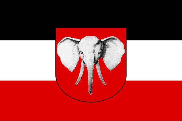 I like elephants, but not on flags.
1961-1975
 This actually looks distinctive. It's also not as uneven as the current. The current flag is a downgrade.
Rule 3
It's an average Pan-African flag. It's not terrible, but it's boring and not distinctive
Flag of Cameroon
Part 1
Rule 1: I wonder how many times I've written a child or draw this from memory. (This flag doesn't break rule 1 btw)
Rule 2: This flag is a Pan-African one. Pan-African flags also have symbolism about the country they represent. In Cameroon's case, green represents the country's southern forests, yellow represents both the Sun and the country's northern savannah. Both the red and the star represent unity (Cameroon has about 230 native languages spoken, and is also an union of a French colony and a British colony (all of Cameroon was German from 1884 to WWI, but there aren't many German speakers in Cameroon), so there's an English speaking part and a French speaking part (Cameroon's language situation is the opposite of Canada's: In Canada English is more popular than French and in Cameroon it's the reverse)
Rule 3: Copypasted from my Benin write-up:
I do, however, think the yellow star doesn't go well at all with the yellow band. Makes this flag look unevenbadposter said:Even if I think African countries use the Pan-African colors (green, red and yellow) too much, I don't think the colors look bad.
Rule 4: Stars are simple.
Rule 5: Also copypasted from my Benin write-up:
Rule 2Some guy who likes flags said:Honestly, the only flags with Pan-African colors I can distinguish are that of Ethiopia, Ghana (due to the World Cup), the Republic of the Congo, São Tomé and Principe, Burkina Faso and Zimbabwe. I think I'm gonna copypaste this in the future.
German Kamerun (1884-1916)
1961-1975
Rule 3
It's an average Pan-African flag. It's not terrible, but it's boring and not distinctive
the centre part of that flag looks like Steven Universe's shirt

- Thread starter
- #81
Flag of Canada
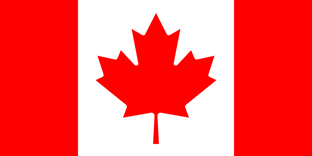
Part 1
Rule 1: Maple leafs are surprisingly hard to draw (though it maybe cause I'm terrible at drawing in general), though recognizability...
Rule 2: This flag, despite only being adopted in 1965 has history behind it: In 1921, red (from St George's Cross, which is in the English flag) and white (from the French royal emblem) were declared Canada's national colors. (I guess the colors represent the English and French colonization of Canada, and its two main languages. Canada's language situation is the opposite of Cameroon's; Cameroon has more French speakers and Canada has more English speakers)
And as for the Maple Leaf:
Rule 3: Red and white. Red and white flags can be boring, but this one isn't.
Rule 4: The maple leaf is a good emblem
Rule 5: This flag is pretty distinctive. I don't think it can be confused with any other.
Rule 2
18681921
 That coat of arms is rather complex.
19211957 (The 1957-1965 just changed the maple leaf's color from green to red. That's a pretty minor change, so my opinion on both flags are the same)
 Just another British colonial flag. The current flag is a big improvement.
Rule 3
I love this flag. It's distinctive, it's not ugly and it's not boring.
Part 1
Rule 1: Maple leafs are surprisingly hard to draw (though it maybe cause I'm terrible at drawing in general), though recognizability...
is more important than perfection
And as for the Maple Leaf:
The maple leaf has eleven points because a maple leaf of that shape was tested to be the least blurry design in windy conditions.Wikipedia said:The maple leaf has been used as a Canadian emblem since the 1700s.[9] It was first used as a national symbol in 1868 when it appeared on the coat of arms of both Ontario and Quebec.[10] In 1867, Alexander Muir composed the patriotic song "The Maple Leaf Forever", which became an unofficial anthem in English-speaking Canada.[11] The maple leaf was later added to the Canadian coat of arms in 1921.[10] From 1876 until 1901, the leaf appeared on all Canadian coins and remained on the penny after 1901.[12] The use of the maple leaf by the Royal Canadian Regiment as a regimental symbol extended back to 1860.[13] During the First World War and Second World War, badges of the Canadian Forces were often based on a maple leaf design.[14] The maple leaf would eventually adorn the tombstones of Canadian military graves
Rule 3: Red and white. Red and white flags can be boring, but this one isn't.
Rule 4: The maple leaf is a good emblem
Rule 5: This flag is pretty distinctive. I don't think it can be confused with any other.
Rule 2
18681921
19211957 (The 1957-1965 just changed the maple leaf's color from green to red. That's a pretty minor change, so my opinion on both flags are the same)
Rule 3
I love this flag. It's distinctive, it's not ugly and it's not boring.
- Pronouns
- She/her
Paging every Canadian user here
- Thread starter
- #83
Fun fact: The next country, while commonly in English as Cape Verde, its official name is Cabo Verde (Its name in Portuguese. The Portuguese, in fact, were the first people to inhabit the island country, whose population is a mix of descendants of European and African slaves they brought there)
So, from a certain point of view, the countries were not reviewed alphabetically.
So, from a certain point of view, the countries were not reviewed alphabetically.
DragonFreak
Everything that drowns me makes me wanna fly!
I tried drawing the Canadian maple leaf.
I couldn't do it.
I couldn't do it.
Stargazing
Retired.
- Pronouns
- They/them
Hello!Charley Dietz said:Paging every Canadian user here
- Thread starter
- #86
Sorry, due to homework and studies I won't write about a country flag today.
But I will banepost:

Flag of Ulsan, South Korea (South Korea has some English language flags. The worst part is that most of the flags were pretty good before being changed, as what happened in Seoul and Jeju)
But I will banepost:
Flag of Ulsan, South Korea (South Korea has some English language flags. The worst part is that most of the flags were pretty good before being changed, as what happened in Seoul and Jeju)
SonicMario
Star Spirit
Are you sure that's not just a travel agency advertisement? xD
- Thread starter
- #88
Flag of Cape Verde (or Cabo Verde)

Part 1
Rule 1: A child could not draw this flag perfectly from memory due to there being too many stars to memorize their number. But if you've read this thread, you'll already know that I think recognizability is...
(Also, proving my point about the stars, I at first wrote that the flag had eight stars. There are ten stars on this flag)
Rule 2: The TEN (not eight) stars represent the country's ten main islands (the Cape⁄Cabo Verde archipelago has ten islands and five islets). The blue represents sea and sky (you know, this topic has made me realize that sea and sky is a common meaning for blue). White represents peace (Cape Verde and São Tomé and Príncipe got their independence peacefully. Independence for the other Portuguese colonies in Africa was definitely not peaceful) and red represents effort.
Rule 3: Red, white, blue and yellow. Look, most of the time I'm lenient with flags that have four or five colors. However, this flag has four colors too close to each other, which doesn't look good.
Rule 4: The stars are simple. There are too many, but they're simple.
Rule 5: It's distinctive even without the stars.
Part 2
19751992
 Other than the wreath, this flag is identical to Guinea-Bissau's. The reason for this is because while both countries were getting independence there were plans to unite both countries. However, the plans were scrapped after Guinea-Bissau had a coup in 1980.
Rule 3
The flag would be better without the stars.
Part 1
Rule 1: A child could not draw this flag perfectly from memory due to there being too many stars to memorize their number. But if you've read this thread, you'll already know that I think recognizability is...
(Also, proving my point about the stars, I at first wrote that the flag had eight stars. There are ten stars on this flag)
Rule 2: The TEN (not eight) stars represent the country's ten main islands (the Cape⁄Cabo Verde archipelago has ten islands and five islets). The blue represents sea and sky (you know, this topic has made me realize that sea and sky is a common meaning for blue). White represents peace (Cape Verde and São Tomé and Príncipe got their independence peacefully. Independence for the other Portuguese colonies in Africa was definitely not peaceful) and red represents effort.
Rule 3: Red, white, blue and yellow. Look, most of the time I'm lenient with flags that have four or five colors. However, this flag has four colors too close to each other, which doesn't look good.
Rule 4: The stars are simple. There are too many, but they're simple.
Rule 5: It's distinctive even without the stars.
Part 2
19751992
Rule 3
The flag would be better without the stars.
- Thread starter
- #89
Found an intervew with the designer of Cape Verde's flag on /r/vexillology/. A translation from Portuguese by a Reddit user:
He speaks like an abstract artist...
The blues are representative of the sky and sea, the two essential elements of Cape Verde. It's offset to represent that not one single point/area of the flag is more important than the other, circular to represent equality, and similarity to an Armillary sphere, representation of their history as mariners. 10 stars, for the 10 islands.
I suppose Cape Verde is a land of Dialogue. When we speak, we create circles, hence the (flag's) circle, also made of stars (referring countrymen as individual stars). Which is offset to a third of the flag, every star distributed at 30 degrees. When we speak (general humanity?), we seek consensus, in order to reinforce ourselves...
But that need for approval must be contained, because too much can be chaotic. Hence, The Red stripe contained by the two white stripes. Because psychologically and historically speaking we consider the color white as a representation of peace. Thus, we must make an effort for the development of cape verde, but we must do this in the realm of peace.
In other words, to create this flag, explored various dimensions... Until I created symbol, that would be impossible to be defined or explained by a simplistic meaning.
- Thread starter
- #90
Flag of the Central African Republic

Part 1
Rule 1: A child could draw this from memory. I think some children couldn't memorize the color arrangment of the flag, but some children could.
Rule 2: Red symbolizes the blood of Central African (Central African history is rather bloody). Blue represents the sky (I bet it'd represent the sea if the country weren't landlocked) and freedom. White represents peace ( ) and dignity. Green represents hope and faith. Yellow represents tolerance (the country's had a lot of ethnic and religious conflict. Yeah, this county needs tolerance). And as for the star, it was taken from MESAN, the country's ruling party from independence in 1960 to its overthrow in 1979. The star guide the steps of Central Africans towards freedom.
Also, this flag combines the French tricolor (this country was colonized by France) with the pan-African one (red, the color's that's in both tricolors is vertical)
Rule 3: Blue, white, green, yellow and red. This flag has too many colors imo.
Rule 4: Stars are...
Rule 5: This flag is actually a good example of related but distinctive. It has both French and pan-African symbolism while being pretty distinctive (not say I like this flag)
Part 2:
Central African Empire (1976-1979) (actually not the national flag, just the imperial standard)
 Yes the Empire was founded in 1976. And its emperor was a garbage human being.
I fucking hate Jean-Bédel Bokassa.
Rule 3
Actually, if you removed the red, the blue and stars it'd make a pretty good tricolor.
Part 1
Rule 1: A child could draw this from memory. I think some children couldn't memorize the color arrangment of the flag, but some children could.
Rule 2: Red symbolizes the blood of Central African (Central African history is rather bloody). Blue represents the sky (I bet it'd represent the sea if the country weren't landlocked) and freedom. White represents peace (
) and dignity. Green represents hope and faith. Yellow represents tolerance (the country's had a lot of ethnic and religious conflict. Yeah, this county needs tolerance). And as for the star, it was taken from MESAN, the country's ruling party from independence in 1960 to its overthrow in 1979. The star guide the steps of Central Africans towards freedom.Also, this flag combines the French tricolor (this country was colonized by France) with the pan-African one (red, the color's that's in both tricolors is vertical)
Rule 3: Blue, white, green, yellow and red. This flag has too many colors imo.
Rule 4: Stars are...
simple
Part 2:
Central African Empire (1976-1979) (actually not the national flag, just the imperial standard)
Fuck you.In 1966, Bokassa used his position to oust Dacko and declared himself president. He then began a reign of terror, taking all important government posts for himself.[2] He personally supervised judicial beatings and introduced a rule that thieves would have an ear cut off for the first two offenses and a hand for the third. In December 1976, in emulation of his hero Napoleon, he appointed himself emperor of the Central African Empire, with a coronation ceremony in 1977 costing US$20 million ($80 million today), practically bankrupting the country. His diamond-encrusted crown alone cost $5 million ($20 million today).[2] In 1979 he had hundreds of schoolchildren arrested for refusing to buy uniforms from a company owned by one of his wives. Bokassa was reported to have personally supervised the massacre of 100 of the schoolchildren by his Imperial Guard.
Also, fuck CAR politicians who praise a guy who literally murdered schoolchildrenMany people in the Central African Republic, and most of the rest of the world, regard Bokassa as a typical kleptocrat or describe him as either an egotistical madman or a bloodthirsty dictator. In 2010, President François Bozizé issued a decree rehabilitating Bokassa and calling him "a son of the nation recognised by all as a great builder".[56] The decree went on to hold that "This rehabilitation of rights erases penal condemnations, particularly fines and legal costs, and stops any future incapacities that result from them".[56] In the lead-up to this official rehabilitation, Bokassa has been praised by CAR politicians for his patriotism and for the periods of stability that he brought the country.[56]
I fucking hate Jean-Bédel Bokassa.
Rule 3
Actually, if you removed the red, the blue and stars it'd make a pretty good tricolor.
- Thread starter
- #91
(Fun flagless fact: Chad has beaten Libya in war)
Flag of Chad

Part 1:
Rule 1: A child could draw Romania's flag from memory
Rule 2: Blue represents hope and sky (You know, I didn't know that meaning for blue was so common) and water (Chad is landlocked, but it does have lakes and rivers. However, according to Wikipedia only 48% of its urban resident have access to potable water and only 2% to basic sanitation). Yellow represent both the Sun and the desert in the country's north. Red represents the blood shed during independence (Chadian history is pretty bloody in general. There's been multiple civil wars, mostly pitting the country's Muslim north against its Christian, and sometimes involving Libya. That war with Libya I mentioned earlier? It was actually one of the first times Chadians acted united.)
Rule 3: Red, yellow and blue. These colors would actually be OK if they didn't make the flag like almost identical to Romania's (the reason I say almost is because Chad's blue is slightly darker)
Rule 4: Unlike Andorra's flag, this flag has neither text nor a complex emblem.
Rule 5: If I posted the Romanian flag here, would anyone notice?
Rule 2
Rule 3
I'll tell you what I think of this flag on my Romania write-up,
Flag of Chad
Part 1:
Rule 1: A child could draw Romania's flag from memory
Rule 2: Blue represents hope and sky (You know, I didn't know that meaning for blue was so common) and water (Chad is landlocked, but it does have lakes and rivers. However, according to Wikipedia only 48% of its urban resident have access to potable water and only 2% to basic sanitation). Yellow represent both the Sun and the desert in the country's north. Red represents the blood shed during independence (Chadian history is pretty bloody in general. There's been multiple civil wars, mostly pitting the country's Muslim north against its Christian, and sometimes involving Libya. That war with Libya I mentioned earlier? It was actually one of the first times Chadians acted united.)
Rule 3: Red, yellow and blue. These colors would actually be OK if they didn't make the flag like almost identical to Romania's (the reason I say almost is because Chad's blue is slightly darker)
Rule 4: Unlike Andorra's flag, this flag has neither text nor a complex emblem.
Rule 5: If I posted the Romanian flag here, would anyone notice?
Rule 2
This flag really needs to change, but the country has bigger issues to solve.Despite many political upheavals within Chad since independence, the flag has not been changed. This may be because the flag is not associated with any of the main power rivals within Chad, which had no sense of national identity before independence, and little after independence.
Rule 3
I'll tell you what I think of this flag on my Romania write-up,
- MarioWiki
- Henry Tucayo Clay
I genuinely thought it was Romania's flag until I saw the filename.
DragonFreak
Everything that drowns me makes me wanna fly!
Why is Chad and Romania's flag identical?
- Thread starter
- #94
Just coincidence, I think.DragonFreak said:Why is Chad and Romania's flag identical?
DragonFreak said:Why is Chad and Romania's flag identical?

Romania's flag is the one on the top, Chad's flag is the one on the bottom.
- Thread starter
- #96
Flag of Chile

Part 1
Rule 1: A chil could draw this flag from memory. That's all I need to say.
Rule 2: The white represents the white peaks of the Andes mountains (the Andes are a rather important part of the country's geography. Check out this topographical map. Chile is very mountainous). Red represents the blood shed during the Chilean war of Independence. The star's meaning has different interpretations: Some interprete it as a guide to progress an honor and others interpret as symbolizing independence.
The blue represents the fucking sea and sky.
Also, this flag history, but it's long and I'm tired.
Also:
Rule 4: Stars are simple.
Rule 5: This flag may not be officialy influenced by that of the US, but it's not a stretch to say that that flag influenced Chile's. However, this flag manages to be distinctive , so it's a good example of distinctive but related. Also, if says this is a ripoff of Texas's flag:
Chile, while it hasn't change its flag since the end of its War of Independence, had other flags during its War of Independence.
Patria Vieja (18121814)
 While I prefer the current flag, I like this flag's colors.
Transition (18171818)

Part 3:
I like this flag. It's simple and distinctive.
Part 1
Rule 1: A chil could draw this flag from memory. That's all I need to say.
Rule 2: The white represents the white peaks of the Andes mountains (the Andes are a rather important part of the country's geography. Check out this topographical map. Chile is very mountainous). Red represents the blood shed during the Chilean war of Independence. The star's meaning has different interpretations: Some interprete it as a guide to progress an honor and others interpret as symbolizing independence.
The blue represents the fucking sea and sky.
Also, this flag history, but it's long and I'm tired.
Also:
Rule 3: Red, white and blue. Some overused things are good.Wikipedia said:There is a rather popular legend in Chile that claims this third Chilean flag won a "Most Beautiful National Flag in the World" contest. Its most common version states that this happened in 1907 in Blankenberghe, Belgium, in the coast of the Baltic Sea [sic].[7] Other versions of this story say this happened in the 19th century, or that the Chilean flag was placed second after the French flag; there are even variations that talk about Chile's national anthem, placing it either in the first place or second, after La Marseillaise. The fact that the only documented version of this story gets basic details wrong (Belgium has a coast on the North Sea, not the Baltic Sea) doesn't reflect well on its historical accuracy.
Rule 4: Stars are simple.
Rule 5: This flag may not be officialy influenced by that of the US, but it's not a stretch to say that that flag influenced Chile's. However, this flag manages to be distinctive , so it's a good example of distinctive but related. Also, if says this is a ripoff of Texas's flag:
Rule 2:Wikipedia said:The flag of Texas was designed and adopted on 25 January 1839; whereas Chile's flag was adopted 22 years earlier on 18 October 1817.
Chile, while it hasn't change its flag since the end of its War of Independence, had other flags during its War of Independence.
Patria Vieja (18121814)
Transition (18171818)
Yeah, it's not very distinctiveWikipedia said:One reason for its suppression was that it was easily confused with both the flag of the Netherlands and the tricolor of revolutionary France, from which it was inspired.
Part 3:
I like this flag. It's simple and distinctive.
- Pronouns
- She/her
A chil could draw this flag from memory
Pun or typo?
- Thread starter
- #98
Typo, but I'm keeping itF-777 said:A chil could draw this flag from memory
Pun or typo?
- Thread starter
- #99
Flag of China (People's Republic of)

Part 1
Rule 1: Yes, the child could.
Rule 2: The red represents the Communist revolution. The big stars represent the Communist Party and each one of the other four stars represents a social class: the peasants, the working class, the urban petite bourgeosie and the national bourgeosie. Each small star is oriented toward the CCP's, representing China's unity under the Party. That's pretty dictatorial IMO.
Rule 3: Red and yellow. A popular color combination for Communist countries, but I do like that combination.
Rule 4: Stars are simple.
Rule 5: This flag could be theoretically confused with that of Vietnam. However, this flag has five stars, while Vietnam's has one. Furthermore, Vietnam's star is bigger and in the center, while China's stars are smaller and in the top left, so I doubt many, if any, people confuse the flag.
Rule 2
Qing dynasty (1889-1912)
 As I have said:
 This is good, for a flag with many colors. The colors actually represents China's five main ethnicities (though there are others): Red represents the Han Chinese (which make up most of the Chinese), yellow represents the Manchu (the Qing dynasty was actually Manchurian), blue represents the Mongols, white represents the Hui (who are mostly Muslim, and live in Northwest China) and black represents Tibetians.
Republic of China (1928-1949, still used by Taiwan)
 The reason Taiwan uses this flag is because, after the Chinese Civil War, the republican government escaped to Taiwan, the only part of China not taken by the communists. Taiwan officially claims to be China and claims China's territory (however, a pro-Taiwanese independence candidate was elected last Taiwanese election). There's actually a lot to say about this, but I am doing a full write-up on this flag, so I won't say much more about it.
Rule 3
Don't like the Chinese government, but this flag is okay.
Part 1
Rule 1: Yes, the child could.
Rule 2: The red represents the Communist revolution. The big stars represent the Communist Party and each one of the other four stars represents a social class: the peasants, the working class, the urban petite bourgeosie and the national bourgeosie. Each small star is oriented toward the CCP's, representing China's unity under the Party. That's pretty dictatorial IMO.
Rule 3: Red and yellow. A popular color combination for Communist countries, but I do like that combination.
Rule 4: Stars are simple.
Rule 5: This flag could be theoretically confused with that of Vietnam. However, this flag has five stars, while Vietnam's has one. Furthermore, Vietnam's star is bigger and in the center, while China's stars are smaller and in the top left, so I doubt many, if any, people confuse the flag.
Rule 2
Qing dynasty (1889-1912)
Republic of China (1912-1928)This breaks some rules. This, however, doesn't matter, as all flags with a dragon are automatically good.
Republic of China (1928-1949, still used by Taiwan)
Rule 3
Don't like the Chinese government, but this flag is okay.