Badposter rates every country flag

Sorry for not posting anything yesterday. I was busy doing homework and *bleep*posting. To make up for it I'll rate two flags today.
Flag of Antigua and Barbuda
800px-Flag_of_Antigua_and_Barbuda.svg.png

Ratio: 2:3 (normal)
Adopted: 27 February 1967
Part 1
Rule 1: A child could draw this from memory, but obviously they couldn't draw the Sun perfecly. However, I think recognizability is more important than perfection, so it follows rule one.
Rule 2: This flag has great symbolism. It represents a beach sunrise (somehow, with a black sky), but every color (well, except white, which just represents sand) represents something else on its own. Black represents African ancestry (a surprisingly common use of black), the blue represents hope (which is somewhat odd, since most of the time hope is represented as green. But this flag not using green is a good decision, since green doesn't fit with the beach sunrise symbolism), the rising sun represents the dawning of a new era of Antiguan history, and the red represents the energy of the Antiguan people (Antigua and Barbuda did not get its independence bloodily, though its natives and slaves probably bled) The reason the red is shaped like a V is because the V represents victory.
Rule 3: The flag has five colors. Personally, I'd take out the red, since I don't really think it's necessary and hurts the beach sunrise symbolism.
Rule 4: The Sun is a good emblem. The V is pretty clever. It's text and not text at the same time. Good use of text.
Rule 5: It's pretty distinctive. Take out the red and it's still distinctive. Take out the red and the Sun (I do not advocate doing this) and it could only be confused with Estonia. Pretty good.
Part 2
Antigua and Barbuda has had this flag even before its independence in 1981; it's had it since 1967, when it became a state in Free Association with the UK.
Part 3
I think it has too many colors, but other than that I think it's a great flag with great symbolism.
.
Next time, more fun in the Sun.
 
Flag of Argentina
800px-Flag_of_Argentina.svg.png

Ratio: 9:14 (a pretty unusual ratio)
Adopted: 27 February 1812 (sun added in 1818, current ratio adopted in 1978)
Part 1
Rule 1: Recognizability is more important than perfection.
Rule 2: To know the symbolism of this flag, one first needs to understand the historical context of early 19th century Latin America. Don't worry, this is the simplified version (if you want the the complicated version go read Wikipedia or an history book). Basically, when Napoleon invaded Spain in 1810, there was disagreement of who would rule Argentina while the king was deposed. One side recognized the government of the viceroy Baltasar Hidalgo de Cisneros, appointed by the Spanish Junta of Seville, and another side recognized a Junta whose members were Argentinian (which would later be named the First Triumvirate), but both sides recognized the Spanish King at first. On February 18, 1812 a blue and white cockade (whose symbolism is actually unknown) was established as a national symbol by the First Junta to distinguish it from the red and yellow used by the other side. Based on the cockade, Manuel Belgrano (one of the main leaders of Argentinian independence) made a flag nine days after the cockade's adoption and sent a letter to the First Triumvirate proposing them the use of the flag. The Triumvirate, however, rejected the flag, because they felt the flag was too independentist. Belgrano, however, got the message rather late, and by the time he got it the flag was flown after his military victories and was even blessed by a priest. When Belgrano finally got the message he stopped using the flag.
In October 1812 the Second Triumvirate was established. While being more liberal than its predeseccor, it was against independence. Still, they approved the use of Belgrano's flag as a war flag, though not as a national flag.
On July 9, 1816 Argentina declared independence and Belgrano's flag was adopted. In 1818 the Sun of May was added to the flag (if you want to know what it symbolizes, read its article, because I'm tired of writing this part of the rating.
TL;DR: Sometimes, history is more important than symbolism.
Rule 3: The colors used are yellow, white and light blue. I like light blue, and I think it's used too little in flags, so I love this flag.
Rule 4: Simple emblems are good. The Sun of May is simple. Which means...
Rule 5: Yeah, it's distinctive. The flag of Uruguay is based on this flag, and is also distinctive. This is good.
Part 2
1819–1820
800px-Flag_of_Argentina_%281818%29.svg.png
During this time, Argentina darkened the blue on its flag after negotiations with France on installing a monarchy in Argentina. These talks failed, and Argentina lightened its blue.
1850
919px-Flag_of_the_Argentine_Confederation.svg.png
Those things are Phrygian caps, they represent liberty and they don't look good on the Argentinian flag.
Part 3
Overall, a good flag. Recognizable, and has good colors and history.
 
Fun fact that I forgot to mention in my previous post; Pakistan does not recognize the existence of Armenia. Seriously.
Flag of Armenia
800px-Flag_of_Armenia.svg.png

Ratio: 1:2 (normal)
Adopted: 28 May 1918 (with a 2:3 ratio). Readopted on 24 August 1990 (with current ratio).
Part 1
Rule 1: Of course it follows rule 1. All tricolors with no emblem and no text do.
Rule 2: You know, after my long Argentina analysis I just want to copypaste from Wikipedia
The red emblematizes the Armenian Highland, the Armenian people's continued struggle for survival, maintenance of the Christian faith, Armenia's independence and freedom. The blue emblematizes the will of the people of Armenia to live beneath peaceful skies. The orange emblematizes the creative talent and hard-working nature of the people of Armenia.[3]
(This quote comes from the Constitution of Armenia)
Rule 3: The colors in the flag are red, blue and orange. The orange is actually the color of an apricot, and is pretty similar to yellow. The colors in this flag are good (They're not unique, but this is what Rule 5 is for)
Rule 4: This flag has neither emblems nor text. Even though I find tricolors boring, at least they don't have complex emblems.
Rule 5: This flag can be confused with the flags of the countries of the former Gran Colombia: Colombia, Venezuela and Ecuador, countries it does not share much history with. And the Armenian flag isn't older; the first Armenian state to use this flag, the Armenian Republic, was formed in 1918, when those three countries had already existed for a long time.
Part 2
I can't verify if the first two standards were actually real, but *bleep* it they're cool, so I'll post them anyway.
Standard of the Artaxid dynasty (189 BC- 12 AD)
The images I can find on the web are either tiny or have stock photo written on it, so I'll link it. As you can see, it's pretty cool an distinctive, even if the birds somewhat break Rule 1.
Standard of the Arsacid Dynasty (52 AD - 428 AD)
Arshakuni.svg
See above standard.
Flag of the Kingdom of Cilicia under the Fremch Lusignan Dynasty (1341 - 1375)
Flag_of_Lusignans.jpg
*throws up*
Proposed flag of Armenia, designed by Ghevont Alishan, an Armenian priest living in Paris (1885)
1200px-1885ArmenianFlag.svg.png
Instead of upside down Colombia, it's upside down Bulgaria! The red and green represent the Sundays of Easter and the green is completely arbitrary.
Second flag proposed by Ghevont Alishan (exact year unkown)
Red-green-blue_flag.svg
Looks like a French flag with mold on it, but it actually represents the rainbow seen by Noah on Mount Ararat (which is actually in Turkey, but don't tell Armenian nationalists that.). It can't really be confused for any other flag, so in my opinion it's good.
Part 3
Well, it's a tricolor. Tricolors aren't very exciting, but they aren't ugly either. One of the flaws of the flags is its rule 5 violation.
Appendix
Flag_of_Nagorno-Karabakh.svg
This is the flag of Nagorno-Karabakh, an Armenian-mayority breakaway region in what is internationally considered Azerbaijani territory. As you can see, the flag looks like Armenia's, except for the white pattern, which symbolizes its separation from Armenia. In my opinion, it's better than the flag it was based on.
.
Next time, the flag of a country which is probably the most important in its continent
 
Magikrazy said:
No, by bad he means Michael Jackson bad.
I actually don't really care about Michael Jackson
.
Flag of Australia
800px-Flag_of_Australia.svg.png

Ratio: 1:2 (normal)
Adopted: 11 February 1903 (current Commonwealth Star adopted in 1908)
Part 1
Rule 1: A child could draw this flag from memory, though I think the cross of St. Patrick on the Union Jack (the diagonal cross) is a little hard to memorize. I also often forget if the flag has five or six stars, but I think that's just a personal problem.
Rule 2: The stars on the right represent the constellation of the Southern Cross, which is often used for navigation in the Southern Hemisphere (this is why it used in the flag of many countries in the Southern Hemisphere, like Brazil, New Zealand or Papua New Guinea) and the big seven-pointed star (the Commonwealth Star) on the represents the six states of Australia plus its territories. The blue represents nothing, as far as I know. The Union Jack represents the fact that Australia was part of the British Empire. I think that this is bad symbolism, because it represents that the country was once the colony of another country, and doesn't represent the country itself.
Rule 3; Red, White and Blue. This is alphabetically the first flag to use this color combination. Even if I think this color combination is used too much, it's not really a bad color combination.
Rule 4: The Union Jack, the Southern Cross and the Commonwealth Star are all simple emblems, though I think ALL of them at once is a bit too much.
Rule 5: The following image features all the flags Australia's flag is similar to.
Ausflag_identity.gif
As you can see, Australia's flag isn't very distinctive.
Part 2
Even though the Blue Ensign is the state ensign and the most popular flag of Australia, there also exists a Red Ensign, which is the Civil Ensign of Australia and from 1901 to 1954 the only Australian flag allowed to be used by civilians.
Civil_Ensign_of_Australia.svg
Even if I still don't like the symbolism, at least it's distintive; the only Red Ensign that are currently in use are the flags of Ontario, Manitoba and Bermuda, none of which have stars.
Part 3
I don't like this flag. It's not very distinctive and I don't like its symbolism (but really, that's just a matter of opinion)
.
Next time, a country with *bleep*ing (it rhymes with booking)
 
I agree, we should at least have a boxing kangaroo or a big boot kicking a bum
 
what about the Aboriginal flag
australian_aboriginal_flag.jpg
shit is wicked
 
Magikrazy said:
Asgore said:
I agree, we should at least have a boxing kangaroo or a big boot kicking a bum
What about a Vegemite sandwich?

He just smiled and gave me a vegemite sandwich. And he said oh!

Anyway,

Crocodile Dippy said:
what about the Aboriginal flag
australian_aboriginal_flag.jpg
*bleep* is wicked

You guys should use that as your national flag. It looks much more interesting.
 
Crocodile Dippy said:
what about the Aboriginal flag
australian_aboriginal_flag.jpg
*bleep* is wicked
Yes, it is
.
Flag of Austria
800px-Flag_of_Austria.svg.png

Ratio: 2:3
Adopted: In use since the Middles Ages. Officially adopted on 11 November 1918.
Part 1
Rule 1: A child could draw this flag from memory. Yeah, not much to say about this.
Rule 2: Look I don't know *bleep* about Austrian history before 1867 (the founding of Austria-Hungary), so I'll let Wikipedia explain:
When the last Otakar Duke Ottokar IV of Styria died in 1192, the Styrian duchy was inherited by the Babenberg duke Leopold V of Austria according to the 1186 Georgenberg Pact. According to the 18th century historian Chrysostomus Hanthaler, his grandson Duke Frederick II of Austria (1230–1246), nicknamed the "Quarrelsome" or the "Warlike", the last of the Babenberg dynasty, designed a new coat of arms in red-white-red after his accession—an attempt to prevail against reluctant local nobles and to stress his autonomy towards Emperor Frederick II. The triband is first documented in a seal on a deed issued on 30 November 1230, confirming the privileges of Lilienfeld Abbey. The medieval chronicler Jans der Enikel reports that the duke appeared in a red-white-red ceremonial dress at his 1232 accolade in the Vienna Schottenstift.
So, in this case history beats symbolism. There's also a legend that explains the symbolism of the flag. Even though the legend is probably false, I still like it:
According to legend, the flag was already invented by Duke Leopold V of Austria as a consequence of his fighting during the Siege of Acre. After a fierce battle, his white surcoat was completely drenched in blood. When he removed his belt, the cloth underneath was untouched by it, revealing the combination of red-white-red. So taken was he by this singular sight that he adopted the colors and scheme as his banner
I'll say it again; this legend is probably made up
Rule 3: The flag uses just red and white. Good, simple colors.
Rule 4: It's a simple triband bicolor, with no emblems.
Rule 5: In my opinion, this flag could be confused with that of Latvia. Both flags have been around since Medieval times, so they can't be changed.
Part 2
Habsburg monarchy (18th century-1867)
Flag_of_the_Habsburg_Monarchy.svg
This flag uses black and yellow, a good color combination that is very unused in flags (no, I'm not an ancap)
Austria-Hungary (1867-1918)
Flag_of_Austria-Hungary_%281869-1918%29.svg
I think the flag is too complex, but I do like the fact it has symbolism from both Austria and Hungary's flags and coats of arms.
State and war flag (current, since 1919)
Flag_of_Austria_%28state%29.svg
Like Austria's flag, but with Austria's coat of arms. Even though I love the Austrian coat of arms and its symbolism (The eagle represents Austrian sovereignity, the republican mural crown represents the Austrian middle class, the hammer and sickle represent agriculture and industry, respectively and actually have nothing to do with communism, and the broken chains (an 1945 addition) represent liberation from Anschluss), I don't think it belongs on Austria's flag because it's too complicated. Still, the Austrian coat of arms and if I ever rated coat of arms (which I probably never will, I don't really care for heraldry) I would give it a favorable rating.
Part 3
I think this flag is boring, and yet at the same time I like Peru's flag even though it's the same thing as Austria's flag except
vertical. People are biased.
 
Flag of Azerbaijan
joxvJRR.png

Ratio: 1:2 (normal)
Adopted: 9 November 1918 (readopted on 5 February 1991).
Part 1
Rule 1: A child could draw this flag from memory, though I don't think the star could be a little hard to draw perfectly.
Rule 2: The blue represents Turkic heritage(Azeris are Turkic, but not Turkish. Turks are just a type of Turkic people), the red represents progress and the green represents Islam (the reason Islam is associated with green is because Paradise is green in that religion). The meaning of the star and crescent is unknown, though I don't think it's a huge stretch to think they symbolize Islam.
Rule 3: The flag uses light blue, green, red and white, colors I think look good on each other. I guess I have a light blue bias.
Rule 4: The crescent and star is a good emblem.
Rule 5: The flag has a star and crescent, like other Muslim mayority, but at the same time its colors make it distinctive.
Flags that are related but distinct are good.
Part 2
Azerbaijan Democratic Republic (May 28th–November 9th, 1918)
Flag_of_the_Democratic_Republic_of_Azerbaijan_%281918%29.svg
It isn't identical to the Turkish flag (that star has five points and this one has eight), but it looks way too much like it.
Azerbaijan SSR (1920-1921)
1280px-Flag_of_Azerbaijan_SSR_%281920-1921%29.svg.png
From 1920 (when the Soviets annexed Azerbaijan) to 1952 the flag of the Azerbaijan SSR was changed a lot. This was the first flag of the SSR, notable for blending Communist and Islamic symbolism.
Azerbaijan SSR (1922-1924)
Flag_of_Azerbaijan_1922_%282%29.gif
Please don't put text on flags.
Azerbaijan SSR (1952-1991)
Flag_of_the_Azerbaijan_Soviet_Socialist_Republic.svg
After 1952 the SSR finally had a consistent design for its flag. I actually think that this is a better flag than the Soviet Union, because the Soviet Union's flag is too dominated by red.
Part 3
I like this flag. It has good colors and it's distinctive.
.
I have rated all the A countries. Now it's time for B countries
 
Flag of the Bahamas
800px-Flag_of_the_Bahamas.svg.png

Ratio: 1:2 (normal)
Adopted: 10 July 1973
Part 1
Rule 1: Yeah, it's a pretty simple flag. A child coul draw it from memory.
Rule 2: The blue represents the sea which surrounds the country, the yellow represents sand and the Sun, the black represents the force and vigor of the Bahamian people, and the triangle represents the Bahamian's "enterprising and determined" nature to cultivate the abundant natural resources on the land and in the sea (copypasted the triangle part from Wikipedia). I like how it symbolizes both land and people.
Rule 3: Black, aquamarine and yellow. I love light blue and black, so of course I love its colors.
Rule 4: This flag has no text and no emblems.
Rule 5: I don't think this flag can be confused with any other flag.
Part 2
The Bahamas has had this flag since independence in 1973
Part 3
I think this is a great flag with great colors.
.
Next time, the land that was once Dilmun
.
Wow this rating was pretty short
 
Keep up the good work. I also like the Bahamas flag too, very pleasing to look at.
 
Flag of Bahrain
800px-Flag_of_Bahrain.svg.png

Ratio: 3:5
Adopted: 1932 (current version adopted on 14 February 2002)
Part 1
Rule 1: A child could draw this flag from memory, though I think it could be hard to draw the exact number of points.
Rule 2: The red is the oldest element of this flag, having been around since before 1820. I haven't been able to find a consistent meaning of the color on the internet. The meaning of the white is clearer; it was added to the flag in 1820 to symbolizes its maritime treaty with the British Empire and to distinguish it from the flags of pirates. The edges were added in 1932 to distinguish the flag with the flags of its neigboring countries. There were at first 28 points. In 1972 they were brought down to eight and in 2002 to five, to symbolize the Five Pillars of Islam.
Rule 3: Red and white are used a lot, but that's because they're good colors.
Rule 4: No text and no emblems. Yep.
Rule 5: I think it looks too much like the flag of Qatar. I think Bahrain's flag is older, or ar least that both their ages are unkown, but Qatar had edge on its flag before Bahrain. Then again, if the flag had no edges, it would look like the flag of Dubai, so I don't think this flag can both be distinctive and not change too much.
Part 2
Pre 1820
Flag_of_Bahrain_%28before_1820%29.svg
I don't like monocolors.
1820-1932
Flag_of_Bahrain_%281820-1932%29.svg
Good, but looks too much like the flag of Dubai.
1932-1972
120px-Flag_of_Bahrain_%281932_to_1972%29.svg.png
Has 28 points. Edgy.
Part 3
Lacks distinctiveness, but it's a good flag.
.
Next up, a country with more people than Russia that is also smaller than Tunisia.
 
Flag of Bangladesh
800px-Flag_of_Bangladesh.svg.png

Ratio: 3:5 (normal)
Adopted: 17 January 1972
Part 1
Rule 1: A child could easily draw this flag from memory.
Rule 2: The red represents the Sun rising over Bengal (the geographical region where Bengali people live, comprising Bangladesh and a part of eastern India), and also represents something shed in the Bangladesh Liberation War, that is in your veins. The green represents the lushness of Bangladesh (due to the high fertility of Bengali land, Bangladesh has a very high population density.)
Rule 3: In my opinion, I think that the colors of this flag don't look good with each other.
Rule 4: The Sun is a good, simple emblem.
Rule 5: This flag, like those of Japan and Palau, have a circle. In the case of Bangladesh and Japan, the circle represents the Sun, and in Palau's case, the circle represents the Moon. However, the colors of those flags make them distincive.
Part 2
Flag used during the Bangladesh Liberation War (1971)
Flag_of_Bangladesh_%281971%29.svg
I personally think maps are too complicated to have on flags, so I'm glad the map was removed.
Part 3
I don't like its colors, but other than that it's a great flag.
.
Next up, a flag that I love
 
Flag of Barbados
bb.png

Part 1
Rule 1: Yes, a child could draw this flag from memory, and even if the trident is somewhat hard to draw perfectly, recognizability is more important than perfection.
Rule 2: The blue represents the ocean, and the yellow represents sands. This is typical Caribbean symbolism. I, however, think the broken trident is great symbolism, whose meaning I will copypaste from my flag thread:
The reason the trident is broken is symbolic; when Barbados was a British colony, its flag featured Britannia holding a Trident, so when Independence came, the Trident was broken, symbolifying Barbados breaking away from the British Empire
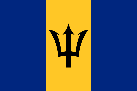
Rule 3: Blue, yellow and black. The colors of this flag look good.
Rule 4: The broken trident is a good, simple emblem.
Rule 5: Yean, I don't think any other flag has a trident that looks like it.
Part 2
Colonial flag of Barbados (1870–1966)
Flag_of_Barbados_%281870%E2%80%931966%29.png
A generic British colonial flag, with a complex coat of arms. Barbados has had one of the biggest flag improvements in history.
Part 3
As I said in my first thread:
There are some flags which I consider great, like the flag of Barbados
.
Next time:
Wikipedia said:
By far the worst country for press freedom in Europe in the 2013–14 Press Freedom Index published by Reporters Without Borders, which ranks Belarus 157th out of 180 nations
 
Flag of Belarus
255px-Flag_of_Belarus.svg.png

Rule 1: A child could not draw this flag from memory. The pattern on the left is too complex.
Rule 2: This flag is in fact almost the same one as that of the Byelorussian SSR, the differences being the removal of the hammer and sickle and the reversing of the colors of the pattern. In the flag of the Byelorrussian SSR, the red represented the October Revolution and the Green represented the forests of Belarus. Nowadays the red and green have no official meaning, although the dictator of Belarus, Alexander Lukashenko, says:
Red represents freedom and the sacrifice of the nation's forefathers, while green represents life
The pattern is derived from local flowers and represents a traditional patterned East Slavic cloth called a rushnik.
Rule 3: Red, green and white. Even though I dislike Bangladesh's flag colors, somehow I like these colors.
Rule 4: The rushnik is a bad, complex emblem.
Rule 5: This flag is pretty distinctive, even without the rushnik.
Part 2
1918, 1991–1995
Flag_of_Belarus_%281918%2C_1991-1995%29.svg
It's a bit boring, but it's simple, it's distinctive and wasn't adoptted by a dictator.
Byelorrusssian SSR (1951–1991)
Flag_of_Byelorussian_SSR.svg
Reminds me of the back of a playing card. I think the current rushnik looks better.
Part 3
The rushnik is too complex, and Belarus should switch back to its 1918 flag
 
Back