Pokemon Sword and Pokemon Shield

WELP LOOKS LIKE I'M BUYING A SWITCH THEN
 
Liking the environmental designs so far.

I'm reserving judgment on the starters until I've seen the final evolutions.
 
Pokemon has been going cutesy for a while now, there was an interview somewhere talking about the trend of people preferring the less monster-like designs over time. Making them smooth and rounded works better for 3d models I guess but I personally hate it. I'm almost surprised they don't look like this, although that's pretty close for the water starter lol.

It looks nice but nothing really new was shown beyond the location and visuals. None of the starters click with me but I never take anything but the final stage into account when choosing pokemon so I won't say I'm going to ditch my starter in this game but I'll probably ditch them anyway

The names are the most impressive thing, I gave an audible what the fuck.
 
Miki Hoshii said:
Making them smooth and rounded works better for 3d models I guess but I personally hate it.
Not necessarily.

If they rationalized it like this, I wouldn't understand it myself. It's easier to model boxes than spheres, and it's certainly easier to uv boxes. I'd see more cylinders and boxes if they really want to have at simple designs.

also spheres manifested themselves in Torchic, Mudkip, Chespin, Squirtle, Oshawott, Popplio, Piplup, Snivy, Tepig, Rowlett, and everything else I forgot so this isn't new to this generation.
 
Team Scorbunny for me, love its design.
 
my namesake has "OnFire" so you can sorta guess which type I tend to gravitate towards to

no not water, i don't need to be doused.
 
I prefer Grass starters starting from Generation 5, only because Generation 3 and 4 already gave us bird Pokemon so I had to pick them.

Anyway, I can see that British humour has already been quite rampant regarding the games on Twitter, which is pretty funny to see. Like this one:
D0awucgW0AY_psj.png


Thank you for reading.
 
I've always preferred grass or water.

Gen I - Bulbasaur (Grass)
Gen II - Totodile (Water)
Gen III - Treecko (Grass)
Gen IV - Turtwig (Grass)
Gen V - Oshawott (Water)
Gen VI - Froakie (Water)
Gen VII - Rowlet (Grass)
Gen VIII - Sobble (Water)

Huh, that's actually an even balance, though Sobble is also dependent on evolutions. On the whole though, grass is my favorite type and the Torterra line are my favorite pokemon of all time.
 
I myself don't worry about evolutions too much because I know I'll be more likely playing the Mystery Dungeons anyway (in the future, still waiting for those though Chocobo Mystery Dungeon is next), and evolutions don't matter in those games.

I've yet to pick a fire starter though.
 
Doc von Schmeltwick said:
A short moment to reflect on the designs.....

D0cHuoxUUAA8S8o.jpg:large


What in blue blazes?!

THIS CANNOT BE A COINCIDENCE.

Anyway, besides what I already said here, I also am really liking the graphics on this. Galar is looking beautiful, and I mean if it really is based on England, then that's not surprising in the slightest.
 
LeftyGreenMario said:
If they rationalized it like this, I wouldn't understand it myself. It's easier to model boxes than spheres, and it's certainly easier to uv boxes. I'd see more cylinders and boxes if they really want to have at simple designs.

I guess what I meant is that these starters have very sleek designs without small details that I feel like were more common previously (torchic has that fur around it's neck, Growlithes fur in general, geodude actually looking like a rock). I'm not gonna dig around for stuff but I'm not talking about the shapes, just the designs themselves being primarily made with 3d models in mind.

If geodude was made this gen he would be a sphere with arms and cute eyes.
 
Mmmm, I really think we should reserve judgement until we see the rest of the generation designs. I personally don't see the problem with those three, I always feel the new gen is sleeker than the previous one. I still remember how smooth and sleek Gen 3 looked compared to first two gens and having the same feelings for the starters of each subsequent gens. I think Sobble and the bunny do have small designs too, not seeing where they don't.

I do think the first Gen has an "old" feel to it. I can't put it in words but we have creatures like Kangaskahn, Rhydon, Bulbasaur, Charmander, Squirtle, those kinda have that 1990s creature look to it. Again, I can't articulate but I hope someone knows what I mean.
 
Yeah, I think so. It certainly doesn't feel established, the creature designs feel a little generic in Gen 1.
 
Wario Deluxe said:
I guess that explains why Mew's original sprite looks very unsettling.
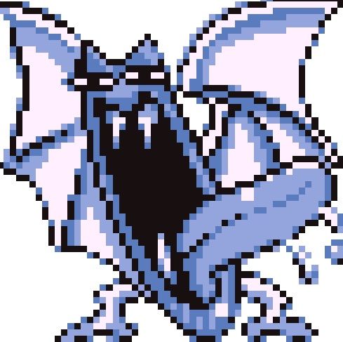
06fc5c137a48cf7f1a2154a47361fe59f4de1682_hq.jpg


So much so they actually remade a bunch of em for yellow.
 
Mcmadness said:
Wario Deluxe said:
I guess that explains why Mew's original sprite looks very unsettling.

06fc5c137a48cf7f1a2154a47361fe59f4de1682_hq.jpg


So much so they actually remade a bunch of em for yellow.
The 90's were a dark and lawless time.
 
Back