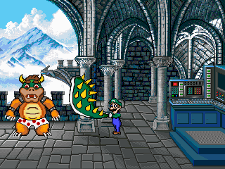
Which game do you feel is the ugliest?

Glowsquid

Shine Sprite
Retired Forum Mod
Retired Wiki Staff
'Shroom Consultant
Exactly what it says on the tin. What Mario game offends your aesthetic sensibilities the most?

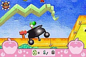
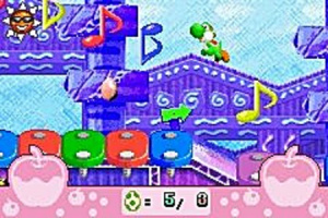
Initially I was going to nominate Yoshi's Island DS what with the inconsistent shading, extreme color banding and the Crime Against God that is Bowser's sprite.

but then I remembered

hqdefault.jpg


yugrga039.jpg


yugrga038.jpg


I suppose it's unfair one of the pic above is an heavily compressed youtube shot of a GBA game being stretched to modern display sizes, but still. Yoshi Universal Gravitation is profoundly ugly.
 
Mona_Lisa_MTMSNES.png

I'd definitely nominate the PC version of Mario's Time Machine for having the ugliest sprite for Mario. Remember, this is from the same guys that brought us the Weegee sprite. On a whole, though, I'd probably nominate WarioWare: DIY. The base microgames, at least, feel robotic and uninspired.
 
Mario + Rabbits, just for the Rabbits alone.

In terms of art style, really most of the GBA or DS games. Not all of them (M&L:SS and BIS have good art styles), but styles like Mario Kart: Super Circuit and DS aren't all that great looking. ...Mostly the spin-off titles, now that I think about it.
 
Surprised Glowsquid didn't mention this

 
Yoshi's New Island models are atrocious.

I mean, just look at this model of Baby Mario.

13358.png


With a model quality like that, you're just better off using the N64 Baby Mario model because at least it doesn't look like his textures are melting.

Also, who could forgot this abomination?

13361.png


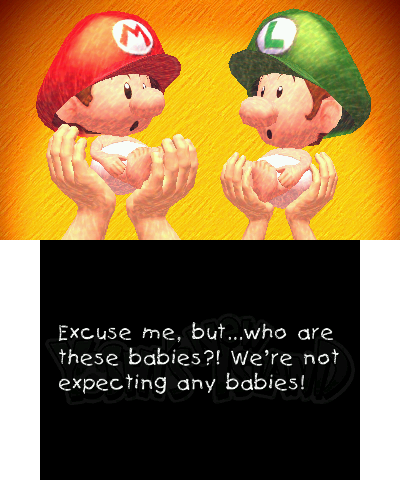
In Yoshi's Island DS, as far as I care, Baby Mario and Baby Luigi look far better than they do in Super Mario World 2, and that's all that matters to me.

BabyLuigi_-_YIDS.png
>>>
YISMA3BabyLuigiSprite.png


LeftyGreenMario said:
Surprised Glowsquid didn't mention this

*Donkey Konga video*

I can easily overlook the graphics with a soundtrack selection from Santanna, Jamiroquai, Queen, Jackson 5, Earth, Wind & Fire, and Benny Goodman
 
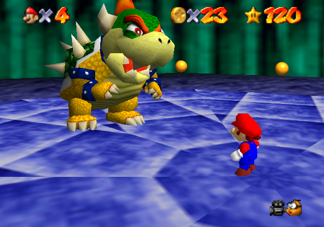
possibly controversial opinion, but super mario 64's graphics (and n64 graphics in general really) are hideous

yeah i'm aware of the whole "it's 20 years old, it was a landmark, first time, etc." argument but that doesn't really shake off the fact that they look really ugly. of course the games are still fun but the graphics did not age well at all

also on a side note, while i like pretty much every other sprite from superstar saga, i absolutely hate the game's bowser sprites. he just doesn't look right at all to me, way too fat, off color... it's just really bleh to me
 
Lord Bowser said:
possibly controversial opinion, but super mario 64's graphics (and n64 graphics in general really) are hideous

yeah i'm aware of the whole "it's 20 years old, it was a landmark, first time, etc." argument but that doesn't really shake off the fact that they look really ugly. of course the games are still fun but the graphics did not age well at all

If you want examples of better looking games on the N64, look at Banjo-Kazooie/Tooie, Rayman 2, and Beetle Adventure Racing.

I still think Mario Kart 64 is the worst-looking Mario game on the system though.
 
I think the environments in Super Mario 64 are fine. It's just that Bowser looks horrible.

20110511214520%21BowserintheDarkWorldFight.png
 
Lord Bowser said:
possibly controversial opinion, but super mario 64's graphics (and n64 graphics in general really) are hideous

yeah i'm aware of the whole "it's 20 years old, it was a landmark, first time, etc." argument but that doesn't really shake off the fact that they look really ugly. of course the games are still fun but the graphics did not age well at all

Yeah, I'll agree on the graphics. It certainly isn't the best looking game on the N64. I think Mario Party did a better job with the character models than SM64 did.

But it was the first 3D game for Nintendo, cut it some slack.
 
In defense of Yoshi's new island, it's models don't look so bad when actually seen in game.

They seem to put some kind of filter on it or some crap that smooths it out.
 
Mcmadness posts in this thread.

And it's not about Splendid Pulpy Mario.
 
That game is unpleasant but unpleasant in a "this isn't even a Mario game" kind of way.

If we are talking just downright ugly Mario games in every sense of the word then there are worse than that.
 
It is the ugliest Mario game to use as abstract geometric 2D shapes for its characters.
 
Time Turner said:
On a whole, though, I'd probably nominate WarioWare: DIY. The base microgames, at least, feel robotic and uninspired.

That's an interesting choice. The Pikmin game is a standout, but otherwise yeah...
LeftyGreenMario said:
Surprised Glowsquid didn't mention this


I'm surprised I forgot! I guess they went with 3D models because that was DKC's shtick, but it's impressive how much less ugly the games Donkey Konga Ctrl+C Ctrl+V (Taiko no Tasjusin) are.
 
Glowsquid said:
Time Turner said:
On a whole, though, I'd probably nominate WarioWare: DIY. The base microgames, at least, feel robotic and uninspired.
DIY always stood out to me more because the rest of the series went to such great lengths to have different art styles for each microgame, and here, it's like they hired a single guy to draw them over the weekend.
 
Mcmadness said:
In defense of Yoshi's new island, it's models don't look so bad when actually seen in game.

They seem to put some kind of filter on it or some crap that smooths it out.

Even with filters, something about this picture causes my Baby Mario Bros. nerdisms to go all out.

BabyBrosYoshisNewIsland.png


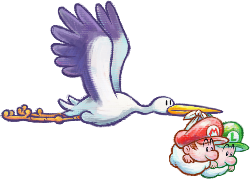
Look at Baby Mario and Baby Luigi's eyes. They're disproportional to each other. Baby Mario has ridiculously large eyes, and Baby Luigi's eyes are a little bit better, but they're in a stark contrast with Baby Mario's. Here's a picture on what their eyes should look like.

800px-Stork_and_Babies_Artwork_-_Yoshi%27s_New_Island.png


See their eyes? It should be around the same height and width with each other, but for some reason, they have drastically, noticeably different eye sizes. Baby Mario's eyebrows in his in-game model are also drawn too thick, they should be more pencil thin than this.

The mouths too. Like what they heck, the circles where their mouths are far too large. Instead of making a curious-looking face, they look like they're actively sucking air like some stupid fish or something. And it's never colored black. It's usually supposed to be a deep red or two shades of red to indicate features of the mouth, never a featureless black.
 
how would one classify baby mario and baby luigi's eyes?
 
Fanart with Baby Mario and Baby Luigi with black eyes will always be the superior option than them being portrayed with blue Mario + Luigi eyes.
 
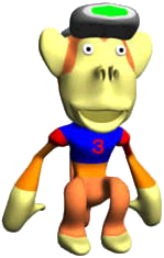
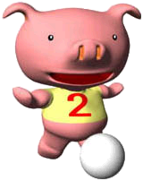
I remembered these models from WarioWare Minigame Mania, which looks out of place from the 2D game. I do not know where those models are found, but they certainly left an impression on me:
Mona%27s_Elephant_3D_WarioWare_Mega_Microgames.png

MonaMonkey.png

Mona%27s_Pig_3D_WWMM.png


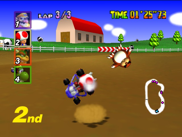
Anyway, when looking back at the games, I felt that Mario Kart 64's use of sprites for the characters don't look very good. It might look good on a CRT TV, but if it's emulated, then it certainly makes the characters not only look out of place from the environment, but also difficult to tell their actions. I have to pause to know that when the characters are hurt, they put their hands on their head (I thought they just took the wheel like a motionless doll all the time). It's part of the reason I think Mario Kart DS looks nice to look at: at least the characters convey action that can be visibly seen, such as Wario slamming his vehicle and Waluigi punching in the air.

Mario%20Kart%2064_Nov19%2018_02_33.jpg


Moreover, when contrasting Mario is Missing! for the SNES, the PC version have character sprites that look very unconventional, but I guess this is before they have a standard look in the form of a 3D model. It might be somewhat cheating to bring up the PC Mario games due to their different styles, but I guess we'll need to start somewhere. (and I am sure somebody will bring up Hotel Mario)

BeachKoopa-Bowser.png


Thank you for reading.
 
winstein said:
Those technically don't count, since they're not directly from any games and were only used on a website, but they're bad enough that I still want them to be included here. Holy christ on a pogo stick, I can't believe I forgot about those Play-Doh abominations.
 
The elephant actually makes an appearance in the GameCube port on Wario's TV during the final cutscene, but I haven't been able to find the monkey or the pig.
 
But since they're intentionally bad, don't they get a bit of a free pass?
 
Back