Navigation
Install the app
How to install the app on iOS
Follow along with the video below to see how to install our site as a web app on your home screen.
Note: This feature may not be available in some browsers.
More options
You are using an out of date browser. It may not display this or other websites correctly.
You should upgrade or use an alternative browser.
You should upgrade or use an alternative browser.
Look at it! Look at it! LOOK AT IT!
- Thread starter Lario
- Start date
Mount Wario
King Bowser
- Pronouns
- He/him
I mean, just look at his face.
Mount Wario
King Bowser
- Pronouns
- He/him
The face is just too jagged and big. He also has 3 fingers and one tooth bigger than the other, if you look closely.
The colors aren't appealing at all either. Couldn't they even give him red hair?
The colors aren't appealing at all either. Couldn't they even give him red hair?
Mount Wario
King Bowser
- Pronouns
- He/him
That one was more excusable because of NES limitations, and Bowser's design being different.
This one had the definitive Bowser design and lots of SNES colors to use.
This one had the definitive Bowser design and lots of SNES colors to use.
- Pronouns
- She/They
- MarioWiki
- Fawfulthegreat64
Mario is Missing NES Bowser looks more like Boom Boom.


Mount Wario
King Bowser
- Pronouns
- He/him
Try Mario is Missing SNES Bowser.

ThatGuy62
Boo
I think NES Mario Is Missing Bowser is probably the most pathetic Bowser to ever exist.I Got No iPhone said:Mario is Missing NES Bowser looks more like Boom Boom.

Like, some like McMadness and I rag on Super Paper Mario Bowser, and very few people like Bowser's portrayal in Sticker Star, but those are Greatest Hits material compared to this:
Mcmadness
The idiot who puts things in the wrong board.
ThatGuy62 said:I think NES Mario Is Missing Bowser is probably the most pathetic Bowser to ever exist.
Like, some like McMadness and I rag on Super Paper Mario Bowser, and very few people like Bowser's portrayal in Sticker Star, but those are Greatest Hits material compared to this:
I can't even call it an insult, it's that insulting.
Catchy music though.
- Pronouns
- she/her
- MarioWiki
- Mario
I think both Bowser and Mario in the NES Super Mario Bros. look ugly.Mr. Saltman said:That one was more excusable because of NES limitations, and Bowser's design being different.
Mount Wario
King Bowser
- Pronouns
- He/him
LeftyGreenMario said:I think both Bowser and Mario in the NES Super Mario Bros. look ugly.Mr. Saltman said:That one was more excusable because of NES limitations, and Bowser's design being different.
Are you talking about the character designs or the sprites?
If it's the sprites, then well, the quote above you is my answer
 .
.- Pronouns
- she/her
- MarioWiki
- Mario
At least in Bowser's case, I do think Bowser is very ugly. But I'll talk about Mario.

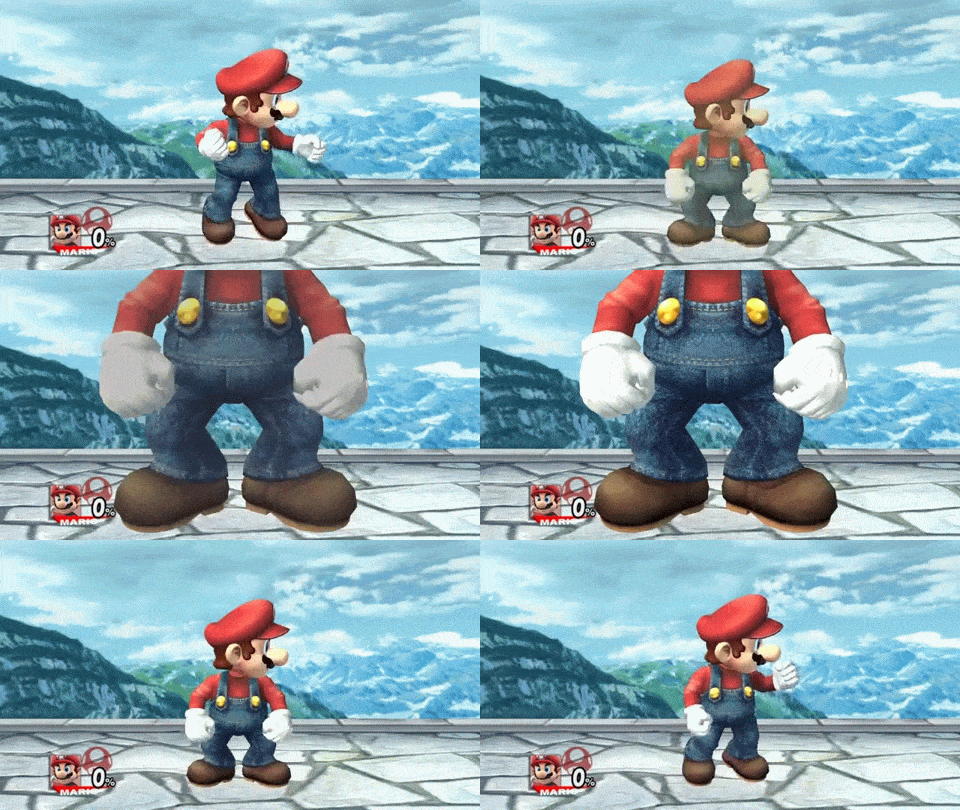
IMO compared to Mario today, the chest is too big, the hat is too small and doesn't look good on Mario's head, the ears are too far back, don't like the dotted eyes, and the mustache is too big. But hey, I don't think I'm being fair (what do I know about NES) but I'm just not a fan of 8-bit Mario. i.e. I'm picky. I think it may has to do with the combination of the dotted eyes and the relatively small hat as I'm not a fan of the Super Mario Bros. 3 sprite and I don't love Paper Mario's design. But again, I don't dislike the Yoshi's Cookie sprite. But just to me something seems OFF about the 8-bit Mario sprite compared to his model today.
I prefer these sprites even though Mario's head takes up half the space of his body rather than the normal 1/3 of his body the current Mario is.


Savato said:
Is this some sort of joke?
It's a horse!
Mount Wario
King Bowser
- Pronouns
- He/him
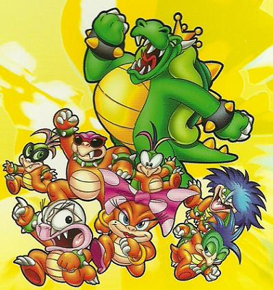
What did they do to everyone here?
Mount Wario
King Bowser
- Pronouns
- He/him
Koops said:Thats what they look like in the cartoon.
I know, but it's still ugly.
- Pronouns
- She/They
- MarioWiki
- Fawfulthegreat64
Christmas morning. All the excited kids are dragging their half-asleep dad downstairs to open presents.Mr. Saltman said:
What did they do to everyone here?
Edward1978
Goomba
This thread is pointless, I want it to end right now. I hope this is the last reply.