yoshiking14x
Retired
Hotel Mario is bizarre looking but not as the Faces of Evil or the Wand of Gamelon, but that's a different story.
King Koopa and his Goombas from the Mario movie.
King Koopa and his Goombas from the Mario movie.

Follow along with the video below to see how to install our site as a web app on your home screen.
Note: This feature may not be available in some browsers.
Aha, here's the problem.Dr. Mario said:Still, I feel like we're missing one more thing.

Lario said:YOU KNOW WHAT THEY SAY
Dr. Mario said:I feel like my love for Mario makes this hell spawn even more painful to look at. It hurts...
"Nice of the princess to invite us over for a picnic, gay Luigi!"
 : MUAHAHAHAHA!!!!
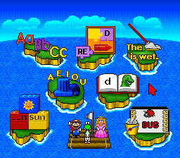
Actually, no, this is Valiant Comics, which just f**ked Peach's design.Zae Eildus said:yum peach early design


? Block said:The eyes on that Luigi always get to me
Yes, it's worse than the death stare.
? Block said:He looks like he has a terrible skin condition

If the team wants to trigger repulsion, it would be understandable.Zae Eildus said:? Block said:He looks like he has a terrible skin condition
maybe he wants to be a part of the Indiana Pacers team .
If the team wants to trigger repulsion, it would be understandable.
It's not the colors that get me as much as the polka-dot pattern.Zae Eildus said:If the team wants to trigger repulsion, it would be understandable.
well its the team colors so uh
Dr. Mario said:It's not the colors that get me as much as the polka-dot pattern.Zae Eildus said:If the team wants to trigger repulsion, it would be understandable.
well its the team colors so uh
The Toad and Peach ones don't look AS bad, but Toad can do without the barf green.Zae Eildus said:i think nintendo is just experimenting.


Mario looks like Popeye.Dr. Mario said:Just look at Yoshi and that pink thing.
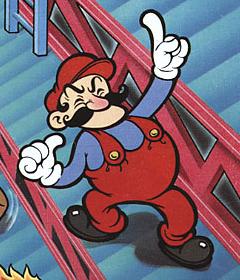
And Mario's early design is awful.
Finally, this pink thing again.